
Using Growform 
4 Different Button Styles You Can Create With Growform
Harvey Carpenter
Updated Published 1 min read
Buttons are the ideal way to start your form – they’re super low friction compared to traditional fields.
Growform is extremely configurable and will let you achieve a number of button layouts, but we’ve noted 4 commonly used settings that are easy to reproduce:
Large, square buttons with icons
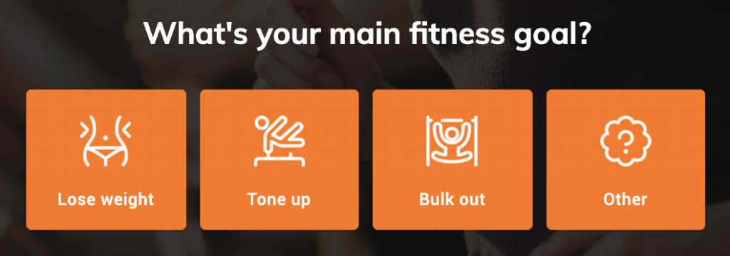
To achieve this look:
- Add some buttons to your form (“Add field” > “Buttons”)
- Set “buttons per row” to “4”
- Set the “button height” to “100”
- Add images when editing the button options
- Edit button colour settings in “Form settings” > “Edit theme settings” > “Buttons”
Large, rectangle buttons with no icons
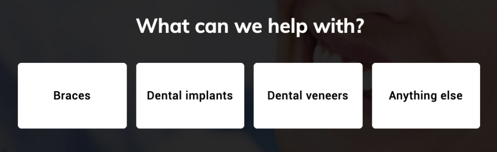
To achieve this look:
- Add some buttons to your form (“Add field” > “Buttons”)
- Set “buttons per row” to “4”
- Set the “button height” to “70”
Full width, colour buttons with no icons
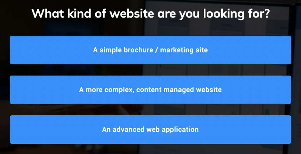
To achieve this look:
- Add some buttons to your form (“Add field” > “Buttons”)
- Set “buttons per row” to “1”
- Set the “button height” to “50”
- Edit button colour settings in “Form settings” > “Edit theme settings” > “Buttons”
Full width buttons with icons

To achieve this look:
- Add some buttons to your form (“Add field” > “Buttons”)
- Set “buttons per row” to “1”
- Set the “button height” to “70”
- Add images to your buttons when editing the button options
- Adjust the width, margin-top and margin-bottom of the button images under the “button images” settings when the button is selected.
Related articles

Growform Mass Tort Intake Forms for Better Screening
Growform helps mass tort marketers and intake teams turn paid traffic into better-screened claimant leads.
September 30, 2026

Growform Debt Relief Forms for Qualified Lead Intake
Debt relief lead forms have to do more than convert.
September 30, 2026

Growform CRM Forms With Hidden Field Pass-Through Built In
September 30, 2026