
Add a Buttons field
Choose “Buttons” when you add a new field, then enter a label for each choice.

Feature
Buttons turn a question into a single click, with text, a picture or both on every choice. The form moves on as soon as the lead answers, which keeps the opening steps quick on a phone.
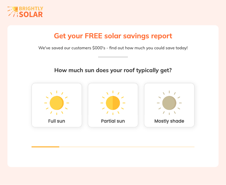
Text buttons and picture buttons are shown here on a working form. A single-choice question needs no separate continue button.
Forms with buttons present the possible answers to a question as clickable choices in place of a dropdown or a text box. The lead sees every option at once and answers with one click or tap. A home improvement company can open its form by asking whether the project is a kitchen, a bathroom or an extension, with one button for each.
Buttons work well as the opening question of multi-step forms, and every button answer can feed conditional logic so that the next step depends on the choice.
Picture buttons carry an image you upload, with or without a text label. The Square style is made for larger images, and its “Image only mode” hides the labels so that the pictures themselves are the choices. The result is an image choice form, which some people call a picture choice form. A roofing company can show photos of shingle, tile and metal roofs for the homeowner to pick from.
Growform has two current button styles, Rectangle and Square, alongside the Legacy style of older forms. Rectangle buttons suit longer lists and can show a thumbnail image beside the text. Square buttons suit visual questions.
“Buttons per row” runs from 1 to 5 on desktop and “Buttons per row (mobile)” runs from 1 to 3, so four buttons across on a laptop can become a single column on a phone. You can also adjust the spacing, show a radio or checkbox control on each button, and set every button color in the theme settings.
Yes, switching on “Can select multiple” lets the lead pick more than one button. The continue button then appears, because the form has to wait until the lead has finished choosing. With single-choice buttons the continue button is hidden and the click itself moves the form forward. For plain lists that need no pictures, checkboxes are an alternative.
Choose “Buttons” when you add a new field, then enter a label for each choice.
Select “Rectangle” for lists of text choices or “Square” for questions led by pictures.
Upload an image to each button, then set “Buttons per row” and “Buttons per row (mobile)”.
Leave “Can select multiple” off for one-click answers, or switch it on when several choices may apply.
A single-choice button answers and advances in the same action, so the lead reaches step two before typing anything.
Every lead picks from the same choices, which gives your rules and your CRM consistent values to work with.
The mobile setting controls how many buttons share a row, down to one button across the full width.
A homeowner who does not know the name of their roof type can recognize it from a photo.
Text buttons, picture buttons and multiple selection are part of every Growform plan.
Rectangle buttons are suited to anything from two choices to more than twenty. Square buttons are intended for visual questions with larger images.
Yes. Switch on “Hide field name” and place a header or paragraph above the buttons to ask the question in your own style.
Upload a large image where you can. On Rectangle buttons Growform tries to display the image at 2.5 times the width you set, which keeps it sharp on high-resolution screens.
Create beautiful multi-step forms that convert, with a 14-day free trial. No credit card required.


