10 Best ClickFunnels Landing Page Examples That Actually Convert
Quick Summary
This guide breaks down 10 effective ClickFunnels landing page examples and explains why they convert, covering tactics like clear messaging, trust signals, urgency, and optimized forms. You’ll also see how to apply these proven strategies with Growform’s multi-step forms to capture higher-quality leads and boost conversion rates. Check out our blog for advanced tips on landing page optimization and multi-step form strategies.
Boost Conversions with Proven ClickFunnels Landing Page Examples
Did you know the average landing page conversion rate across industries is just 6.6%, even though the top-performing pages reach 10% or more? The difference isn’t luck, it’s execution. Some pages follow predictable formulas that quietly guide users toward action, while others miss the mark and bleed opportunities.
That’s where ClickFunnels shines: it gives anyone the tools to build landing pages, but not every funnel built on it turns into a conversion machine. The real question is, what sets the winners apart?
This Growform article shows you 10 high-converting ClickFunnels landing page examples, the proven tactics behind them, and how you can apply the same strategies using Growform’s flexible multi-step forms to capture more high-quality leads.
Why Listen to Us?
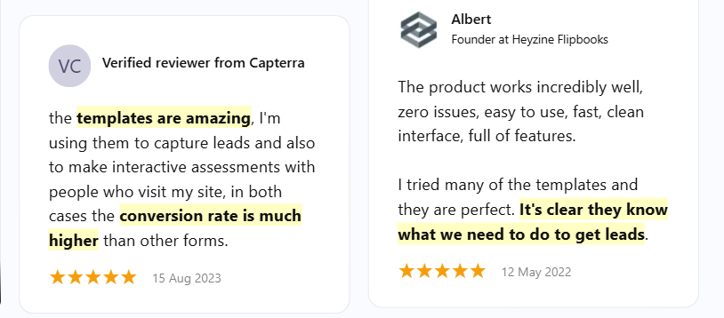
At Growform, we know what makes a landing page convert. Our multi-step, high-performing forms are used by thousands of businesses to generate better leads, reduce friction, and improve the user journey.
The insights are drawn from data, testing, and years of working with real campaigns. If your goal is to capture more high-quality leads, you’re in the right place.
What Are ClickFunnels Landing Pages?
ClickFunnels landing pages are single-purpose web pages created within the ClickFunnels platform, designed to convert visitors into leads or customers. Unlike traditional websites, which often contain multiple links and navigation menus, these pages are streamlined and focused on one clear action.
Key traits of ClickFunnels landing pages include:
- Conversion focus: Every element from copy, layout, and CTA, is designed to guide visitors toward a single goal.
- Ease of use: Built with drag-and-drop tools, making it accessible to marketers without coding skills.
- Integration ready: Connects with email, CRM, and payment tools to move leads smoothly through the funnel.
- Optimization features: Supports A/B testing, upsells, and multi-step flows to maximize conversion rates.
When you look at ClickFunnels landing page examples, you can see these principles in action. Some use urgency to drive quick decisions, others lean on storytelling, and many rely on clean form design to capture leads efficiently. Studying real-world examples reveals not just what works, but why it works.
Why ClickFunnels Landing Page Examples Are Important
Studying ClickFunnels landing page examples helps you:
- Conversion patterns: Identify high-performing layouts and design structures that consistently guide visitors toward specific conversion goals.
- Messaging impact: Understand how headlines, supporting copy, and call-to-action placement shape user decisions and influence conversion outcomes.
- Form optimization: Learn how streamlined or multi-step forms reduce friction, improve completion rates, and capture higher-quality leads effectively.
- Trust building: See how testimonials, reviews, and recognizable brand logos establish instant credibility and reduce visitor hesitation significantly.
- Industry relevance: Discover how businesses across different niches adapt proven ClickFunnels strategies to fit unique offers and target audiences.
Top 10 ClickFunnels Landing Page Examples
1. MIG Soap – 14‑Day Challenge Funnel
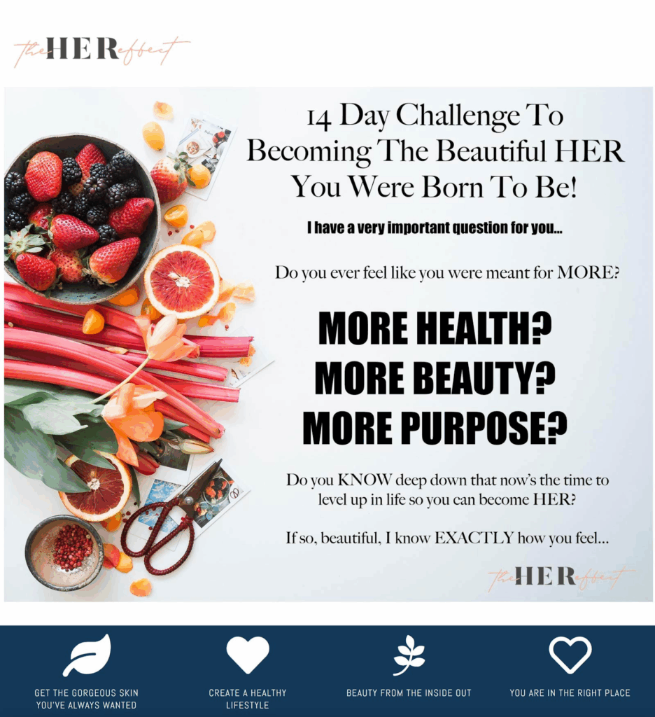
What it does well:
The landing page leads with aspirational, qualifying questions (“Do you ever feel like you were meant for more?”) that emotionally connect with visitors. The simple layout keeps attention focused on the challenge.
Best practices used:
- Challenge-based hook to spark commitment
- Clean, distraction-free layout
- Emotional prompts to pre-qualify leads
What you can learn:
Asking aspirational questions at the top of your funnel helps capture attention and move visitors toward action.
How to apply:
Recreate this flow with a conditional logic form that starts with one powerful question. Based on the answer, reveal only the most relevant next step to keep engagement high.
2. Funnel University – Video Sales Funnel
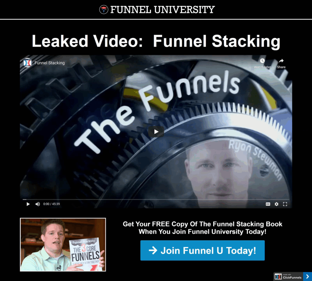
What it does well:
Russell Brunson’s video dominates the hero section, instantly building trust and authority. The CTA button appears immediately after the video, ensuring the momentum carries through.
Best practices used:
- Video storytelling for authority
- Clear CTA placement after content
- Engaging, high-energy delivery
What you can learn:
Video works as a trust shortcut, priming users for the CTA before they scroll away.
How to apply:
Pair a video section with a multi-step form that triggers once the video ends. This creates a seamless handoff from content to lead capture.
3. Moonology Masterclass
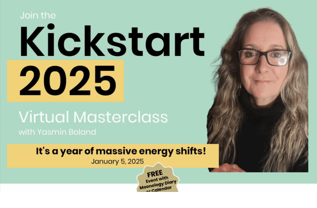
What it does well:
The poster grabs attention with “Kickstart 2025,” highlighting relevance and timing. Featuring Yasmin Boland adds credibility, the “massive energy shifts” hook intrigues, and the free incentive plus speaker photo boost trust and sign-ups.
Best practices used:
- Bold, time-specific headline to create urgency
- Strong emotional hook (“massive energy shifts”)
- Free incentive to boost sign-ups
What you can learn:
Combining urgency, emotional pull, and a free incentive makes events more compelling. Adding a recognizable host and clear event details builds credibility and drives sign-ups.
How to apply:
You can replicate this experience using a Logic Jump Form. By tailoring questions (e.g., “Do you already have the Moonology Diary?”), the form personalizes the journey while keeping sign-ups simple. This makes the registration process engaging and ensures follow-ups are targeted and relevant.
4. Podcasting Guest Mastery – Lead Magnet with Urgency
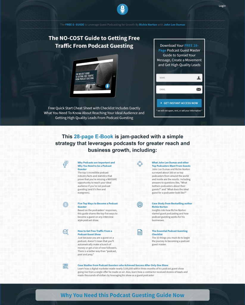
What it does well:
This landing page promotes a 28-page guide with urgency messaging (“Why You Need This Guide Now”). The form is positioned beside strong benefits and social proof, encouraging immediate action.
Best practices used:
- High-value lead magnet
- Urgency in headline
- Testimonials build credibility
What you can learn:
Pairing urgency with tangible value motivates faster sign-ups.
How to apply:
With Growform’s conditional multi-step form, start by asking if visitors want the guide. A “Yes” reveals the next contact fields, while benefit bullets and testimonials displayed alongside the form boost conversions.
5. Tai Lopez – Online Income Reselling Funnel
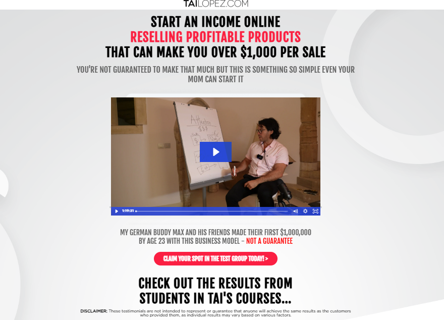
What it does well:
The funnel presents reselling as a high-income opportunity that feels easy to start. Social proof (“my German buddy Max made $1,000,000 by 23”), testimonials, and disclaimers balance bold claims with compliance. The “Claim Your Spot In The Test Group Today!” CTA adds urgency and exclusivity.
Best practices used:
- Strong, benefit-driven headline with high-income potential
- Scarcity framing through “test group” language
- Testimonials paired with clear disclaimers for credibility
What you can learn:
Framing an opportunity as both exclusive and achievable can drive curiosity and sign-ups. Including disclaimers alongside testimonials helps maintain trust while still leveraging social proof effectively.
How to apply:
Recreate this funnel using a logic jump form. This approach allows you to first gauge visitor interest with a qualifying question, then dynamically reveal the minimal fields needed to register, keeping the flow simple and aligned with the exclusive “test group” positioning.
6. Backyard Chicken Coops – Bok Bok Box
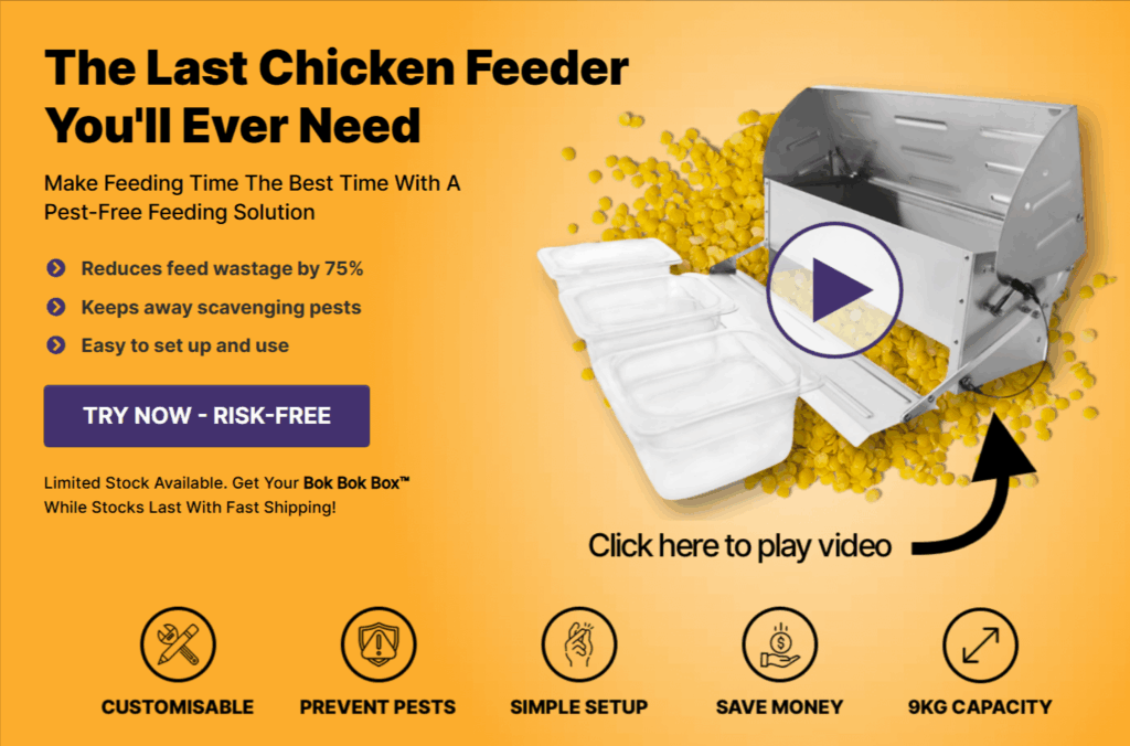
What it does well:
The landing page clearly communicates the Bok Bok Box™’s practical benefits, reducing feed wastage, keeping pests away, and being easy to set up, without feeling pushy. The messaging focuses on solving common pain points for chicken owners and builds trust by mentioning a risk-free trial and limited stock. The copy is concise and scannable, making the value obvious without aggressive selling.
Best practices used:
- Benefit-focused headlines and bullet points for clarity
- Risk-reduction messaging to ease hesitation
- Limited stock phrasing to create gentle urgency
What you can learn:
By emphasizing practical benefits and minimizing sales pressure, landing pages can engage visitors effectively and encourage action through trust and clarity rather than pushy tactics.
How to apply:
You can replicate this smooth, user-friendly flow using conversational forms. These forms make the interaction feel personal and intuitive, guiding visitors through the key information without overwhelming them.
7. ClickFunnels – One Funnel Away Challenge
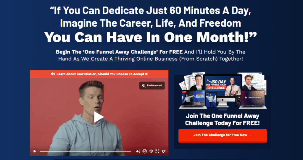
What it does well:
The landing page frames the One Funnel Away Challenge as an achievable, time-friendly opportunity, appealing to visitors’ desire for career growth, freedom, and personal transformation. By emphasizing just 60 minutes a day and a step-by-step guidance approach, it reduces intimidation while increasing motivation. The “FREE” offer and clear start date create urgency without being pushy.
Best practices used:
- Clear, time-bound promise that highlights accessibility (“Just 60 Minutes A Day”)
- Free offer to lower entry barriers
- Action-oriented, benefit-driven headlines
What you can learn:
Breaking down a large goal into manageable steps and highlighting a guided, supportive process can increase engagement and sign-ups. Time-specific framing and free access encourage participation without high-pressure tactics.
How to apply:
You can mirror this approachable, step-by-step flow using a wizard form. By guiding users through one simple step at a time, the form keeps visitors engaged while gradually capturing essential information, maintaining a friendly and supportive tone.
8. Formula Botanica Free Course
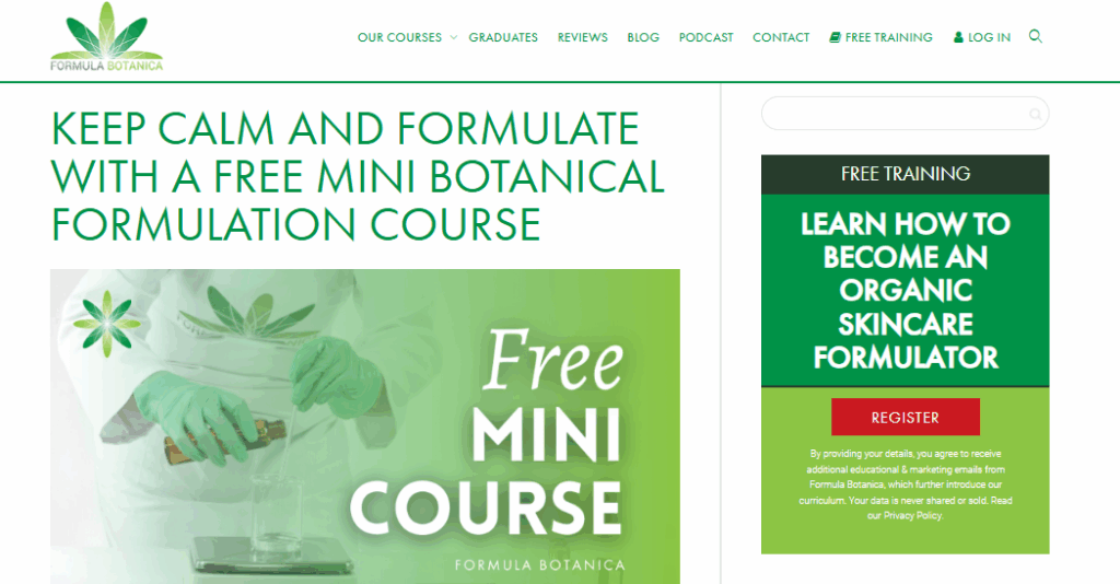
What it does well:
The landing page clearly communicates the value of the free mini course for aspiring organic skincare formulators. It emphasizes education and skill-building rather than pushing a paid product, which positions the brand as a helpful authority. The CTA (“Register”) is straightforward, and the privacy reassurance builds trust, making it easy for visitors to take action without feeling pressured.
Best practices used:
- Clear, educational value proposition (“Free Mini Botanical Formulation Course”)
- Simple, prominent CTA to reduce friction
- Focus on skill-building rather than hard selling
What you can learn:
Offering high-value, no-cost educational content can establish credibility and nurture leads. Transparency about data usage increases visitor confidence and lowers barriers to registration.
How to apply:
You can create a similarly low-friction experience using a lead capture form. A concise form collects only essential details while keeping the focus on the educational offer, helping visitors feel informed and secure when signing up.
9. Digital DJ Tips Course Funnel
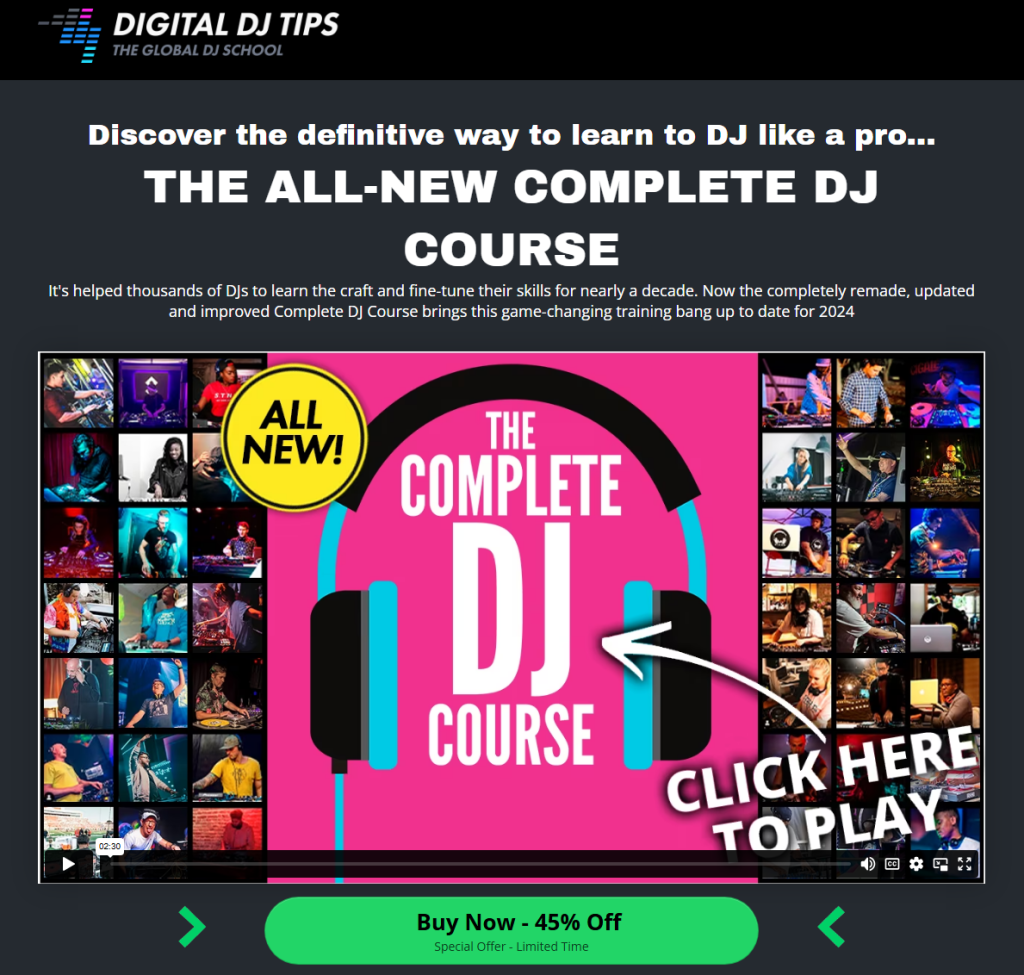
What it does well:
The landing page highlights the Complete DJ Course’s value and credibility, noting nearly a decade of helping thousands of DJs. The 2024 update feels fresh and game-changing. A prominent video, “All New!” labels, and a strong discount CTA (“Buy Now – 45% Off”) grab attention, while visuals of instructors and students add social proof.
Best practices used:
- Highlighted updates and “All New!” for perceived value
- Promotional discount to encourage timely action
- Embedded video to engage visitors and demonstrate course quality
What you can learn:
Using a combination of credibility, social proof, and engaging multimedia content can help establish authority and increase conversions. Highlighting updated content and time-sensitive offers creates subtle urgency without being pushy.
How to apply:
You can replicate this engaging experience using a lead verification form. This type of form ensures interested visitors are genuinely qualified, keeping sign-ups high-quality while maintaining a smooth, low-pressure registration process.
10. AppSumo Affiliate Sign-Up Funnel
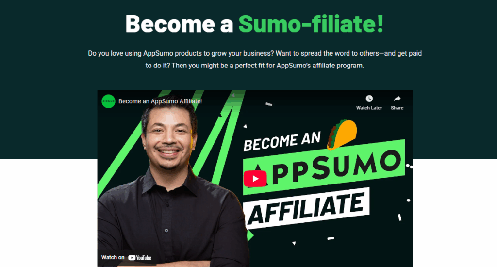
What it does well:
The AppSumo affiliate landing page grabs attention with a playful headline (“Become a Sumo-filiate!”) and clearly presents the opportunity to earn by sharing products. A short, focused copy and an engaging video help potential affiliates connect with the brand
Best practices used:
- Engaging embedded video for authenticity and connection
- Conversational tone that feels approachable and fun
- Focused messaging without overwhelming details
What you can learn:
Using a strong, personality-driven headline combined with concise copy can make your offer both memorable and easy to understand. Adding video humanizes the brand and builds trust, while keeping the message focused ensures visitors immediately know what’s in it for them.
How to apply:
You can replicate this engaging experience using an Embeddable Form. Placing the form directly on the landing page means interested affiliates can sign up without breaking the flow. This ensures a frictionless experience that boosts conversions and maintains the page’s fun, approachable vibe.
Take Your ClickFunnels Pages to the Next Level with Growform
Great landing pages grab attention, but smart forms capture leads. With Growform’s multi-step forms, conditional logic, and seamless embeds, you can guide visitors smoothly, reduce drop-offs, and collect higher-quality leads.
Turn insights into action by creating personalized, high-converting funnels without extra effort. Growform makes it simple to optimize every step of the user journey.
Start your free 14-day Growform trial today and see your ClickFunnels pages convert like never before.