8 Best Webinar Landing Page Examples to Boost Signups
Quick Summary
This guide explores 8 high-converting webinar landing page examples, showing what makes them work and how you can apply the same tactics. Effective pages build trust, reduce friction, and drive registrations. Use Growform’s multi-step, customizable forms to implement these best practices. For more strategies on webinar funnels and conversion optimization, explore our blog.
The Power of a Webinar Landing Page in Driving Signups
Imagine spending weeks preparing the perfect webinar, lining up your speakers, polishing your slides, and promoting it across every channel, only to see a handful of people register. The problem usually isn’t your topic or expertise. It’s your webinar landing page.
A webinar landing page is where curiosity turns into commitment. It’s the difference between an empty room and a fully booked event. Done right, it grabs attention in seconds, builds trust with your audience, and makes signing up feel effortless. Done wrong, it leaves visitors scrolling, second-guessing, and clicking away.
In this Growform guide, we’ll break down 8 of the best webinar landing page examples, showing you exactly what makes them work, the conversion tactics they use, and how you can apply the same strategies using Growform.
Why Listen to Us?
At Growform, we’ve seen what truly drives webinar signups. Our multi-step form builder integrates seamlessly with tools like Unbounce, HubSpot, and ActiveCampaign, making it easy to capture leads, send reminders, and manage registrations. Customers love how simple it is to embed Growform into their landing pages and how quickly it improves conversions. Reviews highlight smoother signup flows, higher attendance rates, and less manual work. Whether you’re a startup or an enterprise team, Growform gives you the integrations, flexibility, and proven results to turn more visitors into attendees.
What Is a Webinar Landing Page?
A webinar landing page is a dedicated page designed to promote your event and capture registrations. Unlike a standard website page, its sole purpose is to persuade visitors to sign up by highlighting the value of attending. The best webinar landing pages use clear headlines, speaker credibility, event details, and a frictionless form to drive conversions.
Looking at webinar landing page examples is one of the fastest ways to understand what works. By studying proven layouts and strategies, you can borrow effective elements and apply them to your own pages to maximize signups.
Why Is a Webinar Landing Page Important?
- Drives signups: Clear, benefit-focused headlines and strong CTAs convert curious visitors into committed attendees, ensuring your webinar room fills up.
- Builds trust: Speaker bios, testimonials, and recognizable brand logos quickly establish authority, reducing hesitation and boosting confidence in registering.
- Communicates value fast: Visitors instantly understand what they’ll learn, why it matters, and how attending benefits them within seconds of landing.
- Creates urgency: Countdown timers, specific dates, and limited availability push faster decisions, preventing delays and driving earlier registrations for your webinar.
- Simplifies registration: Short, distraction-free forms with minimal fields make it effortless for users to commit and complete sign-up in seconds.
8 Webinar Landing Page Examples That Convert (And How to Apply Their Tactics)
1. Shopify – “Selling More on Instagram” Webinar
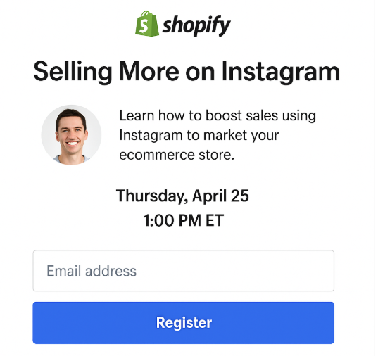
Shopify targets ecommerce store owners directly with a promise-driven headline: “Grow Your Sales Using Instagram.” The headline focuses on outcome, the subheadline identifies the audience, and the sign-up form is simple, sitting above the fold with minimal fields. A speaker photo builds relatability, while the event date and time are prominent to remove guesswork.
What it does well:
- Clear outcome-driven headline
- Targeted copy that speaks directly to ecommerce owners
- Minimal form fields above the fold
- Visual credibility through speaker photo
How you can apply it:
For a Shopify-style landing page, the form needs to be quick and mobile-friendly. With Growform’s drag-and-drop builder, you can easily create a short form that asks only for essentials like name and email. Embedding the form into Webflow, Instapage, or WordPress ensures it looks seamless with your landing page design.
To personalize the experience, you could add conditional logic: if a registrant identifies as a “Shopify store owner,” they might see an extra checkbox asking if they want follow-up ecommerce resources. And with HubSpot integration, every signup flows directly into your CRM for email reminders and lead nurturing.
Takeaway: Match your page copy and form fields to your exact audience. Simplicity wins conversions, but integrations keep your funnel running smoothly.
2. Jenna Kutcher – “Instagram Growth Workshop”
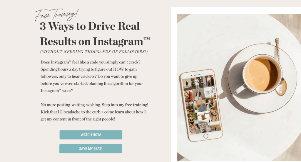
Jenna Kutcher leans into authenticity with a conversational, brand-driven page. The bright “Save My Seat” button pops, while urgency is created through a countdown timer. She also offers a bonus download, stacking value for anyone on the fence.
What it does well:
- Authentic, personal brand tone
- Bonus freebie as a lead magnet
- Clear urgency with a countdown timer
- Strong CTA button that stands out visually
How you can apply it:
If you’re running a similar influencer-driven webinar, Growform’s conversational forms are perfect. Instead of a standard sign-up box, you can ask questions like, “Are you trying to grow your brand on Instagram?” and dynamically adjust the form flow with logic jumps.
To capture additional value, you can use a lead verification feature, making sure submitted emails are valid before triggering reminders. With Zapier or HubSpot integrations, attendees can automatically receive confirmation emails or a bonus download link without extra manual work.
Takeaway: A personal touch combined with smart, interactive forms can build trust and boost registrations, especially when urgency and bonus offers are involved.
3. Zoom – “Get Started with Zoom: Live Product Demos”
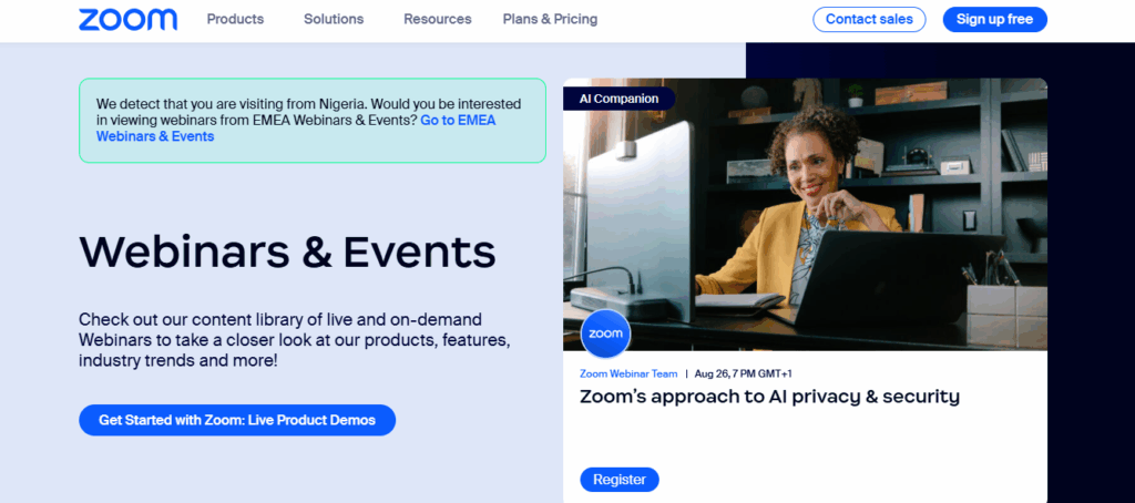
Zoom uses a clean, professional directory-style landing page to showcase ongoing webinars. Each session has clear details, topic, host, and time, alongside a bold “Register” button. Regional prompts like “view webinars from EMEA” personalize the experience, while the structured format makes it easy to compare events at a glance.
What it does well:
- Multiple webinars listed in one hub
- Clear logistics (date, time, hosts) per event
- Personalized regional targeting
- Straightforward registration flow
How you can apply it:
If you host recurring webinars, embeddable forms let you add registration to each event card without clutter. With conditional logic and logic jumps, forms can adapt to a visitor’s role or region, mirroring Zoom’s filters. Add lead verification to ensure valid sign-ups, then push confirmed registrants into HubSpot or Asana for automated reminders and follow-ups.
Takeaway: A structured hub paired with adaptive forms helps streamline registration, personalize sign-ups, and increase attendance across multiple events.
4. Meta Blueprint Webinar Landing Page
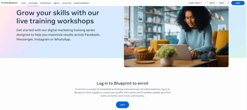
Meta Blueprint positions its webinars as skill-building workshops. The headline highlights growth, while the design emphasizes accessibility and professional development across Meta’s platforms. The CTA, “Log in to Blueprint to enroll”, focuses on ongoing learning rather than a one-time event.
What it does well:
- Clear promise in the headline
- Professional imagery that reinforces learning at home
- Simple, direct CTA without distractions
- Positions webinars as part of a broader training ecosystem
How you can apply it:
If your webinars are education-focused, emphasize growth and continuous learning in your copy. You could embed a signup form directly beneath a workshop overview to reduce friction. Conditional logic can tailor fields based on role or industry, ensuring registrants only see questions relevant to them.
For compliance, Growform’s TrustedForm and Jornaya integrations ensure opt-ins are verified, especially useful when dealing with global audiences.
Takeaway: Make education-focused webinars about long-term value. A clear headline and frictionless signup flow will help drive consistent registrations.
5. HubSpot – “A Marketer’s Take on ChatGPT”
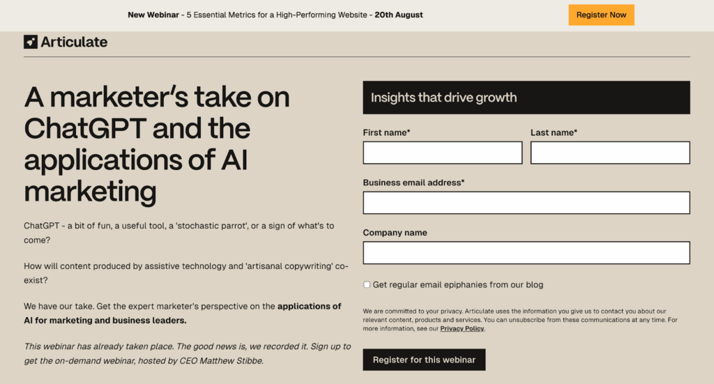
HubSpot’s landing page is minimalist and efficient. A clear benefit-driven headline, a photo of the speaker, and just one form field, email, make it easy to register. There are no distractions, keeping the focus on conversion.
What it does well:
- Minimalist layout with no clutter
- Benefit-driven headline paired with credibility signals
- Single-field form reduces friction
- Professional branding inspires confidence
How you can apply it:
This is a perfect use case for lead capture forms. With Growform, you could design a one-step form with just a single email field and a bold CTA like “Save My Seat.” Embedding it into Unbounce, Leadpages, or Webflow ensures the form fits seamlessly into polished, professional pages.
To improve performance over time, you could use A/B testing in Growform to test CTA text (“Save My Seat” vs. “Get Access Now”) and see which drives more registrations.
Takeaway: Less is more. A simple, professional form embedded in a clean design can dramatically reduce friction and increase signups.
6. Teachable – “New Hire Virtual Onboarding Program”

Teachable uses an emotion-led headline, “Happy students are good for business”, to connect outcomes with attendee benefits. The landing page explains the value step by step, then delivers a clear CTA.
What it does well:
- Emotion-driven messaging
- Clear explanation of benefits and outcomes
- Motivational, aspirational tone
- Strong CTA placement
How you can apply it:
An emotion-driven page pairs perfectly with multi-step conversational forms. You could start with a warm, open-ended question like “Have you created a course before?” and adapt subsequent steps using conditional logic.
Form analytics will let you see where attendees drop off in the process, helping you optimize each step for better completion. Meanwhile, integration with HubSpot or ActiveCampaign allows automated nurturing campaigns to support registrants before the webinar.
Takeaway: Emotion motivates action, but smooth sign-up flows and data insights make sure that motivation translates into actual attendance.
7. edWeb – Maximizing Mathematics Intervention Webinar
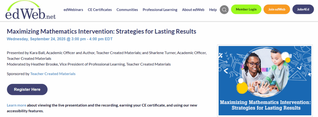
edWeb takes an education-first approach with focused webinar landing pages. For example, the “Maximizing Mathematics Intervention” session highlights the topic, time, and expert presenters while reinforcing credibility with sponsor mentions. The page also emphasizes professional learning value with CE certificates and accessibility options, speaking directly to its teacher-focused audience.
What it does well:
- Single-webinar focus with detailed presenter and sponsor information
- Added professional value through CE certificates
- Accessibility features enhance inclusivity
- Clear and direct “Register Here” CTA
How you can apply it:
If you’re targeting niche audiences like educators, conditional logic forms can personalize sign-ups by role; teacher, administrator, or student services. You can also add conversational forms that ask registrants about their biggest classroom challenges, tailoring follow-up reminders accordingly. With integrations into HubSpot or Asana, these responses can trigger automated workflows for ongoing engagement, just as edWeb builds community through professional learning.
Takeaway: A dedicated, education-focused webinar page backed by interactive forms and smart integrations ensures high-value sign-ups and long-term community engagement.
8. Tony Robbins & Dean Graziosi – “Time to Thrive” Webinar
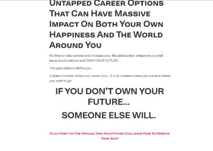
This page leverages emotional power and celebrity authority. The headline, “If you don’t own your future, someone else will”, is bold and motivational. Combined with powerful visuals, trust is almost immediate.
What it does well:
- High emotional impact headline
- Strong credibility via celebrity authority
- Visual storytelling with motivational branding
- Clear, inspirational CTA
How you can apply it:
For high-energy events, form styling and buttons can be customized to match the emotional tone of the page. A bold button with motivational language (“Claim My Spot”) fits seamlessly.
Adding a countdown timer above the embedded form creates urgency, while notifications ensure the event team gets alerts for every new signup. Integrating with Zoom or HubSpot allows instant confirmation emails and reminders, ensuring registrants actually attend.
Takeaway: Big emotional hooks paired with seamless sign-up experiences make it easy for visitors to commit on the spot.
Build High-Converting Webinar Landing Pages
Webinar landing pages aren’t just about forms, they’re about psychology, timing, and trust. The best ones lead with value, reduce friction, and guide users step by step toward registration.
Whether you’re a B2B marketer, course creator, coach, or SaaS founder, your goal is simple: make people feel confident saying yes. That comes from strong messaging, smart form placement, and zero distractions.
With Growform, you can put these best practices into action, without coding or redesign headaches. Our multi-step forms, conditional logic, URL pre-fills, and flexible styling give you full control. Plus, seamless integrations with CRMs, email tools, and webinar platforms make scaling effortless.
If you’re ready to maximize attendance and lead quality, Growform is your go-to solution for conversions.
Start building smarter webinar funnels with Growform, try it free today.