Anatomy of a Landing Page: 12 Essential Elements for Higher Conversions
Quick Summary
Why do some landing pages convert while others flop? This guide breaks down 12 key elements of high-performing pages, from compelling headlines and persuasive subheadlines to trust signals, social proof, and optimized CTAs. With practical tips for visuals, forms, and mobile design, you’ll learn how to boost conversions. Explore the Growform blog for deeper insights and examples.
Understanding What Makes a Landing Page Win or Fail
Most landing pages don’t fail because of bad offers, they fail because of bad structure. A confusing layout, weak copy, or misplaced CTAs can silently drain conversions, even if you’re driving high-quality traffic.
That’s why understanding the anatomy of a landing page is so important. Each element, from the headline to the form, either nudges visitors closer to conversion or pushes them away.
This Growform guide breaks down the 12 essential elements of high-performing landing pages and shows you how to apply them. You’ll also discover how Growform’s multi-step forms reduce friction and capture more qualified leads, turning your clicks into real ROI.
Why Listen to Us?
At Growform, we’ve helped thousands of businesses improve their landing page conversions by making forms smarter, faster, and easier to integrate. Our platform connects with thousands of tools, from CRMs and email platforms to project management apps, so your leads flow seamlessly into the systems you already use.
Unlike generic form builders, Growform was built for lead generation. With multi-step, mobile-responsive forms that reduce friction and integrations that keep your workflows automated, we help businesses consistently capture more qualified leads while saving time on manual processes.
What Makes Up the Anatomy of a Landing Page?
The anatomy of a landing page refers to the individual components that work together to guide a visitor toward a single goal, conversion. Unlike a homepage, which introduces your brand broadly, a landing page is focused and stripped of distractions. Every element is intentional, designed to answer the visitor’s questions and remove friction from the decision-making process.
At its core, a high-converting landing page is built from several key parts: a headline that captures attention, a subheadline that clarifies the value, visuals that illustrate the offer, trust signals and social proof to build credibility, and a clear call-to-action that tells the visitor exactly what to do next. Together, these elements create a seamless experience that transforms casual visitors into qualified leads.
Why Is a Landing Page Important?
- Maximize ROI on Ad Spend: Every click costs money. Whether through Google Ads, Facebook campaigns, or SEO-driven traffic, sending users to a page that isn’t built to convert is wasted spend. Landing pages optimize each visit, giving your ads the best chance to generate real leads.
- Create Focused User Experiences: Unlike homepages, which try to do everything at once, landing pages remove distractions. They guide visitors toward a single goal—whether filling out a form, scheduling a demo, or downloading a resource. By narrowing focus, users understand exactly what action to take.
- Enable Testing and Optimization: Because landing pages are goal-oriented, they’re easier to A/B test. You can experiment with headlines, form placements, visuals, and CTAs to see which version drives the highest conversions. Testing continuously ensures your pages evolve and improve over time.
- Improve Lead Quality: Smart landing pages capture not just more leads, but better leads. With the right form fields and progressive disclosure techniques, you attract users who are genuinely interested in your offer, reducing spam submissions and increasing qualified prospects.
- Build Trust and Credibility: Landing pages often include testimonials, brand logos, and trust badges. These signals reassure visitors that your offer is legitimate, making them more likely to take action.
12 Key Elements in the Anatomy of a Landing Page
1. Headline That Hooks
The headline is the very first element a visitor notices when they arrive on your landing page, and it plays a critical role in shaping their perception of your brand.
A compelling headline immediately communicates what the page offers, highlights the value of your product or service, and influences whether the visitor chooses to explore further or leave.
A strong headline should:
- Be clear and benefit-driven, not vague or clever for its own sake.
- Speak directly to the visitor’s pain point or desired outcome.
- Match the ad, email, or social post that brought them to the page (message match is critical).
Example: Instead of “Our Marketing Tool Rocks,” try “Double Your Qualified Leads Without Spending More on Ads.”
The headline acts like a promise, and the rest of the landing page must deliver on it.
2. Subheadline That Adds Context
Positioned directly beneath the headline, the subheadline provides clarity and context, showing visitors exactly how your offering delivers on the promise made above.

It helps reassure readers that they are in the right place and begins to outline the specific value they can expect.
An effective subheadline should:
- Expand on the headline without repeating it.
- Explain the unique benefit or differentiator.
- Flow naturally into the rest of the content.
Example: “Designed for marketers who want smarter, higher-converting forms without coding.”
Together, the headline and subheadline create a 1-2 punch that holds attention.
3. Eye-Catching Hero Image or Video
Visual content communicates faster than text, making it a key part of any landing page. A well-chosen hero image or short video can immediately grab attention and reinforce the main message.
These visuals also create an emotional connection, helping visitors quickly understand the value of your product or service and encouraging them to engage further with the page.
Best practices for hero visuals:
- Make it relevant, show the product, service, or outcome.
- Keep it professional, avoid stocky, generic images.
- Use it to guide attention toward the CTA.
Example: A SaaS company might use a looping demo video that shows their tool in action, while a coaching program could use a friendly, approachable headshot of the instructor.
4. Prominent Lead Form or CTA Placement
A landing page is designed to guide visitors toward a single, clear action. The lead form or call-to-action (CTA) should be immediately noticeable, ensuring that users can take the next step without hesitation.

Effective placement positions the form or button where it naturally catches the eye, making it simple for visitors to respond. This supports a smooth journey through the page, and increases the likelihood of completing the intended conversion.
High-performing lead forms and CTAs:
- Are placed above the fold, visible without scrolling.
- Ask only for essential information (shorter forms = higher conversions).
- Use multi-step or wizard-style forms to break down longer requests into easy, bite-sized steps.
This is where tools like Growform stand out, supporting conversational forms, logic jump forms, and conditional logic forms that feel natural and prevent users from abandoning mid-way.
Example: Instead of one overwhelming form with 12 fields, a multi-step wizard starts with “What’s your first name?”, a simple task that gets users started.
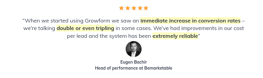
5. Social Proof and Testimonials
People naturally rely on others’ experiences when making decisions. Social proof, such as testimonials, reviews, or endorsements, shows that others have successfully used your product or service, helping visitors feel confident in taking the next step.
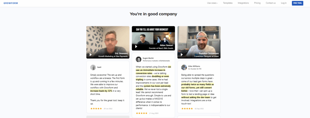
Authentic feedback demonstrates real results and builds trust, encouraging visitors to engage confidently.
Forms of social proof include:
- Testimonials: Use quotes with names, photos, and results when possible.
- Logos: Display recognizable client or partner logos.
- Case studies: Share measurable results (“We helped Company X grow leads by 40%”).
- Reviews and ratings: Especially valuable for products or services.
Place social proof near your CTA so trust is reinforced right at the decision point.
6. Trust Signals
Trust signals go beyond social proof by providing reassurance that visitors’ data and experience are safe.
They also strengthen confidence in your brand, showing that your business is professional, reliable, and committed to a secure and positive user experience.
Effective trust signals:
- Security badges (SSL, payment trust symbols).
- Industry certifications or compliance (GDPR, HIPAA, FCC 1-to-1 consent).
- Privacy policy links near forms.
- Recognition logos from credible sources (press features, awards).
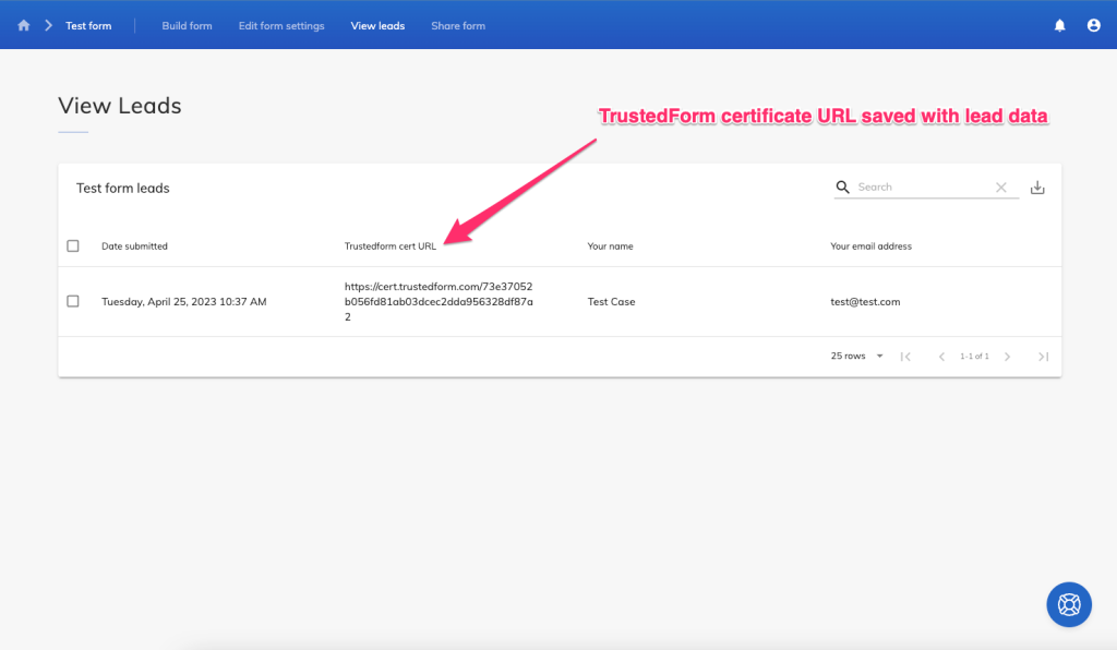
For industries like finance, healthcare, or telecom, tools like TrustedForm and Jornaya forms are crucial, they verify consent and prove that lead capture was compliant.
7. Value Proposition Section
This is where you clearly articulate why a visitor should take action. It answers the all-important question:
“What’s in it for me?”
This section emphasizes the distinct value of your offering and how it meets the visitor’s needs or solves their problem. It provides a clear reason to take action, instilling confidence and motivating engagement.
A strong value prop section should:
- Focus on outcomes, not just features.
- Use bullet points or icons for scannability.
- Tie benefits to the visitor’s real-world goals.
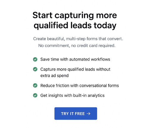
Example:
- Save time with automated workflows.
- Capture more qualified leads without extra ad spend.
- Reduce friction with conversational forms.
Keep it concise, visual, and outcome-oriented.
8. Limited-Time or Urgency Indicators
Urgency encourages visitors to act quickly instead of delaying decisions that might never happen. Without signals that an offer is time-sensitive, many users put off engagement or forget to return later.
Instilling urgency guides visitors to act promptly, leveraging natural decision-making instincts and supporting the page’s goals without compromising the user experience.
Ways to introduce urgency:
- Countdown timers (“Offer ends in 24 hours”).
- Scarcity notices (“Only 12 spots left”).
- Seasonal campaigns (“Kickstart 2025 Masterclass”).
But use urgency genuinely, because fake scarcity erodes trust.
Example: A webinar registration page with a timer showing “Registration closes in 2 days.”
9. Logical Visual Hierarchy and Scannability
Visitors rarely read every word, they scan for key points. A clear layout directs attention to the most important information.
Headings, subheadings, bullet points, and varied element sizes establish an intuitive flow, helping users quickly understand the page’s value and key messages.
To improve scannability:
- Use clear H2 and H3 headings.
- Break text into short paragraphs and bullet points.
- Add white space to prevent clutter.
- Highlight key takeaways with bold or icons.
Think of the page like a guided path, every visual cue should nudge the user toward conversion.
10. Mobile-First Responsiveness
With most web traffic coming from smartphones and tablets, your landing page must work flawlessly on smaller screens. Text, images, buttons, and forms should be clear, easy to navigate, and fully functional.
A mobile-optimized page enhances speed, clarity, and usability, making it easier for visitors to interact and complete the desired action.
Mobile-first design includes:
- Large, tappable buttons.
- Forms that are easy to complete on mobile keyboards.
- Layouts that stack neatly instead of breaking.
- Fast load times (compress images, avoid heavy scripts).
Multi-step mobile forms work especially well here, keeping users engaged instead of overwhelming them with endless fields.
11. CTA Button Design and Microcopy
The call-to-action (CTA) button is where a visitor takes the next step. Its design and text show clearly what will happen when clicked.
A strong CTA combines clear wording with visual prominence. Its color, size, and placement direct attention, while the text communicates the action’s result and motivates the visitor to engage.
Elements of a high-performing CTA:
- Bold, contrasting design that stands out from the background.
- Action-oriented copy that emphasizes benefits (“Start My Free Trial,” “Get My Quote Now”).
- Repeated placements throughout the page (after each major section).
Microcopy matters too. Small text near the button can overcome hesitation:
- “It takes less than 30 seconds.”
- “No credit card required.”
- “Free until you’re ready to scale.”
12. Confirmation Messaging or Thank-You Page
Conversion doesn’t end when a visitor clicks “submit.” The follow-up shapes their experience and impression.
An effective confirmation or thank-you page acknowledges the user’s action, reinforces trust, and provides clear guidance for what to do next, keeping them engaged with your brand.
A confirmation message or thank-you page should:
- Reassure the user their action was successful.
- Provide the next step (download, schedule, check inbox).
- Offer additional resources, upsells, or ways to stay engaged.
- Keep the brand experience seamless.
Example: After a demo request, the thank-you page could include a calendar embed for instant scheduling.
Turn Your Landing Pages Into Conversion Powerhouses
Mastering the 12 key elements of a high-converting landing page ensures visitors know exactly what to do. Compelling headlines, clear subheadlines, trust signals, social proof, and strategic CTAs guide users toward action.
These features improve lead quality, increase ROI, and simplify testing. With Growform, you can create multi-step, responsive forms that integrate smoothly, reducing friction and boosting conversions.
Ready to turn clicks into qualified leads? Build smarter landing pages with Growform today.