4 Different Button Styles You Can Create With Growform
Buttons are the ideal way to start your form – they’re super low friction compared to traditional fields.
Growform is extremely configurable and will let you achieve a number of button layouts, but we’ve noted 4 commonly used settings that are easy to reproduce:
Table of Contents
Large, square buttons with icons
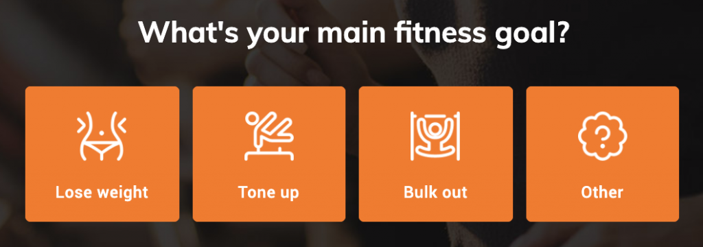
To achieve this look:
- Add some buttons to your form (“Add field” > “Buttons”)
- Set “buttons per row” to “4”
- Set the “button height” to “100”
- Add images when editing the button options
- Edit button colour settings in “Form settings” > “Edit theme settings” > “Buttons”
Large, rectangle buttons with no icons
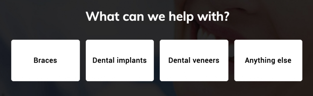
To achieve this look:
- Add some buttons to your form (“Add field” > “Buttons”)
- Set “buttons per row” to “4”
- Set the “button height” to “70”
Full width, colour buttons with no icons
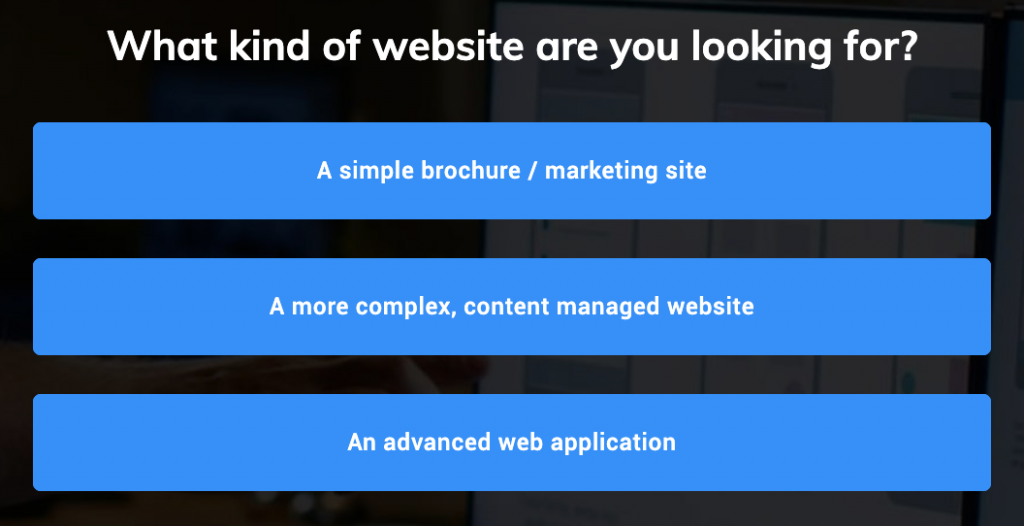
To achieve this look:
- Add some buttons to your form (“Add field” > “Buttons”)
- Set “buttons per row” to “1”
- Set the “button height” to “50”
- Edit button colour settings in “Form settings” > “Edit theme settings” > “Buttons”
Full width buttons with icons
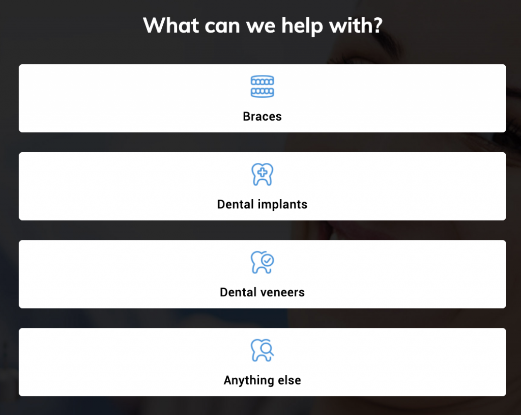
To achieve this look:
- Add some buttons to your form (“Add field” > “Buttons”)
- Set “buttons per row” to “1”
- Set the “button height” to “70”
- Add images to your buttons when editing the button options
- Adjust the width, margin-top and margin-bottom of the button images under the “button images” settings when the button is selected.