
Conditional Logic Forms: The Complete Guide for 2026
Your traffic is there. The ad dashboard looks healthy, the landing page gets clicks, and the form still stalls where revenue should start. Sales says the leads are sloppy, the team blames the creative, and nobody wants to admit the problem might be the questions you're asking too early.
That's where conditional logic forms earn their keep. Not as a flashy feature, but as the layer between traffic and pipeline that decides who should see what, who should be routed where, and who shouldn't make it through at all. If you're also trying to clean up response handling after the form submit, the AI phone answering service guide 2026 is a useful companion read because it deals with the same speed-to-lead pressure from the other side of the funnel.
Table of Contents
Table of Contents
- Why Your Form Is Quietly Costing You Leads
- What Conditional Logic Forms Actually Are
- The Core Mechanics That Move Conversion and Quality
- UX Patterns and Templates That Convert on Mobile
- Vertical Playbooks for Insurance, Solar, Legal, and Trades
- Technical Implementation, Integrations, and Consent Evidence
- Common Pitfalls, Accessibility Gaps, and How to Govern Logic at Scale
- Testing, Measurement, and Your Action Plan
Why Your Form Is Quietly Costing You Leads
The pattern shows up fast in paid media accounts. Click volume looks fine, the landing page gets enough attention, then the form starts bleeding people off before they finish. The weird part is that the form often looks “complete” to the people who built it, which is exactly why the problem gets blamed on the offer, the ad, or the audience instead of the questions.
A static form asks everyone the same thing in the same order. That works until the first irrelevant field lands in front of the wrong visitor, or the first qualification question arrives before trust does. Conditional logic forms let you remove that friction by showing only the fields that matter to that visitor, based on what they just told you, which is the conversion lever. The idea aligns with the broader form logic and branching approach described in Growform's own logic jump guide, where the right next question depends on the answer already given.
What usually goes wrong
The common failure isn't that the form is too short. It's that it's too generic. Someone shopping for a quote doesn't need the same follow-up as someone asking for a callback, and a homeowner doesn't need the same path as a renter.
That's why conditional branching becomes a qualification engine, not just a UX trick. It strips out irrelevant questions before they create doubt, and it protects the sales team from junk submissions that were never going to close. In lead gen, that matters more than clever design flourishes.
Practical rule: if a question doesn't change the next decision, it probably doesn't belong on the first screen.
The rest of the article covers the mechanics, mobile-friendly layouts, vertical playbooks, the plumbing that keeps attribution and consent intact, and the testing discipline that stops silent failures from slipping into live campaigns.
What Conditional Logic Forms Actually Are
Think of a triage nurse at intake. The first answer changes the next question, and the next question changes whether the person stays in the same queue or gets directed somewhere else. That's the simplest way to understand conditional logic forms.
At the formal level, the concept has old roots in reasoning. Aristotle's Prior Analytics is commonly identified as the earliest systematic treatment of syllogistic inference, and a hypothetical syllogism is defined as a syllogism that includes a conditional statement like “if P, then Q” in one or both premises, as summarized in the historical overview of the syllogism concept on Wikipedia's syllogism page. Modern conditional logic is the software-era version of that idea, built to model if-then behavior more faithfully than the classical material conditional.
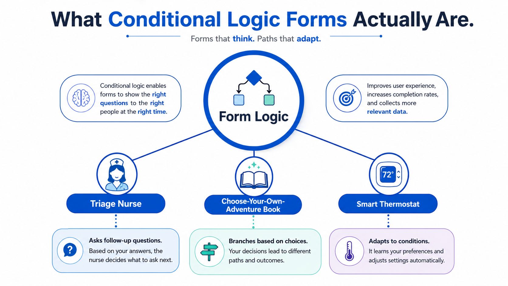
A simple mental model
A form builder usually exposes the rule in three pieces. There's a source field, a condition operator, and a target action. That action might be show, hide, skip, route, or disqualify.
In plain English, the structure looks like this. If the visitor selects one answer, then reveal a new field. If they pick another answer, then hide that section and send them down a different path. That's the entire engine, just wrapped in a UI.
The practical benefit is that the form doesn't need to become a giant spreadsheet of visible questions. It keeps the underlying schema stable while changing what the user sees in real time. That's why teams can reduce irrelevant fields without rebuilding the whole form every time the campaign changes.
How the rules map to form builder controls
Most modern no-code builders now treat branching as a standard setting, not a developer-only customization. Form platforms such as Slate describe conditional logic as filters that show or hide sections and fields based on responses, and their documentation includes operational steps like reviewing logic with “Show Form Logic / Fields” and using “Run Field Tests” to verify behavior. Jotform's workflow similarly places conditional logic inside builder settings, which is a good sign that branching has become normal form behavior rather than a niche feature.
If you can read the rule in the editor, you can usually translate it back into intent. “If service type equals roof repair, then show roof size and access questions.” “If answer equals no, then hide the next section.” The UI may vary, but the logic pattern doesn't.
Short version: conditional logic forms are just structured IF/THEN branching rules applied to form behavior.
The Core Mechanics That Move Conversion and Quality
The mechanics that matter are narrower than most feature lists suggest. You're not trying to build a maze. You're trying to reduce friction for the right people and filter out the wrong ones without creating hidden failure states.
Visibility, requirements, routing, and disqualification
The first mechanic is conditional field visibility. A field appears only when earlier answers make it relevant. That keeps the screen lighter and reduces information overload, which is why it often helps completion.
The second is dynamic required status. A field can become mandatory only on certain branches, which is useful when one answer creates a compliance or qualification need that didn't exist before. It also helps avoid asking everyone to fill in the same detail whether it matters or not.
The third is response routing. Instead of treating every submitter the same, the form can push respondents into different steps or section paths. Softr's documentation on conditional forms explicitly calls out multi-step routing, section-based reveal and hide behavior, and option filtering in linked dropdowns, which is the exact structure many lead funnels need when they split by intent or eligibility.
The fourth is disqualification. That's the branch where the form stops pretending every visitor is a fit. If someone doesn't meet the minimum criteria, the form can end the journey cleanly instead of letting sales waste time on poor matches.
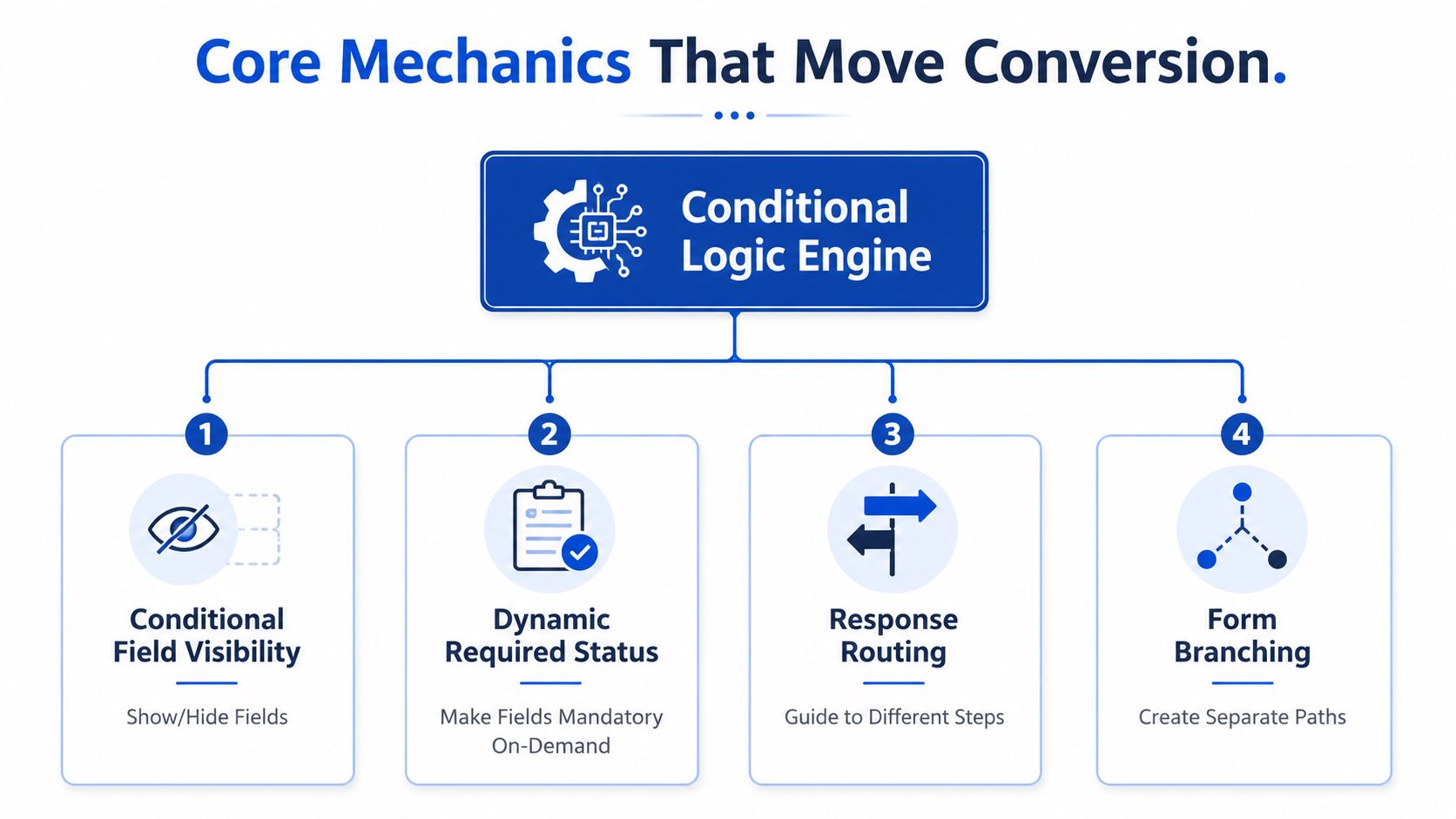
Used together, those mechanics create a more controlled capture sequence. Fewer visible fields usually mean less friction. Better branching means the right lead gets the right next step. Cleaner disqualification means buyer-facing teams see fewer submissions that were never viable.
A useful caution from the implementation side is that every new rule increases the number of possible user journeys. That's why builders repeatedly recommend preview testing each route before launch. The branching tree gets harder to reason about as it expands, and the form can look fine while one path is broken.
For teams building conversational flows or automated intake, the guide to AI chatbot safety is relevant for the same reason, because dynamic decisioning only works if the system stays predictable and trustworthy for the user.
UX Patterns and Templates That Convert on Mobile
The best pattern depends on the job the form needs to do. A single-step reveal works when you want speed. A multi-step funnel works when you need progressive qualification. A quiz-style path works when the user needs a result, recommendation, or tier before they're ready to book.
| Pattern | Best For | Main Strength | Watch Out For |
|---|---|---|---|
| Single-step with conditional reveals | Fast lead capture, lighter qualification | Keeps everything on one screen while hiding irrelevant fields | Can get crowded if too many branches stack up |
| Multi-step with step jumps | Higher-intent funnels, quote flows, booked calls | Makes the journey feel shorter and easier to complete on mobile | Needs careful routing so no branch dead-ends |
| Quiz with scoring or tiered outcomes | Product matching, appointment booking, audience segmentation | Gives the visitor a clear result at the end | Feels gimmicky if the result doesn't change anything |
Single-step forms with hidden reveals
This pattern suits campaigns where the first task is to keep the visitor moving. The form stays visually simple, then expands only when the answer justifies it. On mobile, that usually feels faster because people don't face a wall of fields immediately.
It works especially well when the branches are shallow and the hidden questions are few. Once the number of possible reveals starts to multiply, the screen can feel jumpy and hard to trust. That's when a multi-step layout usually performs better operationally.
Multi-step funnels with logic jumps
This is the cleaner choice for qualification-heavy campaigns. The visitor sees one section at a time, then moves forward only through the path that fits their answers. The form can skip entire steps when the answer doesn't require them, which keeps the route efficient.
A good multi-step flow gives the user a sense of progress. Progress bars and clear step labels matter here because the logic is doing more of the invisible work under the hood. If the visitor can't tell how far along they are, branching starts to feel like friction instead of guidance.
Quiz-style forms with outcomes
Quiz-style flows work when the end state matters as much as the submit. They're useful for tiered recommendations, service matching, and appointment funnels where the result page becomes part of the conversion. The branch doesn't just collect data, it creates a reason to keep going.
The catch is that the quiz has to earn the result. If the outcome feels generic, the whole experience loses credibility. Subtle transitions, clear option labels, and a sensible final page make the difference.
The mobile-specific guidance in Growform's mobile form design guide pairs well with these patterns, because branching only helps if the layout still feels easy to finish with one thumb.
Vertical Playbooks for Insurance, Solar, Legal, and Trades
Conditional branching matters most when the first answer tells you something operationally useful. Different verticals use that signal in different ways, but the logic is the same. Ask the least disruptive question first, then reveal the questions that decide fit, urgency, or routing.
Insurance
Insurance funnels usually need to separate coverage type, household context, and the kind of policy the visitor is shopping for. The branch might start with a simple selector, then reveal follow-up questions only for the coverage path that matters. That helps pre-qualify against carrier filters before the lead ever hits a rep.
A useful structure looks like this. If the visitor wants auto coverage, then show vehicle-related questions. If they want home coverage, then show property details. If they select a path that doesn't match what the agency can place, disqualify or redirect early.
Solar
Solar teams often need to gate the deeper questions behind ownership and physical suitability. The form shouldn't ask about roof-specific details before it knows the visitor is a homeowner and likely installable. That keeps the flow shorter for unqualified traffic and cleaner for sales.
A practical branch is straightforward. If the answer is renter, end the install path. If the answer is homeowner, then reveal roof orientation, utility, or property questions. The form should earn the right to ask the technical stuff.
Legal and mass tort
Legal screening works best when the first branch collects the facts that matter for case review timing and relevance. You want to know incident type, timing, and whether the person belongs on the right intake path before anyone spends attorney time on it. The challenge is to screen efficiently without making the intake feel like an interrogation.
That usually means starting broad, then narrowing only when the answer justifies it. If the incident falls outside the firm's scope, route out cleanly. If it fits, reveal the follow-up facts needed for a case review.
Trades and home services
Trades funnels need fast routing. A roofing lead, an HVAC emergency, and a general handyman request are not the same operational problem, even if they all arrive from the same ad set. The branch should identify service line, urgency, and property type as early as possible.
A simple version looks like this. If the visitor chooses emergency service, prioritize the immediate booking path. If they choose routine maintenance, send them to a slower qualification flow. If the property type affects the right crew, show that field only on the relevant branch.
The question at step one is almost never the same as the question at step three.
Technical Implementation, Integrations, and Consent Evidence
The mechanics only matter if the submission survives the handoff. If the form drops attribution, breaks routing, or loses consent proof, the funnel can look healthy while the downstream system degrades.
The first layer is hidden fields for UTM and click-ID pass-through. Those values need to persist across the whole journey so the CRM or buyer payload still knows where the lead came from. In a multi-step form, that data should survive until submission instead of disappearing between screens.
Delivery and verification plumbing
From there, the routing stack usually fans out through webhooks, native CRM mapping, or distribution-platform handoffs. HubSpot, Salesforce, and GoHighLevel can all receive structured submissions, while platforms such as Boberdoo, Phonexa, LeadsPedia, and LeadByte handle real-time lead distribution. The goal is simple, deliver the right record to the right place without human re-entry.
Instant alerts matter too. Email, SMS, and WhatsApp notifications can keep speed-to-lead tight when a human follow-up still matters. Real-time verification through Twilio for phone and Zerobounce for email can also cut obvious junk before it reaches a buyer or sales rep.
Consent evidence and compliance
The compliance layer belongs at submission, not in a separate spreadsheet later. TrustedForm and Jornaya are used to capture consent evidence at the point of capture, which helps align lead delivery with FCC and state mini-TCPA expectations. That proof becomes part of the lead record, not an afterthought.
If you're briefing a developer, that checklist is usually enough. If you're trying to avoid a dev ticket, a no-code stack can still handle the capture, routing, verification, and consent trail as long as the logic is mapped carefully. Growform is one platform that combines multi-step forms, conditional logic, integrations, and consent evidence in one capture layer, but the requirement is the workflow, not the logo.
For a deeper consent-focused reference, the TrustedForm guide for 2024 is a useful companion when the capture flow has to stand up to buyer scrutiny.
Common Pitfalls, Accessibility Gaps, and How to Govern Logic at Scale
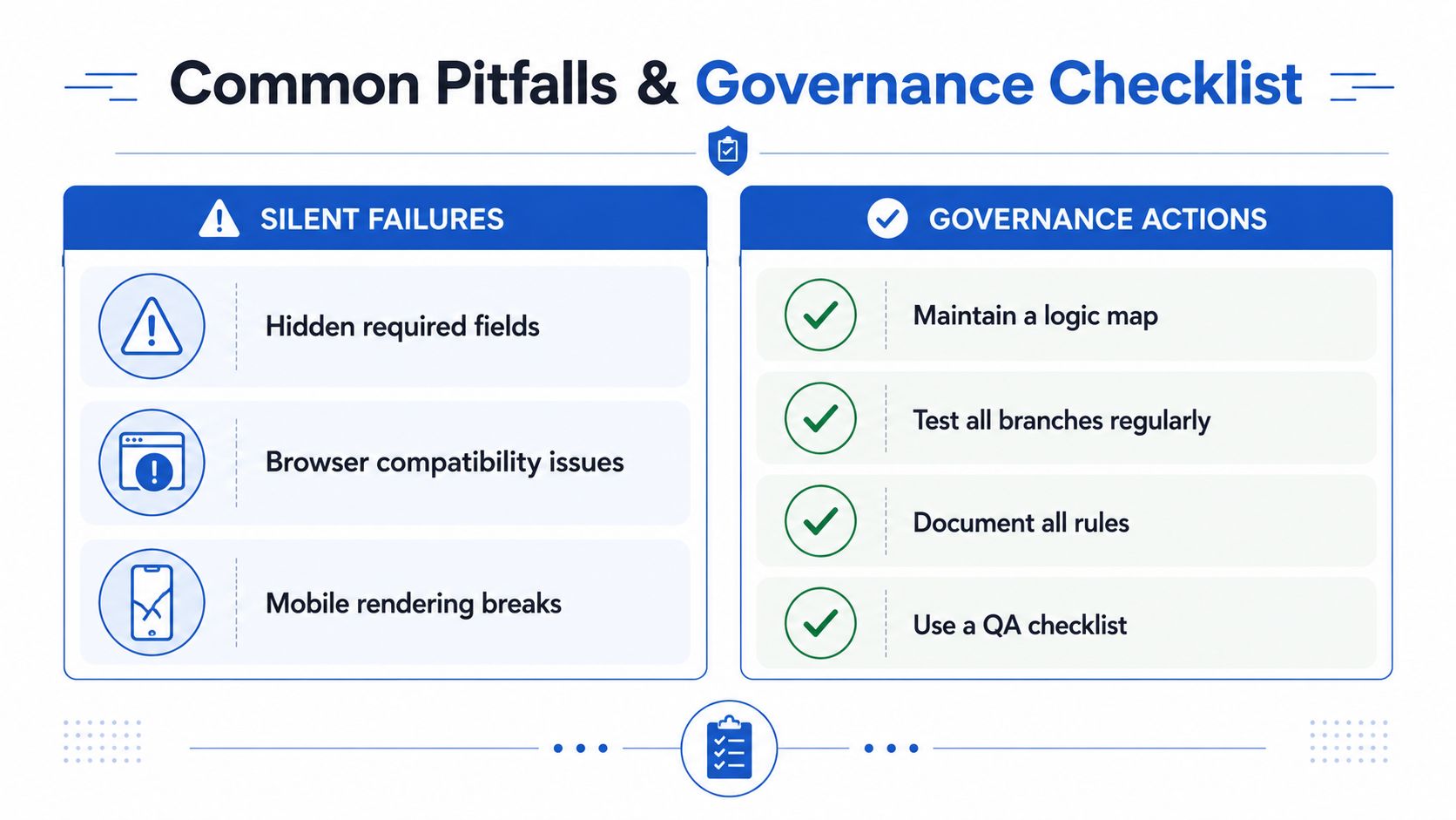
The easiest way to break a good form is to keep adding rules without a governance model. A branch works in preview, then a hidden required field blocks submission on an obscure path, or a later edit creates a dead end with no next action. Those failures don't always show up in visual QA, which is why they're dangerous.
The other issue is accessibility. One independent guide specifically calls out that conditional fields have to be clearly labeled and dynamic changes must make sense to assistive technologies. That's not a nice-to-have. If screen readers can't follow the field changes, the form may still look functional to the team that built it while excluding users who matter.
What breaks first at scale
The most common failure modes are predictable. Hidden required fields can block submission. Maintenance drift can creep in when one campaign's logic changes but another campaign's copy-paste version doesn't. Browser behavior and mobile rendering can also diverge if nobody checks the full set of paths.
The fix isn't to stop using conditional logic. It's to govern it. Keep a single source of truth for the rules, name an owner for each campaign, and log version notes every time the tree changes. When logic is reused across geographies or audiences, that discipline keeps the form from turning brittle.
What good governance looks like
A clean governance routine doesn't need to be fancy. It needs to be consistent.
- Maintain a logic map: write down each branch and the action it triggers.
- Test every visible route: walk the user journeys, not just the happy path.
- Document each edit: note what changed, why it changed, and who approved it.
- Review accessibility behavior: check labels, focus order, and dynamic field updates with assistive tools.
If your forms depend on outbound email, the email deliverability testing resource from MailGenius is worth keeping nearby, because the same governance mindset applies to messages that leave the form and hit the inbox.
Testing, Measurement, and Your Action Plan
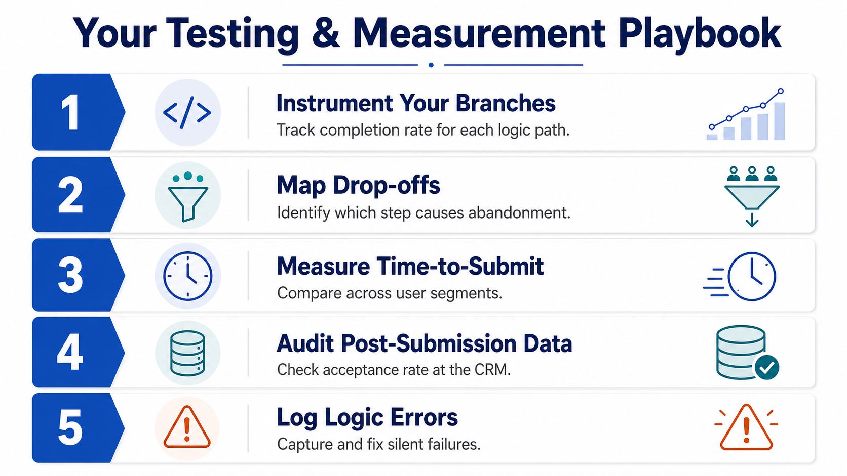
You can't manage what you don't instrument. Conditional branching should be measured by path, not just by overall form performance, because a form can look healthy while one branch underperforms or fails outright.
What to track
Track completion rate by branch, drop-off step, time-to-submit, post-submission acceptance rate at the buyer, and conversion to booked appointment or sale. That gives you a full view from first interaction to downstream quality. If a branch gets lots of submits but weak buyer acceptance, the form is probably qualifying the wrong signal.
How to test before launch
Preview every route before the form goes live. Then test the most important branches again after any major edit, because even small changes can create a dead end or reveal a hidden required field on one path. A/B testing belongs on the branches that matter most, not on every decorative detail.
A practical order of operations
- Start with one disqualification rule. Remove obvious junk before you add more complexity.
- Add one step jump. Shorten the path for the highest-intent visitors.
- Map CRM fields and hidden attribution. Make sure the lead lands with usable context.
- Add consent evidence. Capture TrustedForm or Jornaya at submission.
- Audit the tree quarterly. Check for dead ends, hidden requirements, and stale branches.
If you want a stack that handles this kind of build without a dev cycle, Growform is built for multi-step and quiz-style lead forms with conditional logic, routing, and real-time delivery. Ship one qualified branch first, measure it against the rest of your stack, then expand the logic only where the data says it's worth the complexity.