How to Improve Landing Page Optimization and Boost Conversions
Quick Summary
This guide explores landing page optimization and why it’s essential for turning traffic into conversions. You’ll learn practical steps to improve performance, from structuring your content to testing design elements. Apply these strategies to boost results, track progress, and keep learning through our blog for deeper insights into driving sustainable growth.
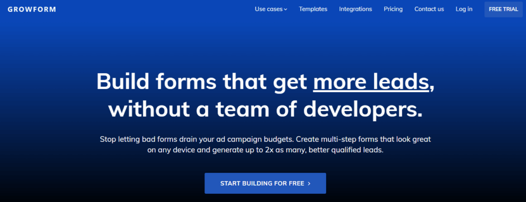
Want to Drive More Conversions from Your Landing Pages?
The average landing page converts at just 4.3%, meaning over 95% of visitors often leave without taking action. This shows how even minor tweaks in design, copy, or layout can drive major gains in leads and revenue.
That’s why optimizing your landing page is more critical than ever. From structure and messaging to form design and page speed, every element can either encourage engagement or push users away.
In this Growform guide, you’ll learn how to master landing page optimization without overcomplicating the process. We’ll cover common pitfalls to avoid and share the tactics top marketers use to turn traffic into conversions.
Why Listen to Us?
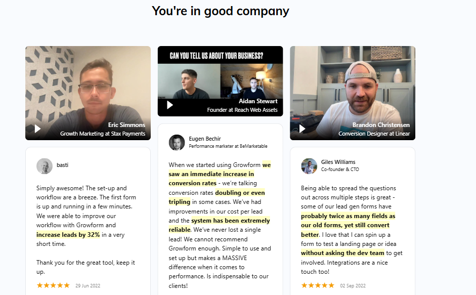
At Growform, we’ve helped marketers and agencies consistently increase landing page conversions with forms designed for results, not just data capture. Our platform makes it easy to build multi-step forms, apply conditional logic, and customize layouts, all without code. With seamless integrations and responsive design, we ensure every lead flows smoothly into your funnel.
What Is Landing Page Optimization?
Landing page optimization is the process of refining a landing page to maximize conversions, whether that means generating leads, signups, or sales. Unlike a homepage, which serves multiple purposes, a landing page is designed with one clear goal in mind.
Optimization often focuses on:
- Clear messaging that communicates your value proposition
- Streamlined design that removes distractions and highlights your CTA
- User-friendly forms that reduce friction and encourage completion
- Data-driven testing like A/B testing headlines or buttons to find what works best
The benefits are powerful. By improving page elements step by step, businesses can increase conversion rates, strengthen ROI on campaigns, and capture more leads or revenue without driving extra traffic. Even small adjustments, like simplifying a form or rewording a headline, can translate into meaningful growth, making landing page optimization an essential part of any marketing strategy.
How to Optimize a Landing Page
1. Craft a Clear and Compelling Headline
Your headline is the first thing visitors see, and it often determines whether they’ll keep scrolling or bounce.
- Keep it concise (10–15 words max)
- Make the value proposition obvious
- Speak directly to the visitor’s needs or problem
For example: instead of “Sign Up Today,” use “Start Your Free 14-Day Trial to Grow Faster.”
A strong headline sets the tone for everything that follows and ensures visitors know exactly what’s in it for them.
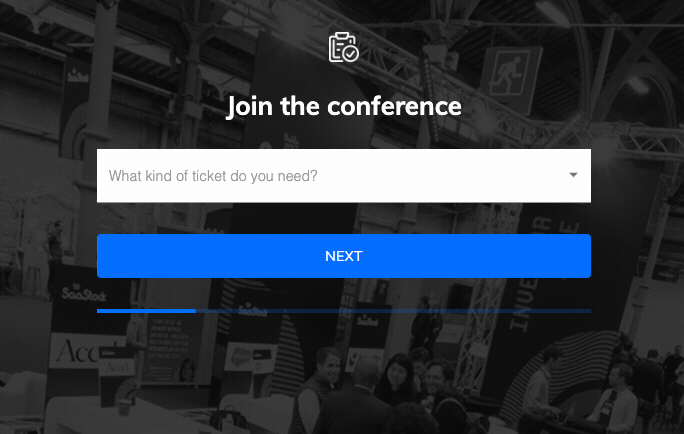
2. Streamline Your Form Design with Multi-Step Flow
Once the headline hooks attention, the form carries the weight of conversion. But long, cluttered forms are intimidating. Users abandon them halfway because they feel like too much effort.
The solution? Multi-step forms. Breaking a form into smaller, conversational steps makes it feel less overwhelming. Instead of facing ten fields at once, a visitor answers two or three simple questions before moving forward. This creates a sense of progress and momentum.
- Use progress indicators (e.g., “Step 1 of 3”) to reduce anxiety.
- Ask for the easiest, low-friction information first (like name or role).
- Keep required fields to the essentials.
Form builders that support multi-step layouts give you flexibility without extra code. In practice, this can double completion rates because visitors are more likely to finish what they’ve started.
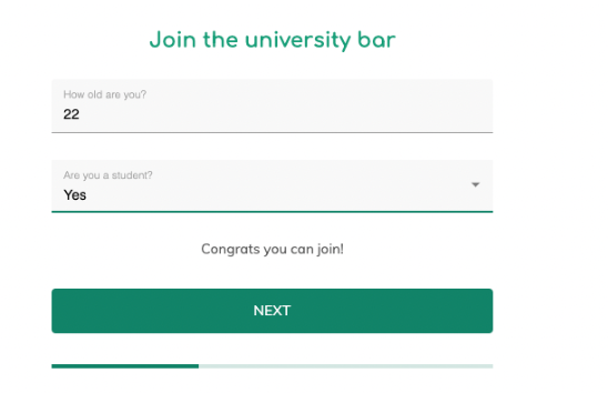
3. Qualify Leads Early Using Conditional Logic
Not every lead is equal. If your sales team spends hours sorting through irrelevant submissions, your landing page isn’t doing its job.
This is where conditional logic comes in. With smart branching, your form adapts based on previous answers. For example:
- If a visitor selects “Student Ticket” → skip business-related add-ons and show only student discounts.
- If they select “Corporate Ticket” → display fields for team pricing and company details.
- If they indicate budget constraints → surface a lower-cost plan or resource.
The result: visitors move through a personalized path that feels relevant, while your team collects cleaner, more qualified data.
Conditional forms not only save time but also create a personalized experience that builds trust.
4. Focus on Visual Hierarchy and Layout
Even the best headline and form will fail if the page looks cluttered. Design is persuasion — your layout should guide the eye toward the action you want visitors to take.
Key principles:
- Place the most important elements (headline, form, CTA) above the fold.
- Use contrast (color, size, whitespace) to highlight buttons and CTAs.
- Break up dense sections with icons, visuals, or testimonials.
Think of your landing page as a visual story: start with the promise (headline), support it with details (copy + visuals), and drive toward the decision point (form and CTA). A clean layout keeps users focused instead of distracted.
5. Optimize for Speed and Mobile Responsiveness
Half of all web traffic is mobile. If your landing page isn’t lightning-fast on phones, you’re losing more than half your audience.
Google research shows that pages taking longer than three seconds to load lose over 50% of visitors. That means speed isn’t just a tech issue, it’s a conversion issue.
Best practices:
- Compress images without ruining quality.
- Use lightweight plugins and form builders that don’t bloat the page.
- Test across multiple devices and browsers.
Mobile-first design is no longer optional. Forms, CTAs, and layouts must adapt seamlessly to smaller screens.
6. Personalize Messaging with Targeted Copy
Personalization makes visitors feel like the page was designed for them. This doesn’t always mean AI-powered dynamic content, simple tweaks go a long way.
Examples:
- Swap “Sign Up” with “Sign Up for Agencies” if targeting agencies.
- Use dynamic text replacement so ad keywords match the landing page headline.
- Address objections directly: “No credit card required” or “Cancel anytime.”
Small changes like these increase trust and relevance. Personalized copy works hand-in-hand with conditional forms to deliver a tailored experience.
7. Build Trust with Social Proof and Testimonials
Visitors need reassurance before they commit. Social proof provides that. In fact, 92% of consumers read reviews before making decisions.
On landing pages, trust signals include:
- Customer testimonials (with names, companies, and photos if possible).
- Star ratings or review snippets from platforms like G2 or Trustpilot.
- Case studies or quick stats (e.g., “Used by 5,000+ businesses”).
- Security badges (“GDPR compliant,” “SSL secured”).
A strategically placed testimonial beside your form or CTA can be the final nudge that converts hesitation into action.
8. Refine CTAs for Maximum Impact
Your call-to-action (CTA) is more than a button, it’s the bridge between browsing and converting. Weak CTAs kill momentum. Strong ones push users to act.
- Use action-driven language: “Get My Free Trial” vs. “Submit.”
- Make it visually distinct with contrast and whitespace.
- Test placement: one CTA above the fold, another lower down for late deciders.
Your CTA should feel like the natural next step in the visitor’s journey, not a leap into the unknown.
9. Leverage Integrations for Automation
A high-converting landing page doesn’t stop at collecting leads. What happens after someone submits a form is just as important.
With integrations, leads can flow instantly into your CRM, email tool, or automation workflows. This eliminates manual follow-up, ensuring prospects don’t fall through the cracks.
For example:
- Send demo requests straight to HubSpot or Salesforce.
- Trigger a welcome email via Mailchimp or ActiveCampaign.
- Route qualified leads into Slack for real-time sales alerts.
The smoother your backend process, the faster you can engage new leads, which directly improves conversion-to-customer rates.
10. Test, Measure, and Iterate Continuously
Landing page optimization isn’t one-and-done. The best-performing pages are the result of ongoing experimentation.Run A/B tests on headlines, form layouts, or button copy.
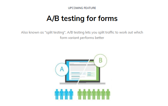
- Track metrics like conversion rate, bounce rate, and form completion rate.
- Use heatmaps to see where users are dropping off.
Even small tweaks, like shortening a form field or rewording a headline, can lead to double-digit improvements in conversion.
Best Practices for Landing Page Optimization
Match Visitor Intent
A landing page should directly reflect the intent of the visitor. Someone arriving from a Google ad searching “affordable CRM software” expects to see messaging about affordability and CRM features, not generic company information. Aligning the promise of your ad, email, or referral link with the landing page content reduces bounce rates and builds instant trust.
Maintain Message Consistency
Consistency across channels is critical. If your ad or email highlights “Free 14-Day Trial,” the landing page must reinforce that exact offer. Any mismatch creates confusion and damages credibility. Consistency ensures the visitor feels reassured that they’ve landed in the right place, making them more likely to complete the desired action.
Appeal to Emotion
Great landing pages speak to the heart as well as the head. Beyond features, they highlight how the product or service will improve life: saving time, reducing stress, or offering exclusivity. For example, instead of only listing “24/7 support,” frame it as “Peace of mind knowing help is always there.” Emotional appeal drives action more effectively than logic alone.
Simplify Cognitive Load
Visitors shouldn’t have to think too hard to understand your page. Cluttered designs, long forms, and too many CTAs create friction. The best practice is to make the journey as easy as possible: one clear flow, concise language, intuitive navigation, and a single call-to-action. Simplifying choices increases the likelihood of conversions.
Personalize and Segment
Not every visitor should see the same landing page. Tailor experiences by segment, whether by audience role, industry, or location. A decision-maker in finance might need different messaging than a small business owner. Personalized landing pages feel more relevant and engaging, giving visitors the sense that the solution was designed for their unique needs.
Ensure Accessibility and Inclusivity
Accessibility is both a legal requirement in many regions and a best practice for user experience. Use proper text contrast, readable font sizes, alt text for images, and ensure your page is navigable via keyboard. An inclusive design not only expands reach but also demonstrates professionalism and care for all users.
Take Your Landing Pages to the Next Level
Traditional landing page builders can help you get started, but their limitations, rigid layouts, limited form options, and lack of advanced targeting, often hold businesses back from maximizing conversions.
With access to smarter tools like conditional form fields, seamless integrations, and customizable templates, you can design landing pages that not only look great but also perform at a higher level.
Whether you’re a marketer, agency, or business owner, Growform gives you the flexibility to design high-performing landing pages that actually convert.
Ready to turn more of your traffic into paying customers? Start your free 14-day trial with Growform today.