
7 Website Form Examples That Drive High Conversions in 2026

A common conversion pattern looks like this. A visitor clicks a paid ad, lands on the page, starts the form, then exits at step two or three. The campaign still appears healthy at the top of the funnel, but lead capture weakens where intent should be highest.
That gap changes acquisition economics fast. Every abandoned form pushes effective cost per lead up, especially in channels where click costs are already high. The problem usually is not traffic volume alone. It is form design, field sequencing, mobile usability, and whether the flow qualifies serious buyers without creating unnecessary friction.
That is why this set of examples is useful.
Instead of showing seven forms from one category, this guide pulls from multiple industries and builder types to isolate repeatable patterns. The value is comparative. You can see where multi-step flows improve completion, where landing-page forms collect better context, and where conditional logic reduces low-fit submissions before they reach sales. For additional reference points, these multi-step form examples and why they work show the same principle in different acquisition contexts.
A second reason these examples matter is implementation speed. Strong form performance rarely comes from visual polish alone. It comes from small structural choices, including one-question-per-step layouts, progress indicators, answer-based routing, tighter copy, and integrations that pass data cleanly into the CRM or scheduling stack. Reviewing builders through that lens makes the examples more useful than a generic gallery of attractive forms.
If your current form gets starts but too few qualified completions, the issue is usually measurable and fixable. The seven tools below are worth studying because each represents a different strategy you can replicate with templates, conditional logic, and clearer field design.
Table of Contents
Table of Contents
- 1. Growform
- 2. Typeform
- 2. Typeform
- 4. Paperform
- 5. Formsort
- 6. Tally
- 7. 123FormBuilder
- 7. 123FormBuilder
- Top 7 Website Form Builders Comparison
- Next Steps to Upgrade Your Forms
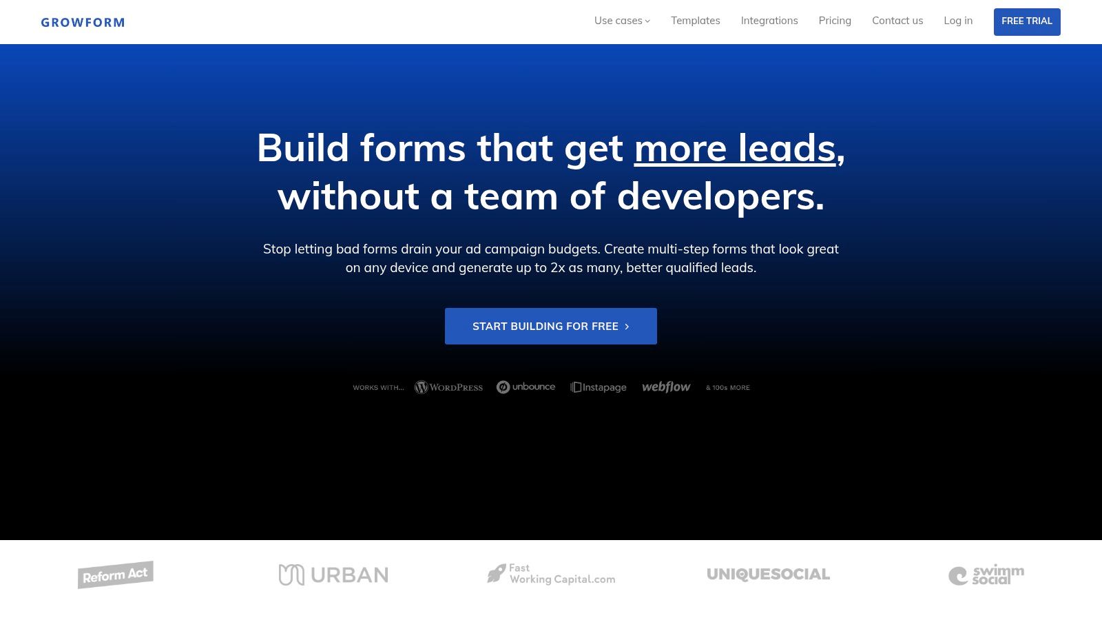
1. Growform
A visitor clicks a paid search ad, lands on your page, and starts the form on a phone. The first screen asks one easy question. Later steps collect qualification data, route answers by fit, and pass attribution fields into the CRM without extra engineering work. That sequence explains why Growform appears so often in performance-focused lead generation stacks.
Growform is built for lead capture rather than surveys or general internal workflows. Its core advantage is structural. Teams can break long intakes into short steps, control field order, use conditional paths, and preserve hidden data such as UTMs and click IDs. For acquisition programs where cost per qualified lead matters more than raw submission volume, those controls are useful.
Why Growform stands out
Growform is strongest in categories where a form has to do more than collect contact details. Legal, solar, insurance, mortgage, and home services teams often need to pre-qualify traffic before it reaches sales. That means asking enough to segment demand, but not so much that completion drops early. Growform supports that balance with multi-step flows, answer-based logic, disqualification rules, and direct handoff into routing or CRM systems.
Its integration layer is part of the case for using it. Native support for TrustedForm, Jornaya, Twilio, Zerobounce, webhooks, and CRM connections reduces the amount of manual stitching required after launch. That matters in high-volume funnels because form performance is not only about front-end UX. It also depends on whether lead data arrives cleanly, with attribution attached and validation handled before follow-up starts.
A second differentiator is replication speed. The product includes templates designed around common acquisition use cases, which makes it easier to test variants without rebuilding the flow from scratch. If you want more pattern-level inspiration, these multi-step form examples and why they work show how the same sequencing logic changes across industries and traffic sources.
Best-fit website form examples to replicate
The strongest Growform examples usually share four traits:
- A low-friction first step that asks for intent, need, or category instead of full contact data
- A visible progress indicator that sets expectations before the higher-friction questions appear
- Conditional branches that remove irrelevant questions and qualify poor-fit leads early
- CRM and validation integrations that make submissions usable immediately
That combination makes Growform relevant beyond one niche. It works especially well for teams running paid traffic into quote requests, assessment forms, booking qualification, or lead-buying funnels where each invalid submission has a direct cost.
If you are comparing implementation models across builders, it also helps to learn about FullEnrich's template solutions as a contrast point for how other form ecosystems package repeatable workflows and templates.
2. Typeform
A visitor taps a paid ad on a phone, lands on your form, and sees one clear question instead of a dense block of fields. That interaction pattern explains why Typeform still shows up so often in high-performing lead capture, feedback, and signup flows. Its template library is broad, visually consistent, and designed around a one-question-at-a-time sequence that keeps cognitive load low.
The strategic advantage is not just aesthetics. Typeform examples often control pacing well. They limit how much a user has to parse on each screen, which makes them useful for industries where attention drops quickly, such as event registration, creator applications, customer research, and simple service inquiries.
Where Typeform works best
Typeform performs best when the form itself is part of the brand experience. A conversational flow can make a newsletter signup feel lighter, a product quiz feel more guided, or a contact request feel less transactional. That matters when your goal is to keep users moving rather than asking them to scan and evaluate the whole form at once.
The tradeoff is visibility. In more complex B2B qualification or operational intake, some users want to see the full structure up front so they can judge effort before they start. Typeform's pacing can feel slower in those cases, especially if the form asks for detailed business context, compliance information, or several conditional paths.
Conditional branching helps offset that weakness. If you use conditional logic in multi-step forms to remove irrelevant questions early, the conversational format stays focused instead of feeling repetitive.
Practical rule: Use Typeform for short to medium-length flows where clarity, tone, and completion momentum matter more than full-form scannability.
Another useful pattern is cross-functional reuse. The same Typeform structure can support lead generation, post-purchase feedback, hiring screens, and webinar registration with relatively small copy changes. That makes it a practical option for teams that want a polished default format across several departments, not just marketing.
If you want to compare how this ecosystem handles repeatable workflows and prebuilt setups, you can learn about FullEnrich's template solutions.
Best-fit website form examples to replicate
The strongest Typeform-style examples usually fit one of these use cases:
- Lead capture quiz: Short, guided qualification for agencies, consultants, or local services
- Product recommendation form: Sequential questions that narrow users toward the right plan or product
- Event or webinar registration: Simple signup flows that feel lighter than a traditional form
- Research or feedback intake: Branded surveys where response quality matters as much as completion rate
Typeform is less about dense qualification and more about controlled attention. If your conversion problem starts with users bouncing before they engage, that design choice can be an advantage.
2. Typeform
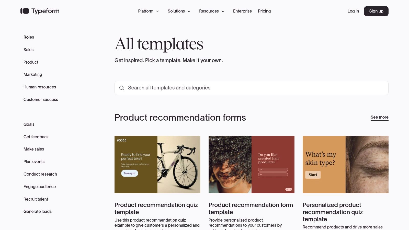
Typeform remains one of the cleanest sources of website form examples if you want a conversational, one-question-at-a-time layout. Its template gallery is broad, well organized, and easy to adapt, which makes it especially useful for marketers who want a polished starting point without much setup.
The main strength is focus. Typeform examples often reduce on-screen complexity by showing one input at a time, which aligns with what mobile users need when attention is limited and scrolling friction is high.
Where Typeform works best
Mobile friction is the issue to keep in mind here. One 2026 dataset found that 62% of mobile form abandonments cite form complexity as the primary cause. Typeform's design style directly addresses that problem by avoiding the wall-of-fields effect that causes many users to leave.
That said, conversational UI isn't perfect for every case. In complex B2B sales or operational intake flows, the format can feel slower because users can't scan the whole form structure at once. Some teams prefer that. Others find it adds too much pacing friction.
A Typeform-style flow works best when the experience itself needs to feel lightweight, guided, and low-pressure.
A good way to use Typeform as inspiration is to borrow the pacing, not necessarily the exact format. For many lead gen teams, the lesson is to simplify the first interaction and delay effort until the user has already progressed. If you want adjacent ideas for adapting this style, learn about FullEnrich's template solutions.
4. Paperform
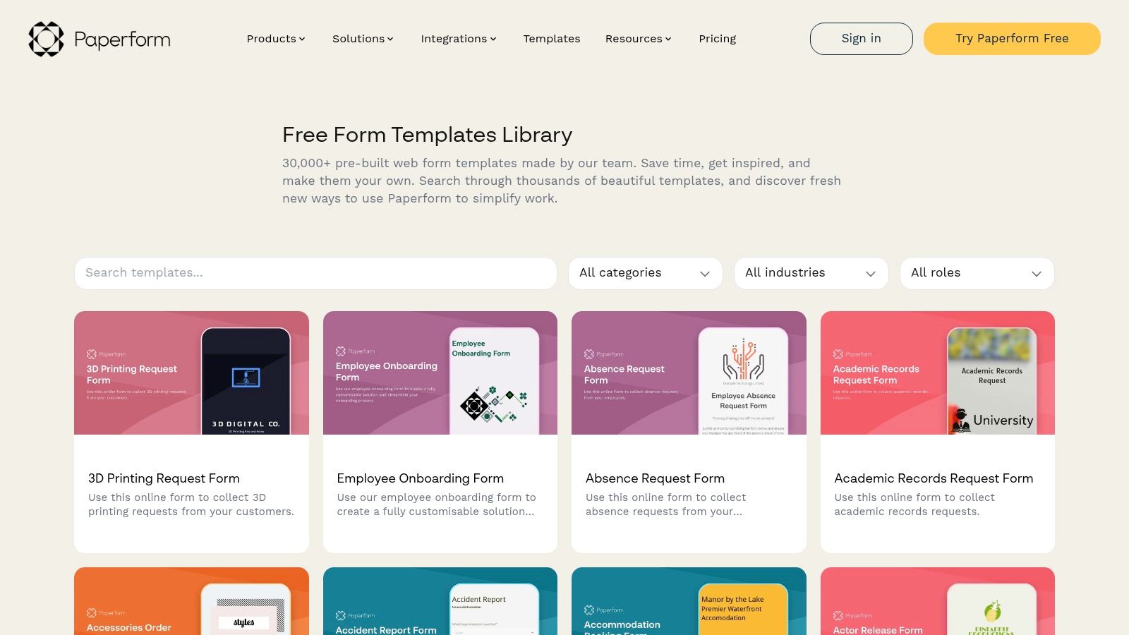
Paperform fits teams that want a form to carry more of the conversion job. Its templates look and behave more like compact landing pages, which makes them useful for quote requests, appointment booking, service applications, and payment flows where context affects completion.
That distinction matters. In higher-intent journeys, users are not only deciding whether to submit. They are also judging price clarity, process clarity, and brand credibility from the form itself.
When Paperform examples convert better
Paperform works well when a standard embedded form feels too thin for the decision being made. A catering inquiry, legal intake, renovation estimate, or workshop booking often needs sections, visuals, pricing cues, and answer-dependent follow-up questions on the same page. In those cases, the form is part explanation, part qualification layer, and part handoff mechanism.
The tradeoff is straightforward. Rich presentation helps only if the interaction still feels short and easy to scan.
That is the design lesson to borrow from strong Paperform examples. Keep the narrative value of a landing page, but control cognitive load with grouped fields, clear section labels, restrained optional questions, and visible progress through the interaction. If you want reference points for that balance, these lead capture form examples across industries show how teams structure higher-intent forms without letting them sprawl.
Good form design does not come from adding more surface polish. It comes from matching the amount of context to the size of the decision.
Paperform is also one of the more useful builders for teams that need native payments, scheduling, calculations, or branded follow-up pages inside the same workflow. That reduces the number of handoffs between tools, which can matter in service businesses where every extra redirect weakens completion and complicates attribution.
Use Paperform as a model when the form needs to sell, qualify, and route the lead in one experience. If the goal is simple contact capture, lighter builders will usually be faster to launch and easier to keep tight.
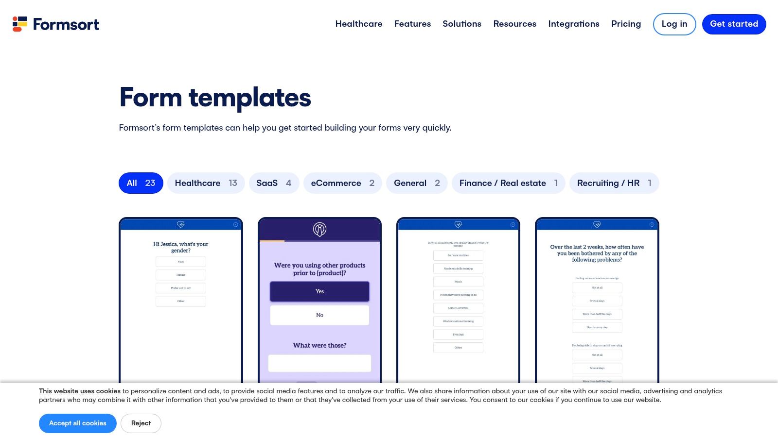
5. Formsort
Formsort is built for forms that act more like guided decision systems than simple contact capture. Its templates are most useful when the business needs branching logic, eligibility checks, onboarding steps, or scored assessments across several screens.
That changes the design goal. The question is no longer how to make the form shorter. It is how to make a longer process feel ordered, relevant, and easy to complete.
Formsort is a strong reference point for industries where each answer affects what should happen next. Mortgage pre-qualification, healthcare intake, insurance screening, education matching, and service recommendation flows all fit that pattern. In these cases, a flat form often creates two problems at once: users see questions that do not apply to them, and teams collect data in the wrong sequence for routing or compliance.
Why Formsort is useful for qualification-heavy flows
The clearest lesson in Formsort's examples is structural. Good multi-step forms group questions by user intent and decision stage, not by the order fields happen to live in a CRM.
That distinction matters more than it first appears.
A database-centered form usually feels administrative. A decision-centered form feels guided. Formsort's better templates use one task per screen, clear step labels, and answer-based branching to remove irrelevant paths. The result is a flow that feels closer to an intake process designed around the user's situation than a static questionnaire expanded across multiple pages.
This makes Formsort especially useful in higher-friction categories. If a business needs to qualify leads before a sales call, estimate, or approval step, asking fewer questions is not always the right move. A better strategy is often to sequence the same questions more intelligently, ask them only when relevant, and signal progress clearly.
That is also where template choice matters. Across a cross-industry set of high-converting multi-step form designs, the strongest performers tend to do three things well: reduce visible complexity, use copy that explains why a question is being asked, and connect answers directly to routing logic or follow-up systems. Teams trying to recreate that pattern in Growform usually need template variants with conditional paths, progress indicators, and tighter microcopy, rather than a generic lead form layout.
Use Formsort as the model when your form is doing triage, matching, or eligibility screening. If the job is straightforward lead capture, a lighter builder will usually be faster to configure and easier to maintain.
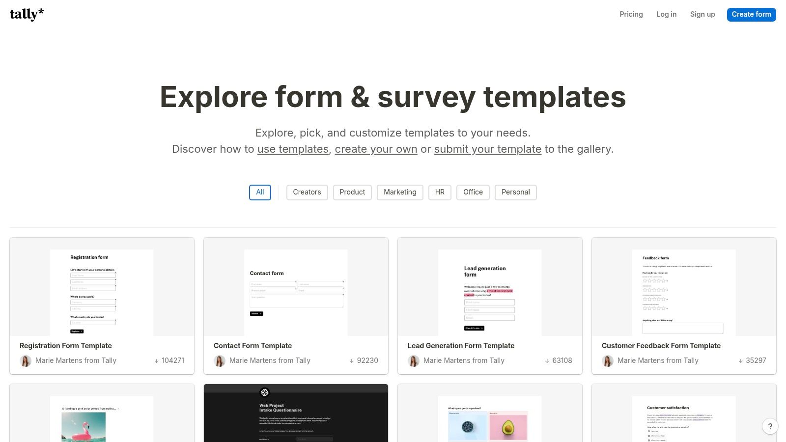
6. Tally
Tally is a useful benchmark for teams that need to test form concepts quickly. A marketer launching a new offer, a consultant validating demand, or a product team collecting early qualification data can duplicate a template and publish a clean multi-step flow with very little setup.
Speed is the point here.
Tally's minimal interface reduces production overhead, but the more interesting benefit is analytical. Sparse layouts expose weak questions faster. If completion drops sharply after one screen, the issue is easier to trace to the question, the copy, or the perceived effort because there is less design complexity masking the problem.
Why Tally is strong for rapid testing
Tally works best in early-stage experiments where the team needs directional evidence before investing in a more customized build. Its templates are especially useful for testing offer framing, step order, and answer formats across different audiences. That makes it relevant to the cross-industry pattern behind many high-converting multi-step forms. Clear sequencing often matters more than visual decoration.
The practical lesson is straightforward. Use Tally to validate structure before optimizing polish. If a stripped-back flow performs well, that gives you a stronger base for rebuilding it in Growform with template variants, stronger branching, tighter microcopy, and closer integration with your sales or marketing stack.
Its constraints also help clarify where it stops being the right tool. Teams handling advanced lead routing, compliance requirements, identity checks, or sales-qualified handoff rules will usually outgrow it. But for fast website form examples and lightweight multi-step tests, Tally shows how much conversion work can be done by sharper question design alone.
7. 123FormBuilder
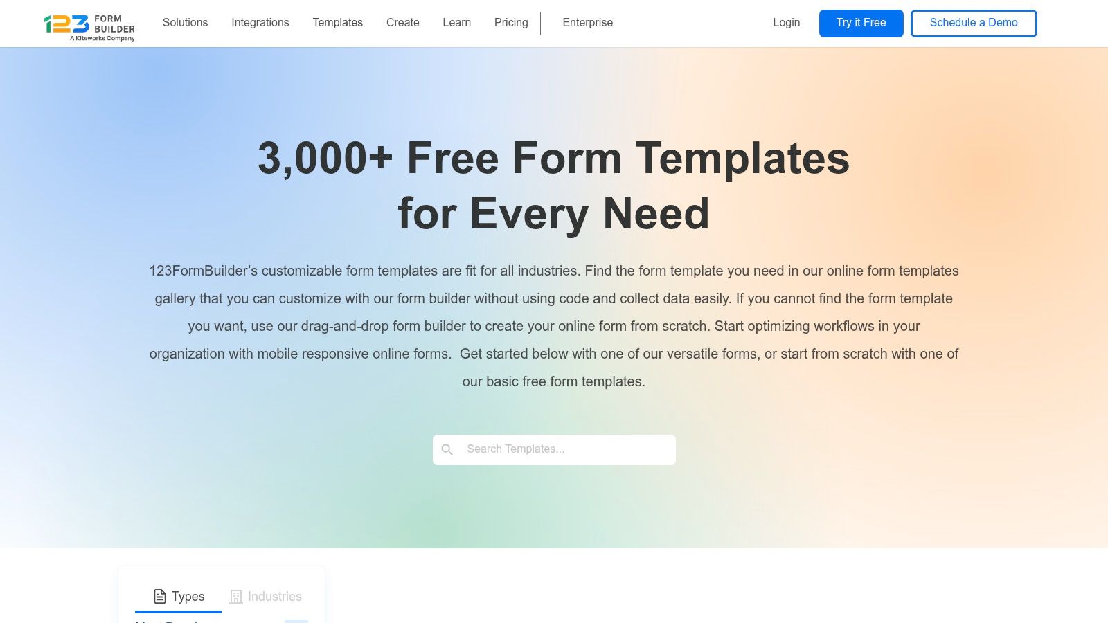
123FormBuilder sits at the practical end of this list. Its examples focus on registrations, applications, quote requests, surveys, and internal workflows. That makes it useful for organizations that need forms to collect structured information reliably, especially in WordPress environments or teams without dedicated frontend support.
That positioning matters.
Across industries, high-converting multi-step forms often get attention because they improve lead capture and qualification. 123FormBuilder solves a different problem. It reduces build friction for standard business processes where consistency, permissions, and fast deployment matter more than a highly guided conversion path.
Where classic business forms still win
The strongest 123FormBuilder examples are the ones tied to known user intent. Someone requesting a certificate, submitting an employee request, or registering for an event usually arrives with a specific task already in mind. In those cases, a familiar structure can outperform a more stylized experience because it lowers interpretation cost. Users recognize the pattern and complete it with less hesitation.
This distinction is easy to miss in roundups of website form examples. A form that works well for operational throughput is not automatically the right model for paid traffic or lead qualification. Different jobs produce different UX priorities.
A useful way to apply 123FormBuilder is to separate process forms from revenue forms. Keep straightforward administrative flows in a conventional layout when the main goal is accurate submission and easy handoff. For acquisition campaigns, consult requests, or multi-step qualification, a Growform template variant usually gives you more control over pacing, conditional logic, and answer framing.
That is the strategic lesson here. 123FormBuilder is less a conversion-first tool than a workflow-first one. Used in the right context, that restraint is an advantage.
7. 123FormBuilder
123FormBuilder is the most traditional option on this list. Its examples skew toward straightforward business forms like registrations, applications, quotes, and operational requests. For WordPress-heavy teams or non-technical implementers, that practicality is still useful.
Not every form has to be persuasive or interactive. Some only need to be clear, accessible, and easy to embed.
Where classic business forms still win
123FormBuilder's best examples are the ones where speed and familiarity matter more than novelty. Internal request forms, simple quote inquiries, and admin-heavy workflows often benefit from conventional layouts because users already understand them.
Still, teams shouldn't assume classic means optimal on mobile. The device gap is real. In 2026 data, desktop users converted from starter to completion at 55.5% versus 47.5% for mobile users. So if you use a traditional template, mobile review is mandatory.
A smart use of 123FormBuilder is to separate operational forms from revenue forms. Keep the utilitarian structure where efficiency matters. For paid acquisition or lead qualification, move to a stronger multi-step experience.
Top 7 Website Form Builders Comparison
| Product | Implementation complexity 🔄 | Resources & speed ⚡ | Expected outcomes 📊 | Ideal use cases 💡 | Key advantages ⭐ |
|---|---|---|---|---|---|
| Growform | Moderate, no-code multi-step builder but requires logic/integration setup 🔄🔄 | Low developer effort; optimized for scale and fast loads (Cloudflare) ⚡⚡⚡ | Higher-converting, better-qualified leads with preserved attribution and verifiable consent 📊⭐️⭐️⭐️ | Paid acquisition, lead-gen agencies, insurance/ mortgage/real estate, high-volume campaigns 💡 | Conversion-focused templates, built-in verification & consent, real-time CRM delivery ⭐️⭐️⭐️ |
| Typeform | Low, template-driven conversational editor; minimal setup 🔄 | Low dev overhead; conversational UX can be slower per-response ⚡⚡ | Polished engagement and UX; good for short flows but less ideal for complex B2B intakes 📊⭐️⭐️ | Surveys, conversational lead capture, quizzes, customer research 💡 | Strong UX and curated templates; easy to duplicate and customize ⭐️⭐️ |
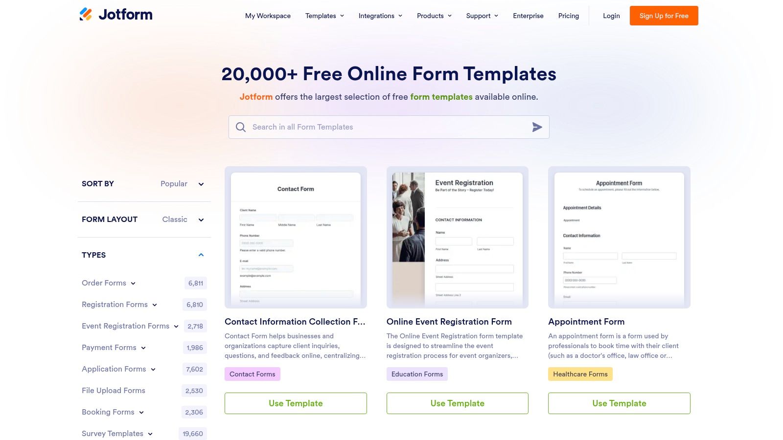
| Jotform | Low–Moderate, drag-and-drop with many widgets; customization may take time 🔄🔄 | Fast to publish templates; design polish varies across library ⚡⚡ | Broad coverage across industries; quick publish for review/A–B testing 📊⭐️⭐️ | Niche industry forms, rapid stakeholder review, testing, general business forms 💡 | Very large template library and many prebuilt widgets/integrations ⭐️⭐️ |
| Paperform | Moderate, visual, landing-page-like form design; branding/configuration needed 🔄🔄 | Moderate resources for design; advanced styling (CSS) on higher plans ⚡⚡ | Visually polished lead capture; supports payments, quotes and calculators 📊⭐️⭐️ | Quote calculators, bookings, payments, branded micro-landing forms 💡 | Strong visual/branding controls and built-in pricing logic ⭐️⭐️ |
| Formsort | High, designed for logic-heavy, multi-step decision trees; configuration intensive 🔄🔄🔄 | Higher setup and testing effort; built for experimentation and control ⚡⚡ | High conversion potential for complex/intake journeys; suitable for regulated verticals 📊⭐️⭐️⭐️ | Onboarding, mortgage pre-approval, healthcare screeners, assessments 💡 | Deep conditional logic, medically validated templates, experimentation focus ⭐️⭐️ |
| Tally | Low, document-like editor, minimal configuration; very fast to edit 🔄 | Extremely fast prototyping; generous free-tier limits for tests ⚡⚡⚡ | Good for rapid experiments and simple lead capture; limited advanced qualification 📊⭐️ | Rapid experimentation, simple lead gen, feedback forms, quick prototypes 💡 | Fast, free-to-duplicate templates and simple editor for many tests ⭐️ |
| 123FormBuilder | Low–Moderate, classic web forms, categorized templates; WordPress-friendly 🔄🔄 | Quick embeds and integrations; may require styling to match brand ⚡⚡ | Reliable, utilitarian business forms for registrations/quotes/applications 📊⭐️ | Registrations, quotes, applications, admin forms, WordPress embeds 💡 | Solid business-form coverage and documented embed/integration options ⭐️ |
Next Steps to Upgrade Your Forms
The fastest win is to audit the form you already have. Count fields, review mobile behavior, test how attribution passes through the funnel, and look closely at where users abandon. If your current form is long and static, redesigning the flow will likely outperform endless copy tweaks.
The next step is choosing the right pattern. If you need simple newsletter or contact capture, a short single-step form may be enough. If you need quote data, buyer fit, or compliance evidence, a multi-step format is usually the better structure. The key is sequencing. Ask easy, low-friction questions first, then collect contact and qualification details once momentum exists.
There's also a strategic choice many teams miss. Better forms don't just increase submission volume. They improve downstream economics. A form that captures cleaner attribution, filters poor-fit leads early, and delivers data instantly into the CRM helps sales act faster and wastes less budget on junk submissions.
For most paid acquisition teams, Growform is the most practical template source on this list because it combines the visible UX layer with the plumbing that determines lead usefulness. That's the difference between a form that looks modern and one that performs inside a real lead stack.
Once you've rebuilt the form, tighten the follow-up too. Confirmation emails, routing logic, and lead alerts shape the user experience after submit just as much as the form itself. If that handoff needs work, this guide to mastering transactional email delivery is worth reviewing.
If you want website form examples you can adapt for paid traffic, qualification, and CRM handoff, start with Growform. It's built for teams that need multi-step lead forms, better mobile completion, stronger filtering, and faster launches without waiting on developers.