
Foot in the Door Phenomenon: Psychology and Ethics

You're looking at a landing page that “looks fine,” traffic is coming in, and yet step three is where people disappear. The dev team wants to inspect the form. The media buyer wants to swap the creative. But in a lot of paid funnels, the leak isn't a broken field or a slow page, it's that the page asks for too much trust too soon.
That's where the foot in the door phenomenon earns its place in CRO. The classic idea is simple, a small initial yes can make a bigger later yes feel more natural, but the practical version for lead gen is more specific. It's about designing a sequence of small, voluntary commitments that feel connected enough to the final ask that the user keeps moving.
Table of Contents
Table of Contents
- The Drop-Off That Wasn't a Bug
- What the Foot in the Door Phenomenon Means
- The Studies That Built the Idea
- Why Trivial Steps Often Fail
- Mapping Psychology Onto Multi-Step Form Design
- A Template Funnel and A/B Test Plan for Paid Lead Gen
- Ethics, Compliance, and When FITD Is Hiding a Weak Offer
The Drop-Off That Wasn't a Bug
The first sign usually isn't dramatic. A paid campaign is spending, the preview looks clean, the form loads fast, and then the prospect vanishes at step three of six. The instinct is to blame the UI because that's the most visible surface, but the more useful question is whether the page asked for a commitment before it earned one.
A flat form treats every field like equal work. A sequence doesn't. It lets the visitor answer one easy question, then uses that answer to make the next question feel like a continuation instead of a new burden.
What the funnel is really missing
A lot of teams call this “friction,” but friction alone doesn't explain why some step-by-step flows outperform a single-page dump while others just feel longer. The difference is often whether the early steps create micro-commitments that feel real, voluntary, and logically connected to the later ask. If the first step is just a dead click, there's no ownership to carry forward.
That's why the same visitor may tolerate a short quiz, a quick qualifier, or a preference question, but bounce when the funnel starts with contact details and business-formality language. The user hasn't yet said, “This is for me.” Until that happens, every later field feels like extraction.
Practical rule: if the first interaction wouldn't make sense as the start of a conversation, it probably won't create the kind of commitment the foot in the door phenomenon depends on.
The reframe is simple. Don't only ask, “How do we remove friction?” Ask, “What is the smallest honest first yes that makes the bigger yes feel consistent?”
What the Foot in the Door Phenomenon Means
A visitor opens a lead form and sees one request for an email address, then a second step that asks for company size or budget. That sequence is the point of the foot-in-the-door effect. A person agrees to a small, low-cost request first, then becomes more likely to agree to a later, larger request. The order matters more than the size of the first ask by itself.
A simple example is a homeowner who first agrees to place a small sign in a window, then later accepts a larger lawn sign. The sign is not the point. The first agreement changes how the person relates to the second request, so the larger ask feels more consistent with what they have already done.
The mechanisms people use to explain it
Classic reviews point to several mechanisms that can work alone or together, including self-perception, commitment and consistency, reactance, conformity, and attribution (technical review). In plain English, people may infer that they care about the topic because they already acted, they may want to stay consistent with an earlier choice, or they may respond differently once the request no longer feels abrupt.
That is why “small yes leads to big yes” is useful but incomplete. The small yes has to register as meaningful to the user. If it feels random, forced, or disconnected, the psychology gets much weaker.
For marketers, the clean definition is this. Foot in the door phenomenon means the first request changes how the user sees the later request, often by making the second request feel self-consistent, voluntary, and socially or personally aligned. That is the language stakeholders need when they ask why a form is split into steps instead of dumped onto one page.
Why the sign example matters to CRO
The classic sign study remains the historical anchor because it showed that a small request could change later compliance in a field setting. In funnel terms, that separates a page that merely collects data from a page that starts a commitment path. The practical translation is not “make it shorter.” It is “make the first step the right kind of small.”
In paid lead gen, that usually means progressive profiling, a low-stakes first click, or a qualifier that feels like a natural start to the conversation. A first step that asks for too much, or asks in a tone that sounds like extraction, can hurt completion rate and acceptance rate even when the funnel looks cleaner on paper. The psychology only helps when the early commitment feels like the visitor chose it.
The Studies That Built the Idea
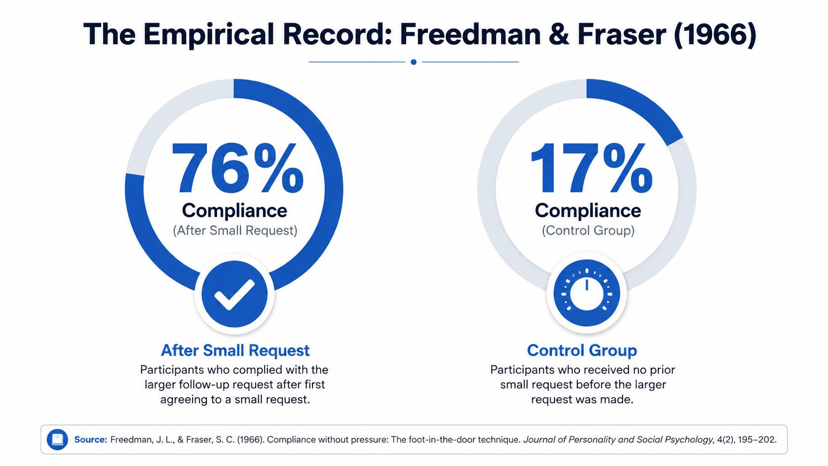
The original field study by Jonathan Freedman and Scott Fraser in 1966 is the landmark here. In one experiment, residents who first agreed to place a tiny sign were later far more likely to comply with the larger sign request than residents who were asked for the larger sign outright, and a later summary reports 76% compliance in the small-request condition versus under 20% when the larger request was made directly (historical summary). That is the result marketers usually hear about, but it is only the starting point.
The effect exists, but it isn't dramatic everywhere
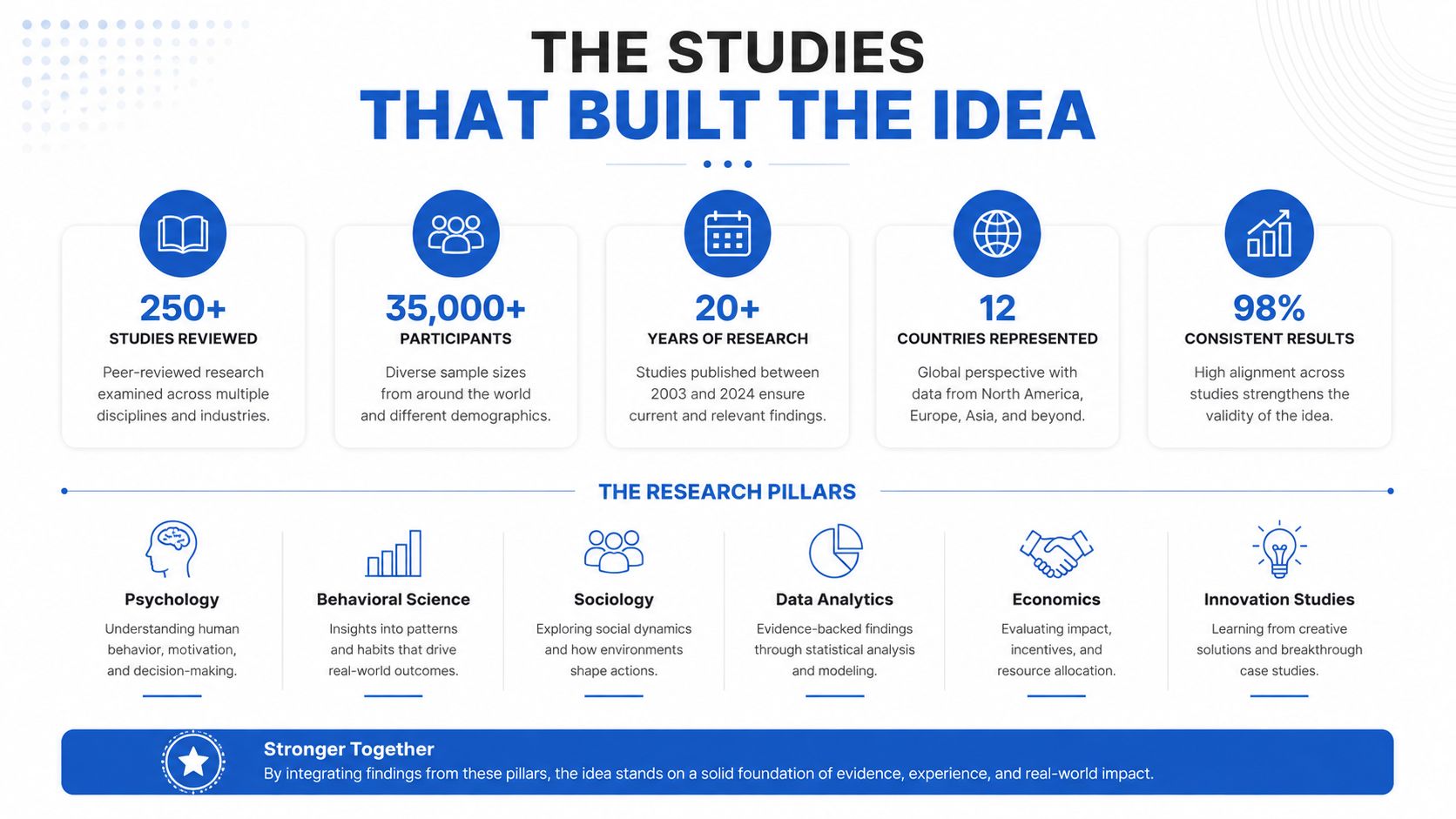
A major quantitative review published in 1983 examined 120 experimental groups and concluded the effect was real but modest rather than dramatic (review summary). The review also found that nearly half of the studies showed no effect or even an effect in the opposite direction. That matters, because it blocks the lazy reading of the research where every small ask is assumed to work by default.
The more realistic interpretation is that the phenomenon shows up across decades, but it usually delivers a small-to-moderate lift, not a universal conversion jump. A form pattern can be psychologically sound and still fail in a paid traffic context if the audience is cold, rushed, or skeptical.
Context changes the size of the lift
A 2012 field experiment found overall compliance with the focal request at 21.3% in the foot-in-the-door condition versus 6.3% in the control group, with men showing 32.5% versus 10.0% (field evidence). Those numbers show variability, not certainty. The effect can be meaningful, but it can also shrink or shift depending on who the user is and what the request looks like.
That variability is the part CRO teams need to respect. A small first step can lift completion rate if it feels like a real start to the decision, but the same mechanic can drag acceptance rate if the audience reads it as a gimmick or a thin filter. In multi-step lead funnels, the practical value sits in the relationship between the steps, the offer, and the traffic source, not in the step count by itself.
What the research means for funnel design
The clean takeaway for paid lead gen is to treat the first step as a commitment cue, not a decorative divider. Progressive profiling, micro-commitments, and conditional qualification all work best when they help the user move forward with a choice that feels consistent with what they already wanted.
That is also where lead quality metrics matter. A funnel can post a better completion rate and still create weaker leads if the early request attracts people who only clicked to get past the first screen. The stronger test is whether CPL improves without wrecking acceptance rate, or whether the lower friction just shifts the problem downstream.
Why Trivial Steps Often Fail
A lot of marketers read the theory as “any small ask works.” It does not. A dead click, a meaningless spinner, or a fake next button can add length without adding commitment, which is the kind of change that hurts completion without improving lead quality.
A first step has to feel like a real decision, not a page transition. The user should choose it voluntarily, see some connection to their situation or identity, and understand why it leads into the next question. A low-friction quiz works better when it reveals something about the prospect's situation, and a qualifying question works better when it helps the user place themselves in a category instead of serving only internal routing logic.
That is the difference between a meaningful micro-commitment and a token interaction. One changes self-understanding. The other only burns patience.
Here's a quick diagnostic I use on funnels that underperform at the top of the sequence:
- Would the user still see value if the form ended here? If not, the first step may be empty.
- Does the first question tell the user something about themselves? If not, the step may not create identity pull.
- Can the user explain why the next question follows logically? If not, the chain is too thin.
- Would skipping the step change anything material? If no, the step may be just decorative friction.
A useful first screen also has to match the traffic source. Paid traffic from Meta or Google is less forgiving than a warm list, and an awkward opener can suppress completion before the funnel has a chance to do its job. The mechanics of a multi-step form only matter when the first move feels worth taking, which is why guidance such as must-follow UX best practices for designing a multi-step form is most useful when it is tied to how people decide, not just how pages are laid out.
Friction isn't the same as commitment
Practitioner reality matters. A “click next to continue” screen can make a funnel feel longer without making the visitor more invested. In paid traffic, that can be fatal because Meta and Google audiences punish hesitation quickly. Users do not care that the sequence is clever if the first move feels like a delay.
Practical rule: use the first step to earn the right to ask the second one, not to prove that the page can be split into steps.
The best first step usually does one of two things. It helps the visitor self-identify, or it gives a small but meaningful reason to continue. Anything else is probably theater.
Mapping Psychology Onto Multi-Step Form Design
Each mechanism in the foot in the door phenomenon maps to a different design choice. That's useful because it keeps the conversation out of abstract persuasion theory and inside the mechanics of form building, where lead quality and acceptance rates live.
A mechanism-to-component table
| Mechanism | Form Component or Copy Pattern | Metric Most Likely to Move |
|---|---|---|
| Self-perception | Opening question that frames the visitor as the kind of person who fits the offer | Acceptance rate |
| Commitment and consistency | Progress indicator, confirm-on-next button, step recap | Completion rate |
| Reactance | Clear length estimate, skip path, transparent “why we ask” copy | Completion rate |
| Conformity | Testimonial step, social proof adjacent to a choice | Acceptance rate |
| Attribution | Contextual copy that explains the purpose of each question | Lead quality, fewer junk submissions |
The table is intentionally practical. These are not five isolated tricks, they're five different ways to shape how the user interprets the sequence. A strong funnel usually uses more than one, but it should never use them all in the same blunt way.
How the mechanisms show up in real forms
Self-perception often starts with a question that feels like identity, not data capture. For example, “Are you a homeowner?” or “What best describes your situation?” can make the user orient themselves before the form gets more specific. Commitment and consistency show up when each step visibly advances toward an endpoint, so the visitor feels they've already started.
Reactance is easy to miss. If the form hides the total number of steps, or pretends the flow is shorter than it is, users sense the manipulation. Transparent cues work better because they keep the choice intact. Conformity and attribution are subtler, but they matter when the funnel needs social reassurance or context for why a particular field exists.
If you need a design checklist, anchor it to the metrics. Acceptance rate usually responds to the quality of the initial yes. Completion rate tends to move when the sequence feels understandable and low pressure. Lead quality improves when the questions sort serious prospects from the merely curious.
An internal UX reference that's useful here is multi-step form best practices, because the form mechanics matter as much as the persuasion logic. The psychology only helps if the interface doesn't fight it.
A Template Funnel and A/B Test Plan for Paid Lead Gen
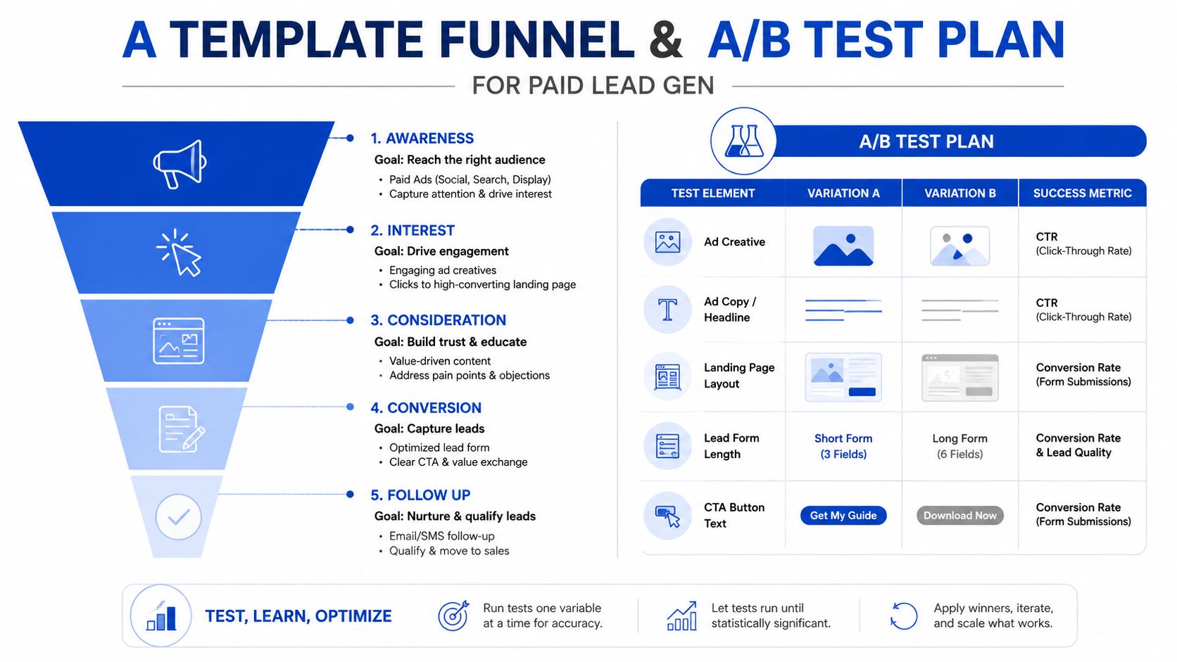
A paid lead gen funnel that respects how people move through a form usually begins with a soft identity question, then shifts into conditional qualification, then finishes with contact capture. In solar, insurance, legal, and home services, that often means four to six steps. The number is not magic. It gives the sequence enough room to earn the ask without feeling padded, and it gives the media buyer enough structure to compare CPL, completion rate, and downstream acceptance rate without guessing where the friction starts.
A practical sequence that fits real traffic
Step one should be the easiest meaningful choice, often a category or situation question. Step two can ask a qualification question that changes the path, such as service type, timeline, or ownership status. Step three can branch conditionally, so users only see the questions relevant to them.
Step four is where the form can capture details that a buyer or sales team needs. Step five, if you use one, is the contact field stage. Step six is the confirmation or disclosure screen, where consent evidence and handoff logic should stay intact if you're handling regulated lead flows.
Progressive profiling and clean exits
Repeat visitors should not see the same qualifying questions again if you've already captured them. Progressive profiling handles that cleanly. The form can remember prior inputs and skip repeated steps, which protects completion and lowers the sense that the brand is ignoring what the visitor already told it.
Disqualification should be direct. If the visitor does not fit, tell them plainly and route them out without pretending they are still in the core funnel. That usually preserves throughput better than forcing every lead into the same path and hoping a buyer sorts it out later.
For teams tracking ad platform performance, it helps to wire conversion events correctly from the start. A practical setup guide like how to track Google Ads conversions with Growform is relevant because the funnel only helps if the signal survives the handoff.
Operational rule: optimize the test around acceptance rate first, not just raw completion. A form that finishes more often but yields worse leads is a worse funnel, not a better one.
An A/B test that answers the right question
Run a flat single-step control against the multi-step version. Keep the traffic source, offer, and audience as stable as possible, then compare acceptance rate as the primary metric. Use CPL and lead-to-appointment rate as secondary checks, because a cheap lead that gets rejected does not help the business.
If you need landing page structure ideas, the Agency tips for high-converting pages piece is a useful companion, especially for teams that need the whole page, not just the form, to carry the weight.
Ethics, Compliance, and When FITD Is Hiding a Weak Offer
The foot in the door phenomenon can improve a funnel, but it can also hide a problem. If the offer is weak, the lead criteria are sloppy, or the consent language is doing too much work, a better step sequence may only delay the moment the buyer notices.
Warning signs that the tactic is working against you
If completion rises while downstream acceptance falls, the funnel may be optimized for motion rather than intent. If users cruise through the early steps but fail at contact or show poor response quality after handoff, the sequence may be creating superficial compliance instead of meaningful commitment. That's especially dangerous in regulated lead gen, where capture mechanics have to align with consent expectations and evidence handling.
A careful operator should check for these signals:
- Too much ease at the front, weak intent at the back. The sequence may be asking the wrong first question.
- A hidden or compressed disclosure flow. That can create compliance risk, not just conversion risk.
- A final reveal that feels unrelated to the earlier steps. Users often sense bait-and-switch structures.
- Better completion but worse buyer feedback. That's a lead quality problem, not a UX win.
Use the psychology without using it as cover
The goal is to make the next request feel earned, not to smuggle consent through clever sequencing. That matters in lead gen where consent capture, TCPA sensitivity, and buyer expectations all collide. A thoughtful capture layer should make the evidence, path, and qualification visible before the lead is sold or routed.
A plain-language TCPA primer like what lead gen operators need to know about TCPA in 2026 is worth keeping close if your funnel touches phone leads or one-to-one consent flows. The practical takeaway is simple, use the mechanism to surface fit, not to disguise noncompliant capture.
If the first step makes the rest of the form feel natural, it's helping. If it makes a weak offer look stronger than it is, it's just postponing the truth.
If you're building paid lead funnels and want a cleaner way to structure the first yes, the follow-up questions, and the handoff, Growform is built for multi-step lead capture and qualification. It gives you the form mechanics, conditional logic, and lead handoff layer needed to test this approach without turning it into a dev project.