
Form Accessibility: The Complete Guide for Lead Gen Funnels
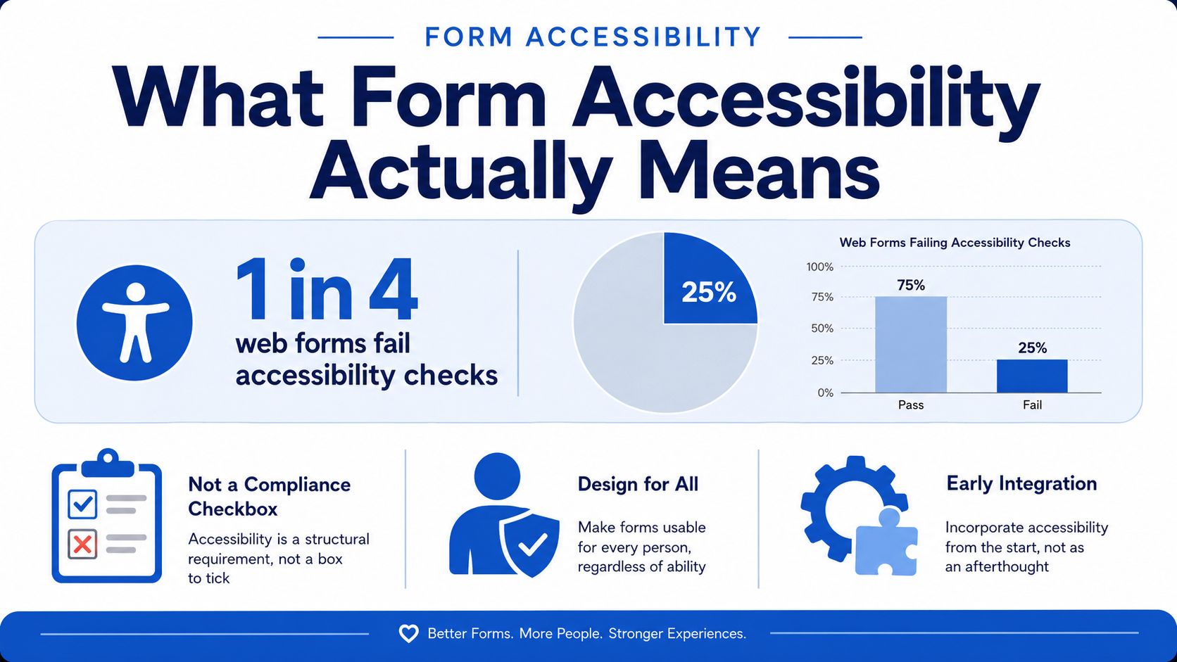
Nearly 25% of the web forms scanned by AudioEye were inaccessible to people with disabilities, and the most common failure was missing descriptive labels that screen readers could use to identify fields (AudioEye benchmark). That number should reset how performance teams think about form accessibility. This isn't a niche compliance clean-up, it's a structural problem in the way lead forms are built, labeled, and recovered from when something goes wrong.
For marketers, the practical definition is simple. An accessible form is one that every user can perceive, understand, operate, and recover from, including screen reader users, keyboard-only users, people with low vision, and people with motor impairments. WCAG 2.1 ties that directly to keyboard operability, visible focus, and programmatic labels so assistive technologies can determine each control's name, role, and value (WCAG 2.1).
That matters far beyond ethics. Broken or confusing forms create legal exposure under regimes such as the ADA, EAA, and Section 508. They also waste paid traffic, because a form that's hard to complete drags down the value of every click you bought. On top of that, malformed submissions pollute your CRM with bad data, half-finished leads, and entries that don't reflect what the user intended.
A good lead form has to do two jobs at once. It has to convert and it has to remain usable when the user is navigating by keyboard, relying on a screen reader, or moving through a conditional multi-step flow on a phone. That's the bar this guide uses.
Table of Contents
Table of Contents
- What Form Accessibility Actually Means
- The Business and Legal Case for Accessible Lead Forms
- WCAG Requirements Mapped to Real Lead Form Features
- Implementation Patterns for Labels, Focus and Error Handling
- Multi-Step Funnels, Conditional Logic and Mobile Reality
- A Practical Pre-Launch Accessibility Checklist
- Testing Tools and How to Use Them Together
- Accessibility Wins Specific to Growform-Style Funnels
What Form Accessibility Actually Means
The cleanest way to think about form accessibility is this. A form is accessible when the user can complete it without guessing what a field is, where focus is, what failed, or how to recover after an error. If a keyboard user can't tab through it in a sensible order, or a screen reader only announces “edit text” with no context, the form is broken in practice even if it looks fine in the browser.
The scale of the problem is not small. The WebAIM Million 2026 report found 56,114,377 distinct accessibility errors across one million home pages, an average of 56.1 errors per page. In the same research ecosystem, labeling failures remained common, with 34.2% of form inputs not properly labeled and 51% of top home pages shipping form inputs without proper labels (WebAIM Million 2026). That makes form accessibility less like a polish issue and more like a recurring production defect.
Practical rule: If a user needs sight, a mouse, or perfect memory to move through the form, you don't have an accessible funnel.
For lead generation teams, the business case is direct. Accessibility failures create extra drop-off, more support requests, more rework after compliance complaints, and more noise in the pipeline. They also force sales and operations teams to handle submissions that came through despite confusion, which is a bad sign for lead quality. A form that misleads people doesn't just lose conversions, it can degrade the integrity of the entire acquisition system.
The image above is deliberately simple because the core issue is simple too. Accessibility is not a compliance checkbox, it's a requirement that the input layer of your funnel works for everyone who reaches it. Build that way from the start, and the rest of the stack has a much better chance of staying clean.
The Business and Legal Case for Accessible Lead Forms
Accessibility is now a board-level issue because the legal and operational risk is converging. Public entities are already under deadline pressure from the ADA Title II web rule, and private companies are dealing with ongoing litigation, broader accessibility expectations, and the reality that digital forms sit at the front door of revenue. A form that excludes users is still a business problem even before it becomes a legal one.
The commercial logic is just as strong. Every broken label, hidden error, or unusable step turns into wasted media spend because the click happened, but the lead didn't finish cleanly. If a user can't confidently complete a form, the CRM record that comes back may be incomplete, mistranscribed, or structurally unreliable. That creates friction for routing, attribution, lead scoring, and downstream sales follow-up.
Accessibility is one of the few projects that can improve compliance, data quality, and conversion discipline at the same time.
There's also a practical budget angle. Retrofitting a form after complaints is slower than building the right patterns into the builder, template, or component library up front. Teams that wait usually end up patching labels, tab order, error handling, and contrast one by one, which is expensive and fragile. Teams that start with accessibility as a constraint avoid a lot of that churn.
For marketers who outsource or audit their funnel stack, it helps to treat accessibility like conversion infrastructure. That's why resources such as when to hire a CRO agency are relevant here, because the same rebuild discipline that improves conversion often fixes accessibility failures too. A good CRO process doesn't just test button copy, it checks whether real users can move through the flow without friction.
The clearest line from WCAG conformance to business outcomes runs through trust. If your lead form looks polished but behaves unpredictably, users notice. If a buyer later finds that submissions are inconsistent or incomplete, they notice too. Accessible forms don't just help people complete the funnel, they help the funnel produce data that other teams can trust.
WCAG Requirements Mapped to Real Lead Form Features
WCAG can feel abstract until you map it to the editor controls that marketers use. Native HTML inputs matter because browsers and assistive tech already know how to interpret them. Custom-styled divs pretending to be inputs often break that built-in behavior, which is why “looks like a field” and “behaves like a field” are not the same thing.
The WebAIM data makes one thing obvious, labeling remains a persistent failure point (WebAIM Million 2026). That lines up with WCAG's emphasis on programmatic labels, because the label can't just be visually nearby. It needs to be associated correctly so the technology reading the page can announce the field name, and the tab order has to follow the visual order so keyboard users aren't forced into a confusing path (WCAG 2.1).
The features that matter most
- Native input elements: Use real
input,select, andbuttonelements where possible. They give you baseline semantics, keyboard behavior, and better interoperability with screen readers. - Linked labels: Connect labels with
forandid. Visual proximity is not enough, because assistive tech needs the relationship in the markup. - Visible focus: If users can't see where focus moved, the form is effectively guessing for them.
- Clear error identification: Error text needs to name the problem in plain language, not just turn a border red.
- Suggestions when possible: If a value is malformed, tell the user what to do next instead of forcing trial and error.
A builder can make all of this harder when it abstracts away the markup but doesn't preserve the semantics. The same is true when conditional fields appear dynamically without an announcement or when error states exist visually but aren't exposed to assistive technology.
For a practical example of a lead-capture layout that needs these basics handled correctly, look at the structure of a lead capture form. The layout can be conversion-focused and still be broken if labels, focus, and error states aren't wired up properly.
| Common Builder Mistakes and the WCAG Criteria They Violate | ||
|---|---|---|
| Common Mistake | WCAG Criterion | User Impact |
| Placeholder text used as the only label | Labels and programmatic names | The user loses the field purpose as soon as they start typing |
| Custom clickable div used as a button | Keyboard operability and semantics | Keyboard and assistive tech users can't reliably trigger it |
| Error shown only in color | Error identification and contrast | The failure is invisible or ambiguous |
| Focus jumps unpredictably after a step | Focus order and focus visible | The user gets stranded mid-flow |
A useful rule of thumb is simple. If you can't explain how the field is announced, focused, and corrected, the form isn't ready for production.
Implementation Patterns for Labels, Focus and Error Handling
The biggest mistake I still see is teams treating accessible forms as a visual design task. It isn't. It's markup, state management, and recovery logic. You can have a beautiful layout and still break the experience the moment validation fires or a conditional field appears.
Build the relationship between input and help text
Use a real label for every field, then attach supporting instructions and error messages with aria-describedby when the text helps the user complete the field. That way, the user hears the instruction at the same time as the control, not after the fact. When a value is invalid, the error message should stay linked until the issue is resolved.
Practical rule: Don't hide the fix in a toast or a generic banner if the user needs that explanation to correct a specific field.
Announce problems without making the form noisy
Live validation should be restrained. If you announce every keystroke, users get buried in interruptions. A better pattern is to validate on blur or on submit for most fields, then surface the error in a live region when the form needs the user's attention. The point is to help the user recover, not to narrate every partial state.
Keep focus where the user needs it
When validation fails, move focus to the first invalid field or to a summary that clearly points to the problem. Don't dump the user back at the top of the page with no explanation. If a step changes because of conditional logic, preserve the entered values and keep the tab order aligned with what the user now sees.
The guide from Bruce and Eddy is useful here because it reinforces the basics teams often miss when they get lost in tooling. Good checklists are only valuable if they point to the actual behavior users experience, not just the presence of an ARIA attribute.
| Common Builder Mistakes and the WCAG Criteria They Violate | ||
|---|---|---|
| Common Mistake | WCAG Criterion | User Impact |
| Error message appears but isn't referenced by the field | Name, role, value and relationships | Screen reader users don't know what needs fixing |
| Focus stays on the submit button after failure | Focus management | Users have to hunt for the broken field |
| Tab order doesn't match the visible layout | Keyboard navigation | The flow feels random and error-prone |
| Focus ring is removed for aesthetics | Focus visible | Keyboard users lose their place |
The standard is straightforward. Every field needs an accessible name, every error needs a recovery path, and every state change needs a predictable focus outcome. That's the difference between a form that looks finished and one that can ship.
Multi-Step Funnels, Conditional Logic and Mobile Reality
Generic accessibility advice falls apart here. A simple form with a few labeled fields is one thing. A five-step qualification flow with branching logic, disqualification paths, inline verification, and mobile-first design is something else entirely.
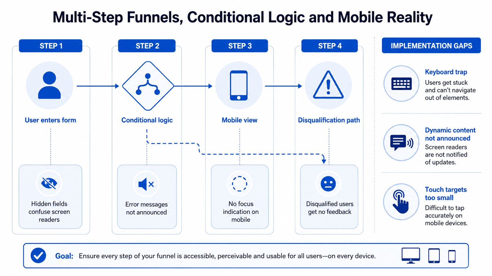
The hidden risk in multi-step funnels is state loss. If a user answers step two, reveals step three, and then the interface changes without announcing what happened, screen reader users can get stranded. WCAG 2.2 adds requirements like Consistent Help, Accessible Authentication, and Redundant Entry, which matter directly when a funnel asks users to repeat information or move through verification steps (WAI forms tutorial). The issue isn't just whether a field is labeled, it's whether the user can keep moving through a changing interface without losing context.
Stage by stage checklist
- Design: Decide which fields are required, and don't make the user rediscover them through error states. Keep the visual order and logical order aligned from the start.
- Build: When a conditional field appears, make sure it enters the accessibility tree in a way assistive tech can understand. If a field disappears, don't leave focus behind on a dead element.
- Launch: Test the full funnel on mobile with the on-screen keyboard open, because that keyboard often covers labels, buttons, or helper text.
- Audit: Check that progress indicators say something meaningful. A decorative bar is not enough when the user needs to know where they are in the flow.
The mobile layer creates its own failures. Tap targets can end up too small to use cleanly, pinch-zoom gets disabled by well-meaning templates, and fields that look fine on desktop collapse into clutter on a smaller screen. If the funnel depends on precise tapping or tiny text, it's not mobile-ready, no matter what the layout says.
I've also seen disqualification paths handled badly. The UI shows an error or a dead end, but the user gets no clear explanation of what happened. That's a conversion problem and an accessibility problem at the same time, because the user deserves a clear outcome even when they're not qualified.
For a practical mobile-focused reference, this six essential mobile form design guide is useful because mobile accessibility failures are often just usability failures with a tighter screen. A form that works on a laptop but breaks under touch, zoom, or conditional changes is still broken.
If a user can't tell what changed between steps, your funnel has turned into a guessing game.
A Practical Pre-Launch Accessibility Checklist
This is the version I'd want inside a project management ticket before launch. Keep it tight, run it in order, and don't ship until every item is checked.
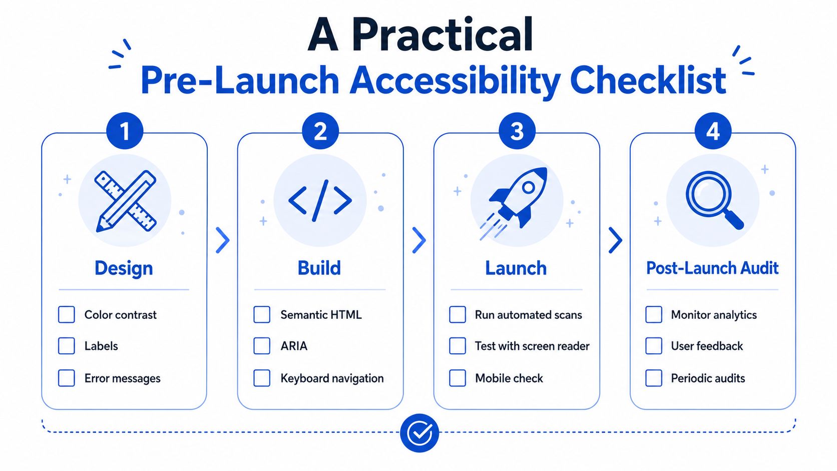
Design
- Label every field clearly: Write real label text, not placeholder text that disappears.
- Reserve space for errors: Don't let the layout collapse when validation messages appear.
- Plan the tab flow: Make sure the visual sequence matches the keyboard sequence.
Build
- Use native controls first: Reach for standard HTML before layering on custom widgets.
- Link help and error text: Attach supporting copy with
aria-describedbywhere it belongs. - Keep focus visible: Test the focus ring at every breakpoint, including mobile.
Launch
- Run a keyboard-only pass: Complete the full form without touching the mouse.
- Test at 200% zoom: Check whether labels, buttons, and errors still fit and remain readable.
- Try one full screen reader path: Use NVDA, VoiceOver, or JAWS through the full flow.
Post-launch audit
- Read user feedback carefully: Look for repeated complaints about getting stuck, repeating data, or not understanding errors.
- Re-test after each funnel change: Conditional logic and copy edits can break accessibility without changing the page design.
- Use automation and human testing together: Automation catches obvious structure problems, but it won't tell you whether the form is usable.
Automated tools are fast, keyboard passes are revealing, and screen readers expose state problems that scanners miss. Real-user testing catches the rough edges that don't show up until somebody tries to complete the form under normal conditions. Use all three, because each one sees a different layer of the problem.
Testing Tools and How to Use Them Together
Automated scanners are useful, but they're not a finish line. Tools like axe, Lighthouse, AudioEye, and Level Access are good at spotting missing labels, contrast problems, and structural issues, which is exactly why they belong in every build workflow. They're also much less reliable at catching the messy parts of a funnel, like step transitions, conditional reveals, and recovery after a failed submission.
That's why the testing stack needs layers. Browser-based extensions help you inspect what's on the page in real time. Screen readers such as NVDA, VoiceOver, and JAWS show you what the user hears. Keyboard-only testing tells you whether a person can move through the form without getting trapped or confused. The combination matters more than any single tool.
Practical rule: If a tool can't complete the funnel end to end, it can't be your only gatekeeper.
A sensible cadence is simple. Scan on every change, run a manual keyboard and screen reader pass before launch, then schedule periodic external review for the forms that matter most. If you run a dedicated analytics layer, a resource like Growform form analytics is useful for spotting where people drop out, but analytics still need human interpretation when accessibility is the root cause of abandonment.
The best teams don't ask which tool is “best.” They ask what each one catches, what it misses, and how quickly they can fix the failures that matter to lead quality. In a funnel, that usually means catching problems before traffic pays for them.
| Tool Type | What It Catches | What It Misses |
|---|---|---|
| Automated scanners | Missing labels, obvious contrast issues, basic structural errors | Flow logic, focus behavior, real-world confusion |
| Browser-based tools | DOM state, runtime behavior, quick checks during development | True user experience and assistive tech output |
| Manual testing | Logic gaps, keyboard traps, screen reader friction | Purely static code issues at scale |
Automation is the first pass. Manual testing is the proof. Real users are the final check.
Accessibility Wins Specific to Growform-Style Funnels
For multi-step, conditional, mobile-first lead funnels, the highest-value accessibility work is usually the work that preserves context. Conditional fields should be removed from the accessibility tree when they're not relevant, step changes should be announced through a live region, and entered data should survive between steps so users don't have to retype what they already gave you. If the funnel disqualifies someone, the outcome should be announced clearly, not left to implication.
What tends to move the needle fastest
- Announce step changes: A brief status update gives screen reader users a clear sense of progress.
- Preserve input across branches: Don't make users start over because they took a different path.
- Make progress informative: The progress indicator should tell the user where they are, not just decorate the page.
The most common objection is that accessibility will hurt conversion. In practice, well-implemented accessibility usually helps because it removes friction for everyone, not just for assistive tech users. The conversion killer is ambiguity, and accessible forms remove a lot of it.
When budgets are tight, fix the basics first. Labels, focus order, and error recovery beat cosmetic redesigns every time. A WCAG 2.1 AA target is still a sensible floor for 2026, but teams building longer funnels should pay attention to the WCAG 2.2 behaviors that affect multi-step flows, especially the ones around help availability, repeated entry, and authentication.
Bots and verification are a separate concern. Phone and email checks should reduce junk, not lock out real users who need a little extra time or who rely on assistive technologies. If a verification step becomes a wall, it needs to be redesigned, not defended.
One option in this space is Growform, which is built for multi-step lead capture and conditional qualification. The product choice matters less than the implementation choices, though, because even a strong builder can ship a broken funnel if labels, focus, and state changes are handled carelessly.
If you're auditing a live form today, start with three fixes, real labels, predictable focus after errors, and clear announcements when the funnel changes state. Those three changes usually uncover the rest of the work that needs doing.
If you want a lead form that's built for qualification flows without forcing users into dead ends, start by reviewing how Growform handles multi-step capture, conditional logic, and mobile-first completion. Then test your current funnel against the checklist above and fix the places where users have to guess.