
Mobile Conversion Optimization for Lead-Gen Funnels

Mobile traffic is now the default, not the exception, and that's exactly why mobile conversion optimization has become a hard revenue problem instead of a cosmetic UX project. Recent benchmark data puts mobile at about 65% of all website traffic, while it converts at 1.82% versus 3.14% on desktop, a 42% gap that widened from 38% in 2024 to 42% in 2026 despite continued mobile-first design investment (digitalapplied.com). In lead gen, that gap hits harder because mobile is often the first touchpoint from paid social, native ads, and search, so friction doesn't just lower completion, it raises cost per lead and weakens downstream revenue.
A common mistake is treating mobile as a compressed version of desktop. This works poorly in lead-gen funnels because the user is doing three things at once: evaluating trust, reading the offer, and deciding whether the form is worth the effort. Ecommerce guides tend to stop at checkout, but lead-gen stacks have a second problem: attribution plumbing has to survive the click, and qualification has to happen without destroying completion.
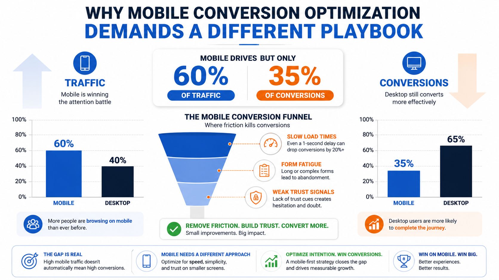
The right way to think about it is as a three-layer system, mobile UX, technical plumbing, and lead qualification. If any one of those breaks, the funnel underperforms. If all three work together, mobile stops being the channel that leaks budget and starts becoming the channel that feeds sales with usable leads.
Table of Contents
Table of Contents
- Why Mobile Conversion Optimization Demands a Different Playbook
- Designing Multi-Step Forms That Reduce Mobile Abandonment
- Technical Performance and Attribution Plumbing
- Qualification and Verification Without Killing Completion
- Testing Framework and Metrics That Actually Matter
- Deployment Playbooks for Performance Teams and Agencies
Why Mobile Conversion Optimization Demands a Different Playbook
Mobile doesn't just convert worse, it breaks in different places. Across broader CRO benchmarking, analysts report average mobile conversion rates around 2.3%, below tablets at 3.1% and desktops at 2.8%, while ecommerce-specific reporting puts mobile in the 1.8% to 2.8% range and desktop closer to 3.6% to 3.9%. That gap matters because mobile is not a smaller desktop experience, it is a more fragile one.
Why lead-gen funnels break differently
In ecommerce, the user can browse, compare, and buy later. In lead gen, the form itself is the sale. Every extra tap, every unclear field, every delay in loading, and every missing trust cue hits completion rate directly.
Paid social and native traffic make the problem sharper because the session often starts on a phone, in a noisy environment, and with low patience. If the landing page feels slow or the form asks for too much too early, the visitor bounces before the sales team ever sees the lead. The mobile lead-gen version of the problem is tighter than the general advice in conversion optimization tips from MarTech Do, because you are not just improving a page, you are trying to keep a fragile handoff intact.
The three layers that need to work together
The UX layer is what the visitor sees and feels, form length, button size, keyboard behavior, and visual clarity. The technical layer is what makes the journey measurable, UTMs, click IDs, CAPI, and hidden fields that do not drop off halfway through the flow. The qualification layer is what protects the sales team from junk without making legitimate prospects pay the friction tax.
Practical rule: if mobile completion rises but lead quality falls, the funnel did not improve, it just got easier for the wrong people.
That is why a mobile-first form strategy has to include a clean front end, a reliable attribution chain, and a qualification system that filters without scaring off good leads. For teams building the front end of that stack, this mobile form design guidance is a useful reference point for layout and interaction patterns, but the bigger win comes from wiring the whole funnel together instead of treating the form as a standalone asset.
Designing Multi-Step Forms That Reduce Mobile Abandonment
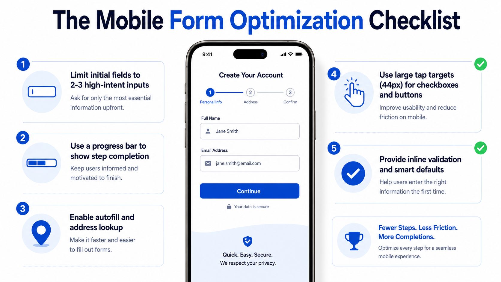
The easiest mobile form to complete is the one that doesn't feel like a form at all. That usually means the first screen asks for 2 to 3 required fields only, then the rest of the qualification happens in steps that feel manageable on a phone. The goal isn't fewer questions overall, it's fewer decisions per screen.
Start with the smallest possible commitment
The first screen should capture only the highest-intent inputs, usually name, phone, or email, depending on the campaign objective. Once someone has started, a progress indicator helps keep them moving, especially when the remaining questions are more sensitive or more detailed. If the form is long, multi-step structure turns a wall of friction into a sequence of small commitments.
A quiz-style layout works well when the questions can be presented as one decision at a time. That format is especially useful when qualification depends on branching logic, because the user only sees follow-up questions that matter. Conditional logic is the difference between a form that feels personalized and a form that feels nosy.
Use mobile-friendly inputs, not just mobile-friendly design
The interface has to cooperate with the keyboard. Email fields should trigger the email keyboard, phone fields should trigger numeric input, and address fields should support lookup or autofill where possible. Those details sound minor on desktop, but on mobile they remove tiny points of resistance that add up fast.
Floating labels are useful because they keep context visible without consuming space. Inline validation is even more important because it lets the user fix errors as they go instead of discovering them at the end. Skeleton states help too, especially when the form is transitioning between steps and you don't want the page to feel frozen.
A few field-level standards matter a lot on touch screens:
- Keep initial forms short: 2 to 3 fields for high-intent entry points, then expand later.
- Use large tap targets: make checkboxes and buttons easy to hit without zooming.
- Keep labels readable: small text creates avoidable errors on narrow screens.
- Surface validation immediately: don't make people hunt for the broken field.
- Avoid clutter near the CTA: dense navigation or promos create accidental taps.
The internal pattern is simple. Ask less at the start, show progress, and only reveal what's needed next. If you want a reference implementation for the form architecture itself, Growform's multi-step form UX guidance maps closely to these tactics without forcing a generic survey experience.
Good mobile forms don't feel shorter because they ask fewer questions. They feel shorter because each step is easier to finish.
Technical Performance and Attribution Plumbing
A mobile form can look polished and still underperform if the page is slow or the tracking breaks. Performance and attribution are not separate concerns, because a slow or unstable page reduces completion and a broken chain makes it impossible to tell what worked. Teams that test creatives and headlines before fixing this layer usually end up optimizing noise.
Set a speed budget before you test anything
A practical mobile baseline is to keep LCP under 2.5 seconds, CLS below 0.1, and INP at or below 200 ms at the 75th percentile (Media Search Group). Those targets give you a speed budget that the funnel has to respect before you start arguing over button colors or microcopy. Compress hero media, defer non-critical JavaScript, and use CDNs and caching so the page doesn't stall on mobile networks.
The load experience matters more than many organizations admit. Industry reporting tied to 2026 commerce benchmarks says mobile sites that load in two seconds or less are reported to achieve a 15% higher conversion rate, while every 0.1-second delay can reduce conversions by 8.4% (AMRA & Elma). You don't need to quote those numbers in every meeting, but you do need to act like mobile patience is finite.
Make attribution survive the whole journey
Hidden fields should carry UTMs, click IDs, source, and sub-IDs from the first interaction through submission. In a multi-step flow, the failure mode is often subtle, the first page captures the data, the second page drops it, and the CRM receives an incomplete record that looks fine at a glance. That's a revenue problem disguised as a tagging issue.
Server-side tracking matters for the same reason. Facebook and Meta conversion APIs, plus similar server-side setups, help preserve signal quality when browser-level tracking becomes inconsistent. Growform's Meta CAPI setup notes are relevant here because the product layer has to pass clean events to the ad stack, not just render a nice form.
Operational rule: if your hidden fields don't persist across every step, your attribution is already damaged before the lead reaches the CRM.
One practical advantage of getting this right is that your team can separate creative problems from funnel problems. If the ad drives qualified traffic but the backend shows missing source data or broken event flow, the issue isn't media buying. It's plumbing.
Qualification and Verification Without Killing Completion
Qualification is where mobile lead gen becomes a balancing act. Ask too little and sales wastes time on junk. Ask too much and the visitor drops before the lead exists. The best systems use sequencing, not interrogation.
Reveal harder questions only when they're relevant
Conditional logic and logic jumps let you ask follow-up questions only after the user has shown intent or selected a path that makes the question relevant. That keeps the form from feeling like a compliance checklist. It also means disqualification can happen early, before the user invests too much time.
Practical rule: disqualify cleanly, don't bury bad-fit users in a long form hoping they give up.
If the lead doesn't fit the offer, the form should route them out quickly and clearly. That protects completion rates for valid prospects and keeps downstream teams from dealing with uncontactable or irrelevant submissions. Progressive profiling helps too, because some qualifying data can be collected after the first conversion instead of on the first screen.
Verify without making the user do extra work
Real-time phone and email verification cuts fake submissions and typo-driven dead ends before they hit the CRM. The key is to run those checks in the background or at the point where the user has already committed, so the verification doesn't feel like a separate obstacle. That's especially useful on mobile, where correction effort is higher and patience is lower.
Compliance evidence capture belongs in the same conversation. TrustedForm and Jornaya are common requirements in lead-gen stacks that need consent proof attached to the submission, especially in regulated verticals. In practice, that means the form has to collect and pass evidence cleanly, not just store a name and phone number.
A simple operating model works well:
- Use conditional paths: ask more only when the prior answer makes it necessary.
- Verify in real time: catch obvious bad data before it reaches sales.
- Capture compliance evidence: attach consent proof at submission time.
- Profile progressively: move non-critical questions into later touchpoints.
This is also where Growform fits naturally as a capture layer, because it's built for multi-step qualification, hidden field pass-through, and real-time delivery into CRMs and lead distribution systems. That matters more than flashy form effects, because a pretty form that breaks the handoff still loses money.
Testing Framework and Metrics That Actually Matter
Mobile testing gets messy fast if teams only watch headline conversion rate. On lead-gen funnels, a higher submission rate can hide worse lead quality, weaker acceptance, or a broken attribution chain. The test has to measure what happens after the submit button, not just at the submit button.
Track metrics that connect to revenue
Start with the metrics that tell you whether the funnel is improving. Cost per lead shows efficiency, lead quality scores show whether the prospects are worth keeping, and downstream acceptance rates show whether sales or buyer systems trust the traffic. If those move in different directions, you've learned something useful, even if the form conversion rate looks cleaner on paper.
| Mobile Conversion Testing Metrics | Target | Why It Matters |
|---|---|---|
| Form completion rate | Directional improvement, not isolated success | Shows whether the mobile UX is reducing friction |
| Cost per lead | Lower, without quality loss | Connects mobile changes to acquisition efficiency |
| Lead quality score | Stable or higher | Prevents low-friction junk from distorting results |
| Downstream acceptance rate | Stable or higher | Confirms sales or buyer teams still want the leads |
| Attribution match rate | High and consistent | Verifies UTMs, click IDs, and source data survived |
| Verification pass rate | Stable, without added abandonment | Shows whether validation is catching bad data cleanly |
Test in a way mobile traffic can actually support
Mobile traffic is often smaller and more variable than desktop traffic, so test design matters. Don't stack multiple changes into one experiment unless you already have a high-volume account and clean attribution. When mobile and desktop behave differently, isolate device segments instead of averaging them into a misleading blended result.
One useful reference point for the broader measurement mindset is Prometheus Agency's AI-driven revenue system notes, since the job here is connecting on-site behavior to revenue outcomes. That doesn't replace your own funnel data, but it reinforces the right question, did the lead become valuable downstream?
Use tighter controls when you're testing on mobile:
- Fix attribution first: otherwise you can't trust the result.
- Hold one variable constant: especially on low-traffic campaigns.
- Watch post-submit quality: don't stop at form completion.
- Segment by device: mobile and desktop rarely respond the same way.
- Prefer clean wins over messy lifts: a small reliable gain beats a noisy spike.
The goal isn't to win an A/B test in isolation. The goal is to produce a mobile funnel that makes more qualified leads at a lower effective cost.
Deployment Playbooks for Performance Teams and Agencies
A good mobile rollout fails less on strategy than on coordination. The performance team may have the form ready, but if the CRM mapping is wrong, the webhook is off, or the sales team isn't prepared to score the new lead shape, the launch creates confusion instead of lift. Agencies face the same issue at client scale, just with more moving parts.
What the first month should look like
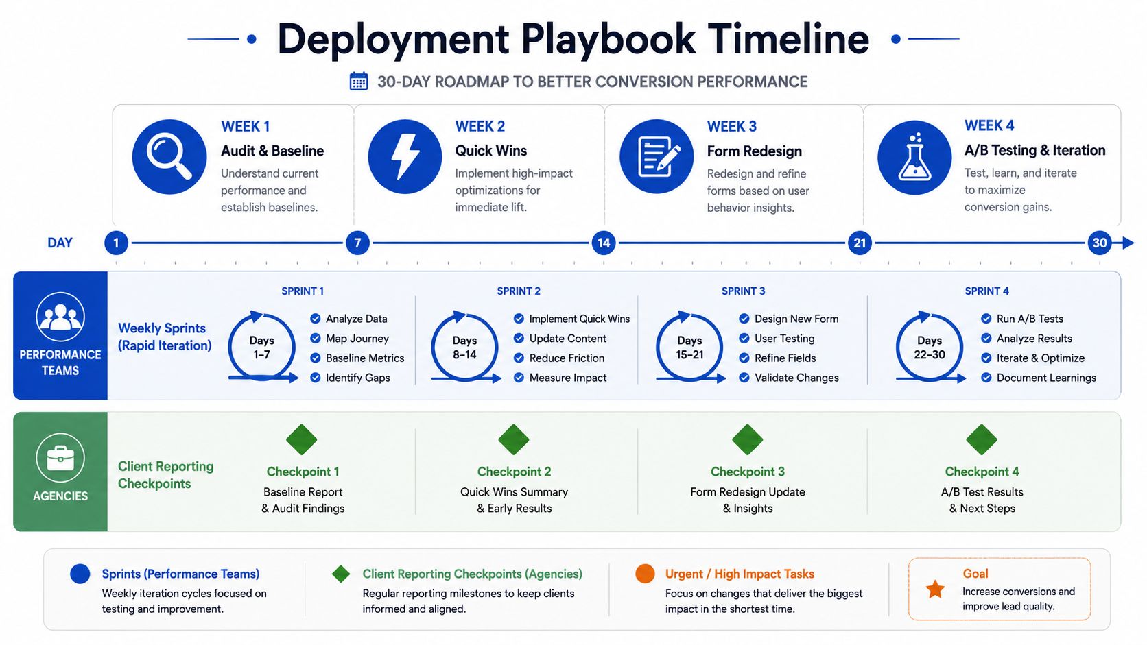
Week 1 is audit and baseline, with device testing on real phones, not just emulators. Week 2 is quick wins, usually speed fixes, field reduction, and tracking repair. Week 3 is form redesign, and Week 4 is A/B testing and iteration once the plumbing is stable.
Performance teams should work in weekly sprints so the funnel doesn't sit untouched between launches. Agencies should build reporting checkpoints into the process so clients see what changed, what was measured, and what downstream feedback came back from sales. If the lead quality shifts, the client needs to know whether the shift came from targeting, qualification, or form friction.
A clean rollout checklist keeps the launch from turning into a cleanup project:
- Test on real mobile devices: touch behavior and scroll issues don't show up reliably in emulators.
- Verify pixel and webhook settings: form submissions should hit every downstream destination.
- Confirm CRM field mapping: hidden fields and qualification data need to land where teams can use them.
- Align with sales feedback: low-quality leads should trigger a form or routing review.
- Document the baseline: if you don't know the starting point, you won't trust the lift.
Mobile conversion optimization works best when it's treated like an operating system, not a one-off redesign. The teams that win are the ones that keep UX, attribution, and qualification in the same conversation after launch, not before it.
If you're building mobile lead-gen funnels and want the form layer to do more than just look good on a phone, visit Growform to see how multi-step qualification, hidden field pass-through, and real-time delivery can fit into your stack. It's a practical option for teams that need mobile completion, clean attribution, and lead quality to move together instead of fighting each other.