Radio Button
« Back to Glossary IndexQuick Summary
Radio buttons let users pick one clear option from a set, making forms easier to complete and responses more accurate. In this article, we covered when to use them, how they differ from checkboxes, and why they improve form performance. Growform makes adding smart, effective radio buttons to any form simple. Check our blog for more tips for optimizing your forms.
Looking to Understand Radio Buttons and How They Work?
Radio buttons are a common form element, allowing users to choose only one option from a predefined set. Whether you’re creating a survey, signup form, or payment selection, radio buttons help streamline decision-making by ensuring only one choice is made at a time.
In this Growform article, we’ll explore how radio buttons work, how to implement them in HTML, and how using a platform like Growform simplifies the process.
Why Listen to Us?
At Growform, we help businesses build smart, high-performing forms designed specifically to capture more quality leads. We know exactly what makes forms convert and how details like clear, effective radio buttons can significantly improve user experience, reduce friction, and boost completion rates. We’re here to help you get forms right.

What is a Radio Button?
A radio button is an input type that lets users select one option from a group of options. It’s ideal for situations where only a single choice is allowed, such as answering a multiple-choice question.
The name “radio button” comes from early car radios, where pressing one station button would pop out the others, leaving only one selected at a time. With radio buttons, choosing a new option automatically deselects the previous one.
For example, when choosing a shipping method during an online purchase, users may select Standard, Express, or Overnight Shipping. Only one option can be selected, making it the perfect use case for radio buttons.

Radio Buttons vs. Checkboxes
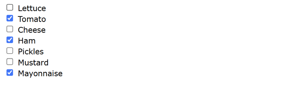
Radio buttons allow only one selection from a list, which is ideal for exclusive choices like payment methods. Checkboxes, however, allow multiple selections, which is perfect for preferences or agreeing to terms.
For example, you can’t use radio buttons when selecting all the ingredients you want on a sandwich because this allows multiple selections. So, you use checkboxes as shown below:
Why Use Radio Buttons?
Radio buttons in buttons improve usability and help guide users through decision-making processes smoothly. Here’s why they matter:
- Mutually Exclusive Selection: Users can only pick one option, so there’s no risk of conflicting inputs.
- Immediate Visibility: All options are shown up front, making it easy for users to scan and decide.
- Simplified Decision Process: Perfect for simple questions, reducing the mental effort needed to choose.
- Enhanced User Experience: Fewer mistakes and less need for extra validation.
- Consistency: They’re familiar and align with standard UI practices, making your interface intuitive.
Implementing Radio Buttons in HTML
Using our shipping options example, here’s how to implement Radio Buttons in your HTML forms:
Step 1. Use the <input type=”radio”> Element
Start by using the <input> tag with type=”radio”. This tells the browser to render it as a radio button.
<input type=”radio”>
Step 2. Group Options Using the Same name Attribute
To ensure only one option can be selected at a time, give all related radio buttons the same name. This groups them together.
<input type=”radio” name=”shipping” value=”standard”>
<input type=”radio” name=”shipping” value=”express”>
<input type=”radio” name=”shipping” value=”overnight”>
If the name values are different, users could select multiple options, and this would defeat the purpose of Radio Buttons.
Step 3. Label Each Option Clearly
Use the <label> tag and link it to the input using the for attribute (which matches the input’s id). This improves accessibility and lets users click on the label to select the option.
<input type=”radio” id=”standard” name=”shipping” value=”standard”>
<label for=”standard”>Standard Shipping</label>
Repeat for “Express” and “Overnight” with corresponding IDs and labels.
Step 4. Set a Default Option (Optional)
You can pre-select a radio button using the checked attribute if you want to suggest a default choice.
<input type=”radio” name=”shipping” value=”standard” checked>
Step 5. Verify the Result
These lines of code will give you a clear, user-friendly HTML form where users select one shipping method, as shown below:

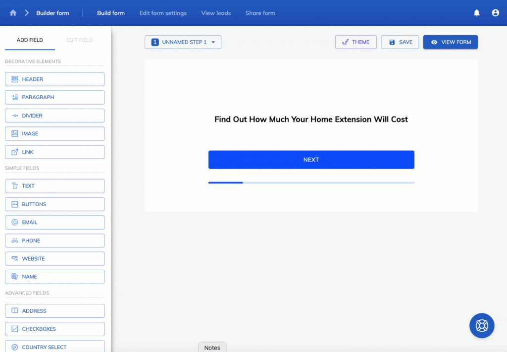
Implementing Radio Buttons in Growform
Growform offers an intuitive platform for creating forms with radio buttons, simplifying the process compared to traditional HTML implementations.
To set up radio button functionality in Growform, use the “Buttons” field. This field lets users select one option from a list, just like traditional radio buttons. Simply add the field, input your options, and ensure it’s set to single selection mode.
Advantages of Using Growform Over HTML
- User-Friendly Interface: Growform’s drag-and-drop builder allows for easy addition and customization of radio buttons without manual coding.
- Design Flexibility: Choose between rectangle or square button styles, with options to adjust spacing, layout, and incorporate images.
- Responsive Design: Buttons automatically adjust for optimal display on both desktop and mobile devices.
- Advanced Features: You can enhance form functionality and appearance by using conditional logic, custom CSS, and analytics integration.
Best Practices for Implementing Radio Buttons
- Be Clear and Specific with Wording: Use concise, easy-to-understand labels. Avoid technical terms or ambiguity, so users know exactly what each option means.
- Order Options Logically: Arrange choices in a natural or meaningful order—alphabetical, numerical, or by popularity—to reduce decision time.
- Use Vertical Layouts When Possible: Displaying options vertically improves readability, especially when labels are longer or on mobile devices.
- Avoid Overloading with Too Many Options: Radio buttons work best with limited choices. Consider using a drop-down to save space if there are more than 5–6 options.
- Provide Visual Feedback: Make selected states visually distinct so users can immediately recognize which option is active.
- Ensure Accessibility: Support screen readers and keyboard navigation by properly associating labels and using semantic HTML.
- Test Across Devices: Check that your radio buttons function well on mobile, tablet, and desktop, ensuring consistent experience and responsiveness.
Conclusion
Radio buttons might be small, but they play a big role in keeping your forms clear and easy to complete. They help users make quick, confident choices, and that leads to better data and higher conversion rates.
With Growform, adding clean, mobile-friendly radio buttons takes just a few clicks. No code, no clutter, just smart form design that works. Whether you’re qualifying leads or running surveys, Growform helps you build forms that guide users smoothly from start to submission.
Start your 14-day free trial today and build better forms with Growform!