Squeeze Page
« Back to Glossary IndexQuick Summary
This guide explores the key strategies behind a high-converting squeeze page, covering everything from removing distractions and crafting compelling CTAs to optimizing form fields and offering irresistible incentives. Learn how to design a page that captures more leads effortlessly while keeping the sign-up process smooth. For expert insights on lead generation, visit the Growform blog.
Cutting Through the Noise with Squeeze Pages
Ever landed on a page asking for your email in exchange for something valuable? That’s a squeeze page—a focused landing page designed to capture leads with a clear offer and call-to-action (CTA).
Marketers love them because they eliminate distractions, making sign-ups effortless. The goal? More leads, better conversions, and a direct connection with potential customers.
This Growform guide breaks down how squeeze pages work, the key elements that drive conversions, and how to create one that delivers results.
Why Listen to Us?
At Growform, we build high-converting squeeze pages designed for maximum lead generation. Our users see up to 2x more qualified leads with our optimized, multi-step forms. With proven results and 5,000+ integrations via Zapier, Growform helps businesses capture more leads—efficiently and effectively.

What is a Squeeze Page?
A squeeze page is a streamlined landing page designed with one goal: capturing a visitor’s email address in exchange for something valuable, like a free guide, webinar, or discount. Unlike regular web pages, it removes all distractions, keeping visitors focused on signing up.
What makes a great squeeze page?
- A Compelling Headline: Instantly grabs attention and communicates the value of signing up.
- An Irresistible Offer: A freebie, exclusive content, or discount that makes giving up an email a no-brainer.
- Minimal Form Fields: Asking only for what’s necessary keeps sign-ups quick and effortless.
- A Strong Call-to-action (CTA): A clear, action-driven button like “Get My Free Guide” instead of a generic “Submit.”
- Trust Elements: Testimonials, security badges, or social proof to build credibility and ease hesitation.
Done right, a squeeze page feels like a fair exchange—visitors get something valuable, and businesses gain potential customers.
Squeeze Pages vs. Landing Pages: What’s the Difference?
At first glance, squeeze pages and landing pages seem similar, but they serve different purposes. A squeeze page is a hyper-focused tool for capturing email addresses, while a landing page can serve broader marketing goals, such as selling a product or collecting customer information.
| Feature | Squeeze Page | Landing Page |
|---|---|---|
| Form Length | Short—usually just an email field. | Can vary, often collecting more user details. |
| Page Length | Minimal, with little to no scrolling. | Can be long, providing detailed content. |
| Focus | Solely designed for lead capture. | Can support multiple goals, like sales or event sign-ups. |
| Traffic Sources | Driven by targeted ads, email, or social media. | Can attract visitors through SEO, paid ads, referrals, and more. |
| Call-to-Action (CTA) | Direct and opt-in focused, like “Get My Free Guide.” | Varies—could be “Buy Now,” “Learn More,” or “Sign Up.” |
Why You Need a Squeeze Page
Higher Conversion Rates
Squeeze pages drive more conversions by eliminating unnecessary elements. With no navigation links, sidebars, or competing CTAs, visitors have a single decision to make—sign up or leave.
The best squeeze pages use:
- A single, clear CTA that directs attention to the opt-in form.
- Minimal form fields to reduce hesitation and increase submissions.
- Urgency or exclusivity that motivates visitors to act immediately.
Every element is optimized to remove friction and guide users toward action.
More Targeted Email Lists
Instead of collecting passive subscribers, a squeeze page filters out unqualified leads, ensuring only engaged users sign up. This results in higher email open rates, stronger engagement, and more qualified prospects for future marketing efforts.
Key elements that contribute to list quality include:
- A highly relevant lead magnet that speaks to visitor pain points.
- Clear, focused messaging that aligns with the audience’s needs.
Cost-Effective Lead Generation
Because squeeze pages focus entirely on conversions, they reduce wasted ad spend and increase ROI. Instead of sending traffic to a general page, businesses capture leads efficiently, turning each visitor into a long-term marketing asset.
Every part of the page works toward one measurable goal—generating leads with minimal costs.
Creating a Squeeze Page that Works (5 Best Practices)
- Keep It Distraction-Free
A squeeze page’s power comes from its singular focus—capturing leads. Anything that doesn’t support that goal should be removed. Extra links and unnecessary content only give visitors a way to exit before converting.
- No Navigation Menus: Prevents users from clicking away.
- No Excess Copy: Every word should reinforce the opt-in.
- One Cear CTA: Multiple calls to action create confusion.

For example, HubSpot’s Marketing Plan Template squeeze page follows this principle flawlessly. There are no navigation links. Instead, there’s a concise copy that highlights the value and a single CTA (“Download for Free”) that directs visitors toward the only action that matters—downloading the template.
- Use a Compelling Offer
Nobody gives away their email for free. The incentive needs to feel like an irresistible trade, where the value outweighs any hesitation about signing up.
- Exclusive Content: E-books, research reports, or webinars that solve a problem.
- Discounts or Free Trials: Great for SaaS and eCommerce businesses.
- Templates or Tools: Actionable resources that help users achieve quick wins.
A great example is Mindful’s “How to Meditate” squeeze page. It offers a clear, valuable lead magnet—a simple, beginner-friendly meditation guide.
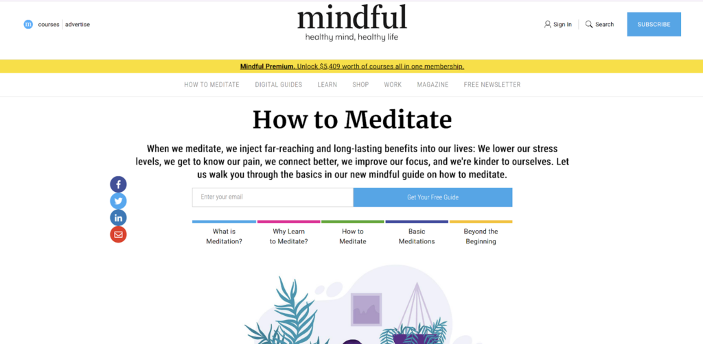
The page instantly communicates why this content matters, using trust signals like expert endorsements and clear, actionable copy. The offer feels like a low-risk, high-reward exchange, making it easy for visitors to opt in.
- Optimize Form Fields
The longer the form, the fewer the sign-ups. Visitors don’t want to fill out unnecessary fields, so the form should feel quick and frictionless.
- Multi-Step Forms: Breaking forms into steps increases completion rates by making sign-ups feel effortless.
- Smart Field Customization: Only ask for what’s essential to reduce hesitation.
- Progress Indicators: Showing how far a user has left to complete encourages follow-through.
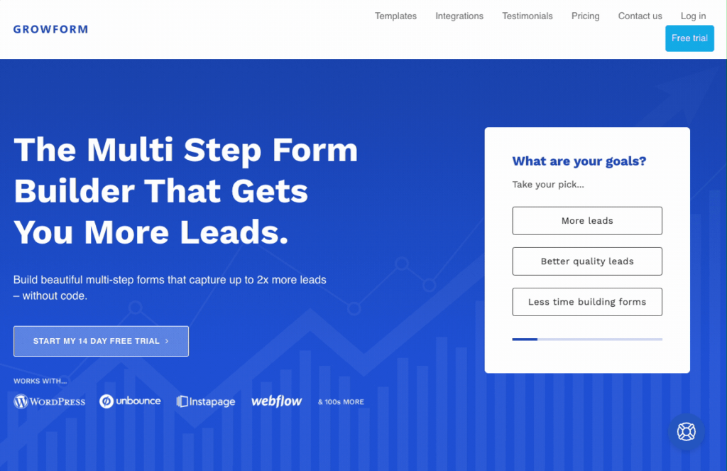
Multi-step forms, like those offered by Growform, create a smoother user experience by presenting one question at a time. Instead of overwhelming users with too many fields at once, our multi-step forms guide them through a structured journey, improving lead quality and completion rates.
This approach keeps visitors engaged, reducing form abandonment and improving lead quality.
Want a multi-step form like this? Growform makes it easy—see how it works with a free 14-day trial.
- Craft a Strong CTA
A weak call-to-action (CTA) kills conversions. Visitors need clear direction and a compelling reason to click.
- Action-Oriented Language: “Get My Free Guide” is stronger than “Submit.”
- Benefit-Driven Messaging: Reinforce what users gain by opting in.
- High-Contrast Design: A CTA button should stand out visually.
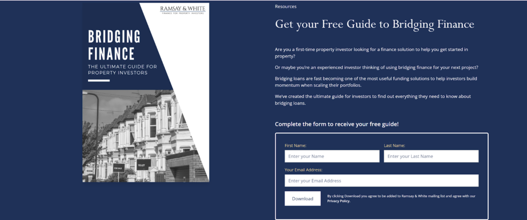
Ramsay & White’s “Guide to Bridging Finance” page nails the CTA. “Download” is clear and easy to see, while a bold, high-contrast button grabs attention. The copy also reinforces what users gain, making clicking feel like the obvious next step.
A great squeeze page guides users toward action. The CTA should make it feel like clicking is the next logical step.
- A/B Test for Optimization
Even small changes can make a huge impact. A/B testing helps identify what resonates most with visitors, refining each element for maximum conversions.
- Headlines: Clarity vs. curiosity-driven messaging.
- Form Design: Single-step vs. multi-step formats.
- CTA Placement and Wording: Subtle tweaks can drive major lifts in sign-ups.
By continually testing and optimizing, a squeeze page never stops improving, ensuring long-term growth and better lead generation.
Make Your Squeeze Pages Better with Growform
A well-designed squeeze page removes distractions, highlights a compelling offer, and streamlines the conversion process. By following best practices—keeping the page focused, optimizing forms, and crafting strong CTAs—you can significantly increase lead generation and capture high-quality prospects. Growform makes this process even easier.
Growform is built for businesses that need high-converting, multi-step forms without complexity. With intuitive customization, seamless integrations, and conversion-focused designs, Growform helps you create squeeze pages that maximize leads and engagement—all without writing a single line of code.
Start building smarter, higher-converting squeeze pages with Growform today.