10 Landing Page Best Practices For More Conversions (With Examples)
Quick Summary
We explain 10 top landing page best practices. Here’s a brief recap:
- Focus on one clear goal.
- Write a simple, benefit-driven headline
- Use multi-step forms to reduce friction
- Use a strong, action-oriented CTA
- Mobile-first design
- Add social proof and trust signals
- Personalize based on intent.
- Align your landing page message tightly with ads and traffic sources.
- Experiment and A/B test
- Use templates
Use proven templates as a starting point instead of reinventing the wheel.
Struggling to Improve Your Landing Page Conversions?
Landing pages are ridiculously easy to create. That is the fun part.
The not-so-fun part is realizing the page you just shipped is doing almost nothing for you.
A landing page that converts is equally EASY to get wrong if you skip important landing page best practices.
In this Growform guide, we will walk through core landing page best practices to avoid that spiral and give every visitor a clear, simple path to “yes”.
But first…
Why Listen to Us?
Lead gen is what we do all day at Growform. High-converting multi-step forms are one part of it, and solid landing pages are the other. So when we share landing page best practices, you can trust it comes from hands-on, tested experience.
Our Top Landing Page Best Practices to Maximize Conversions
1. Keep Your Landing Page Focused on a Single Goal
A landing page should do one main thing.
Not “book a demo + start a trial + read the blog + join the newsletter.” One clear next step. Everything else either supports that step or gets out of the way.
And we’re not saying this just because…
So many AB tests and studies back this up. For example.
- Pages with a single primary CTA tend to convert better than pages with lots of competing links.
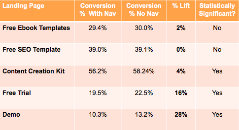
- Removing header/footer navigation on landing pages has repeatedly increased conversions, sometimes by 16–28% for mid-funnel offers.
It’s an innocent mistake most marketers make. We want to funnel leads into different pipelines/intents with one landing. But you’ll be better off doing this instead
- Decide the page’s job in one sentence.
“This page exists to get people to book a demo.” If you can’t say it that clearly, pause and fix that first. - Make the CTA match that job.
Repeat the same action: “Book a demo”, “Get the quote”, “Start your free trial”. Same button, multiple places, one outcome. - Cut or downplay everything else.
Remove nav for campaign pages. Get rid of random “learn more” buttons that send people elsewhere. If something doesn’t help someone feel ready to click the main CTA, it’s either rewritten or removed.
When someone lands on that page, they shouldn’t need to think hard about what to do. The next step should feel obvious and natural. That’s what “one goal” really means.
2. Write a Compelling, Benefit-Driven Headline
Headlines do most of the heavy lifting on a landing page.
People decide in a couple of seconds whether to stay or bounce, and the headline is the first thing they actually process.
You don’t need to “be clever”. You need to answer one question fast:
“What do I get if I stick around?”
That’s all “benefit-driven” really means.
In our experience, this structure works 99% of the time:
[Clear outcome] +/- for [who it’s for]
For example:
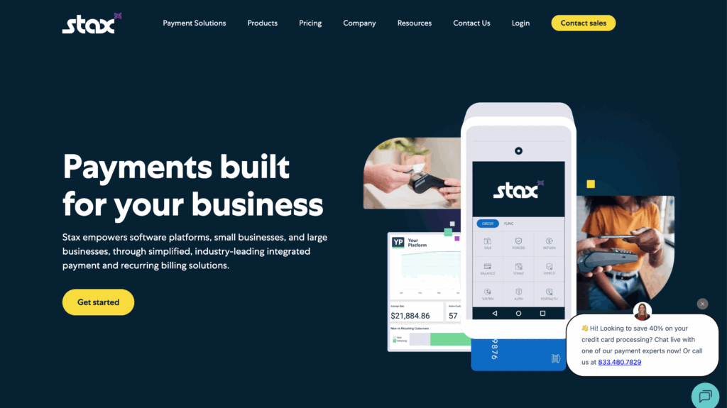
Stax:
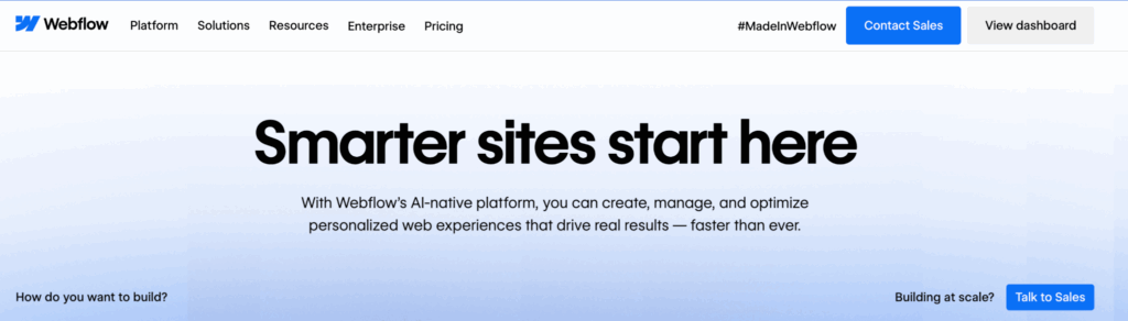
Webflow: smarter sites start here
Zapier: the most connected AI orchestration platform
…you get the idea.
It’s simple, but it works.
Besides this, you should also take note of some practical, unwritten rules.
- Lead with the outcome, not the tool: “Forms that turn more visitors into leads” is clearer than “A powerful, flexible form builder.”
- Keep it specific: “Get more signups from your PPC traffic” beats “Grow your business online.”
- Make the subheadline do the explaining: Let the main headline be simple and punchy, then use a short subheadline to add context:
- Test, don’t guess: If you’re unsure between two angles (e.g. “save time” vs “get more leads”), A/B test them. You’ll almost always learn something about what your audience actually cares about.
If someone only reads your headline and subheadline, they should still understand what you do, who it’s for, and why it’s worth 10 more seconds of their attention.
3. Use Multi-Step Forms to Reduce Friction
When people talk about landing page best practices, they talk about EVERYTHING while skipping the forms.
It’s strange because this largely ignored element can be the difference between a hit and a miss.
Over time, we’ve found that if your landing page form asks for more than a name and email, using a single long page, people find it difficult to complete.
External studies and even psychology back this up, of course.
Cognitive load theory states that processing too much information at once can lead to cognitive overload in working memory, which can slow down and hinder task completion
But when you break that same form into steps, completion can jump from around 4–5% to 13–14%, and in some cases, multi-step forms have delivered 80–300% higher conversion rates.
You get what we’re driving at now: multi-step forms.
Now, this is exactly where Growform comes in.
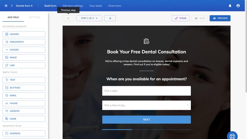
Growform is a multi-step form builder built specifically for conversion: psychology-backed templates, progress indicators, and components like loaders and address lookups are baked in.
It’s designed to help you get up to 2x more leads than a traditional single-step form, and it plugs into most landing page tools and 300+ destinations via Zapier.
Want to see this in action? You can start with our 14-day free trial today.
4. Use a Strong, Action-Oriented CTA
The CTA is the moment of truth. You’ve done all the work to get someone to care… the button is where they decide if they’re in or out.
You don’t need clever wordplay here. You need a short line that makes the next step obvious and low-friction.
Think:
Verb + clear outcome
Examples:
- “Book your demo”
- “Get your custom quote”
- “Start free trial”
- “Build your form”
All of those say what happens when you click, not just that you should click. Buttons like “Submit” or “Click here” usually underperform because they don’t tell people what they’re getting for the effort.
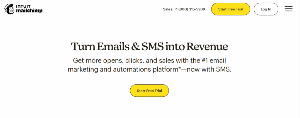
Most businesses with successful landing page strategy understand this fact. Just look at Mailchimp, for example.
Here are some other important things to keep in mind:
- Lead with a verb. “Get”, “Book”, “Start”, “Download”, “See” all work well.
- Make it specific. “Get your quote” is stronger than “Get started”.
- Keep it consistent. If the main action is “Book a demo”, every primary button should say some version of that – not five different CTAs fighting each other.
- Make it easy to spot and tap. Clear button, good contrast, plenty of space around it, especially on mobile. Put it where the eye naturally lands (hero, after a strong proof section, near the end).
5. Make Sure Your Landing Page is Optimized For Mobile Users
Most of your visitors are on their phones now. Recent reports put mobile at around 60–65% of global web traffic, with desktop taking the rest. Yet, mobile still converts worse: desktop often converts 1.5–1.7x better than smartphones.
It sounds ironic, but it happens because many developers still design for desktop first.
They follow all the landing page best practices for desktop, then try to shrink it down for mobile.
NO
You should be mobile first, not mobile last.
Open your mockup on a phone-sized frame and ask:
- Can I see what this is, who it’s for, and what to do next without scrolling forever?
- Cut anything that gets in the way of that.
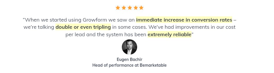
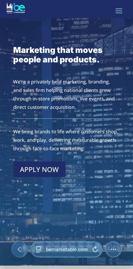
One of our clients, BeMarketable, exemplifies this:
You also need to make it fast. Mobile users are impatient. Google’s research found that as page load goes from 1 to 3 seconds, bounce probability jumps 32%, and it keeps getting worse as you get slower.
This is a huge topic on its own. But here’s an overview of some common things you can do:
- Compress images
- Ditch heavy background videos on mobile,
- Minimize third-party scripts,
- And test your page speed on 4G/5G, not office Wi-Fi.
Last but not least: make tapping painless
- Use big, full-width buttons with plenty of space around them.
- Use readable font sizes.
- Keep forms short and clean – mobile has the highest cart/checkout abandonment, partly because forms suck on small screens.
Set the right keyboard for each field (email, number, etc.) so filling it out feels easy.
6. Add Social Proof & Trust Signals
People don’t really believe what you say about yourself. They just give you a “bombastic” sideeye when you say those things.
They believe what other people say and what the page shows them.
That’s all this section is about:
- Social proof = “People like you use this and it works.”
- Trust signals = “It’s safe to give us your details or card.”
Done well, this isn’t a “nice to have”.
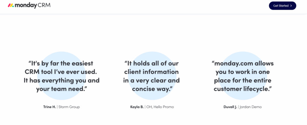
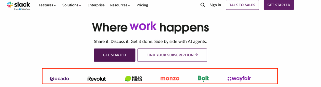
- For example, pages with customer testimonials have been shown to convert around 30–35% better than pages without them.
- And SaaS companies that build proper, multi-format social proof (logos, reviews, case studies) have reported conversion lifts from 10% up to 270%, with a median around 37%.
SO, what signals can you use?
Mix 2–3 of these, rather than trying to use everything:
- Short, specific testimonials (“In 3 months, our demo bookings increased 42%”).
- Recognizable customer logos in a simple bar.
- Review scores (e.g. G2, Capterra) or basic “4.8 / 5 from 312 reviews”.
- One-sentence “mini case study” with a concrete result.
For trust signals:
- Payment/security badges near where you ask for card details, not buried in the footer.
- Clear statements like “No spam. Unsubscribe anytime.” or “14-day money-back guarantee”.
Placement matters as much as the proof itself:
- Near the hero + primary CTA (e.g. a strong testimonial right under the main button).
- Next to the form or pricing section, to calm last-minute doubts.
- On longer pages, again near the bottom CTA, for people who actually read everything.
7. Personalize the User Experience
Personalization doesn’t have to be a creepy “Hi {FirstName}, we see you’re in {City}” moment. 🙂
On a landing page, it just means: “Make this feel relevant to the person who just arrived.”
Done right, it lifts conversions without making your stack complicated.
Here’s how to keep it simple and useful.
Start with intent, not identity
Instead of obsessing over who they are, focus on why they’re here:
- Came from a “multi-step form builder” ad → show copy that leans into forms and lead gen.
- Came from a “agency partner program” email → lead with partner benefits, not generic product features.
Even small tweaks like adjusting the headline and subhead to match the ad or email promise already count as personalization.
Personalize key “moments”, not every pixel
You don’t need 10 versions of the page. Start with:
- Hero section
- Headline that matches the visitor’s intent (“Get more qualified demo requests from PPC traffic”)
- Subheadline that adds context for that segment.
- Social proof
- Swap in testimonials or logos that match their world (e.g. SaaS examples for SaaS traffic, agencies for agency traffic).
- CTA framing
- Same action, slightly different angle.
- Example: “Book your agency walkthrough” vs “Book your demo” for generic traffic.
Keep a strong default
Personalization should improve a solid base page, not rescue a bad one.
Build one version that works for a broad audience first. Then layer personalization on top using:
- UTM parameters (campaign, keyword, etc.)
- Simple rules in your landing page tool or CDP (e.g. show variant A for “/ppc” ads).
If you’re not sure where to start: personalize the hero (headline + subhead) and one key proof block by traffic source. That alone already makes the page feel more “for me” instead of “for everyone”.
8. Align Your Landing Page with Ads and Traffic Sources
A lot of “landing page problems” are really message mismatch problems. The ad says one thing, the page talks about something else, and people bounce.
Platforms care about this too. Google literally bakes it into Quality Score – higher scores go to ads and landing pages that are tightly aligned and “useful to someone searching for your keyword,” which usually means lower CPCs and better positions.
CRO people call this message match or ad scent: the pre-click promise (ad, email, social post) should clearly continue on the page in the headline, visuals, and CTA.
Mismatch is a common reason you see high CTR but low conversion.
Here’s how to do it in a way that’s simple and repeatable:
- Group traffic by intent: Don’t dump everything on one generic page. Have at least one page per core intent: “multi-step form builder”, “agency partner program”, “get a quote”, etc.
- Mirror key phrases from the ad in the hero: If your ad says “multi-step forms that 2x your leads”, your hero should say a version of that – not “A better way to collect data”. Keep the same idea, not a totally new angle.
- Match the offer and CTA exactly: Ad offers “Free 14-day trial”? The main CTA should be “Start free 14-day trial,” not “Book a sales call”.
- Respect the channel: Search traffic = high intent, problem-aware → clearer, more direct copy. Social traffic = lower intent → more context, more proof.
Quick sniff test: if you hid the logo, would someone easily recognise that the page belongs to the ad they just clicked? If not, you’ve got message match work to do.
9. Anchor decisions in benchmarks and user research, not opinion
At some point, someone will say “this page is doing fine” or “this page is terrible.” Without context, both are just vibes.
Benchmarks give you a reality check.
As of late 2024, large studies of hundreds of thousands of landing pages put the median conversion rate around 6–7% across industries, with the top 10% often above 11%.
So if your core lead-gen page is converting at 2–3%, you don’t need a debate – you have clear headroom.
But benchmarks only tell you that there’s a problem, not why. That’s where user research comes in:
- Usability tests (even 5–10 sessions) quickly show where people get stuck, confused, or give up.
- UX research helps you test your assumptions about what users care about, instead of designing around internal opinions.
Here’s simple workflow:
- Benchmark: Compare your page’s conversion rate to industry ranges and your own past performance.
- Observe: Run a few usability tests where people try to complete the main action while thinking out loud.
- Prioritize: Turn what you see into a short, ranked list of issues to test (e.g. unclear headline, form too long, mobile layout painful).
- Test, don’t argue: Use A/B tests to settle big questions instead of design-by-opinion.
That’s how you move from “I feel like this might work” to “We know this version works better, and here’s the data to prove it.”
10. Consider using a landing page template
You don’t get extra points for starting from a blank canvas.
A lot of modern builders (Unbounce, Leadpages, Instapage, Landingi, etc.) are built around this idea: start from a proven layout, then customize.
So using a template isn’t “cheating”. It’s just smart time management, especially if you’re not a designer.
But even with templates, a lot of things can go south. So:
- Choose based on your goals: Pick a template that matches your main outcome: lead gen, webinar signup, free trial, product launch, etc. Many tools let you filter templates by goal or industry.
- Customize the structure, not just the colors: Swap in your headline, subhead, benefits, proof, and CTA so the page fits your offer. Remove sections you don’t need instead of filling them with filler. Unbounce and others explicitly recommend trimming and adapting, not copying blocks blindly.
- Keep best practices, change the surface: Keep the core layout that works (hero → benefits → proof → CTA). Change brand, tone, and examples so it feels like your page, not “Template #17”.
- Use templates as testing shortcuts: Need a variant fast? Duplicate your page and try a different template layout for the same content. Many builders (and agencies) treat templates as pre-tested patterns they can swap in to speed up experimentation.
Why Landing Pages are Essential
You can run ads, post on social, send emails and tweak SEO all day, but at some point people have to land somewhere and decide what to do next.
That “somewhere” is usually a landing page. It is the bridge between attention and results.
Here are a few reasons they matter more than most people admit:
They turn traffic into something measurable
Landing pages are built to drive one clear action. That is why industry benchmarks treat them as the main way to track conversion rates from paid media, email and campaigns. Top performers regularly see double-digit conversion rates, far higher than generic site pages.
They give you control over the story
On a homepage, you are trying to serve everyone. On a landing page, you can tailor the headline, offer and social proof exactly to the campaign or audience you are targeting. CRO and PPC studies consistently show that tight alignment between ad and landing page improves both Quality Score and conversion.
They are the easiest place to test and improve
Most A/B testing case studies happen on landing pages for a reason. Small changes to headlines, CTAs, forms and layout can lead to meaningful lifts, sometimes 20–100% or more, without touching the rest of the site.
They protect your media spend
If you are paying for clicks, a weak landing page wastes budget. Performance marketers routinely see big gains in ROAS just by fixing the page, even with the same audience and bids.
Improve Your Landing Page Conversion Rate With Growform Multi-forms
Optimizing your landing page can make all the difference in converting traffic into leads. By applying proven strategies such as using multi-step forms, social proof, and clear calls-to-action, you can ensure visitors stay engaged and take action.
At Growform, we help you take these best practices to the next level by offering customizable, responsive forms designed to boost lead capture. With powerful features like conditional logic, multi-step forms, and seamless integrations, we ensure your landing page forms not only look great but also convert visitors into qualified leads.
Ready to see real results? Start using Growform today.
Frequently Asked Landing Page Questions (and our opinion)
How many sections should a landing page have?
There’s no magic number. A simple lead form landing page might work with 3–5 sections; a long form landing page or webinar landing page can easily go 7–10.
The real rule: every section has to earn its place. A solid layout for most landing pages with forms:
- Hero (headline, subhead, primary CTA / landing page form)
- Problem + benefits
- Social proof (logos, testimonials, case studies)
- How it works / features
- FAQ + final CTA / landing page with form again
Long form landing pages are fine if they stay focused and support your main goal. When in doubt, look at landing page best practices examples in your niche and aim for that level of depth, not a specific length.
What is the visual hierarchy of a landing page?
Visual hierarchy is just the order in which people notice things. Good landing page CRO best practices say:
- First: headline and main benefit
- Second: primary CTA or landing page form
- Third: supporting copy, benefits, and proof
- Finally: FAQs, fine print, footer
You can steal from unbounce landing page best practices above the fold CTA social proof: clear headline, a short subhead, a strong above-the-fold CTA, and visible trust elements.
On mobile-friendly landing pages for insurance or SaaS, make sure the headline, “why this matters,” and first CTA are visible without scrolling. That’s mobile landing page optimization best practices in one sentence.
What is the main goal of a landing page?
The main goal is one clear action – not “educate people” or “show who we are.”
Examples:
- Submit a landing page form
- Register for a webinar
- Start a free trial
- Request a quote
Everything else (copy, layout, social proof, images) exists to make that action feel safe, relevant, and easy.
This is why effective lead generation strategies always include focused pages: a lead gen landing page best practices playbook will tell you to pick one outcome and design around it. That’s how landing page best practices to increase lead conversion stay practical, not fluffy.
What elements are absolutely necessary in a landing page?
At minimum, best practice landing pages need:
- Clear value prop – what you do and who it’s for
- Benefit-driven headline + subheadline
- Strong CTA + landing page form (or multi step landing pages for more complex lead capture)
- Social proof / trust – testimonials, logos, reviews
- Basic structure that works on mobile (mobile landing page best practices)
For a landing page with forms, layer in landing page form best practices:
- Only ask for fields you’ll actually use
- Consider a landing page form builder that supports multi-step, progress indicators, and conditional logic
- Test whether a form on landing page increases conversions vs sending people somewhere else
If you’re in a niche (e.g. best practices for insurance landing pages or mobile-friendly landing pages for insurance), you’ll often add compliance notes, guarantees, or regulator info as trust elements.
What metrics show if my landing page is working?
Look beyond “it feels fine.” For conversion landing page best practices, track:
- Conversion rate: % of visitors who complete the main action (core metric for landing page conversions)
- Cost per lead / registration / sale: crucial for lead gen landing page best practices and AdWords landing page best practices
- Form completion rate: for landing page forms and multi step landing pages, see where people drop off
- Device split: desktop vs mobile; tie this to mobile landing pages best practices and mobile landing page best practices
- Traffic source performance: which campaigns or channels convert best (classic +landing +page +management question)
If form completion is low, that’s a signal to revisit your landing page form best practices or try a different landing page form builder or effective lead capture tools.
How are landing pages different from regular web pages?
Regular web pages (home, about, blog) are there to inform and explore. They have nav, multiple links, and several possible next steps.
Landing pages with forms are built to do one job:
- Lead form vs landing page? A lead form alone is just a component. A lead form landing page is the whole, focused experience built around that form.
- They usually hide normal navigation and stick closely to landing page conversion best practices.
- They’re tightly matched to campaigns (AdWords landing page best practices, webinar landing page best practices, best practices for insurance landing pages, etc.).
So best practices landing pages are where you apply landing page best practices to maximize your offers, test different layouts (landing page maximize conversion vs engagement), and plug in your forms landing page flow.
If you’re serious about effective lead generation strategies, your homepage is nice – but your landing pages with forms are where the money is.