10 Unbounce Landing Pages Examples You’ll Want To Steal
We’ve written quite a lot about Unbounce recently, our favourite landing page builder.
Unbounce is the perfect tool if you want to quickly throw together a high-converting landing page and don’t have a team of developers at your disposal.
It’s great to see some companies taking it a step further, using it for their main website or pushing the boundaries of what can be done using custom code.
So, here are 10 Unbounce landing page examples you may not believe were built on Unbounce!
We’ve linked to each landing page so you can check them out for yourself.
Related: How To Track Google Ads Conversions With Unbounce
Table of Contents
10 – Zola’s Wedding Invitations Landing Page
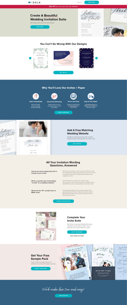
Zola’s landing page is a well-structured, visually elegant example of a high-converting eCommerce page. The design immediately draws users in with a hero section featuring a bold CTA, high-quality imagery, and a discount offer in a sticky bar, making it clear what’s on offer.
The carousel showcasing invitation designs is a smart touch, letting visitors browse options interactively without overwhelming them. Key selling points like free guest addressing and customizable templates are emphasized through icons, keeping the page easy to scan.
One standout CRO feature is the FAQ section, which directly addresses common customer concerns. If we had one suggestion, we’d keep the CTA buttons messaging consistent by pointing to a “get started” page rather than different pages.
9 – Cameo’s Celebrity Messaging Landing Page
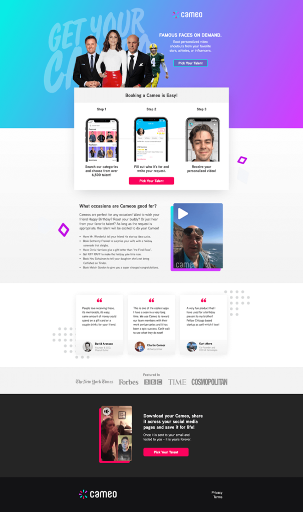
Cameo’s landing page is a textbook example of how to streamline user journeys while showcasing a unique offering. The hero section grabs attention immediately with high-profile celebrity images, a bold tagline, and a clear CTA button.
The page’s standout feature is its three-step process visualization, which effortlessly explains how the service works, reducing friction for new visitors. Social proof is also leveraged well, with customer testimonials and media mentions reinforcing credibility.
The only potential improvement? The hero CTA button could be more visually distinct to draw even more clicks, but overall, this is a stellar example of a high-converting Unbounce landing page.
8 – GREATS’ Luxury Sneaker Landing Page
GREATS delivers a visually striking eCommerce landing page that expertly balances aesthetics and functionality. The page focuses on craftsmanship, materials, and value, reinforcing its premium brand positioning.
We love the strategic use of high-resolution product imagery and lifestyle shots, which immerse visitors in the brand’s luxurious appeal. The breakdown of product benefits; such as handcrafted Italian leather, durability, and versatility, makes a compelling case for purchase.
Customer testimonials further reinforce trust, while strong CTAs guide users toward conversion.
7 – Indochino’s Custom Suit Landing Page
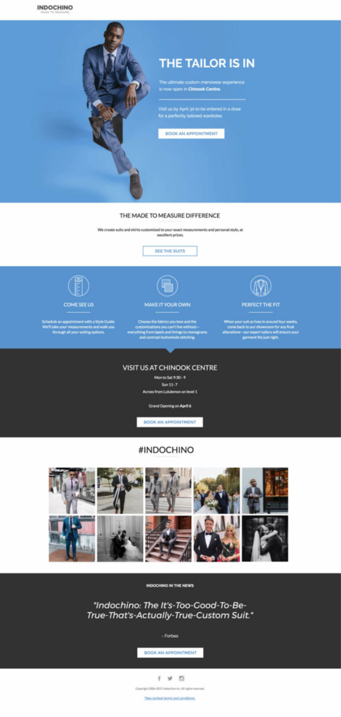
Indochino’s made-to-measure menswear landing page is a masterclass in luxury branding and lead generation. The hero section immediately grabs attention with a bold image and a clear CTA to book an appointment, emphasizing the custom tailoring experience.
The page effectively builds credibility and excitement with a breakdown of the customization process, a social media gallery, and a Forbes feature. The modern, clean layout and use of aspirational imagery make the user feel like they’re investing in quality.
One area of improvement? The messaging could be made more compelling by adding urgency, such as a limited-time offer.
6 – Procurify’s Webinar Landing Page
Procurify’s landing page is an excellent example of lead generation through gated content. The page effectively promotes a webinar on spend analysis, using clear, concise copy to highlight key benefits.
The registration form is placed prominently in the hero section, making it easy for visitors to sign up without scrolling. The speaker bios add credibility, while the strategic use of contrasting colors ensures readability and visual hierarchy.
To improve conversions, we could use Growform to shorten the form or break it into multi-steps, reducing friction and boosting sign-ups.
5 – Grand Canyon University – “Find Your Purpose”
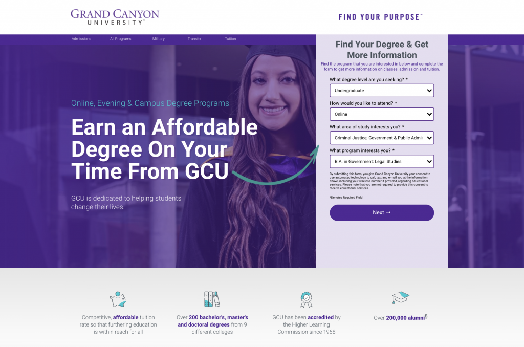
This super professional landing page features custom-designed icons, parralax images and a simple multi-step form.
From a CRO perspective, we loved the clear CTAs, good use of imagary (no boring stock photos here) and social proof in the form of testimonials.
The mobile variant is nice too, with the main form appearing suitably high up on the page and everything keeping a logical order.
4 – CarsForSale’s dealer website offer
Okay, “won’t believe it was built on Unbounce” is a stretch for this one – but this CarsForSale landing page is clean, professional and to the point – so deserved a mention:
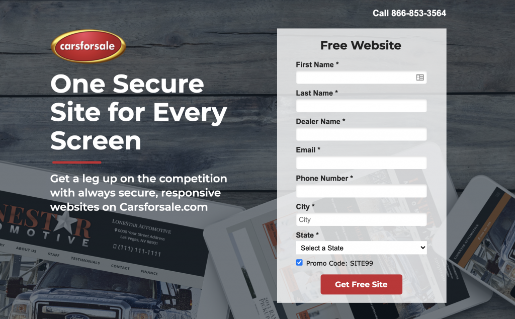
The value proposition is clear, it includes a solid special offer and everything is visually consistent.
We would’ve broken up the 8 field form into a few steps and made the CTA a bit clearer, but it’s a solid start.
3 – Caroo’s employee gift boxes page
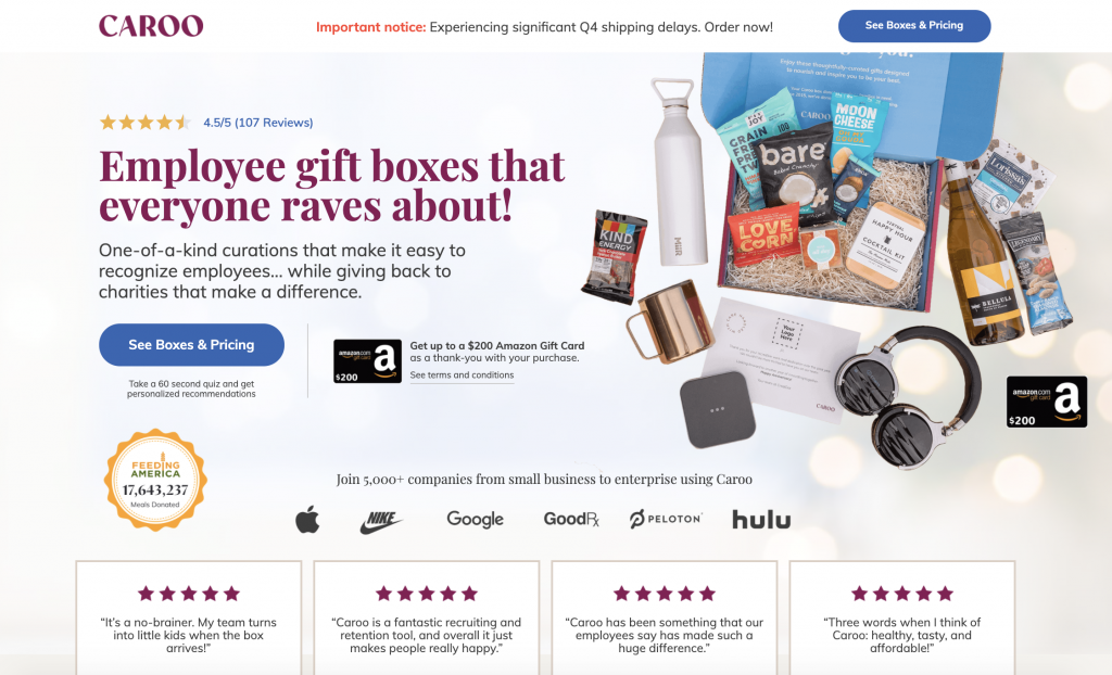
Caroo’s landing page is so built-out we had to double check it was built on Unbounce, and sure enough, it was! The designers clearly put a lot of work into this page.
Social proof is tip-top: logos of large companies, relatable testimonials and 4.5 stars above the fold.
Professionally created product imagary clearly conveys what we expect to receive in a gift box, and leaves no doubt to the product’s contents.
Our only criticism of this page is there is a lot going on – we’d try to make better use of negative space to avoid overwhelming users.
2 – Just Wills & Legal Services’s Multi Step Form
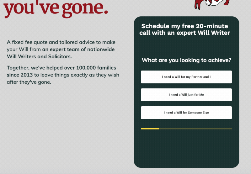
We love to see a solid landing page that uses our 2 favourite pieces of marketing tech – Unbounce and Growform!
Writing a Will is a serious decision, so this landing page pulls out all the stops in terms of demonstrating trust and threat reduction. The “100% Satisfaction Guaranteed” seal eliminates any lingering doubts, and testimonials convey the benefits of the service in the customer’s language.
Rather than asking all 8 fields upfront, this page uses a Growform multi-step form to take advantage of the sunk cost fallacy and boost conversion rates.
1 – Fender’s “Fender Play” landing page
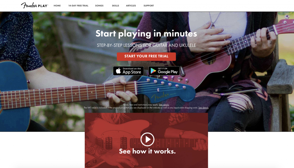
It’s always cool to see a household name using the same tools as us – it shows what’s possible with a bit of clever design.
Fender’s landing page for their guitar lesson software is a really well designed page, with crisp imagary and good use of negative space. Videos are a fantastic way of communicating complicated concepts, and Fender use the medium to great effect.
Ever wanted a multi step form on your Unbounce page?
Some of the best landing page examples on this very list use multi step forms, and it’s no coincidence – smart designers know they can get up to 2x more leads by splitting their form up into a few steps.
Up until recently, creating multi-step forms on Unbounce was hard – but Growform changes that.
You can try Growform on a free 14 day trial, with no credit card required here.
Related: 5 Powerful (Cheap) Unbounce Alternatives To Try In 2023