We Breakdown 5 Lead Magnet Landing Page Examples (Plus Actionable Tips)
Quick Summary
This article highlights five high-converting lead magnet landing page examples and provides actionable tips to boost conversions. From free consultations to ebooks, each example emphasizes design, messaging, and form optimization. To dive deeper into landing page conversion rate optimization, explore more on the Growform blog.
Struggling to Get More Leads from Your Landing Page?
You’re driving traffic, but conversions just aren’t where they should be. A well-optimized lead magnet landing page can be the difference between visitors bouncing and potential customers filling out your form. The right design, messaging, and form setup can dramatically boost your lead generation efforts.
In this Growform article, we’ll break down five high-converting lead magnet landing page examples, each with actionable tips you can implement right away to boost your conversions.
But first…
Why Listen to Us?
At Growform, we specialize in helping businesses capture more leads with high-converting forms that reduce friction and maximize engagement. We understand that a strong lead magnet is only as effective as the landing page it’s on. After analyzing numerous landing pages, we’ve pinpointed what makes some perform exceptionally well, while others miss the mark.
What is a Lead Magnet Landing Page?
A lead magnet landing page is a standalone page designed specifically to collect visitors’ contact information in exchange for a valuable resource. It promotes a gated offer; such as an ebook, checklist, or webinar, that users can access by submitting their email address. You may also hear it referred to as a squeeze page or a lead generation landing page.
While pop-ups and alert bars can promote a lead magnet, a dedicated landing page provides a home base for it. It’s where you’ll direct visitors from paid ads, social media posts, and other promotional efforts.
A well-optimized lead magnet landing page isn’t just about getting an email, it’s about making the process as frictionless as possible. That’s where Growform comes in. We make it easy to create multi-step forms that guide users through the process, reducing overwhelm and increasing conversion rates.
5 Top Lead Magnet Landing Page Examples
1. Free Consultation or a Free Quote
The Pest Control Allentown PA landing page offers a free consultation or quote for pest control services. The page helps users quickly connect with local exterminators to get customized quotes and solutions for pest issues like rodents, termites, and insects.

Why This Landing Page Works
- Clear and Direct Call to Action: The prominent “Get a Fast Free Quote” button encourages immediate action.
- Concise Process Explanation: The 3-step process is easy to understand, guiding users from form submission to receiving a quote.
- Social Proof: Testimonials and ratings from local customers add trust and credibility to the service.
- Service Coverage: The landing page highlights the areas served, providing users with confidence in the service availability.
- User-Focused Form: The form is simple, with a dropdown for users to choose the specific pest control service they need.
Actionable Tips
- Make the Call-to-Action Clear and Repeated: Ensure that your CTA stands out and appears multiple times throughout the page, making it easy for users to act.
- Simplify the Form: Keep forms short and to the point, asking for only necessary information to prevent user drop-off.
- Use Social Proof: Add testimonials or real-time data (like the number of people who’ve requested quotes) to enhance credibility and encourage users to take action.
- Leverage Conditional Logic: Use Growform’s conditional logic to dynamically show questions based on the user’s responses, making the experience more relevant and personalized.
2. Webinar
Webinars are an effective lead magnet for educating prospects while positioning your brand as an authority. Slack’s Dreamforce 2024 webinar landing page effectively encourages sign-ups by highlighting key content and making the registration process simple and clear.
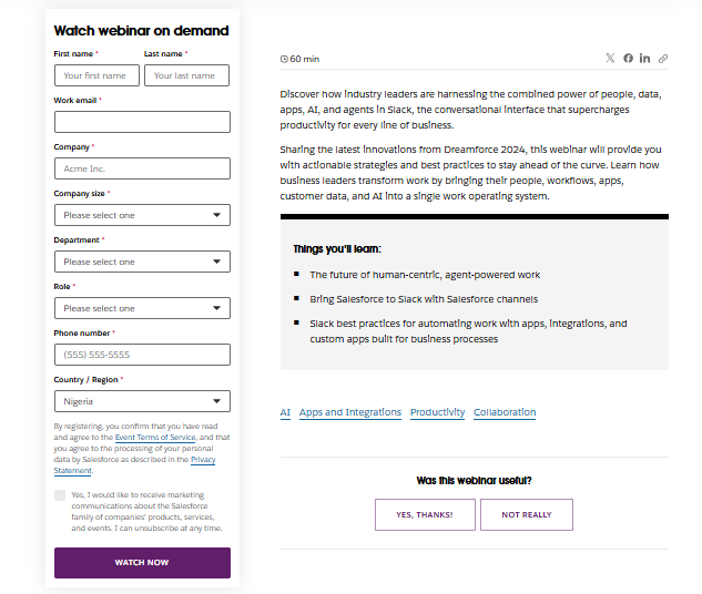
Why This Landing Page Works
- Strong Headline and Description: Clearly states what the webinar covers, why it matters, and how long it will take.
- Clean, Modern Design: Professional design reinforces credibility and makes the page visually appealing.
- Simple Registration Form: Even though they ask for more details than the eBook example, it makes sense since their target audience is mainly decision-makers and stakeholders.
- Social Proof and Trust Elements: Mentions of industry leaders, and company branding reassure users.
- Call to Action Stands Out: A clear and compelling “Watch Now” CTA button drives conversions.
Actionable Tips
- Create a Sense of Urgency: Use a countdown timer to emphasize limited-time access and drive registrations.
- Keep Forms Short: When requesting more details, Growform’s multi-step forms can be used to break down the registration process into manageable steps, improving user experience and boosting conversion rates.
- Highlight Key Takeaways Clearly: Use bullet points to outline the most valuable insights attendees will gain.
3. Free Trial
A free trial landing page is a fantastic lead magnet to give potential customers a risk-free way to try out your product, especially for SaaS businesses.
Sendible’s free trial landing page showcases the platform’s best features while encouraging users to sign up quickly and easily.
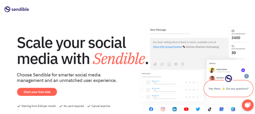
Why This Landing Page Works
- Prominent Call to Action: Clear, visible CTA button encourages visitors to start a free trial immediately.
- Feature Highlights: Displays key features like scheduling, content customization, and reporting, which entice potential users.
- Testimonial: Social proof with logos of well-known brands and a high rating on G2 builds trust and credibility.
- Clear Benefits: The page emphasizes how users can save time and amplify their brand stories with Sendible’s all-in-one platform.
- Free Trial Highlight: Users are clearly informed that they can start a free trial with no card required, lowering the barrier to entry.
Actionable Tips
- Clearly Display the Free Trial Duration: Make sure the trial period is visible so users understand how long they have access to the tool.
- Highlight the Key Benefits: Communicate what users will gain from the trial—quickly scheduling content, custom reporting, and better social media management.
- Use Social Proof to Build Trust: Display testimonials or logos of trusted brands that use your product to show credibility.
4. Quiz or Assessment
A quiz or assessment is a fantastic way to engage users while providing personalized insights. Persona Nutrition’s quiz landing page leads users through a tailored assessment, offering custom supplement recommendations based on individual needs.
Want to create a personalized quiz for your business? Use our multi-form builder templates to quickly get started.

Why This Landing Page Works
- Prominent Call to Action: The CTA, “Start free assessment,” is clearly visible, encouraging immediate action.
- Personalized Approach: The landing page emphasizes the creation of a custom wellness profile based on the user’s specific needs, which makes the offer more compelling.
- Clear Process Explanation: Step-by-step breakdown ensures users understand how the quiz works and what they’ll receive.
- Expert Backing: Mentions of nutritionists and evidence-backed science lend authority and trustworthiness to the service.
Actionable Tips
- Personalize the Experience: Tailor form questions dynamically based on user responses with Growform’s conditional logic, making the process feel more relevant and conversational.
- Clearly Communicate Value: Highlight the specific benefits users will get—like personalized daily supplement packs and expert advice—in bullet points.
- Offer Immediate Value: Provide immediate access to the personalized assessment and emphasize the convenience of getting supplements delivered directly to users’ doors.
5. Ebook
Ebooks remain a powerful lead magnet because they provide in-depth knowledge and valuable insights on a specific topic. Hip2Keto’s Keto Recipes Ebook landing page is an excellent example of a high-converting ebook lead magnet.
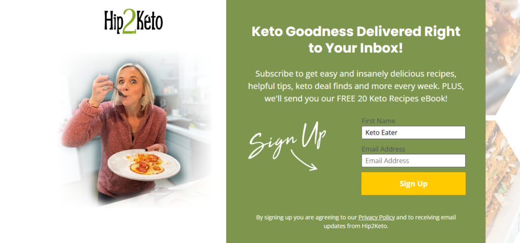
Why This Landing Page Works
- Clear Headline: “Keto Goodness Delivered Right to Your Inbox!” instantly communicates value.
- Compelling CTA: “Sign Me Up!” encourages immediate action.
- Strong Value Proposition: Visitors know they’ll receive 20 crave-worthy keto recipes that make low-carb eating enjoyable.
- Minimal Form Fields: The pop-up lead form requires only a name and email, reducing friction and boosting conversions.
- Engaging Visuals: High-quality images make the offer irresistible.
Actionable Tips
- Keep it simple: Use a clean design with a clear message. Avoid clutter.
- Highlight the benefit: Tell visitors exactly what they’ll gain from your ebook.
- Use a strong CTA: Make it action-oriented and persuasive.
- Reduce form fields: Ask for only essential information to lower drop-offs.
Increase Lead Generation with Growform’s Powerful Form Builder
If you’re looking to supercharge your lead generation strategy, using optimized landing pages with engaging lead magnets is essential. These pages capture attention and guide users toward meaningful conversions, boosting both engagement and quality leads.
Growform’s intuitive, no-code form builder makes creating high-converting multi-step forms a breeze, ensuring that your landing pages perform at their best. With powerful features like conditional logic and custom styling, Growform allows you to tailor forms to fit your exact needs, driving better-qualified leads and improving your conversion rates.
Ready to streamline your lead generation process? Get started with Growform today.