6 Essential Mobile Form Design Best Practices for Higher Conversions
Quick Summary
This guide breaks down six practical steps to help you design mobile-friendly forms that actually get filled out. From using multi-step layouts to choosing the right input types, each tip is backed by real mobile form design examples and built around what today’s users expect. Even if you’re optimizing for speed, clarity, or lead quality, this is the playbook to follow. You can find more lead capturing and conversion tips in our blog section.
Optimizing Mobile Form Design for Better Lead Capture and User Experience
Mobile users don’t have time to struggle with busy forms. They want speed, clarity, and zero confusion. But too many businesses still rely on forms that were never built for mobile, costing them leads every single day.
Poor layout, endless scrolling, and clumsy input fields cause users to abandon forms or submit bad data. The fix is simple: use forms built specifically for mobile devices and users.
In this Growform guide, we walk you through eight proven steps to design mobile-friendly forms that actually capture and convert.
Why Listen to Us?
At Growform, we help teams build forms that convert, not just collect data. Our platform is designed for lead generation, with features like multi-step layouts, conditional logic, and mobile-first design. We’ve seen what works across hundreds of campaigns, and this guide shares the exact steps to build mobile forms that actually perform.
What Is Mobile Forms Design?
Mobile forms design is the process of creating forms that are easy to complete on a phone or tablet. It’s not just about shrinking a desktop form, it’s about building with mobile users in mind from the start.
A well-designed mobile web form can be the difference between unsuccessful and successful lead capturing efforts because:
- Most users now complete forms on mobile, not desktop
- Small errors in layout or flow lead to big drop-offs
- Good mobile design improves both form completion rates and lead quality
- Faster, simpler forms lower user frustration and increase trust
Done right, a mobile form leads to better engagement, cleaner data, and more conversions. Done poorly, it sends potential leads straight to the exit.
Why Is Mobile Form Design Important?
Mobile form design is crucial for several reasons:
- Mobile Usage Dominates: The majority of users now fill out forms on mobile devices, not desktops. If your forms aren’t optimized for mobile, you risk losing a significant portion of potential leads.
- Avoid Frustration and Drop-offs: A poorly designed mobile form frustrates users and leads to higher abandonment rates. Simplifying the experience reduces friction and keeps users engaged, making them more likely to complete the form.
- Boost Conversions and Trust: Mobile-friendly forms enhance user trust and satisfaction, improving form completion rates and driving higher conversion rates. A smooth, seamless experience on mobile devices directly contributes to greater success.
6 Tips for Mobile Form Design Best Practices
1. Break Forms Into Steps and Structure Them Logically
Don’t overwhelm users with long forms. Breaking your form into steps and presenting them in a logical order makes the experience faster, easier, and more likely to convert.
Here’s how to do it right:
- Start with simple questions (name, email)
- Group related fields together under clear headings
- Use short steps with just a few fields each
- Add section titles to guide users
- Show questions only when relevant using conditional logic
- Keep the call to action at the end
Growform is built for this. Its step-by-step builder lets you break long forms into focused sections, rearrange fields easily, and guide users smoothly through the process.
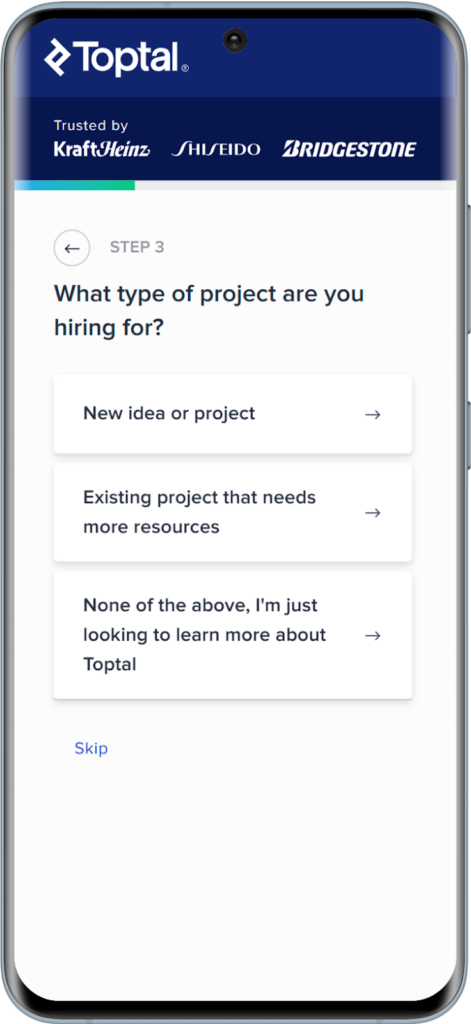
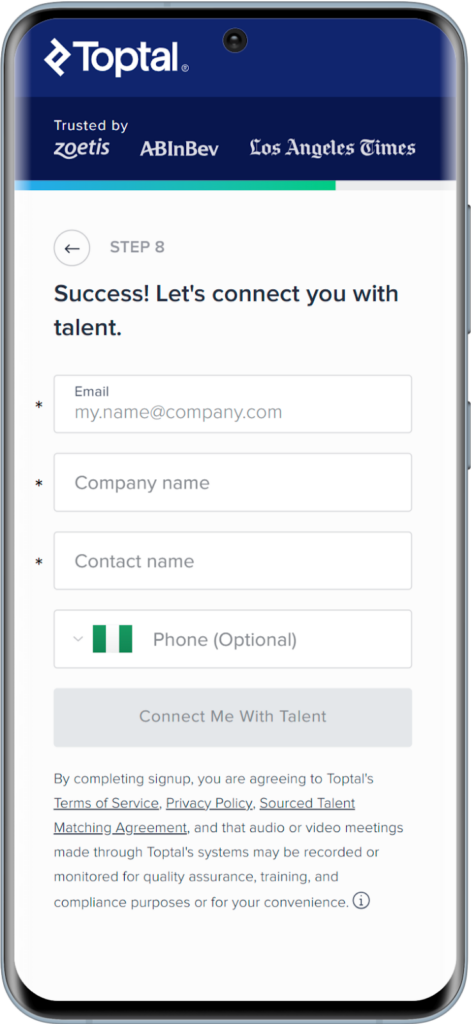
Toptal’s freelancer hiring form is a great example of this practice. It starts with the type of freelancer to hire and the type of project and continues until it’s time to provide the client’s details. The form feels more conversational as it progresses, encouraging users to move forward.
2. Use a Responsive, Mobile First Layout
Ensure your form adapts to all screen sizes. A mobile-first layout is necessary to provide an optimized user experience on smartphones and tablets.
Users should never need to pinch, zoom, or scroll sideways just to fill out a form. Everything should fit comfortably within the screen, with enough breathing room between elements.
Here’s what a good mobile-friendly web forms layout looks like:
- One Column: Keep fields stacked vertically, not side by side
- Clear Spacing: Avoid cramming fields together
- Touch Targets: Buttons, checkboxes, and inputs should be large enough to tap without precision
- Font Size: Make sure the text is legible without zooming (at least 16px is a good starting point)
- Contrast: Text and background colors should have strong contrast for readability in all lighting conditions
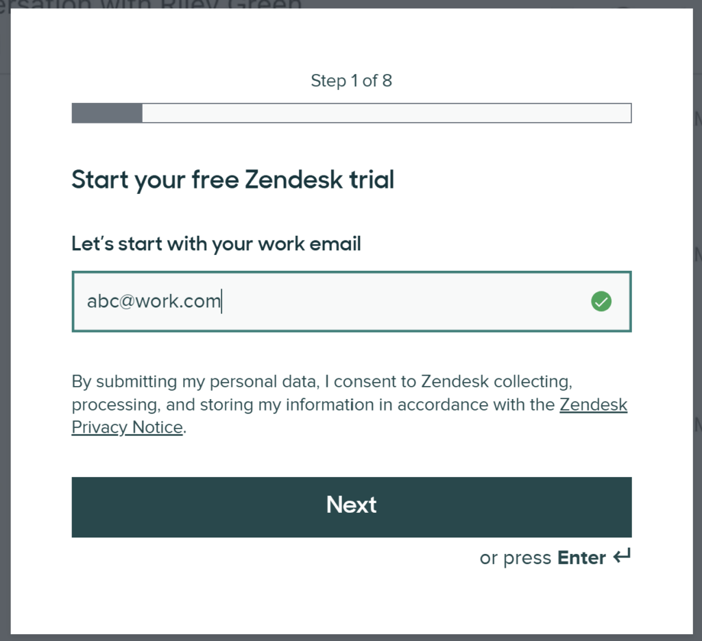
Zendesk’s registration form is a great reference. Every field is cleanly spaced, the text is readable, and the buttons feel made for thumbs. The layout stays consistent whether you’re using a phone, tablet, or laptop.
Every form you build on our platform is fully responsive out of the box, especially if you start with our templates.
For further customization, using the drag-and-drop builder includes custom CSS, allowing you to adjust button sizes, font styles, spacing, and colors to meet accessibility best practices and your brand guidelines.
The less effort users need to put into using your form, the more likely they are to finish it.
3. Provide Inline Validation and Helpful Error Messages
Help users fill out forms correctly by providing real-time feedback. Don’t make users hit “Submit” only to find out they messed something up five fields ago. That’s a fast track to drop-offs.
Inline form validation fixes this. It checks input as users go and points out errors early, while they’re still paying attention.
Here’s what good validation looks like:
- Instant feedback after a field is filled or tapped away from
- Error messages placed right next to the field, not dumped at the top
- Clear, plain language, say “Email format looks wrong,” not “Invalid input detected”
- Highlight the field visually, like a red border or icon, so it stands out
You can set fields as required and define allowed input formats (like numbers only, or email addresses). You can also trigger real-time validation without writing a single line of code.
SIESMIC’s quote request form gives an idea of what’s expected as a Work Email by giving an example (“example@yourdomain.com”). It also tells you what went wrong right under the field (“invalid email address”) when a personal email was used instead of a work email.

4. Use Appropriate Input Types
Input types are one of the mobile form design best practices to prioritize. Typing on a phone is slower, clumsier, and more prone to mistakes, so when you ask for information, make it as easy as possible for the user to provide it.
One of the simplest ways to do that is to match each field with the right input type. That way, users get the exact keyboard they need, no tapping around, no frustration.
Use these smart choices:
- Email field: Shows the email keyboard with the “@” symbol
- Phone number field: Opens the number pad
- Date field: Brings up a calendar or date selector
- Number Field: Hides unnecessary letters and symbols
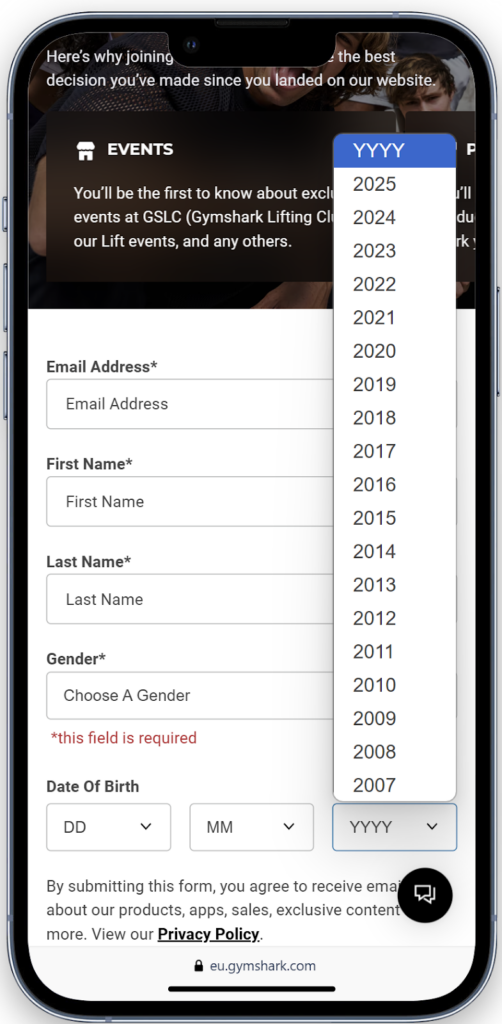
Gymshark’s signup form is built this way. When you tap the email field, the mobile keyboard changes to include “@” and “.com”. When you tap on the calendar, the day/month/year automatically comes up. This might seem small, but it keeps the process smooth and focused.
5. Avoid Dropdowns When Possible
Dropdowns might seem tidy, but they’re not great on mobile. They take extra taps, often load slowly, and make users scroll through long lists in a cramped space. That’s not ideal when someone’s filling out your form on the go.
Instead, use quicker alternatives that are easier to tap and process.
Better options:
- Radio buttons for short lists with one possible answer
- Checkboxes for multiple selections
- Buttons for common actions like “Yes” or “No”
- Searchable input fields for long lists like countries or job titles
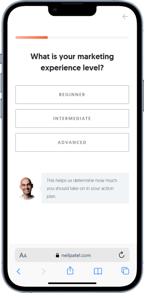
Neil Patel’s “Want more SEO traffic?” form skips dropdowns entirely. Instead, it uses large, tappable buttons and clear selections that feel made for mobile. No hunting through menus. No wasted time.


6. Keep It Short and Focused
We round up this list of mobile form design best practices with this simple but important point: brevity. Avoid asking for unnecessary information upfront. Keep the form short and ask for only the essential data to increase completion rates.
Here’s how to keep things lean:
- Ask only what you need upfront; leave the nice-to-have questions for later
- Use conditional logic to show extra fields only when they’re relevant
- Combine fields when possible, like using “Full Name” instead of asking for first and last separately
- Use hidden fields to pass tracking data without asking users to enter it manually
With conditional logic and hidden fields, you can customize every form to show just what’s needed for that user, no more, no less.
Trello’s signup form asks only for name, email, and password. That’s it. It gets users into the product fast and saves other information for later.
Start Building Better Mobile Web Forms with Growform
Designing mobile-friendly forms is not complicated, it just requires the right approach. From layout to input types to form length, small changes can have a big impact on completion rates and lead quality. The six steps above show exactly how to implement a good mobile form design.
Growform was built for this. With multi step layouts, mobile-ready design, conditional logic, and zero code required, it helps you build smarter forms that convert.
Try Growform today with a 14-day free trial!