
We checked 66 multi-step lead forms. Here's what we learned
We filled out 66 multi-step lead forms from US insurance, mortgage, legal, solar, real estate and home services sites and counted what they do before they ask who you are. Nine lessons for your own lead form, with the numbers behind each one.
 Harvey Carpenter Published 16 min read
 Most multi-step form best practices you read online come from SaaS sign-ups and newsletter popups. We build multi-step lead forms for a living, so we wanted to know what the teams who pay for traffic in insurance, mortgage, legal, solar and home services actually ship. In early October 2026 we opened 90 lead forms, filled them in with obvious test answers and captured every screen. 66 were properly multi-step, and 21 were good enough to feature.
The surprise wasn't how long they are. It was how little they give back. Only two of the 21 show the visitor anything, a dollar figure or a named firm, before asking who they are. That gap, and eight smaller ones, became the nine lessons below.
- 9screens, on a median form, before it asks who you are
- 52%open with a ZIP code, address or state
- 0 of 21ask for contact details before a single qualifying question
- 2 in 3show a progress bar or step count before the contact step
- 2 of 21show you a result before asking for an email
- 1 in 3load TrustedForm or Jornaya to certify the lead
How we checked them
We opened 90 lead forms on US sites across insurance, mortgage and loans, legal, solar, real estate, auto, debt relief and home services, found through search results, ads and direct visits to brands we knew. 66 were multi-step in the sense that matters here: one question or one tight topic per screen, in sequence, with the name, email and phone number at the end. The rest were long single pages, two-page splits or checkouts.
From the 66 we picked 21 to feature, judged on design, question wording and whether the form earns its contact step. One of the 21 is our own roofing template, disclosed as such. We captured the forms between 2 and 6 October 2026 in a cloud browser at desktop size, stepping through each one with obvious test answers, and we never pressed a final submit button. The tiles above describe the 21, which were picked because they're good, so they're the numbers for good forms rather than for the market. Every screen of the 21 is in our multi-step form examples.
Two of those numbers shape everything that follows. Half the forms open with a ZIP code or an address, because location decides who can buy the lead and the visitor knows the answer without thinking, which is why ZIP code validation on step one matters more than it looks. And only two show the visitor anything before asking for an email. That gap is the biggest opportunity in the whole set, so it's lesson one.
Show them something before you ask who they are
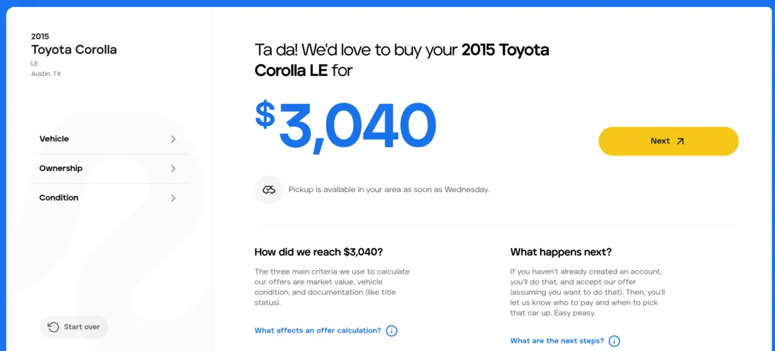
"Ta da! We'd love to buy your 2015 Toyota Corolla LE for", and then the number.
That is what Peddle's sell-my-car form puts on screen after seventeen screens about the car and a loader that reads "Beep bop boop, this'll just take a few secs." Only on the next screen does it ask for an email, on a plain "Create an account" page. By then the visitor has a number to protect, and an email address is a small price for keeping it. (Our first test car, a 2000 Corolla, was offered $895.)
SuperMoney's tax relief form does the same with a name instead of a number. Four quick questions about a tax debt, then a loading screen that ticks through "Reviewing state availability" and "Matching on tax case details", then a card for OptimaTax Relief, already ticked, labeled "Strongly recommended" under the headline "You qualified for a free consultation:". Then, and only then, an email field. The visitor hands it over knowing which firm will call, which is the one thing most lead forms never say.
Case Connect doesn't show a number before the contact step, so it hands out a verdict instead. Step 7 opens with "You qualify! Let's calculate your compensation!" and then asks for name and email. Once you've been told you qualify, walking away feels like leaving something on the table.
This is rare. Two of the 21 featured forms show a result before contact, and seven of the 65 in the wider sample. TrueCar comes close by printing the car's estimated value at the top of the contact screen itself. Everyone else asks you to trust that the quote is on its way.
If you can compute anything from the answers, a range, a match or a verdict, put it on the screen before the first contact field. A loading animation with three lines of visible work makes the result feel calculated rather than canned. If you truly can't compute anything, at least tell them they qualify.
Put a reason under every question
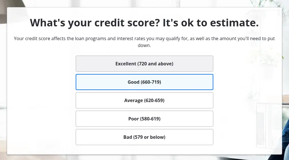
Zillow's pre-approval form has the best question wording we saw, and the trick is one sentence under each question that says why it's being asked. Property type: "It can make a difference in the interest rate you get." Military service: "If so, you may qualify for a VA loan with $0 down and no PMI." Down payment: "Tip: most loans require at least 3% down." The credit question puts the reassurance in the headline: "What's your credit score? It's ok to estimate."
Twelve screens, no progress bar, and it still reads like a conversation with someone who wants you to get the loan. The contact step is three short screens, "Almost there! What's your name?", then "Nice to meet you. What's your email address?", then the phone.
NerdWallet's small business loan form, run by Fundera, writes the helper line exactly where an owner would stall. Business start date: "If you don't remember the month, take your best guess." Monthly revenue: "Take an average of your last few months." Credit score, the question most likely to lose someone: "Rest assured, checking rates won't impact your credit score." The urgency question includes "Just Shopping", so a low-intent visitor can stay honest instead of picking "Today" to get past it.
Hippo uses the reason to justify the hardest ask in the set. It opens with the full home address, which most forms hide until late, and explains in the subhead: "We use it to understand your home and customize your coverage." Every option card after that defines itself. "House" means "a single-family home, townhouse, or duplex you own, and you are listed on the deed." The contact screen is headed "Whose name will be on the policy?", which sounds like buying insurance rather than handing over data.
Read your own form aloud and ask "why do you need that?" after every question. If the answer isn't on the screen, add it in one line. Credit, income and address are the questions that need it most.
Make the first question a drag or a tap
Freedom Debt Relief's first question is a slider in the homepage hero. "How much do you owe?", preset to $25,000, with a live dollar readout. Nobody wants to type a number they're embarrassed by, but dragging a handle costs nothing, and a visitor arriving from an ad is inside the form before they've read a word of the page. Under the Continue button sits the Trustpilot score, "4.5/5" and "Excellent • 51,269+ reviews".
The rest is short. A state dropdown, then a contact screen headed "See your results" with a button that reads "Click to see your results". The stage bar names "Debt Estimate", "Personalization" and "Results" rather than counting, so the contact screen arrives as "Personalization" instead of as step 3 of 3. One thing we'd change: the SMS consent box under the button arrives already ticked, the only pre-checked box in the 21.
Palmetto puts its first two questions inside a guide to home battery backups. Halfway down the article a dark card reads "See how much you can save by going solar with Palmetto" and asks for a home address and a monthly electric bill on a slider at $150, with the button "Calculate My Savings". The reader gives the two most useful answers a solar installer can get without leaving the page they came for. Then a loading checklist works through "HOME LOCATED" and "SOLAR POTENTIAL CALCULATED", and on our first run a map of the house appeared and the questions chained into a conversation: "First, we need to know: Do you rent or own your home?" and "Thanks! Solar works on most materials, so what type of roof do you have?"
Half the forms in the set open with a bare ZIP box. Both of these show the first question can carry the hook as well as the routing. The click from the ad should already be an answer, so put a slider or a tap in the hero, inside your best content pages, wherever the visitor already is.
Use their answers back to them
Our test dog was called Biscuit. Pumpkin asks for the pet's name before anything else, even before dog or cat, and the next screen is headed "Let's get some basic info about Biscuit." Two screens later it's "One last thing! Let's get your info, human." Typing a dog's name costs nothing, and from then on the form is about the dog rather than about the owner's data. Three screens to contact, with breed, age and sex grouped on the second because those are the three things a pet insurer prices on.
WindowsEstimate does it with a photograph. Type a ZIP code and the page background becomes a satellite view of your area. Type the address and the view shows the house you typed, with a white card floating over it. No extra question, and nothing else in home services makes a form feel this much like it's about your house. The entry screen sets expectations in three lines, "Takes about a minute", "Priced for your home and area" and "Up to 3 vetted contractors", and under the window-count grid sits a nudge in blue italics about local rebates.
Peddle does it in every question ("Do you own the Toyota?", "Where will we pick up your Toyota Corolla?"). Insurify keeps the car you chose, with the maker's logo, above every later question. HomeLight goes one better and fills in bedrooms, bathrooms and build date before you've answered anything, each marked "Fetched from public records".
Every answer you collect is something you can say back. The pet's name in the next headline, the make of the car in the question, the address on a map. It's the cheapest personalization there is, because the visitor did the work.
Let the progress bar tell the truth
EnergySage's step counter gets shorter as you go. It opens at 1/15, drops to 3/14 after the ownership question and to 7/13 a few screens later, because your answers have ruled out whole branches. The finish line moves toward you. We've never seen another form do this, and it's the opposite of the usual long-form experience where the bar crawls and the visitor stops believing it.
HomeLight makes a promise and keeps it. The entry copy says "Answer 8 quick questions about your kitchen, bath, and upgrades", and the counter runs from "Question 1 of 8" to "Question 8 of 8". The questions themselves have opinions: "Kitchens can make or break a home's value. How's yours feeling?" with answers like "Due for an update" and "Full gut needed". The contact screen is headed "We have your home estimate" and the button says "Get final estimate", which is honest about the exchange even if you don't see a number first.
Insurify is the longest form we tested, 29 screens before the first name field by our count, and it survives because the line above the bar keeps changing. "3 minutes until deals. Let's go!" at the start, "Drivers in TX can save up to $1,100 a year with Insurify!" in the middle, and "Thank you! Your deals are ready!" on the phone screen, where the padlock icon in the bar springs open and the whole thing turns green. The answer labels sell on the way through: "2 cars (Save 20%)" and "25 Miles (National average)".
Two in three of the featured forms show progress before the contact step, and 82% of the wider sample. Of the ones without, Zillow, NerdWallet, Hippo and WindowsEstimate are where we'd test a counter first. Watch for the dishonest bar too. AskLegally's reaches 100% on question five and then the contact screen appears outside the count. Palmetto, on our first run, said "Finally" on its third question with four screens still to go.
Count the contact screen. If branching skips questions, let the total fall. If the form has to be long, give the visitor a fresh reason to finish every few screens. A progress bar is only useful when the visitor can trust it.
Use pictures when the answer is a matter of taste
"How would you describe your kitchen?" Opendoor answers with five photographs, from "Fixer Upper" to "Luxury", each with one line underneath such as "Kitchen needs significant repairs", and a subhead that takes the pressure off: "For these questions, just select the closest match." A homeowner who would dither between "dated" and "standard" in words can match a picture in a second, and Opendoor gets the same grading across thousands of homes. The same five tiles come back for the bathroom, the living room and the exterior.
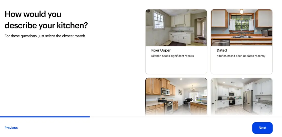
The flow runs past a dozen screens and never feels it, because every screen explains itself ("This question helps us select comps when preparing your offer"), the address stays pinned in the header, and a Save link sits on every step so a seller can leave and come back. The marketing SMS opt-in on the contact screen is a separate, unchecked box, which is how optional should look.
Our own roofing template opens the same way, and we say so plainly because we built it. "Which roofing material are you interested in?" gets six photo cards: asphalt shingles, metal, wood shingles, slate, tile, and not sure. Plenty of homeowners can't name their roof but can recognize it. A tap advances with no Next button, the address comes fourth after three taps, and contact sits on screen six under "How shall we get in touch?". It ships without consent text so an operator can add their own with the consent checkbox, and we'd move the free-text question after contact, since it's the only screen that asks the visitor to write.
Use pictures for condition, material, style and anything else where the visitor would otherwise stare at a list of words, and put a one-line definition under each one.
Ask for the phone number last, on its own, with a reason
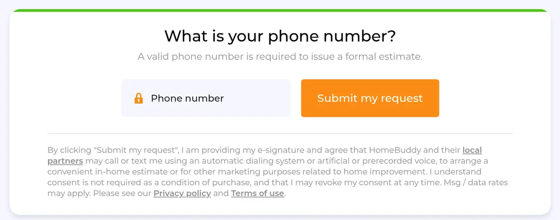
HomeBuddy asks a ZIP code and sixteen questions about a walk-in shower before a single contact field, every one a tap on an icon tile, while a cartoon contractor's speech bubble switches to "Almost there…" and then "And the final step!" near the end. The name and email screen is written in his voice, "Who should I prepare this estimate for?", which makes your name sound like the label on a document. Then the phone, alone, with the reason straight under the question: "A valid phone number is required to issue a formal estimate." A lock icon sits inside the field and "Industry-leading Data Encryption" runs under the card.
LendingTree runs name, email and phone as three one-field screens at the end of a 14-screen refinance flow, with the phone under the outcome button "View My Rates" and two lines under every Continue: "Your information is securely encrypted" and "No impact to your credit score". Earlier it pulls off the cleverest input in the set. You estimate the property value on a slider, and the next screen asks for the remaining mortgage balance on a slider scaled from 0% to 100% of the number you just gave, with "It's OK to estimate." beneath it. No arithmetic, no digging out a statement, and LendingTree walks away with a loan-to-value figure.
Six of the 21 put the phone number alone on the final screen, and half of the forms where we saw the whole contact sequence split it over two or more screens. The phone is the field that decides whether a lead can be worked, so it earns its own moment. Insurify's email screen asks "Where would you like to receive a copy of your quotes?", which turns a data request into a delivery address. Case Connect's reason for the phone is the odd one out, "To help confirm you're not a robot", and we'd test it against a reason that promises something.
Name and email on one screen, phone on the next with one sentence that says what it's for, phone validation behind it so the lead you pass on is a real number, and the consent text sitting right where the button is.
Break the one-question rule when the job calls for it
Orkin asks for your address, bedroom count, bathroom count and yard size in one sentence. "I live at", then an underlined red field, then "My home has 1 bedrooms and 1 bathrooms" with the numbers as inline inputs, then "My property has a..." with a gentle aside, "(Maybe a porch, a patio, or nothing at all.)", and three yard sizes. Four answers on one screen, and it reads like speech. Under it: "Don't stress over the details. Your Orkin Pro will help verify everything in your initial inspection."
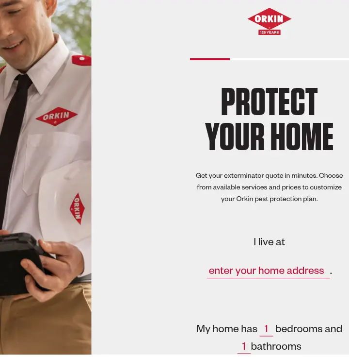
One more question follows, "I have a specific pest problem" or "I want a pest prevention plan", and then the contact screen, "Lastly, a few more details about yourself." with "We promise not to spam you!" and an unchecked marketing box. Pick the prevention plan and the contact step is the third screen on a 125-year-old brand, with a real technician photo down the left. Name a pest and an illustrated pest grid and a details screen come first. One slip: the terms line refers to a "SUBMIT" button, and the button says "VIEW YOUR PEST PLAN".
TrueCar groups instead. A plate lookup opens the flow, the next screen says "We found your car! Let's confirm a few details." with year, make, model and trim already filled, and from then on related questions share a screen under a named stage. "Vehicle history" asks four things at once, title type, owned outright, ever in an accident, ever reported stolen, with "I don't know" on offer and a seven-stage stepper down the left. More decisions per Next, but each stage is one topic the seller already holds in their head, and the lookup has spared them five questions. The contact screen opens with "Your vehicle's estimated value", then "1 dealer wants to buy your car today!", and the button reads "Looks good, let's sell my car".
One question per screen is the default, not a law. Group when the questions are one topic, write it as a sentence when the answers are small numbers, and ask for a lookup key when a lookup can answer five questions at once.
Name who will call, and say what gets sent
Under every one of AskLegally's five questions sits the same sentence: "Nothing is sent until you submit your contact information." It answers the fear most people have about lead forms before they've had time to feel it. The hero promises "Free consultation", "No obligation" and "About 2 minutes", and the contact screen says exactly what the button does: "Submitting sends your answers, your state, and the contact details below." The consent is an unchecked box, "I agree to be contacted about this request", the way back is labeled "Review my answers", and the button reads "Request My Free Case Review". It's the most transparent form in the set, and the whole thing costs one sentence.
Vivint names the person. Its quote form is a pill-shaped bar borrowed from travel sites, split into "Residence Type", "Interested In" and "Doors & Windows", each opening a small panel, with plus and minus steppers for entry doors, garage doors and windows, which is precisely what a rep needs to size a system. Press "Finalize" and the bar turns into a contact card in place: "A Vivint Smart Home Pro will contact you within 24 hours. Or skip the form and call now". A "SAVE TIME, CALL NOW" button stays on screen the whole way for anyone who would rather talk.
Zillow goes furthest of all. Its last button reads "Contact Service First Mortgage Company", the one lender who will actually ring, and the consent text beneath names the same company. No other form in the set does that. Nine of the 21 consent blocks name only the first-party company, eight describe partners by category or behind a link, and one, Freedom Debt Relief's SMS box, is already ticked when you arrive.
Say who calls, when, and what you send. If a partner will make the call, name them if you can. Leave the box unchecked, keep the button label the consent text refers to the same as the button on the screen, and read our TCPA guide for lead generation operators before you write the paragraph.
What this means for your form
Open with the question the visitor can answer without thinking, as a tap or a drag, and make location an early one because it routes the lead. Put one plain reason under any question that asks for money, credit or an address. Say the visitor's answers back to them in the next headline. Show progress only if it is honest, and let the total fall when branching skips screens. Use pictures where words would make a homeowner hesitate. Group questions only when they are one topic. Show a range, a match or a verdict before the first contact field if you can compute one. Then ask for name and email, and the phone number alone with one sentence that says what it is for, and put the consent text, unchecked, beside the button that sends the lead. Every one of those is a field or a setting in Growform, and the 21 forms that show them in action are laid out screen by screen in our multi-step form examples.
Related articles

Form testing priorities for higher quality paid leads
October 8, 2026
8 best mobile form builders for lead generation teams
October 1, 2026
A/B Testing for Landing Pages How to Lift Conversions
September 30, 2026