

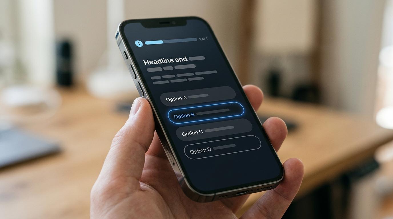
When a paid click costs real money, form UI is not just a design choice. It is a margin choice.
For consumer lead generation teams in solar, roofing, final expense, legal, and home services, the goal is not to squeeze out the cheapest possible lead at any cost. The goal is to capture people who can be contacted, sold, routed, and accepted downstream. That is why step by step form UI design tends to outperform long static forms in serious lead funnels.
A good multi-step experience makes the form feel shorter, even when it asks more. It also gives operators a cleaner way to qualify traffic before asking for sensitive contact details. That combination matters when you are buying volume from Meta, Google, native, or affiliate traffic and every junk submission shows up later as rejection rate, poor contact rate, or wasted sales time.
Why step by step form UI design improves lead quality
There is solid research behind this approach. Google Research tested optimized web forms in a controlled lab study and found faster completion times, fewer form submission trials, fewer eye fixations, and higher user satisfaction than the original versions. Those are not vanity outcomes. Faster completion and fewer retries usually mean less friction, less confusion, and fewer low-intent exits.
The quality angle is what makes this topic commercially important. A step by step flow lets you front-load intent and eligibility questions, then collect contact info later. People who make it through those first steps have already invested effort and signaled interest. That often means better phone answer rates, better buyer acceptance, and less junk making its way into the CRM or ping/post platform.
A few design mechanics explain why this works:
- Shorter perceived effort
- Clear progress cues
- Less visual overload
- Better mobile readability
- Contact details collected after qualification
The win is not “more steps” by itself. The win comes from smaller steps, obvious progress, and a low-friction start.
Step by step form UI structure for paid traffic funnels
The best lead gen forms do not start with “First name, last name, email, phone.” They start with an easy question that matches the ad intent.
If a user clicks a roofing ad, the first screen might ask whether the property is residential or commercial. If they click a final expense ad, the first screen might ask an age bracket. If they click a solar offer, the first screen might ask whether they own the home. These are simple, low-effort choices that also qualify traffic immediately.
That structure does two useful things at once. It lowers resistance at the top of the funnel, and it gives you routing data before the contact step. For high-volume operators, that matters because the front end of the funnel should help the back end. Better UI creates better payloads.
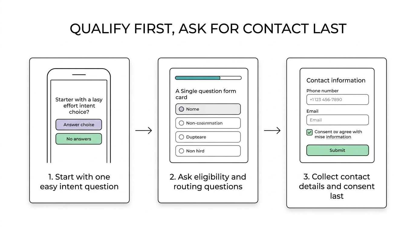
A practical sequence looks like this:
- Step 1: confirm core intent with one easy selection
- Step 2: ask the most important eligibility question
- Step 3: gather details that affect routing or value
- Step 4: ask timing or urgency questions
- Step 5: collect contact details and consent
That order works well because it earns the right to ask for personal information. It also supports conditional logic. A roofing funnel might only ask storm damage questions if the user selected “repair.” A final expense form might branch by age or state.
Step by step form UI patterns that reduce drop-off
The highest-performing step by step forms are usually simple to look at: one question, one clear action, one direction of movement.
Single-column layouts matter here. This is even more relevant on mobile, where attention is narrower and visual clutter hurts more.
Progress indicators matter too. People are more willing to keep going when they know where they are and how much is left. A progress bar does not need to be fancy. It just needs to be honest, visible, and stable.
Here is a practical way to think about the core UI choices:
| UI pattern | Why it helps conversion | Why it helps lead quality |
|---|---|---|
| One question per step | Reduces cognitive load and speeds decisions | Makes qualification answers more deliberate |
| Clear progress bar | Lowers uncertainty and abandonment | Keeps high-intent users moving through full qualification |
| Single-column layout | Cuts scanning errors and confusion | Reduces bad data from skipped or misread fields |
| Large tap targets on mobile | Makes completion easier on paid traffic devices | Prevents accidental entries and user frustration |
| Inline validation | Fixes mistakes before submit | Improves phone and email usability |
| Conditional logic | Shows only relevant questions | Filters low-fit leads before handoff |
Microcopy is another quiet winner. Short helper text can remove doubt at the exact moment it appears. Think “We only use this to match local installers” under ZIP code, or “Mobile number for your quote” under phone. You do not need much. You need clarity.
Buttons deserve more care than they usually get. “Next” is acceptable. “See your options” or “Continue to quote” often works better because it reinforces value. The CTA should match the promise of the funnel, not read like a generic survey.
One more point: do not make the first step heavy. If the first screen has five fields, a date picker, a long dropdown, and a wall of text, the multi-step format loses most of its advantage.
Where to place contact fields in step by step form UI
In most paid lead gen funnels, contact fields belong near the end.
This is one of the easiest changes to make and one of the most effective. Early contact requests feel expensive. Users have not seen enough value yet, and many are still deciding whether the process is worth their personal information. Asking for phone and email too soon can reduce completions and attract throwaway data.
Late contact capture often lifts both conversion and quality. By the time someone reaches the final step, they have already answered eligibility questions, invested time, and understood the offer. That raises the odds that the phone number is real and the person expects follow-up.
This is also the right place to apply verification. A step by step form can validate email syntax in real time, confirm phone formatting, or add SMS OTP when lead value justifies the extra friction. High-risk traffic sources, contested verticals, and any funnel with rejection or duplicate problems can benefit from stronger verification on the last step.
There are exceptions. Some call-transfer flows or partial lead routing setups need contact details earlier. Even then, the UI should still keep the first interaction light. Ask only what is required for the next system action, then continue qualification without overwhelming the user.
Lead quality controls inside the step by step form UI
Good UI does more than improve completion rate. It can actively protect downstream economics.
That starts with qualification logic. If a lead falls outside your criteria, the form should disqualify cleanly instead of pushing junk into the CRM, buyer feed, or dialer. For operators using Boberdoo, LeadsPedia, Phonexa, or webhook delivery into a sales stack, front-end filtering reduces waste before routing ever begins.
A few quality controls are especially useful in high-volume funnels:
- Conditional questions: only show steps that matter for the selected scenario
- Disqualification rules: stop low-fit traffic before submission
- Phone verification: reduce fake, mistyped, and unreachable leads
- Email validation: catch disposable or malformed addresses
- Consent capture: attach TrustedForm or Jornaya evidence when required
- Duplicate checks: keep repeat submissions from inflating volume
Notice how none of these features are separate from UI. They are part of the interface. The user experiences them as clarity, relevance, and confidence. The operator experiences them as better contactability, cleaner routing, and fewer buyer complaints.
Growform builds these controls into the form itself. Conditional logic and disqualification rules stop low-fit leads before they submit, phone numbers are checked through Twilio and email addresses through ZeroBounce while the lead is still on the form, and a TrustedForm or Jornaya certificate is saved with every lead. Each submission then goes by webhook or Zapier to Boberdoo, Phonexa, LeadsPedia or your CRM, with every qualification answer attached.
Step analytics for step by step form UI design
A multi-step form gives you better testing data than a single long form because it shows where the friction really sits.
If you can fire a step-completed event into analytics platforms and ad platforms, you can see where people stall. That makes UI work much more precise. You are no longer guessing whether the issue is “the form.” You know step three is losing mobile users, or the phone step is fine but the consent step is too abrupt.
For lead operators, the most useful readout is not just completion rate. It is the relationship between step completion and downstream metrics. A change that lifts submissions by 20% but tanks answer rate or buyer acceptance is not an improvement.
Watch these together:
- Step-to-step drop-off
- Final submission rate
- Contact rate
- Show rate or appointment rate
- Acceptance or return rate
- CPL and revenue per lead
That is where form UI becomes an operating advantage rather than a design exercise.
What to test first in step by step form UI design
Testing is most useful when you change one thing that maps to a clear hypothesis.
Start with the opening step. If that screen feels easy and relevant, more paid traffic will enter the flow. Then test contact placement, progress bar style, button copy, and the number of fields on the final step. After that, test qualification order and whether some fields should become conditional.
Do not ignore mobile behavior. Many consumer lead funnels live or die on mobile taps, keyboard changes, field spacing, and scroll depth. What looks acceptable on desktop can feel slow and awkward on a phone.
If you are rebuilding a form right now, the safest first version is usually this: one question per step, single column, obvious progress, easy first step, contact fields last, inline validation, and only the qualification screens that truly affect routing or sales readiness.
And for teams buying traffic at scale, effective UI is exactly what better lead quality looks like at the top of the funnel.
Related articles
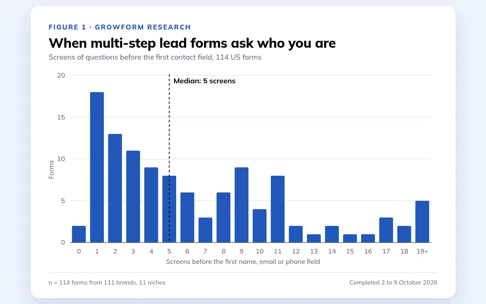
Multi-step lead forms: a 2026 study of 114 forms
We completed 114 US multi-step lead forms screen by screen in October 2026 and counted how long they are, what they ask first, how they show progress, when they ask for contact details and how they ask for consent.
October 9, 2026
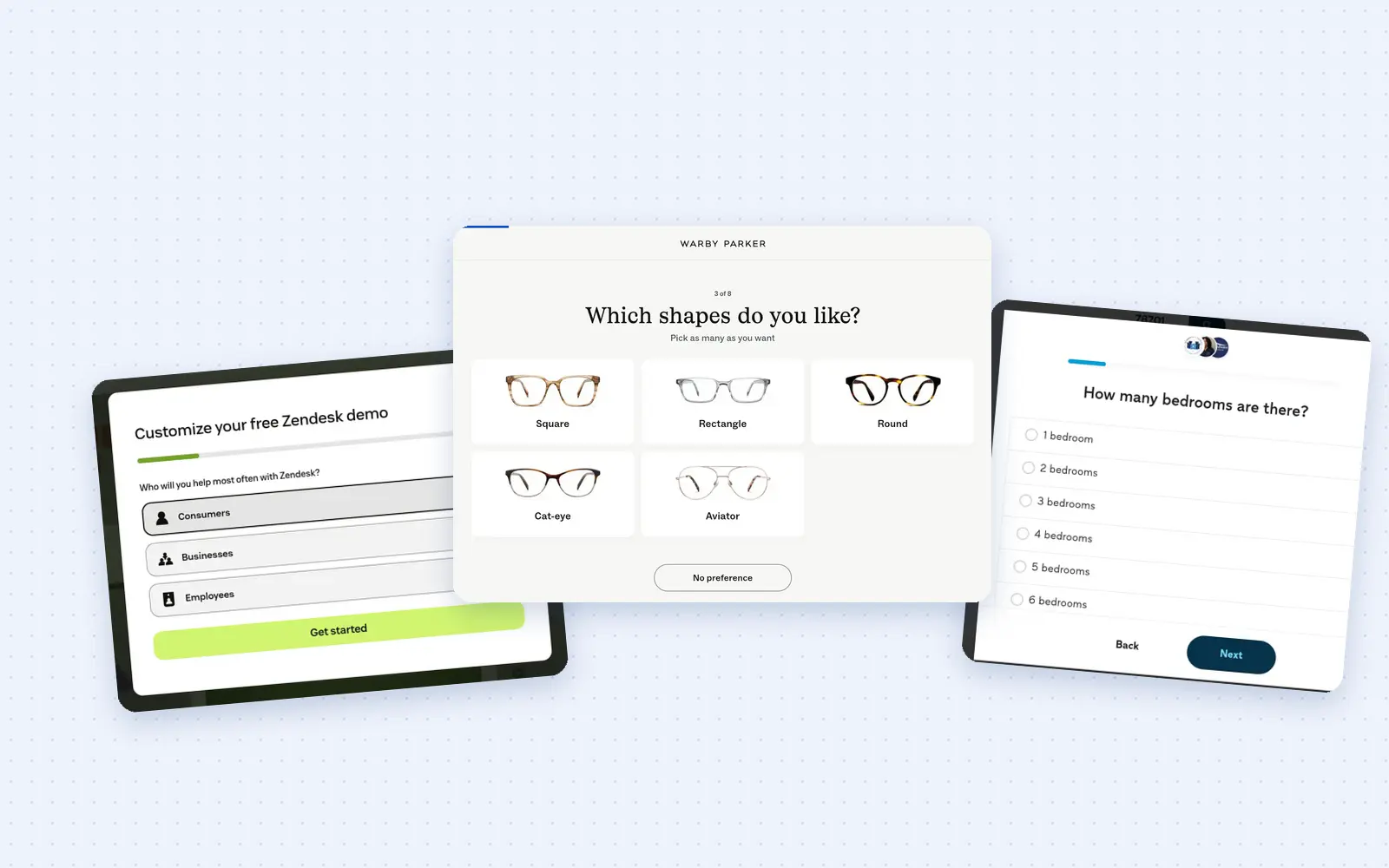
25 lead generation form examples to steal in 2026
From one-field newsletters to mortgage forms, we filled out 25 lead generation forms of every type. Here's what works in 2026, and what to learn from them.
October 9, 2026
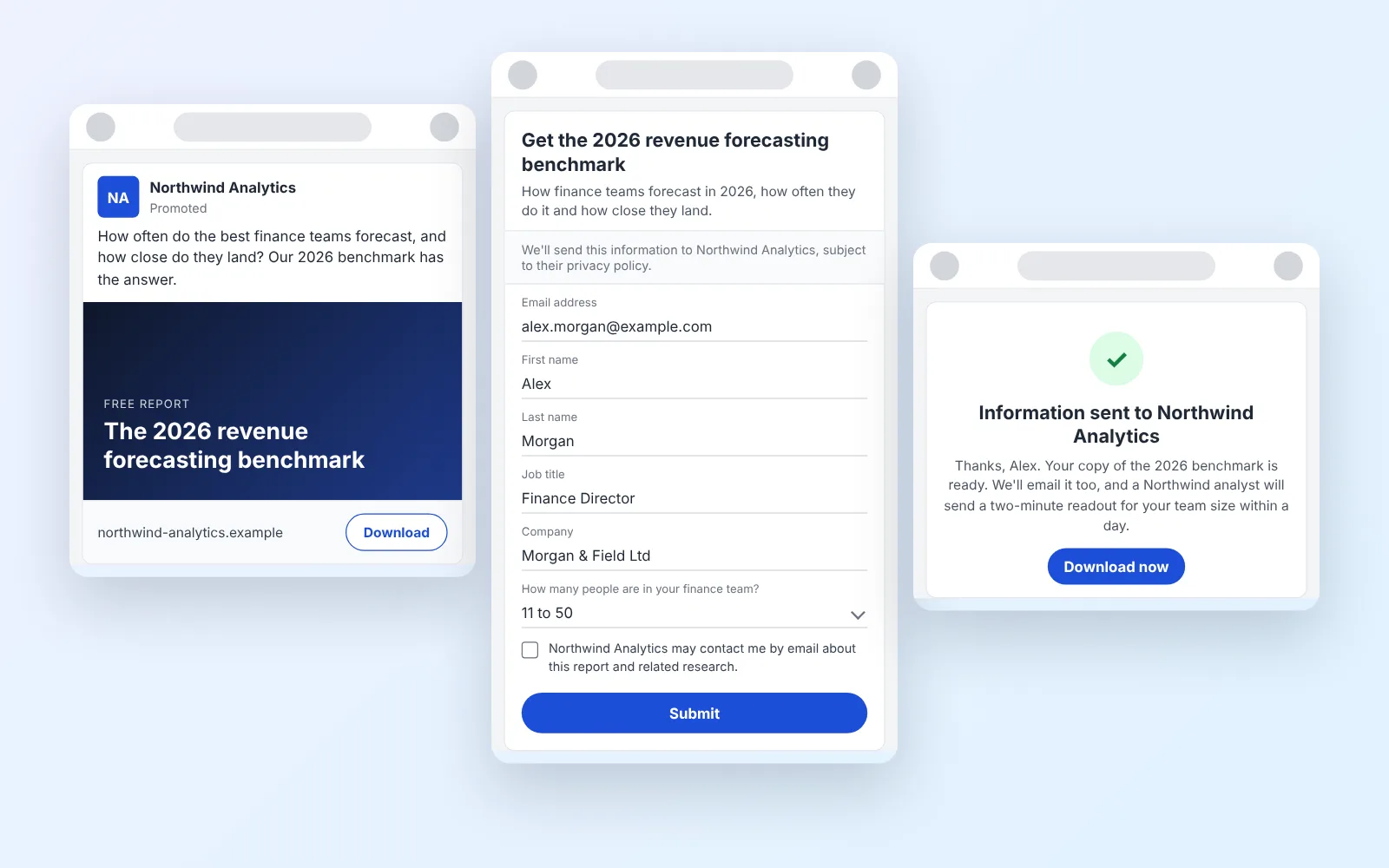
14 LinkedIn lead gen form examples worth stealing in 2026
We painstakingly searched across hundreds of LinkedIn lead gen forms, collated reams of data and worked out what's worth drawing inspiration from in 2026.
October 9, 2026