


A consent checkbox looks small, but on a paid traffic lead form it sits right where conversion, compliance, and lead quality meet.
For high-volume consumer lead generation, that matters more than it first appears. If the checkbox is buried, preselected, mixed into a wall of legal copy, or placed far from the final action, you create two problems at once: weaker consent evidence and a harder path to form completion. If it is handled well, the form stays easy to finish while the consent record stays usable downstream in your CRM, lead distribution platform, or buyer payload.
This page reflects a 2026 review of general consent and UX guidance. It is not legal advice. The practical goal is simpler: place the checkbox where users can clearly see it, keep it unchecked by default, and store enough proof to defend the lead later.
Why consent checkbox placement affects lead form performance
Most operators think about consent as a legal requirement and submit-button placement as a UX decision. On a lead form, those two things are tied together.
UX guidance favors putting the main action near the last field in the user’s top-down workflow. Consent guidance favors a clear, separate, affirmative action that is easy to notice and easy to understand. Those two ideas point to the same layout pattern: place the consent checkbox near the end of the form, just before the submit action, on the step where contact details are collected.
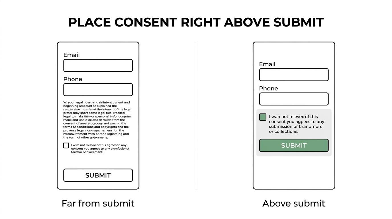
That placement works because it lowers cognitive switching. The user enters phone and email, sees the consent request, checks the box, and submits, with no scrolling back up, no split attention between the legal text and a button far away, and no guessing whether checking the box was optional.
For paid traffic funnels, that flow also gives operators cleaner evidence. When the consent control sits on the same step as the final action, it is easier to associate the exact wording shown, the timestamp, the page URL, the device session, and the user action that completed the lead.
Best consent checkbox placement on lead forms
The strongest default for most consumer lead forms is simple: put a standalone, required consent checkbox directly above the submit button on the final step, usually the step that collects phone and email.
This matches both user behavior and recordkeeping needs. Regulatory guidance on consent favors a prominent request that is separate from other terms and that requires a clear affirmative action.
If you run a multi-step form, keep the checkbox off the early qualification steps. Asking for consent before a user has even entered contact details can feel premature, and it creates distance between the consent action and the final submission event. In most lead generation funnels, the best moment is when the user is ready to hand over contact information.
Here is a practical view of where different placements tend to land:
| Placement option | Conversion impact | Consent clarity | Recommended use |
|---|---|---|---|
| Above the submit button on the contact step | Strong | Strong | Best default for most lead forms |
| Below the submit button | Weaker | Weak | Avoid |
| At the top of the form | Weaker on mobile | Medium | Avoid unless the form is extremely short |
| Hidden in paragraph text near submit | Unclear | Weak | Avoid |
| On an earlier step, before contact details | Mixed | Medium | Rarely the best option |
| Separate popup or modal before submit | Often weaker | Medium to strong | Use only if there is a strict legal reason |
That “above submit” pattern is especially effective on mobile, where users move in a straight downward flow. Putting the checkbox near the CTA keeps the task compact.
Consent checkbox design rules that reduce risk
Placement is only half the job. The checkbox itself has to be configured in a way that creates real consent rather than a weak paper trail.
A good consent control should follow a few non-negotiables:
- unchecked by default
- standalone checkbox
- concise label text
- visible link to privacy policy and terms
- required when the consent is necessary for lead submission
The default-state rule matters a lot. Regulatory guidance has been consistent on this point: pre-ticked boxes, opt-out framing, or hidden default settings do not create the same kind of affirmative action as a user actively checking the box.
The wording should also be separate from broader site terms. Do not bury lead consent inside a general legal paragraph that covers everything from cookies to arbitration to marketing calls. A user should be able to look at the checkbox label and know what they are agreeing to, in plain language, at that exact point in the form.
For high-CPC verticals like insurance, solar, home services, debt relief, or mass tort, that clarity is not just about legal defensibility. It also reduces downstream disputes. Buyers, internal sales teams, and compliance reviewers want to see that consent was captured in a way that was explicit, not inferred, and consent standards matter here.
Mobile consent checkbox UX for multi-step forms
A lot of consent problems are really mobile layout problems.
On desktop, a form builder can get away with sloppy spacing and still look passable. On mobile, the distance between the last input, the consent checkbox, and the submit button directly affects completion. If those elements are too spread out, users pause. If they are too compressed, the checkbox can be missed or tapped by mistake.
The best mobile implementation uses a single-column layout, generous spacing, and a touch-friendly checkbox hit area. The consent label should wrap cleanly without pushing the button too far below the fold. If the text is long, keep the main consent statement visible and link out to supporting documents rather than dumping all legal language into the label itself.
A few mobile-specific rules are worth keeping:
- Keep proximity tight: The checkbox should sit immediately above the submit button, not separated by unrelated text blocks.
- Use readable copy: Tiny legal text may satisfy no one if users cannot practically read it.
- Avoid top placement: Putting submit or consent at the top breaks the natural top-down workflow.
- Make the tap target forgiving: The checkbox and label area should both be easy to tap on smaller screens.
If you use a multi-step form builder, this is one of the clearest wins over generic form tools. You can keep the early steps focused on qualification, then use the last step for contact fields, consent, and submit in one compact block.
Consent wording and proof trail for TCPA-sensitive lead generation
Placement protects conversion. Proof protects revenue.
In consumer lead generation, especially where calls or texts follow the form submission, the checkbox cannot be treated as just a visual element. You need an audit trail that travels with the lead. That becomes even more relevant in TCPA-sensitive programs and in states with stricter mini-TCPA rules.
A usable proof trail usually includes the following:
- Who consented: name, phone, email, and any internal lead ID
- When consent happened: timestamp in a consistent timezone
- How it happened: web form submission, checkbox state, source page
- What they saw: exact checkbox copy, linked policy versions, page snapshot or replay token if available
This is where tools like TrustedForm and Jornaya often enter the stack. They do not replace good form design, but they help preserve evidence around the page experience at the point of capture. If a buyer requires one or both, the checkbox layout still matters because the certificate is only as useful as the consent experience it documents.
For lead sellers and aggregators, version control matters too. If you update your checkbox wording on Monday and a dispute arrives three months later, you need to know which exact wording was live when that lead converted. Treat consent text like a versioned asset, not a casual CMS edit.
What to test and what not to test with consent checkboxes
Many teams avoid testing anything around consent because they do not want to create risk. That caution makes sense, but it should not stop optimization. You can test the form around the consent control without weakening the consent action itself.
Safe tests usually improve clarity or reduce friction while keeping the legal structure intact.
Here are solid testing areas:
- Shorter label copy
- Spacing above the checkbox
- Button text
- Contact-step layout
- Single-step vs. final-step placement within the same form logic
What should stay stable is the core consent model. Do not test prechecked boxes, vague copy, hidden disclosures, or layouts that separate the checkbox from the submit action by a large visual gap. Those changes may produce short-term conversion gains, but they can create rejection risk, compliance risk, or both.
A useful approach is to define a “locked” consent zone. The exact legal wording, required state, and recordkeeping behavior stay fixed. The surrounding layout can then be tested for completion rate, field drop-off, mobile readability, and speed to submit.
Consent checkbox implementation in lead capture software
If your form builder is meant for consumer lead gen, setting this up should not require custom code.
A strong implementation has a required checkbox field, rich-text label support for policy links, hidden field pass-through for attribution data, and delivery into the systems that need the consent record. That means the checkbox state and the wording should move with the lead into the CRM, webhook payload, or ping/post flow, not stay trapped in the front-end form.
For operators using Growform or a similar lead-focused builder, the practical setup is straightforward: add the consent checkbox on the contact details step, place it directly above the submit button, make it required, and use the label field to present the exact consent language with links to the privacy policy and terms. Then make sure the submission record includes the checkbox response, timestamp, page URL, and any evidence token from TrustedForm or Jornaya.
This is also where routing teams should think ahead. If a lead is being sold into Boberdoo, LeadsPedia, Phonexa, or another distribution platform, map the consent-related fields early. Do not wait until a buyer asks why the payload contains a phone number but no proof of how the user opted in.
A practical standard for paid traffic lead forms
If you want a default rule that works across most verticals, use this one: the consent checkbox should be visible, separate, unchecked, required when needed, and placed directly above the submit button on the final contact step.
That standard works because it respects both user behavior and consent standards. It also fits how real lead stacks operate. The form captures the action clearly. The submission stores the proof. The downstream systems receive a lead that is easier to route, easier to defend, and less likely to trigger quality disputes.
For teams spending serious money on Meta, Google, native, or TikTok traffic, that small layout choice can have a real impact on CPL, acceptance rate, and compliance posture at the same time.
Related articles

Step by step form UI design for better lead quality
November 5, 2026
Multi-step lead forms: a 2026 study of 114 forms
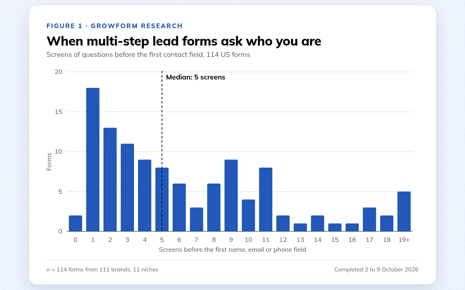
We completed 114 US multi-step lead forms screen by screen in October 2026 and counted how long they are, what they ask first, how they show progress, when they ask for contact details and how they ask for consent.
October 9, 2026
25 lead generation form examples to steal in 2026
From one-field newsletters to mortgage forms, we filled out 25 lead generation forms of every type. Here's what works in 2026, and what to learn from them.
October 9, 2026