14 Best Converting Landing Pages & Tools for 2025
April 2023 update: We’ve added landing pages, removed outdated links and added more in-depth analysis on the highest converting landing page examples.
Looking for some great examples of landing design to help you your audience and boost that conversion rate? Well, search no further! We’ve meticulously handpicked and analyzed 14 stellar landing page examples that are smashing it in 2025.
These examples not only boast exceptional design and user experience but are backed by proven strategies (detailed below) which make them conversion machines. Read on to uncover the secrets behind these success stories and glean valuable insights to elevate your own landing page game!
We’ve chosen 14 highest converting landing page examples from various industries and market segments, so you’ll have no problem finding inspiration for your next campaign.
But first, let’s dissect the elements that can make a good landing page.
Related: Lead Generation For Lawyers: 11 Best Tips In 2024
Table of Contents
Key Elements of a Highest Converting Landing Page
Landing pages that convert visitors into signups and customers take on many different forms – but there are a few common themes that help them succeed across the board.
So what makes a landing page effective?
Based on our research, here are the top ingredients that help make a high-converting landing page:
- It should answer questions and solve problems. You can achieve this by relaying how your product will benefit rather than simply waxing lyrical about it.
- Hook visitors in quickly with an attention-grabbing headline that explains exactly what you do or sell.
- Use an attention-grabbing image of the solution that your product or service provides.
- If a visitor arrives at your landing page through search results or an ad, make sure there is enough information on the page so that they don’t have to go digging around elsewhere on your site for it.
- A clear and unambiguous CTA that tells visitors exactly what they’ll get when they click on it.
- Don’t ask for information you don’t need and keep forms short whenever possible.
- An offer that is hard to resist or, better yet, impossible to resist (i.e., free, no risk, limited time).
- Incorporate social proof to back up your claims.
The ideal landing will clearly convey the value proposition and will be relevant to the user or their search term. It’ll decrease anxiety or hesitation whilst adding a sense of urgency.
These principles apply whether you’re creating a B2B landing page, e-commerce or something else altogether – but we’ll highlight the highest converting lead generation landing page examples from different industries to make it easy to follow.
Related: Solar Lead Generation: Top Tools & Strategies for 2025
The 14 Highest Converting Landing Page Examples
Although it’s impossible to know exactly how well a landing page converts, we’ve put together this list based on known best practices, secondary information and interviews – so if it’s made it into the list, you know it’s one of the highest converting landing pages with a good landing page design.
- Solo Stove
- ABtesting.ai
- Nearly Real Florals (Lead generation landing page example)
- Growth Sprints (B2B landing page example)
- Rippling
- ShipBob
- Jasper
- Omniscient Digital
- OpenPhone
- Notch
- Effin Amazing
- Promo
- Home Chef
- MeowBox
Related: 5 Unbounce Landing Pages Examples You’ll Want To Steal
1. ABtesting.ai
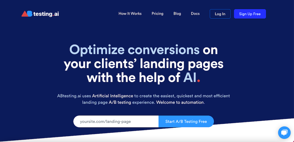
As soon as you land on ABtesting.ai’s landing page for agencies, you’ll know it’s an A/B testing tool.
For starters, the landing page has a clear value proposition, highlighting the features (AI to create A/B tests) and the key benefit of their product (optimize conversions on client’s landing pages).
The layout is easy on the eye (despite the use of bright colors) — too many images or ads will distract visitors from what’s important: the content itself. Testing.ai seems to know this.
Finally, the CTA button – Start A/B Testing Free – encourages prospects to enter their email address and click right away. Who wouldn’t sit up and take notice once they read the power word “Free?”
The prospects get something for free, and ABtesting.ai gets their email address. Win-win!
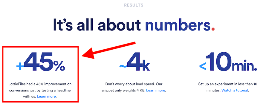
And as you scroll down, they show you some stellar social proof and even case studies, which builds trust and reassures you that ABtesting.ai is a reliable company.
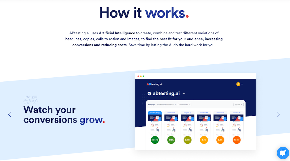
Further down, they give their prospects a step-by-step account of how it works coupled with images demonstrating the steps.
What improvements could be made to the landing page?
- Differentiating Factor – While the landing page checks all the right boxes, it would be even better if they could highlight what makes them unique from their competitors.
2. Nearly Real Florals (Lead generation landing page example)
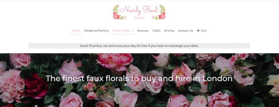
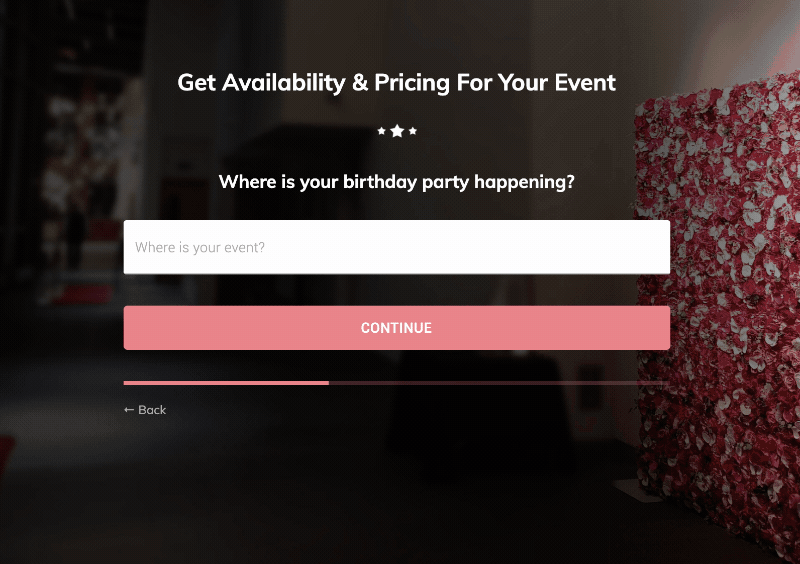
Nearly Real Florals is an e-commerce site selling bespoke, handcrafted artificial floral arrangements. Their landing pages feature a multi-step order form and a beautiful color palette that complements their products.
The use of big, bright images of their products to show off the quality and beauty of their flowers is another bonus.

The best part? Their multi-step forms make the users feel like they’re not even filling out a form!
After all, the inclusion of a multi-step order form in their landing pages did help Nearly Real Florals increase the conversion rate by 87%.
One reason why this technique is so effective is that it’s less overwhelming for visitors. There’s a psychological phenomenon called “decision fatigue,” which states that when people are faced with too many choices or decisions, they get tired and avoid making any decisions.
So, by splitting a single form into multiple steps, Nearly Real Florals is lowering the number of decisions people have to make at once and reducing any feelings of “overwhelm” they might feel.
See it in action:
Want a multi step form like this? Growform makes it easy – try a free 14 day free trial.
We covered the form in more detail in our post on multi step form examples.
This is a fantastic lead generation landing page example too: users start off with a question (“I wonder how much this costs”), start filling in the form and soon become a lead in the company’s CRM.
Other factors that make it a great landing page include:
- Lots of whitespaces, making it more inviting than competing pages with cluttered content.
- They keep it short and sweet. Nobody wants to read huge chunks of text!
- They’ve incorporated social proof to help build trust and credibility for their brand.
What improvements could be made to the landing page?
This is a beautifully designed page. The image is large, crisp, and colorful. But there are no CTA buttons telling you how to buy the product. There’s no indication that it’s possible to buy this product until you scroll down to the bottom of the page.
Related: 20 Best Roofing Lead Generation Ideas For 2024
3. Growth Sprints (B2B landing page example)
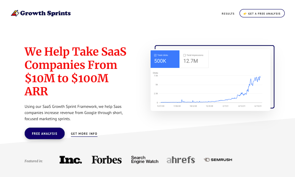
While this one is more of a homepage than a landing page – this homepage itself constitutes the entire website. And it does tick all the boxes that make a high-converting B2B landing page.
It has a nice clean layout, which we appreciate. We love when a landing page isn’t crowded or overwhelming but instead has just enough information to get visitors interested in learning more.
The headline is clear and succinct, telling you precisely what Growth Sprints does: “We Help Take SaaS Companies From $10M to $100M ARR.” Legit numbers rather than waxing lyrical about their services.
Growth Marketer at ActiveCampaign and founder of Growth Sprints, Brendan Hufford, says,
“What really helped me on that page was addressing confusion about what happens after filling out the form. Almost NOBODY does that.”
The subhead is also great. It tells you even more about:
- What the product does (SaaS Growth Sprint Framework)
- Who it’s for (Saas companies)
- How does it benefit (increase revenue from Google) them?
The page is focused on the product, with just enough text to tell you what you need to know and make you want it.
The best part? They’ve used graphics to show the progress of their customers rather than rambling on with the text.
Another feature that sets this landing page apart is that visitors are automatically directed to the founder’s calendar upon clicking the CTA button, saving time for both parties.
Brendan adds, “I’ve found that, for my needs, a calendar embed is the best form to fill because I want people to book time directly on their calendar. No reason to fill a form just to send them the calendar link.”
What improvements could be made to the landing page?
None! It has pretty much everything you’d ever want on a landing page: clear, easy-to-follow sections that tell you all about who they are and what they do, an explanation of how the service works, testimonials from real people who have used the service, and CTA buttons that prompt you to take action.
4. Rippling
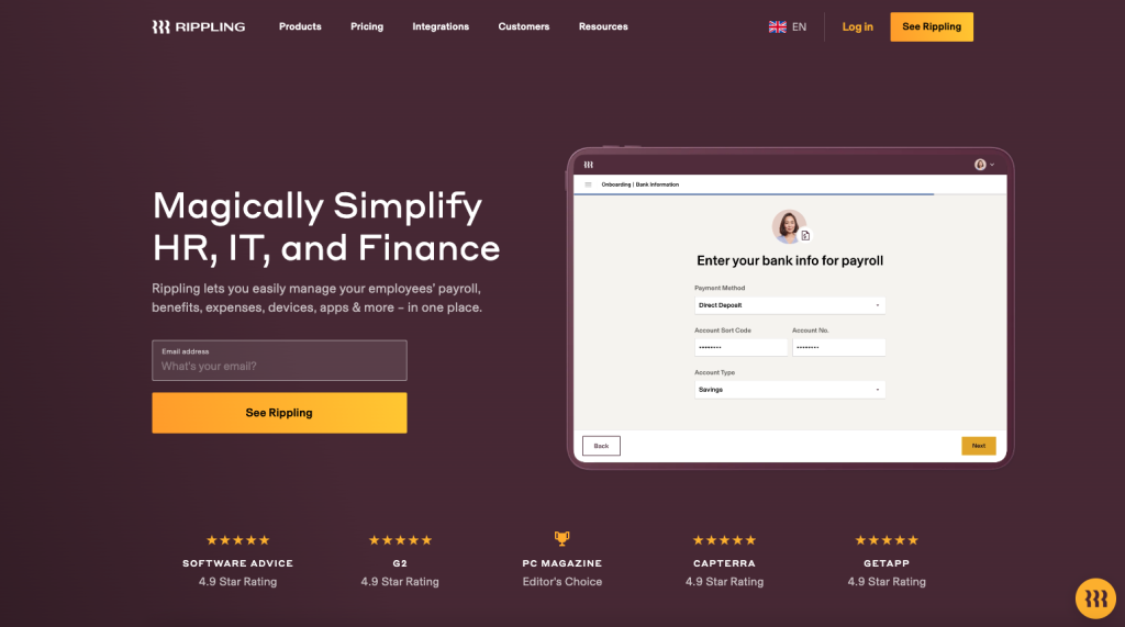
Rippling score highly for clarity and social proof. The headline is a beautiful example of the AIDA framework in action: this great example of a landing page grabs the user’s attention with the headline “Magically Simplify HR, IT and Finance” before stoking interest and desire with more information (“Rippling lets you easily manage your employees’ payroll, benefits, expenses, devices, apps & more – in one place”).
Above the fold, we’re left with absolutely no doubt that:
- This product solves our pain point
- The product is well-loved and used by many others
- What to do next: we can see more by adding our email address
Rippling are great at repositioning the product depending on who’s reading: if you search “Rippling for HR”, you’ll be greeted with a landing page aimed at solving the problems of HR, whereas if you search “Rippling for Payroll”, you’ll see a whole new landing page about how the product solves for Payroll.
What improvements could be made to Rippling’s landing pages?
There’s very little to criticize, but if we’re being nit-picky: the CTA “See Rippling” could be called a little vague: it’s not clear to the user what happens next. As it happens, we get taken to a book a demo form. Perhaps Rippling are smarter than we’re giving them credit for, and know about the sunk cost fallacy!
5. ShipBob
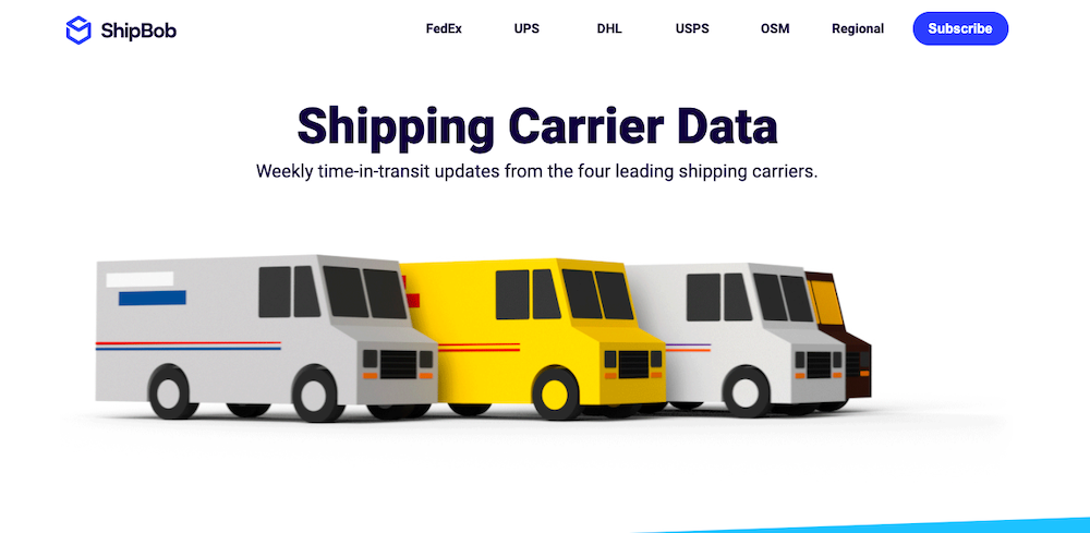
ShipBob’s landing page is a visual treat. You’ll find four little trucks moving back and forth on a white background, each one representing one of the leading shipping carriers ShipBob works with to make shipping easier.
We’re so enthralled by these pretty 3D trucks that we’re willing to overlook the lack of a CTA button or a clear value proposition, at least for a while.
Nonetheless, it seems that Nick Cotter, Founder @ newfoundr, the architect behind this age, achieved what they set out to do.
Nick suggests, “We wanted this to be a “shareable” landing page, so we added some cool 3D delivery trucks that would get people excited — and it sure did! It was featured across several hundred websites and publications, and even after two years, the page is still live today and shared extensively.”
What improvements could be made to the landing page?
A clear call to action (CTA) – The design is minimal, polished, and the graphics are strong. The sub-heading on the page is relevant to the target audience and communicates the motive of the page.
But even though this landing page has some great attributes, there’s one major mistake that affects its conversion rate: the lack of a clear call to action (CTA).
On the ShipBob landing page shown here, the CTA is at the bottom of the page. This means that users have to scroll down below the fold to get to it.
6. Jasper
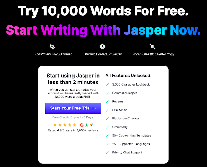
Jasper’s free trial offer page is another example of a landing page done well. It has a simple but beautiful design, plenty of social proof, and a prominent, easily noticeable call to action button. The bold text “Claim 10,000 Words Free” makes it obvious what visitors can expect if they click the CTA.
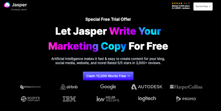
If the “Special Free Trial Offer” at the top of the landing page isn’t enough to entice the visitors, social proof and ratings strewn all over the page will do the rest of the job.
Even the articulate and succinct sub-heading doubles down by adding “Rated 5/5 stars in 3,000+ reviews.” The inclusion of the “3000+ reviews” part emphasizes that thousands of people are using and finding the tool helpful, implying that it must be good.
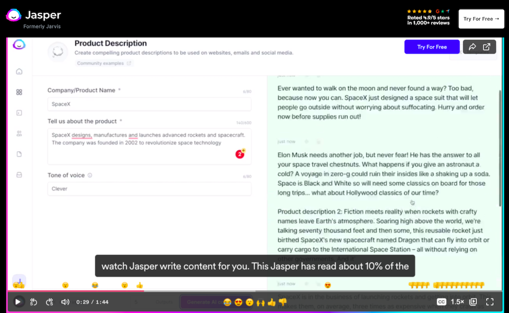
The best part? As you scroll down, you can see an explainer video with the product action, which is a great way to visualize how the product actually works.
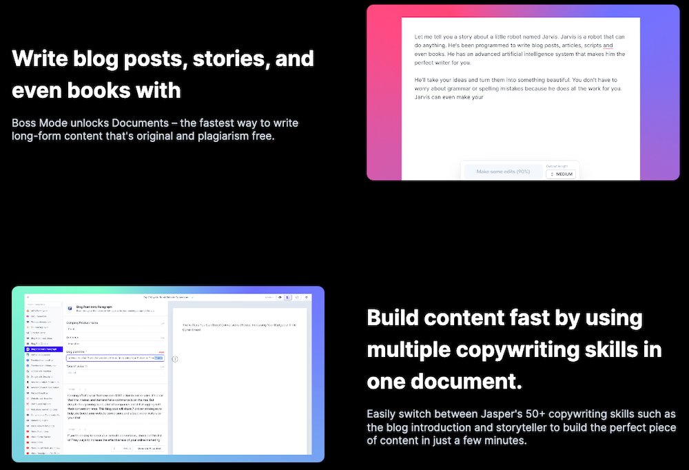
Further down the page, they specify Jasper’s features and benefits in quick, snappy paragraphs accompanied by attractive graphics. Using gifs to demonstrate the process, they again stay true to their “show, don’t tell approach.”
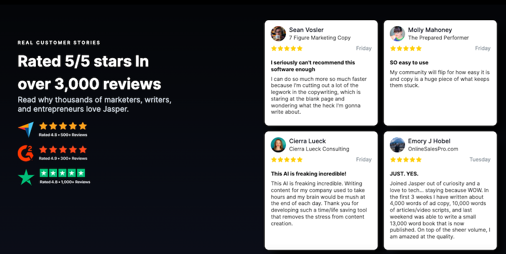
The landing page again uses strong social proof in the form of testimonials from actual customers, coupled with their headshot and the company.
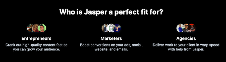
The landing page also lays out who the product is appropriate for right after the testimonials – precisely what people who are interested in the product want to know. Another point for Jasper!
There’s a final section that quantifies the benefits with value proposition statements like “Publish Content 5x Faster” and “Try 10,000 Words For Free.”
What improvements could be made to the landing page?
Nothing! The folks at Jasper know a thing or two about landing pages, and you can see that reflected here.
The whole landing page is uncluttered and in perfect harmony – with every detail considered and placed to encourage that all-important conversion – from social proof to CTA buttons to the FAQ section and the value proposition.
7. Omniscient Digital
Omniscient Digital’s service page has tons of elements that make up good landing pages.
For one, Omniscient Digital has an interesting way of presenting a lot of information on one page by breaking up the text to make it easy to scan. Using subheadings, skimmable points, and icons creates a very pleasurable reading experience for the visitors.
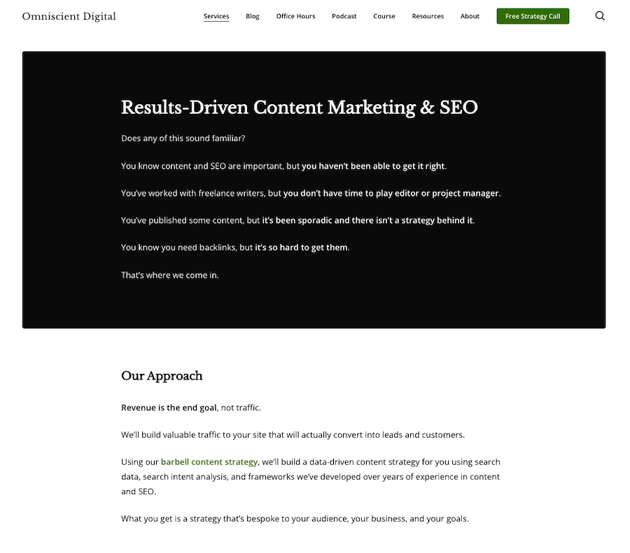
It also features an inspiring headline that explains what they do and still piques your interest. The page then goes on to describe the top benefits of hiring Omniscient Digital to handle your content marketing needs.
But they do it deftly by asking questions that play on your FOMO (fear of missing out), like “You know content and SEO are important, but you haven’t been able to get it right.”
Then they talk about their approach, followed by a case study, which proves that their approach works wonders for business. They even have video testimonials towards the end of the page.
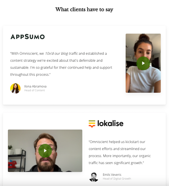
And with 42% of people claiming that testimonial videos are effective because they showcase an actual person telling their story, video testimonials are solid evidence to back up their claims. So, the inclusion of video testimonials gives another point to Omniscient Digital.
They place a final CTA towards the end of the page.
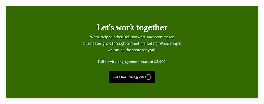
Here, they mention that their full-service engagement starts at $8000, which will help them get only qualified leads – potential customers who are genuinely interested in their product. And they entice potential customers with the idea of a free strategy call, which gives a nudge to people sitting on the fence about their services.
What improvements could be made to the landing page?
While the landing page in question follows many practices that make a remarkable landing page, it lacks something that makes landing pages sing: a hero image and a clear CTA at the beginning of the page.
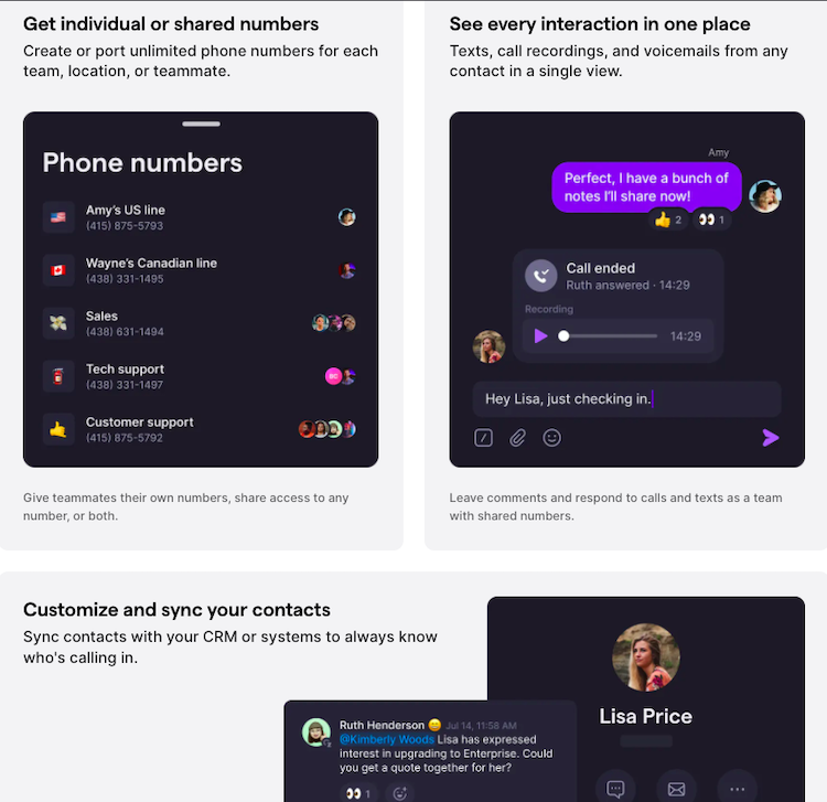
8. OpenPhone
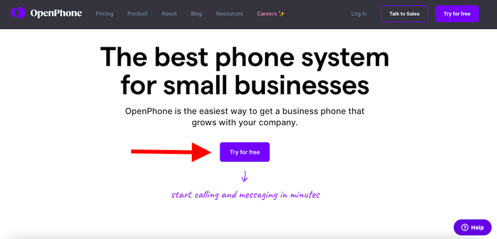
As soon as you land on OpenPhone’s landing page, you’ll think that it’s nothing to write home about – except for the “Try for Free” CTA.
They claim they’re the “best phone system for small businesses,” and here we are thinking, “Yeah, of course, Patricia!”

But not so quick. Just as you scroll down, you’ll realize why the page made it to our list. First, they quickly show – not just explain – what makes them the best phone system for small businesses.
Since their biggest USP is the ease of use and an intuitive UI, what better way than to show it in action? This is necessary because it’s not as if users can physically hold a VOIP system in their hands while they are shopping around for one.
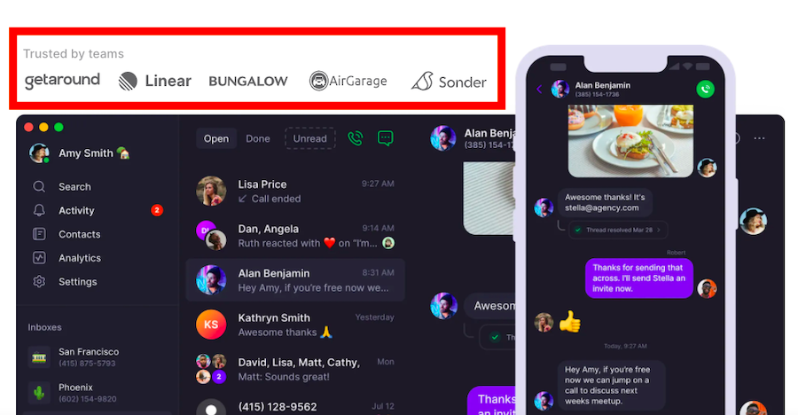
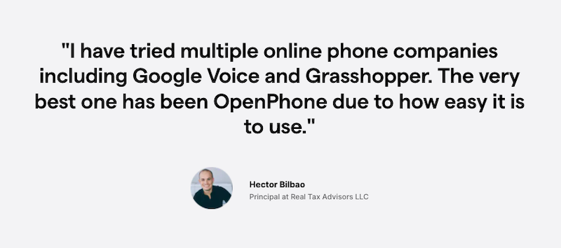
Aside from giving you a complete tour of their product, they highlight the small businesses already using their services. They further double down with testimonials that again allude to OpenPhone’s ease of use and great customer service.
They also highlight their benefits briefly without prattling on too much and again stay true to their “show, don’t just tell” method. It’s an effective way to communicate the benefits of using the service quickly while creating some hype.
What improvements could be made to the landing page?
A clear headline – Before delving into the details of your service, it’s important to give visitors enough information to whet their appetites. OpenPhone’s landing page lacks a headline clearly stating what the service does and why it benefits the reader. The supporting headline doesn’t do a great job either.
As a result, it’s difficult to figure out how OpenPhone is different from other similar services on the market until you scroll down.
9. Notch
The first insurance for Instagram accounts, Notch has one of the best landing pages we’ve ever seen. The colors are vibrant, the imagery intriguing, the CTA buttons carefully positioned, and the icons unique and highly effective.
The page doesn’t skimp on any information either. The heading and the supporting headline – both of which convey what the product is all about, its benefits, and what sets it apart – are clear and enticing.
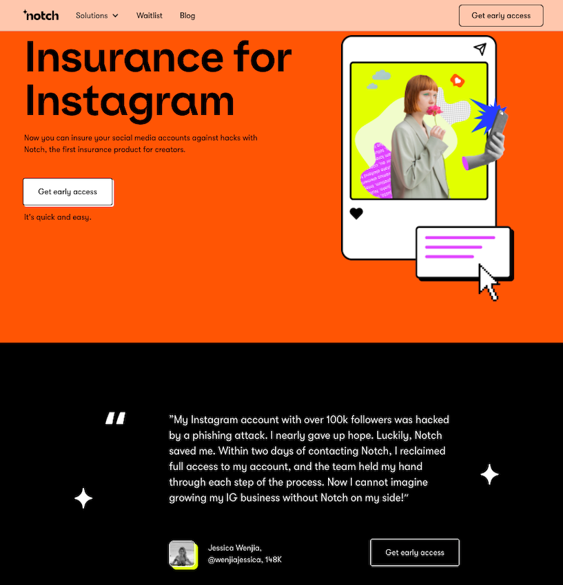
The testimonials of users sharing their Instagram hack stories and thanking Notch for restoring their account make the app seem trustworthy and useful. They first invoke anxiety and then cleverly alleviate any worries the user may feel about their Instagram account.
Each step of the way, Notch shares the benefits of using their app, and they directly address their potential users – Instagram influencers, creators, and businesses.
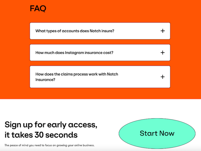
They also have an FAQ section, which is like a cherry on top of the rest of the page and help visitors dispel any lingering concerns before they click on the CTA button.
What improvements could be made to the landing page?
Nothing! This landing page is a great example of how effective design combines aesthetics, information, and social proof to convert prospects into buyers.
10. Effin Amazing
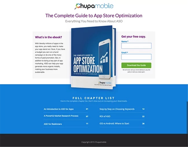
This landing page by Effin Amazing, an analytics and growth agency, is short and sweet with ample whitespace. It asks for an email address in return for a free guide to App store optimization, and it’s made even better by a CTA (“Get the Guide”) that’s front and center.
There’s just a simple description, an image, and an opt-in form with only two form fields – no hassle. The heading and the supporting subhead also convey what the guide is all about.
What improvements could be made to the landing page?
- Testimonials: The landing page is missing third-party testimonials, which could help convince new leads of the quality of the guide.
- Not compelling enough: The landing page is not tantalizing enough. It doesn’t entice visitors with benefits to give their information in exchange for the guide.
11. Promo
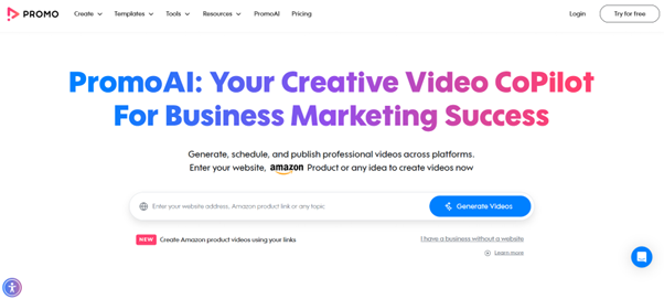
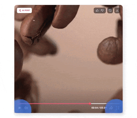
Promo’s landing page effectively showcases its video creation platform with clear messaging and a vibrant, user-friendly design. The headline instantly communicates value: “Your Creative Video CoPilot For Business Marketing Success.” Below, an explainer video demonstrates the platform’s capabilities, catering to users who prefer visual learning:
The layout is uncluttered, guiding visitors toward actionable steps. A bold CTA—“Try for Free”—reinforces the no-risk value proposition.

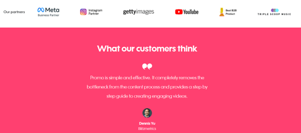
Testimonials from notable clients, with partners like Instagram and YouTube, provide compelling social proof.
Promo excels by addressing user pain points directly, such as time constraints and budget concerns, with features that enable quick, affordable video production. By embedding a lead capture form below the fold, the page optimizes conversions without overwhelming users.
This strategic blend of design, functionality, and trust-building elements ensures maximum engagement.
12. Home Chef
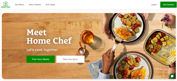
Home Chef’s landing page captivates visitors with a visually rich design and the catching phrase: “Let’s cook together” The page opens with appetizing images of ready-made dishes, immediately showcasing the product’s appeal.
A well-placed headline emphasizes simplicity and convenience, addressing common user pain points like time constraints and meal variety. The CTA—“Get Started”—is prominent and action-oriented, encouraging immediate sign-ups.
Social proof is integrated seamlessly, with user reviews and trust signals like “Customer Satisfaction is our #1 Priority”:
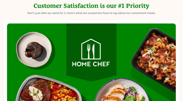
By presenting customizable meal plans and discounts upfront, Home Chef’s landing page creates urgency while demonstrating flexibility to attract diverse audiences.
13. MeowBox
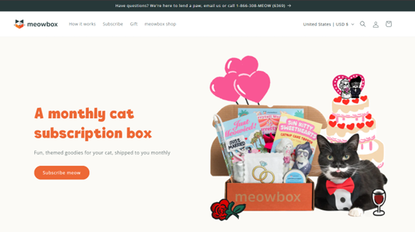
MeowBox’s landing page excels at emotionally connecting with its target audience—cat lovers. The headline, “A monthly cat subscription box” immediately conveys value while evoking curiosity. Bright and animated visuals of a cat enjoying MeowBox products draw users in.
The page highlights unique selling points, such as customizable box options and eco-friendly materials, differentiating MeowBox from competitors. Testimonials and photos from satisfied customers add credibility and warmth.
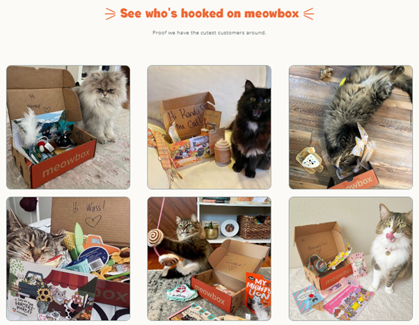
The CTA, “Subscribe meow” is positioned prominently on the landing page. This blend of personalization and trust-building makes MeowBox irresistible for its audience.
14. Solo Stove
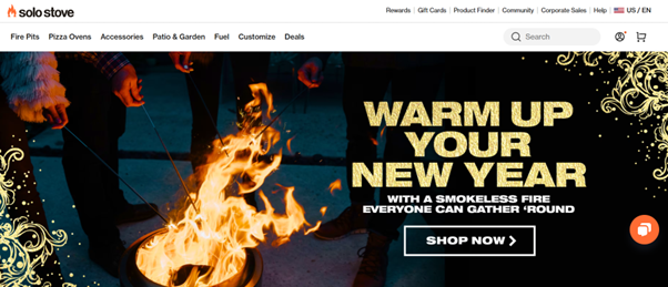
Solo Stove’s landing page stands out with vibrant visuals showcasing its sleek, portable fire pits in action. The headline, “Warm Up Your New Year” addresses a common pain point while highlighting its unique value proposition.
Clear, benefit-driven sections emphasize durability, eco-friendliness, and ease of use. A promotional offer—“Fire Off a Gift Card”—is displayed prominently to create urgency.
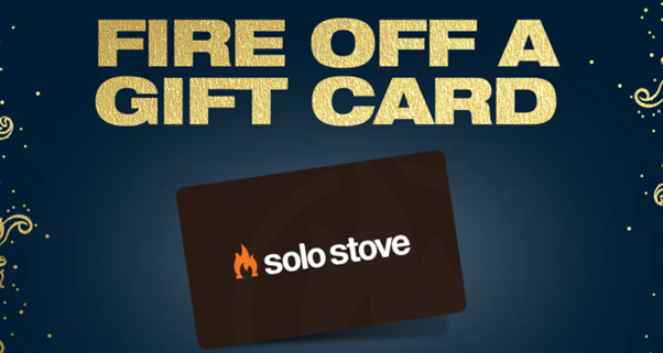
Social proof is reinforced through customer reviews and photos of Solo Stove in diverse outdoor settings.
The prominent CTA, “SHOP NOW,” encourages immediate action, making the page both inspiring and conversion-focused for outdoor enthusiasts.
Your Turn to Make Your Landing Page Convert Better!
So there you have it: ten killer landing page examples that convert in 2023. If you want to get yourself a spot on this list, make sure your landing page follows the principles at the top of this post – and perhaps use some of these examples as inspiration.
One of the quickest, simplest ways to improve your landing page conversion rate is to add a multi-step form:
Growform is an online form builder built specifically to boost conversion rates and get you more leads. It comes with 20+ best practice templates and its beautiful forms can be embedded just about anywhere.
Boost your landing page conversion rate today – sign up for a 14 day free trial.