We Breakdown 11 Lead Magnet Landing Page Examples (Plus Actionable Tips)
Quick Summary
This article highlights 11 high-converting lead magnet landing page examples and provides actionable tips to boost conversions. From free consultations to ebooks, each example emphasizes design, messaging, and form optimization. To dive deeper into landing page conversion rate optimization, explore more on the Growform blog.
Struggling to Get More Leads from Your Landing Page?
You’re driving traffic, but conversions just aren’t where they should be. A well-optimized lead magnet landing page can be the difference between visitors bouncing and potential customers filling out your form. The right design, messaging, and form setup can dramatically boost your lead generation efforts.
In this Growform article, we’ll break down 11 high-converting lead magnet landing page examples, each with actionable tips you can implement right away to boost your conversions.
But first…
Why Listen to Us?
At Growform, we specialize in helping businesses capture more leads with high-converting forms that reduce friction and maximize engagement. We understand that a strong lead magnet is only as effective as the landing page it’s on. After analyzing numerous landing pages, we’ve pinpointed what makes some perform exceptionally well, while others miss the mark.
What is a Lead Magnet Landing Page?
A lead magnet landing page is a standalone page designed specifically to collect visitors’ contact information in exchange for a valuable resource. It promotes a gated offer; such as an ebook, checklist, or webinar, that users can access by submitting their email address. You may also hear it referred to as a squeeze page or a lead generation landing page.
While pop-ups and alert bars can promote a lead magnet, a dedicated landing page provides a home base for it. It’s where you’ll direct visitors from paid ads, social media posts, and other promotional efforts.
A well-optimized lead magnet landing page isn’t just about getting an email, it’s about making the process as frictionless as possible. That’s where Growform comes in. We make it easy to create multi-step forms that guide users through the process, reducing overwhelm and increasing conversion rates.
11 Top Lead Magnet Landing Page Examples
1. Free Consultation or a Free Quote
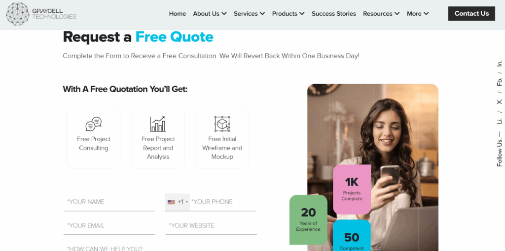
GrayCell Technologies’ landing page makes requesting a complimentary quote simple. The page’s clean design, clear call to action, and straightforward form reduce friction and help prospects quickly connect and receive customized solutions in software development or IT services.
Why This Landing Page Works
- Clear Value Proposition: Immediately highlights a free consultation, project analysis, and initial wireframes.
- Simple, Focused Form: Requests only essential details, reducing friction and encouraging submissions.
- Visual Appeal: Clean, professional design with engaging visuals builds trust and credibility.
- Quick Response Promise: The guarantee of a one-day turnaround sets clear expectations and enhances user confidence.
- Trust Through Experience: Citing “20+ years” of industry expertise reassures visitors that they’re engaging with a seasoned, reliable agency.
What Could be Improved?
- Make the CTA Compelling: Instead of “SEND” you would use “Get My Free Quote”
- Use Social Proof: Add client testimonials, case studies, or logos to enhance credibility and encourage users to take action.
- Leverage Conditional Logic: Use Growform’s conditional logic to dynamically show questions based on the user’s responses, making the experience more relevant and personalized.
2. Webinar
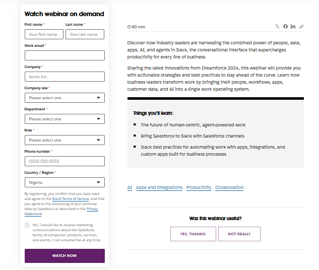
Webinars are an effective lead magnet for educating prospects while positioning your brand as an authority. Slack’s Dreamforce 2024 webinar landing page effectively encourages sign-ups by highlighting key content and making the registration process simple and clear.
Why This Landing Page Works
- Strong Headline and Description: Clearly states what the webinar covers, why it matters, and how long it will take.
- Clean, Modern Design: Professional design reinforces credibility and makes the page visually appealing.
- Simple Registration Form: Even though they ask for more details than the eBook example, it makes sense since their target audience is mainly decision-makers and stakeholders.
- Social Proof and Trust Elements: Mentions of industry leaders, and company branding reassure users.
- Call to Action Stands Out: A clear and compelling “Watch Now” CTA button drives conversions.
What Could be Improved?
- Create a Sense of Urgency: Use a countdown timer to emphasize limited-time access and drive registrations.
- Keep Forms Short: When requesting more details, Growform’s multi-step forms can be used to break down the registration process into manageable steps, improving user experience and boosting conversion rates.
- Highlight Key Takeaways Clearly: Use bullet points to outline the most valuable insights attendees will gain.
3. Free Trial
A free trial landing page is a fantastic lead magnet to give potential customers a risk-free way to try out your product, especially for SaaS businesses.
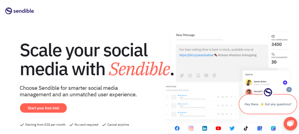
Sendible’s free trial landing page showcases the platform’s best features while encouraging users to sign up quickly and easily.
Why This Landing Page Works
- Prominent Call to Action: Clear, visible CTA button encourages visitors to start a free trial immediately.
- Feature Highlights: Displays key features like scheduling, content customization, and reporting, which entice potential users.
- Testimonial: Social proof with logos of well-known brands and a high rating on G2 builds trust and credibility.
- Clear Benefits: The page emphasizes how users can save time and amplify their brand stories with Sendible’s all-in-one platform.
- Free Trial Highlight: Users are clearly informed that they can start a free trial with no card required, lowering the barrier to entry.
What Could be Improved?
- Clearly Display the Free Trial Duration: Make sure the trial period is visible so users understand how long they have access to the tool.
- Highlight the Key Benefits: Communicate what users will gain from the trial—quickly scheduling content, custom reporting, and better social media management.
- Use Social Proof to Build Trust: Display testimonials or logos of trusted brands that use your product to show credibility.
4. Quiz or Assessment
A quiz or assessment is a fantastic way to engage users while providing personalized insights. Persona Nutrition’s quiz landing page leads users through a tailored assessment, offering custom supplement recommendations based on individual needs.
Want to create a personalized quiz for your business? Use our multi-form builder templates to quickly get started.

Why This Landing Page Works
- Prominent Call to Action: The CTA, “Start free assessment,” is clearly visible, encouraging immediate action.
- Personalized Approach: The landing page emphasizes the creation of a custom wellness profile based on the user’s specific needs, which makes the offer more compelling.
- Clear Process Explanation: Step-by-step breakdown ensures users understand how the quiz works and what they’ll receive.
- Expert Backing: Mentions of nutritionists and evidence-backed science lend authority and trustworthiness to the service.
What Could be Improved?
- Personalize the Experience: Tailor form questions dynamically based on user responses with Growform’s conditional logic, making the process feel more relevant and conversational.
- Clearly Communicate Value: Highlight the specific benefits users will get—like personalized daily supplement packs and expert advice—in bullet points.
- Offer Immediate Value: Provide immediate access to the personalized assessment and emphasize the convenience of getting supplements delivered directly to users’ doors.
5. Ebook
Ebooks remain a powerful lead magnet because they provide in-depth knowledge and valuable insights on a specific topic. Hip2Keto’s Keto Recipes Ebook landing page is an excellent example of a high-converting ebook lead magnet.
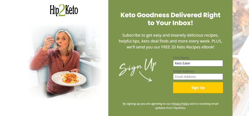
Why This Landing Page Works
- Clear Headline: “Keto Goodness Delivered Right to Your Inbox!” instantly communicates value.
- Compelling CTA: “Sign Me Up!” encourages immediate action.
- Strong Value Proposition: Visitors know they’ll receive 20 crave-worthy keto recipes that make low-carb eating enjoyable.
- Minimal Form Fields: The pop-up lead form requires only a name and email, reducing friction and boosting conversions.
- Engaging Visuals: High-quality images make the offer irresistible.
What Could be Improved?
- Keep it simple: Use a clean design with a clear message. Avoid clutter.
- Highlight the benefit: Tell visitors exactly what they’ll gain from your ebook.
- Use a strong CTA: Make it action-oriented and persuasive.
- Reduce form fields: Ask for only essential information to lower drop-offs.
6. Free Report/Guide
Free reports make effective lead magnets, offering valuable insights in exchange for contact details. Brain Biotech’s landing page delivers this with a professional design, guiding visitors through a CEO letter, strategic highlights, and key figures, with a clear option to download the full report.
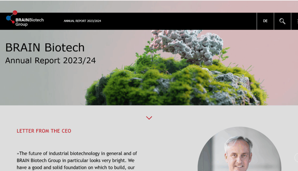
Why This Landing Page Works
- Organized Navigation: Clear menus and section links make it easy for visitors to move between sections.
- CEO Letter: The letter reinforces the authority of the report, making the insights feel trustworthy.
- Strategic Focus: Highlights growth opportunities and R&D advancements upfront, increasing the incentive to download.
- Direct Download CTA: The clearly positioned CTA button simplifies access to the report, reducing friction and boosting conversions.
- Compelling Use of Figures: Key metrics are presented visually, providing quick proof that encourages deeper engagement.
What Could be Improved?
- Highlight Key Findings: A concise summary of the most important takeaways in the report could capture attention quickly and boost conversions.
- Streamline Navigation: Reducing the number of links and secondary options on the page would help keep visitors focused on the main call to action.
- Make CTA Prominent: Bring the CTA button to the Hero section of the page, just after the first heading, “Brain Biotech” annual report 2023/2024.
- Capture Leads: Use Growform to build a form to capture leads for remarketing purposes.
7. Toolkit
Free tools are effective lead magnets, offering immediate value in exchange for a small commitment. HubSpot’s email signature generator landing page highlights its signature tool with a clean design, clear CTA, and minimal distractions for quick sign-ups.
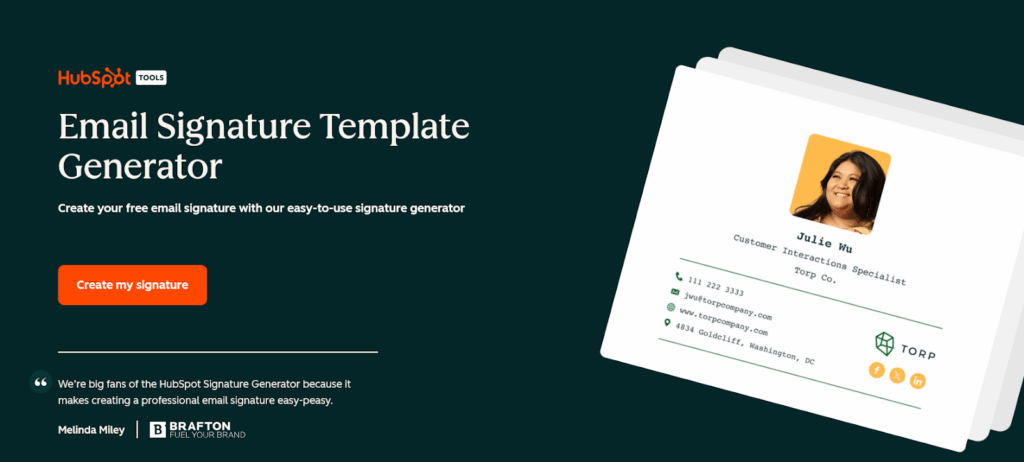
Why This Landing Page Works
- Clear Headline: Visitors instantly know they’re getting a free email signature generator without confusion.
- Prominent CTA: The “Create my signature” button is large and prominent, guiding users to act right away.
- Minimal Distractions: The uncluttered layout keeps the focus on completing the tool instead of wandering elsewhere.
- Trust through Simplicity: The straightforward design emphasizes function and speed, reducing barriers to engagement.
- Social Proof: A testimonial from a recognizable brand adds credibility and reinforces the tool’s value.
What Could be Improved?
- Illustrate Interface Features: Showing tool options, like logo upload, formatting, or styling, can help users understand the ease of customization.
- Highlight Ease and Security: A brief note on data and privacy protection could reassure visitors and improve conversions.
- Highlight Integration Potential: Explaining how signatures can be used across email platforms would highlight practical value.
8. Case Study
Case studies are powerful lead magnets offering real-world proof that builds trust. Clear Capital’s case study landing page uses a clean business-oriented layout, a simple form with a clear call to action, and concise messaging to encourage quick downloads.

Why This Landing Page Works
- Prominent CTA: A clear “Download the case study” button makes the next step obvious.
- Minimal Distractions: The clean design keeps focus on the value proposition, reducing visual clutter.
- Concise Messaging: A brief, powerful blurb succinctly communicates the core benefit of reading the case.
- Consistent Branding: Professional layout and design reinforce brand credibility throughout.
- Concrete Results: The headline includes a specific outcome, “approve 30% more loans,” which signals strong ROI.
What Could be Improved?
- Consider Multi-Step Forms: Since the page requests more than just basic details, embed a multi-step form to make the process feel less overwhelming.
- Display Download Metrics: Showing download counts like “500+ downloads” adds urgency and social proof.
- Use a Stronger Headline: Replace the generic “Download the free case study” with a results-driven line like “Want to get more loan approvals like Hitch? Download the free case study.”
9. Resource Library
Free resource libraries offer a platform for sustained value through content in exchange for user engagement. Hibu’s resource library landing page uses a practical layout, clear CTAs, and uncluttered navigation to help visitors easily explore and access its resources.
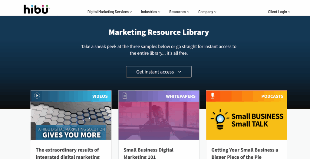
Why This Landing Page Works
- Straightforward Headlines: Immediately communicate the purpose and value of the library.
- Prominent CTAs: Calls-to-action like “Get Instant Access” are easy to find and encourage clicks.
- Organized Layout: Clean structure and uncluttered navigation simplify exploration.
- Concise Copy: Quick, scannable resource descriptions make it easy to scan and understand offerings.
- Resource Categories: Organizing by categories, such as whitepapers, videos, and podcasts, helps users navigate more effectively
What Could be Improved?
- Add User Testimonials: Including quotes or usage metrics could build trust and highlight the library’s value.
- Clarify Benefits: Briefly summarizing advantages like “Learn the best marketing strategies” could reinforce why users should explore.
- Highlight Freshness: Adding timestamps (e.g., “Updated June 2025”) or marking new/seasonal resources signals ongoing relevance and encourages return visits.
10. Discount
Discount offers are compelling lead magnets, giving immediate value in exchange for minimal commitment. YOOX’s landing page uses a bold, fashion-forward design without distractions, and a clean call to action to claim early access and 15% off by subscribing to their newsletter.
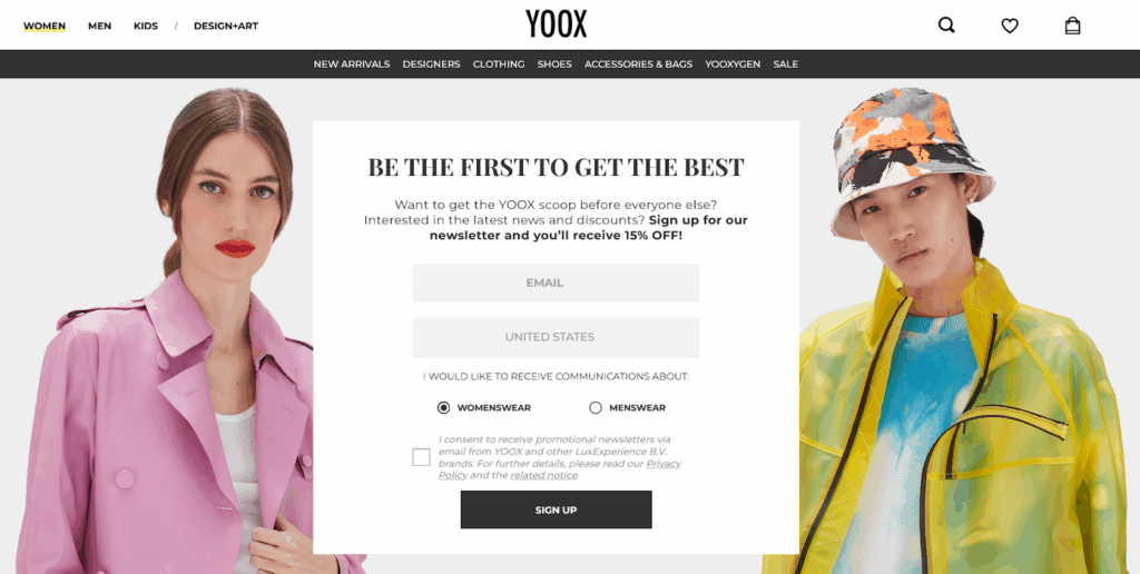
Why This Landing Page Works
- Striking Visual Style: The fashion-forward aesthetic aligns with brand identity and sets the tone instantly.
- Immediate Clarity: A strong headline, “Be the First to Get the Best,” conveys exclusivity and value at a glance.
- Low-Friction Form: Minimal input fields reduce barriers, helping users convert quickly.
- Bold CTA: The “Sign Up” button is clear, simple, and visually prominent.
- Compelling Incentive: Highlighting a 15% discount upfront offers tangible, immediate value to motivate subscription.
What Could be Improved?
- Clear Value Proposition: Make the “15% discount” more visible with a larger font or bolder styling so visitors instantly grasp the benefit before leaving the page.
- Create Urgency: Add a countdown timer, such as “Offer ends soon,” to push immediate action.
- Use a More Engaging CTA: Instead of a generic “SIGN UP,” try a more compelling call to action like “Grab Your 15% discount.”
11. Challenge
Challenges work great as lead magnets because they combine interactivity with a clear outcome. WebinarGeek’s landing page uses a clean, professional design with a bold CTA that funnels visitors toward signing up for the webinar challenge quickly.

Why This Landing Page Works
- Action-Oriented CTA: The “Let’s Go!” button is prominent and motivating, guiding users to act immediately.
- Focused Design: Minimal distractions keep attention on the signup form and challenge details.
- Benefit-Driven Copy: The landing page communicates clear participant gains, showing why the challenge is worth joining.
- Credible Visual Appeal: A professional, balanced layout boosts trust and reinforces authority.
- Consistent Alignment: All elements, including the headline and CTA, work together toward one goal: registration.
What Could be Improved?
- Use Multi-Step Forms: The form requests a lot of information; switching to a Growform multi-step form would break questions into smaller batches and reduce drop-offs.
- Remove Distractions: Eliminate the “Recommended Articles” section so visitors stay focused on the primary goal, which is to complete the signup form.
- Highlight Participant Outcomes: Sharing measurable results (e.g., “X% of attendees launched their first webinar”) would boost trust and motivation.
Increase Lead Generation with Growform’s Powerful Form Builder
If you’re looking to supercharge your lead generation strategy, using optimized landing pages with engaging lead magnets is essential. These pages capture attention and guide users toward meaningful conversions, boosting both engagement and quality leads.
Growform’s intuitive, no-code form builder makes creating high-converting multi-step forms a breeze, ensuring that your landing pages perform at their best. With powerful features like conditional logic and custom styling, Growform allows you to tailor forms to fit your exact needs, driving better-qualified leads and improving your conversion rates.
Ready to streamline your lead generation process? Get started with Growform today.