16 Best Multi-Step Form Examples and Why They Work (2024)
Table of Contents
Helpful Summary
- Overview: We discuss the designs for different multi-step forms, highlighting what they do well (and what we could potentially improve on).
- Why you can trust us: Growform has years of experience in designing, testing, and optimizing multi-step forms. Our insights are based on real-world data and extensive research.
- Why this is important: Well-designed multi-step forms can significantly enhance the user experience and increase completion rates, ensuring users provide all necessary information.
- Action points: Test different multi-step form designs to determine which approach works best for your audience.
- Further research: For more advice and tips on generating leads through effective multi-step forms, check out the Growform blog.
Looking for Multi-Step Form Inspiration?
The power of multi-step forms is no secret – a good multi-step form can increase your conversion rate by over 100% off the bat.
And according to Klientboost, a leading conversion rate optimization (CRO) agency, it’s one of the highest-impact CRO experiments you can run right now.
What’s more, multi-step forms allow you to ask more questions without your users becoming bored – letting you collect more detailed, qualified leads.
But how do you know what a good multi-step form looks like?
We’ve spent years building and studying these forms, and have gathered our favorite 16 best multi-step form examples from across the Internet.
There’s no doubt about it: these multi-step forms convert like crazy.
Related: How To Add A Growform Multi Step Form To Leadpages
Why Listen To Us?
At Growform, we specialize in optimizing form design for better lead generation. Our platform is trusted by top industry professionals and has received numerous accolades for its effectiveness.
Here’s what some of our users have to say:
- “…we’re talking conversion rates even doubling or tripling…” – BeMarketable
- “…increased leads by 32%…” – Stax Payments
- “…nearly doubled by conversion rate…” – Real Florals
So, let’s dive in!
16 Examples of High-Converting Multi-Step Forms
16 – “Post a job?”, by Khoros
This form from Khoros only just scrapes onto the list, but we wanted to point out a few nice UX elements we liked:
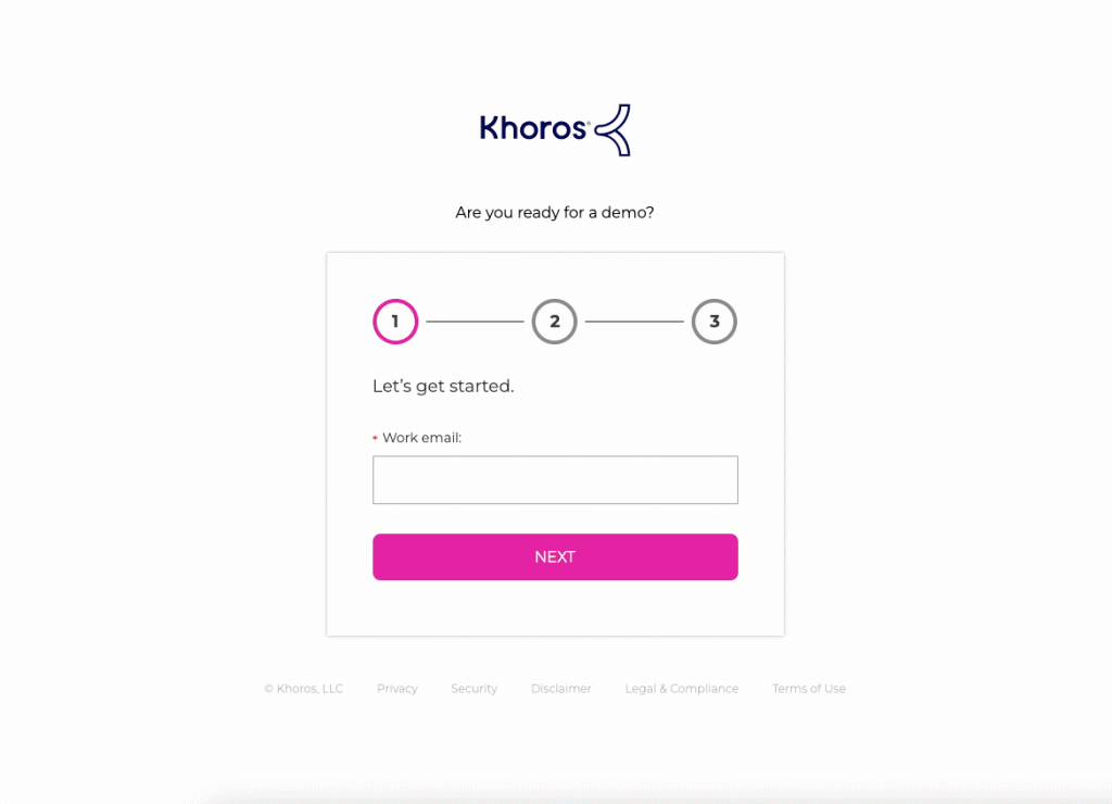
What we liked:
- There’s a clear sense of progression between the steps
- The steps become lengthier as the form progresses (as the sunk cost fallacy takes hold)
What we’d test:
- Asking email on the first step is a pretty high threat and could turn off some visitors. Instead, we’d try putting the email address last and retargeting visitors who don’t complete the first step.
- The form conveys value poorly: “Are you ready for a demo?” is an uncompelling headline.
As well as being a good example of a multi-step form, this is also a decent example of product-led onboarding.
15 – “Want more SEO traffic?”, by Neil Patel
It’s no surprise Neil Patel made the list – he’s been a marketing powerhouse for years, and never lets a single visitor or conversion opportunity go to waste!
Neil and his team give us a great reason to start filling out the multi-step form: a 7-week SEO action plan, delivered straight to our inbox.
The first piece of information we’re asked for is our website – a nice, low-friction “ask”, since it’ll be needed to provide the free report.
Notice how the form often asks about the benefits we hope to receive, and the collection of information is always justified:
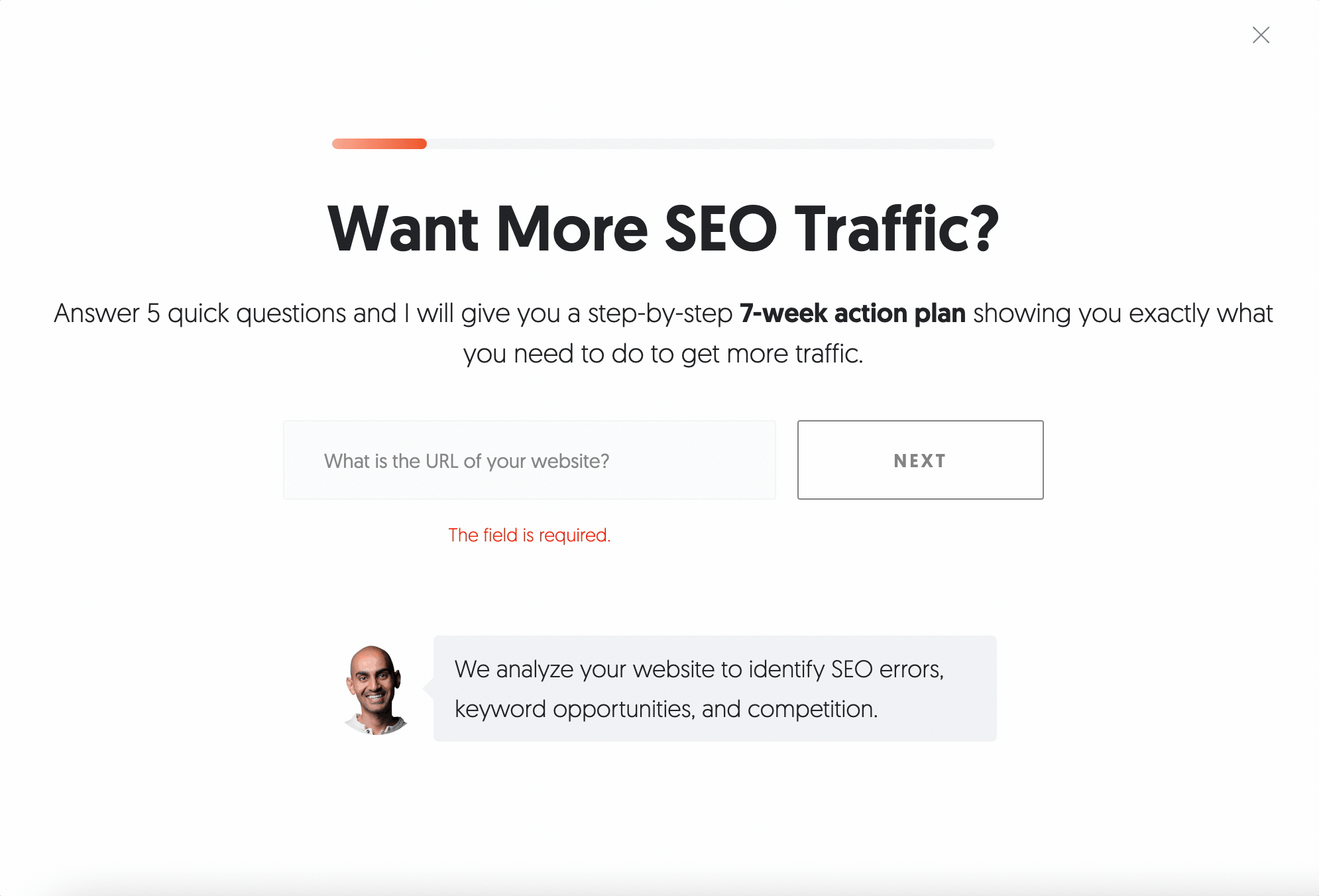
What we liked:
- Super clean design
- Great justification for data collection
- The questions both reassure the user and provide useful information on budget/qualification
What we’d test:
- Asking for a phone number is a bit cheeky, but we bet this has been tested!
Want to create a form like this? Growform makes it easy – try a free 14 day free trial.
14 – “2 steps away”, by TeamGantt
Rather than feeling like a stand-alone registration form, this form feels like part of the product. The blurry background makes it clear there’s just one thing standing in between you and your shiny new Gannt chart – and you need to do it now.
The copywriters knew what they were doing too – every piece of information you give up has a clear purpose and benefit – for example, when adding a password, “Protect your account with a password and get planning”:
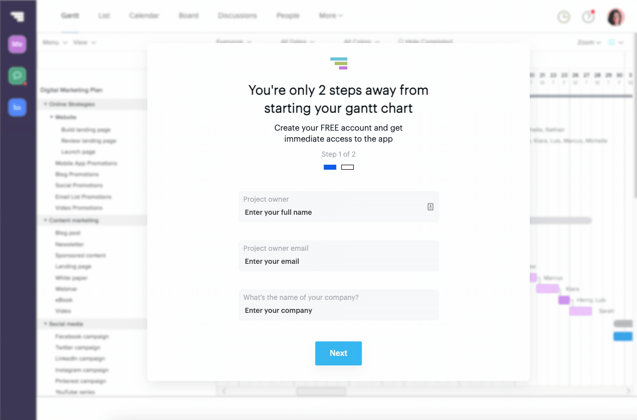
What we liked:
- Nice inline validation. There won’t be a barrage of error messages at the end of the form!
- Strong, benefit-driven microcopy
- Clean, simple, thoughtful design
What we’d test:
- Users registering for your product are fairly motivated. TeamGantt probably could have gotten away with asking for more information between steps 1&2.
13 – GEICO’s Insurance Quote Form
With this form, GEICO gets straight to the point with a minimalist, multi-step form that dives straight into personal questions. The cute, lizard mascot is gone—now, GEICO is all business as they collect the info they need to give you an accurate quote.
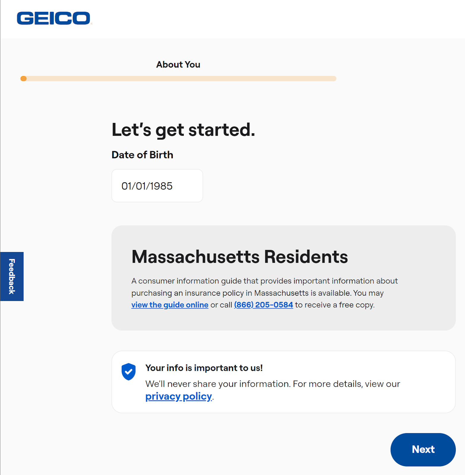
What we liked:
- Great use of progressive disclosure—each step has a narrow, clear focus.
- The minimalist design helps users focus on the task at hand.
- Along the way, you can access supplementary info like privacy policies and terms of service.
What we’d test:
In our opinion, there’s a bit too much white space. We’d like to try making the form a bit more fun and engaging to look at. GEICO is known for its mascot above almost anything—that’s effective branding at work, and it seems like a waste not to include him throughout the form.
12 – Lemonade.com’s Easy Insurance Quote
We’re torn on conversational forms. Executed badly, they can come across as patronizing, out of place, and… so 2017.
But done well, they can elevate your website to an experience and make a brand literally speak to you – like a scaleable army of loveable, approachable salespeople.
If that all sounds like a load of rubbish, take a look at this example: Lemonade’s conversational multi step form:
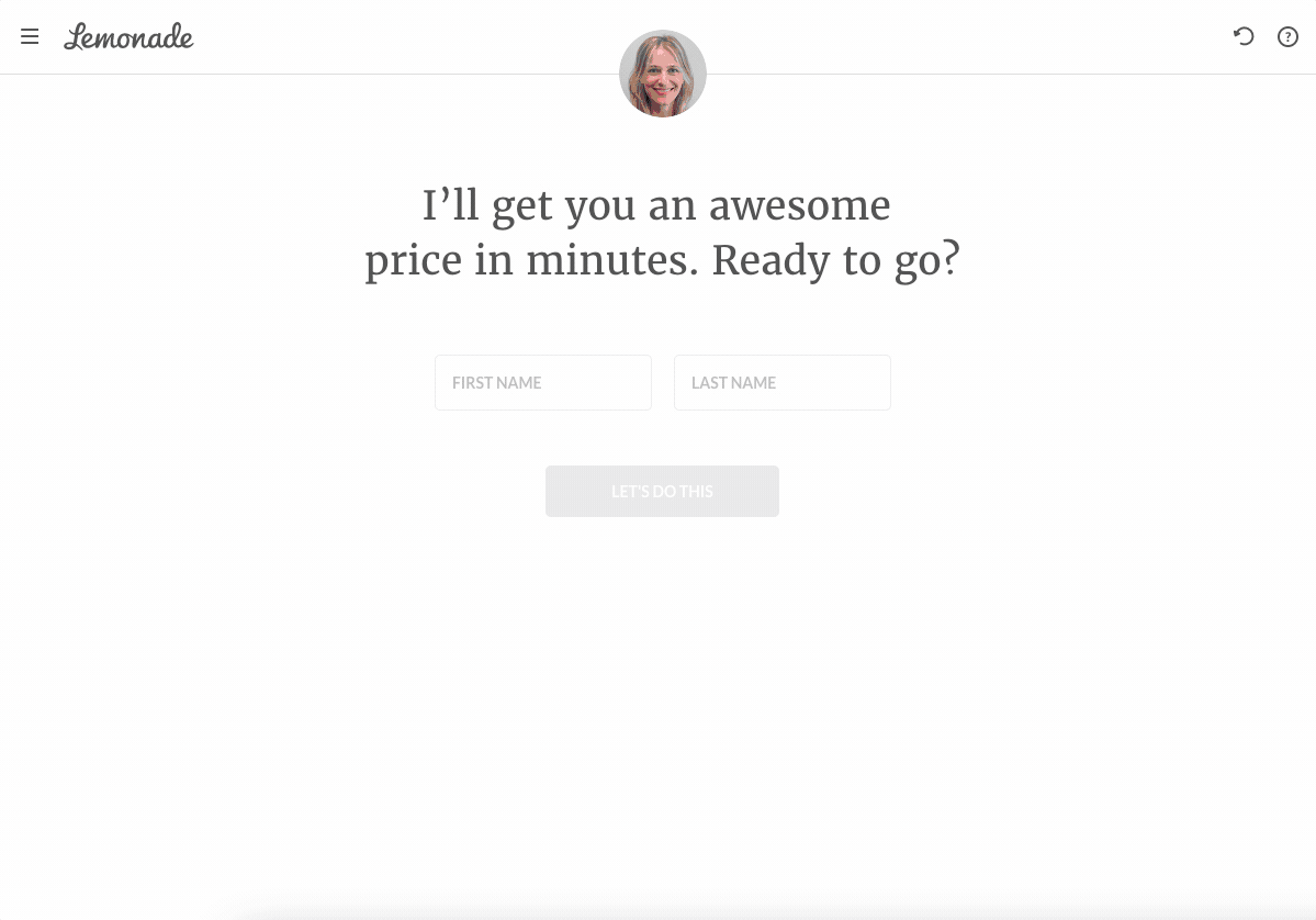
What we liked:
- A fresh, conversational approach that fits in with the brand.
- A good, clear reminder of the benefit the user is receiving (“I’ll get you an awesome price in minutes”).
- Nice use of non-standard form fields, like Google address autocomplete
- High-threat questions last (email address, date of birth, terms of service checkboxes)
What we’d test:
- Add a better sense of progress as you complete the steps: it’s unclear whether there are 4 steps left, or 40.
11 – Thread.com’s Stylish Onboarding
The team at Thread makes signing up for their service straightforward, engaging, and fun. And the UI (user interface) of this form is particularly polished, with crisp, clear buttons and fields.
We’re never asked for too much information, with numbers being requested as ranges rather than exact figures.
When Thread wants to know the color of our eyes, they ask us to tap the visual representation of the color, rather than making us read through a long list:
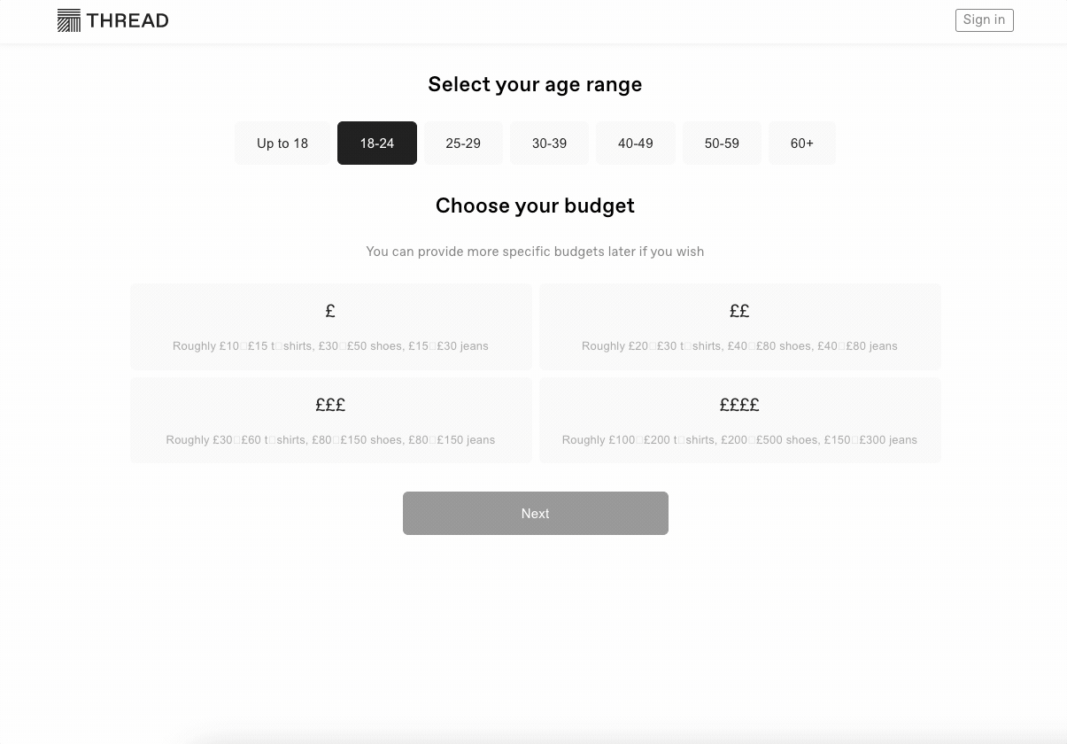
What we liked
- We’re told exactly why each piece of information is important
- There’s a clear outcome (read: benefit) to filling in the form – a new wardrobe!
- Great use of bespoke components (color pickers)
What we’d test
- There’s not a great sense of progress, so the form starts feeling a little “endless” – try a progress bar or indicators.
- Validation should point out exactly where a user missed a field, rather than making them guess.
10 – “Tell us about your place,” – Airbnb
Airbnb uses simple, straightforward copy to inform potential hosts of the required upfront information. They also try not to freak anyone out by splitting the information into three main areas, including a “Finish up and publish” stage.
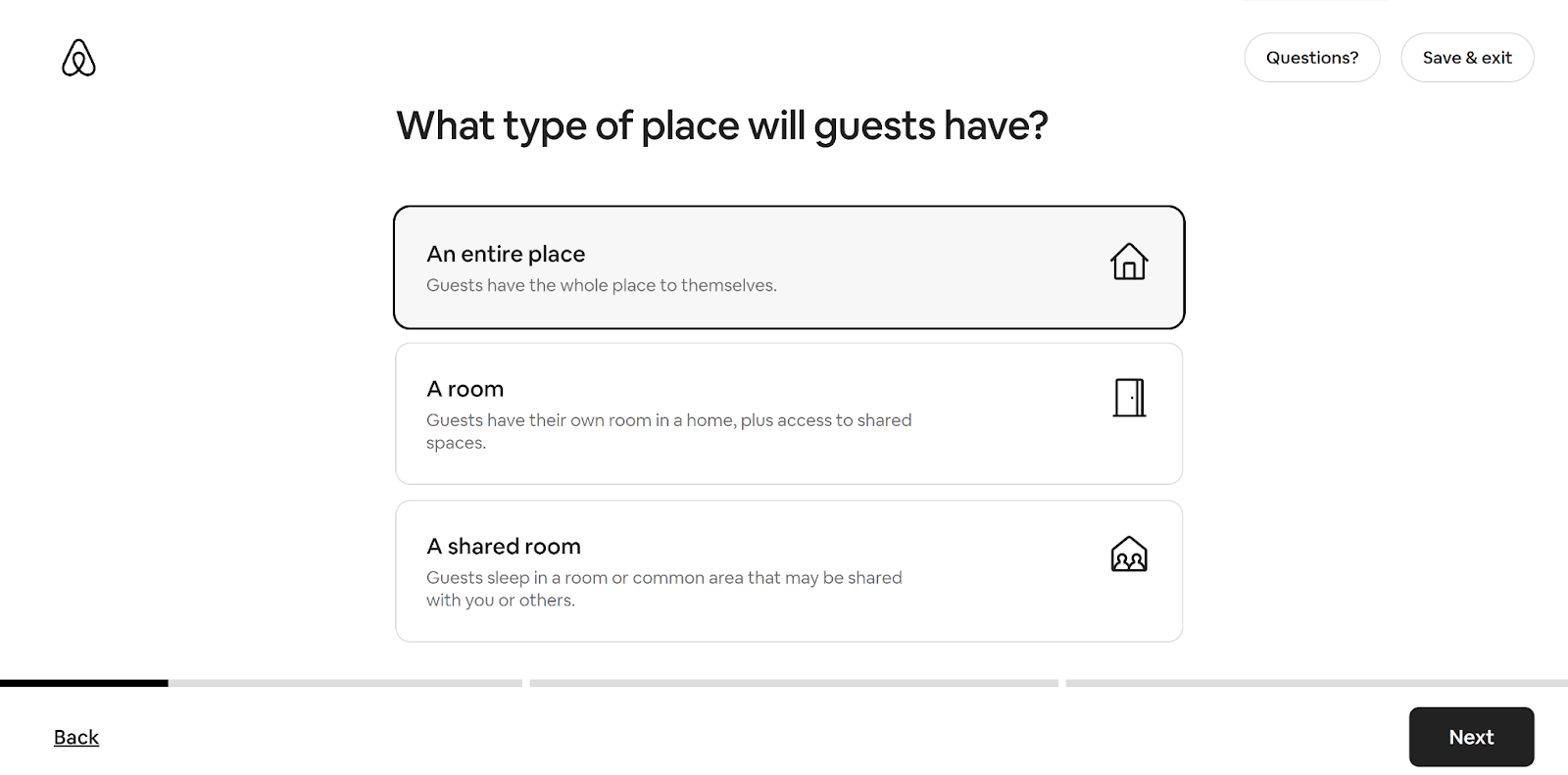
What we liked:
- Has a very responsive design that looks great on mobile.
- Copywriting is clear, concise, and gentle throughout.
- Stages are clearly laid out in the beginning and there’s a separate progress bar for each stage.
- Icons on each field option make the form much more clear and intuitive.
What we’d test:
We think the “add pictures” stage could be better optimized. While the form’s explainer text mentions that you’ll be asked to upload photos, it doesn’t say this is a requirement to continue the form. We’d experiment with users to continue through the form without uploading images and requiring them to upload them before submitting.
9 – Hello Fresh’s Special Offer
Hello Fresh’s form is a lesson in copywriting as well as form design. They clearly articulate the value proposition in step 1, so users can be left with no doubt about what the service does.
Calculations in the form itself show the user exactly how much they’re saving, encouraging larger baskets:
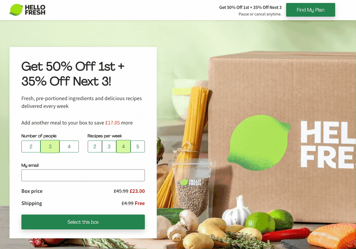
What we liked
- This is a complex form delivered well – the user could select from 12 combinations of “number of people” and “recipes per week”, but there’s no overwhelm here.
- No punches pulled in the H1 copy – we bet the Hello Fresh team has tested discounts and knows what works.
What we’d test
- We’d be tempted to try out some visual representations of the boxes: “recipes per week” could lend itself really well to an illustration showing the differences between the boxes.
- On mobile (probably 50%+ of their traffic), there’s no graphical representation of what a recipe box is – which could lead to a lack of clarity and decreased conversion rates.
8 – “Let’s Start Hiring”, by Toptal
This form’s been around for a few years and is actually one of the first forms that inspired us. It appears as an overlay on “exit intent” as a last-ditch attempt to get users to engage.
It’s clear, accessible, and has an excellent progress bar to reassure the user that they’re getting closer to the end. Greyscale customer logos add to the brand’s credibility without being too distracting:
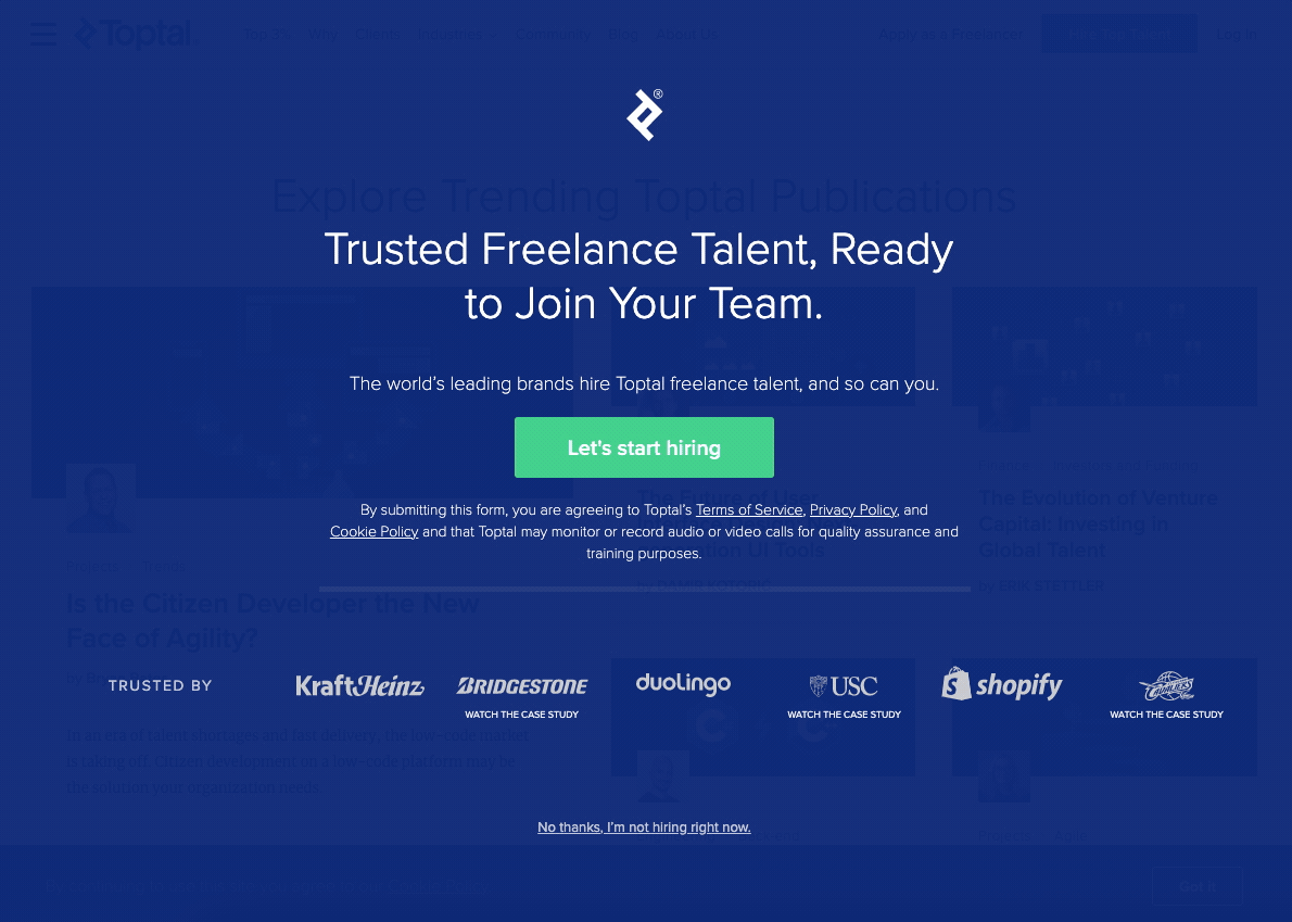
What we liked
- A simple, effective multi step form with nice transitions and a solid design
What we’d test
- It’s not always clear exactly why Toptal are asking us for information on each step.
- The snarky “close” text (“No thanks – I’m not hiring”) reminds us of those annoying popups – “No, I hate saving money!“. We have yet to see a study of these improving conversion rate, so a simple “X” in the top right corner would suffice.
7 – Termly’s Terms & Conditions Builder
One of the great things about multi step forms is that they can take an overwhelming, almost unmanageable request for information and reduce it down it into something almost joyful.
There’s nothing more dry and unmanageable than asking legal questions to generate a terms & conditions policy – and Termly did a great job.
It’s nice to feature a form this complex, as we know most forms will be much easier and simpler to build than this!
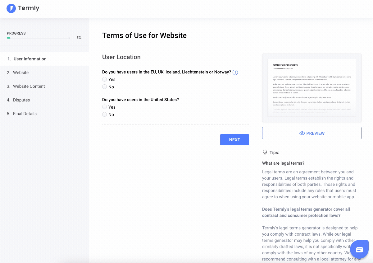
What we liked
- Clear information hierachy.
- Clear outcomes (user can see a preview of their document as they progress).
- Delightful, simple and consistent UI.
What we’d test
- Add validation to the form to ensure users fill in each step as they progress. Forcing users to do everything at the end increases the chance of distraction.
- We’d expect the items on the left of the page become a “checklist” as the user progresses through the form.
What we’d test
- There’s no ability to go “back”, which will annoy a small percentage of users.
- “Almost there” as a CTA is playful and conveys a sense of progress – but fails to convey what the button does. We’d swap this out for a consistent button and add a progress bar.
6 – Switchable’s Solar Quote Form
Switchable used Growform to design this clean and simple form, which boosts completion rates by asking only highly relevant questions and instilling trust throughout the process. Switchable smartly used our progress bar feature to indicate progression and let users know from the start how close they are to getting a quote.
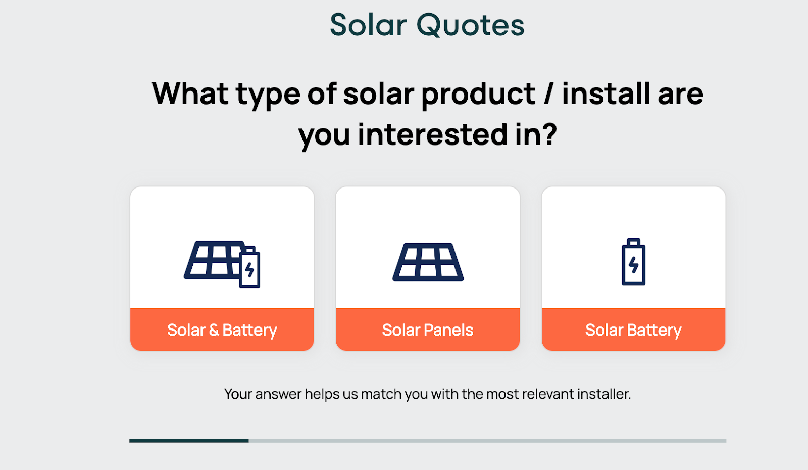
What we liked:
- Each stage explains why you need to provide the information being requested.
- Picture buttons and excellent use of brand colors to quickly identify the required product.
- Straightforward form fields reduce friction.
- Responsive design—the entire form is kept above the fold on the desktop and mobile.
What we’d test:
- Although a Trustpilot icon is displayed at the top of the screen throughout, we think that displaying more trust signals, such as security badges, privacy policy links, and testimonials, to reassure users about the safety of their information would instill even more trust.
5 – “Find the perfect professional”, by Bark
The building trade isn’t known for building beautiful forms, which is perhaps what makes Bark’s multi-step form so wonderfully refreshing. Bark has taken an industry littered with non-responsive, difficult-to-use websites and created something beautiful.
This bespoke form makes great use of autocomplete, postcode lookups and more. Even the easing effect on the progress bar is a delight!
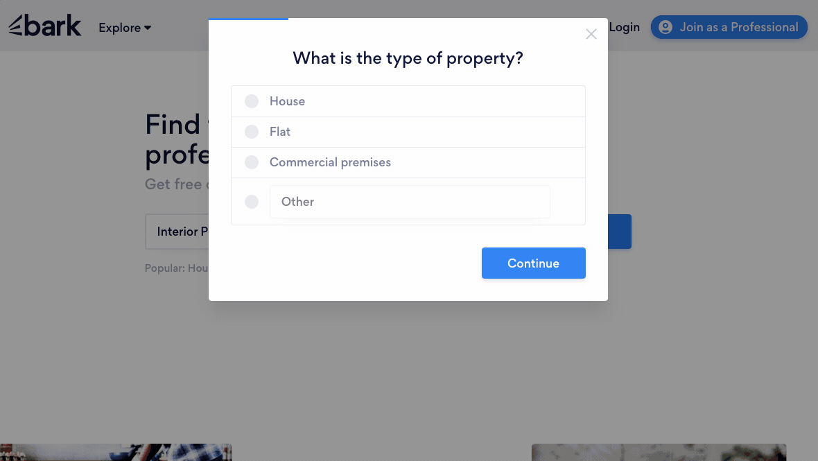
What we liked
- Beautifully clean interface
- Clear sense of progress
- Pretty much distraction-free
- There’s lots going on under the hood here: this form almost certainly loads from a backend delivering just the right question to ask next – clever!
What we’d test
- It’d be nice to see better use of iconography/images, but we can see why these weren’t included!
- It’s hard to suggest anything more – this is near multi-step form perfection!
4 – National Debt’s “You’re on Your Way to Financial Freedom” Form
Many people needing financial help are motivated to get to the end of a debt relief form.
However, how easy it is to complete significantly influences a user’s decision to choose a particular company. Forms that collect financial information can be overwhelming and tedious. We feel National Debt does a great job of trying to make the process less painful.
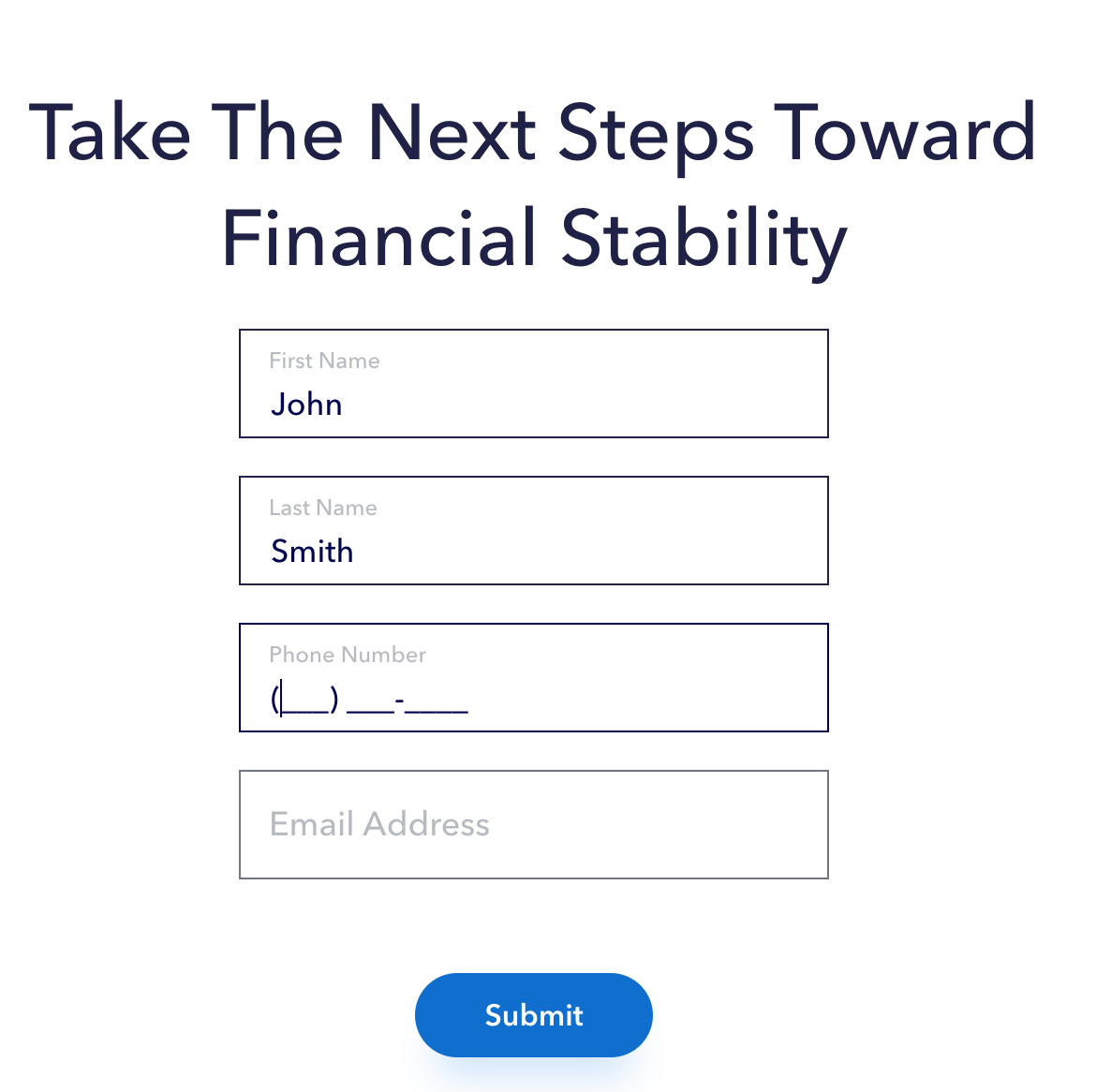
What we liked:
- The form uses conditional logic to reduce the number of questions shown at once—questions are personalized as you go.
- Users receive positive feedback encouraging them to continue—always nice!
- Clear instructions and tooltips.
- Clean and uncluttered design to help reduce cognitive load.
What we’d test:
- Simplify the debt information section slightly by letting users provide rough estimates initially and then follow up with detailed information later. Offering all the information upfront can be a burden and reduce completion rates.
Provide handy links to resources or tools to help users quickly find their credit scores if they don’t have them on hand.
Related: Top Form Builders with Conditional Logic for Enhanced User Experience
3 – KlientBoost: “What do you need help with?”
Klientboost were one of the early advocates of the multi-step form, so it’s no surprise they appear on this list.
In this form, clever copywriting meets beautiful design – it’s a stunning example – one of the best multi step forms we’ve seen:
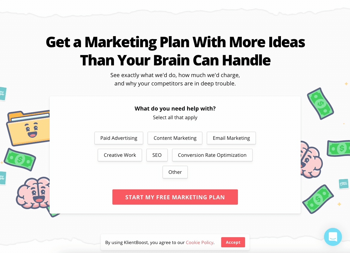
What we liked:
- Clear, benefit-driven headlines and copy. The form asks users how it can help the user, rather than the other way around. It follows the principle of quid pro quo.
- Clever use of tech to pre-fill information where possible.
- Gives users an “out” if they’d prefer to call. If we know Klientboost, these calls will be tracked too.
What we’d test:
- We’d be willing to bet a few visitors type their name into the email address, only to see it invalidated. Consider using a first name + last name box, or only asking for first name.
2 – “Build your Boxt”, by Boxt
If you’ve ever tried to order a replacement hot water boiler, you’ll know how frustrating it can be. You can spend hours gathering quotes from installers and chasing installers for delivery dates. Boxt changed all of that, making ordering a new boiler super easy with their multi-step form.
We love how this form provides “just enough” information at a glance to appear simple and intuitive – whilst always providing more information a click, tap, or mouseover away.
It’s clear the team has pored over every part of the process, removing friction and doubt where possible and adding clarity. Boxt goes against the grain by showing an “On the wall” price in its form, rather than a price that’ll increase later down the line.
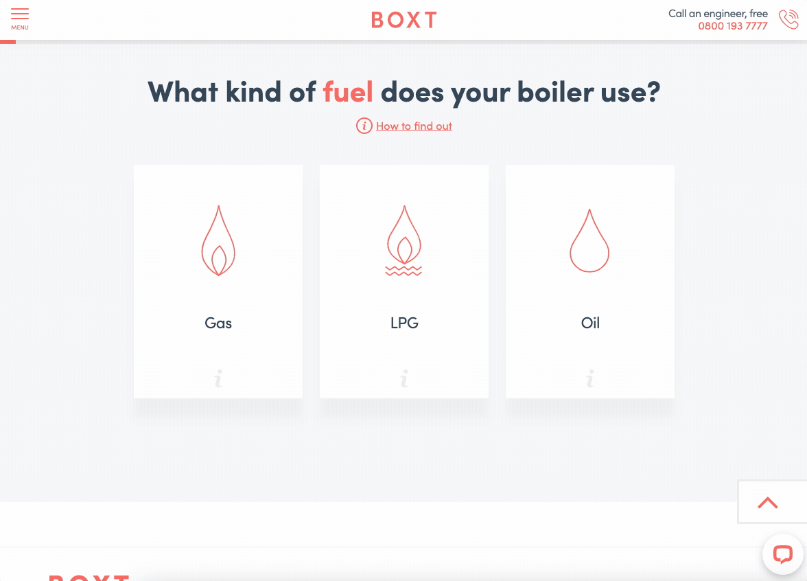
Shout out to Zone Digital, who we understand created this form!
What we liked
- This is a best-in-class multi step form. It’s clear and easy to navigate, asks sensible and relevant questions and shows the user’s progress nicely.
- Perfectly responsive – looks just as great on tablet or mobile
- This was a holistic effort: Boxt could have created a fantastic multi-step form, but still had mysterious pricing or no reviews. They’ve systematically worked on every part of their value proposition to deliver a grade A experience.
What we’d test
- Rather than asking the user to enter the “first part” of their postcode, consider getting the whole postcode and splitting it out for them.
- That’s it!
1 – The Quote Hound’s Life Insurance Form
The Quote Hound’s insurance quote form uses Growform’s tried and tested lead conversion strategies to create a seamless, intuitive form experience.

For starters, the form is blended nicely with the page and overall branding. Plus, the surrounding copy does a great job of setting up the core benefit that leads get when they fill in the form—access to expert guidance on the best insurance policies available.
What we liked:
- It uses the “foot-in-the-door” technique and starts with a low-commitment question: “Who are you looking to be insured?” with two simple options. Users are more likely to engage with the form when an intro like this is used because it’s easy, feels less intrusive, and requires minimal effort.
- The I’m not sure yet option lets users know it’s okay not to be completely clear on the type of cover required. This option reassures users that one of the benefits The Quote Hound provides is clarity.
- Personal information is requested right at the end. This is a great time to ask since, by this point, users have already invested time in providing other details, making them more likely to complete the form. This should give them the final push to complete it. At this stage, we also liked that The Quote Hound told us what happens after entering our phone number and email address.
- The progress bar is displayed throughout—this is a key conversion-boosting move.
What we’d test:
- The Quote Hound does include trust signals below the form. However, we’d like to potentially make these bigger and higher quality. Insurance can be risky, so building trust and credibility is crucial.
- The offer could also potentially be more exciting. While some people might find a great insurance policy exciting, most probably won’t—so we could test emphasizing other benefits of using The Quote Hound, such as saving time and money.
- We should also consider the overall design and branding of the form. Eye-catching colors, clear font and graphics, and consistent branding can make the form more user-friendly and inviting.
- Similarly, The Quote Hound could have used our picture buttons feature to jazz up their form a bit. For example, the text-based options at the start could include images or icons to humanize the experience more.
Try this template: Life insurance lead generation form template
Need your own multi step form?
If you’ve found these forms inspiring, you may be wondering how you can create your own multi step form.
Multi step forms are traditionally very difficult to build: when factoring in validation rules, integrations, and maintenance, they can cost $000’s in custom development.
Luckily, Growform makes it easy to build multi step forms, with no developers required:
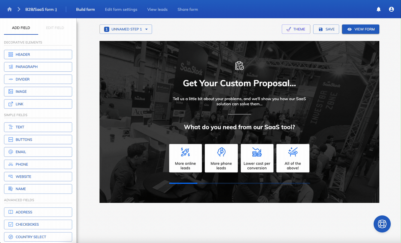
The tool was built from the ground to help you build high-performing, multi step forms – and even comes with a 14 day free trial.