
7 Best Monday.com Form Builders for Lead Capture Teams

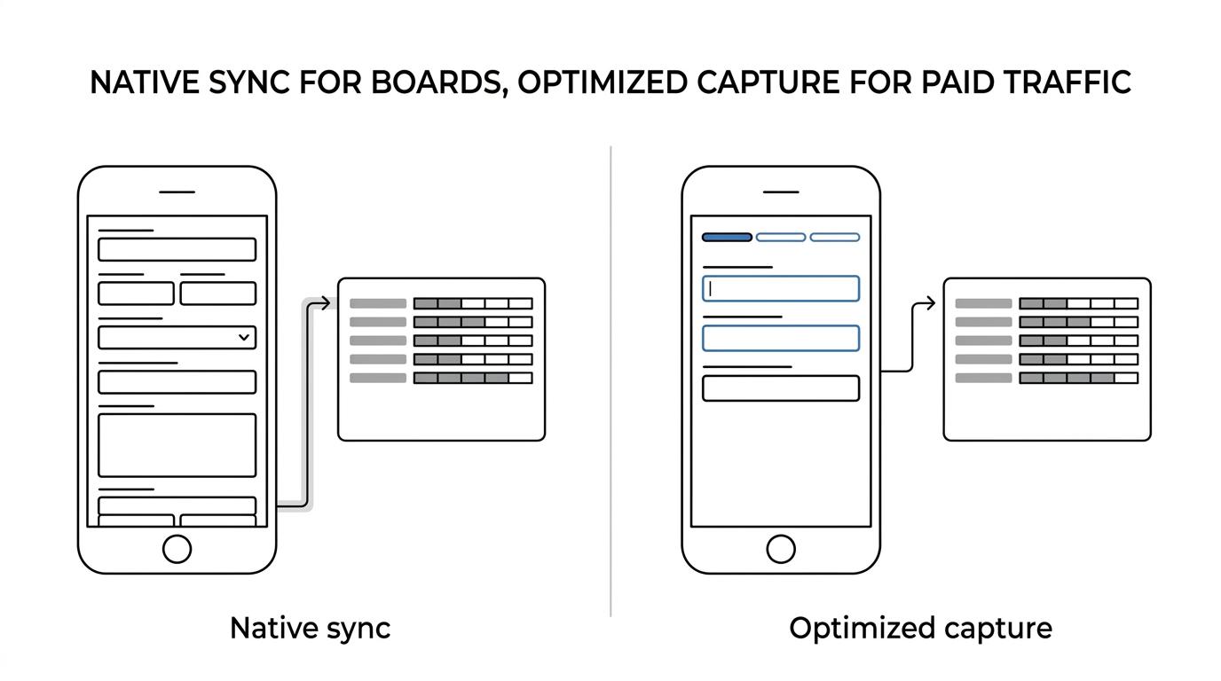
Teams searching for a monday.com form builder usually want one of two things: a native way to collect submissions into boards, or a higher-converting front end for paid traffic. That is why monday.com WorkForms often gets compared with tools like Growform, especially by lead capture teams that care about mobile completion, qualification, and routing rather than simple internal intake.
Table of Contents
TL;DR: Summary
- The best monday.com form builder for your team depends on the job: monday.com WorkForms is strong for native board sync, while Growform and other specialist lead capture tools are usually a better fit for paid traffic and higher conversion demands.
- monday.com WorkForms can be created inside the platform, shared externally, and synced directly to boards, but lead capture performance still depends on field count, mobile UX, and form structure.
- HubSpot’s analysis of 40,000+ landing pages found that conversion rates drop as form fields increase, and textareas and dropdown select boxes are linked to lower conversion.
- Baymard’s mobile usability research found major form design problems across mobile sites, including overuse of long dropdowns and weak field descriptions.
- If you buy traffic, compare monday.com form builders on five things: mobile completion, conditional logic, attribution pass-through, verification options, and delivery into boards or downstream systems.
That distinction matters because lead capture is not the same as ticket intake or internal request management. A form that syncs perfectly into monday.com can still underperform on Meta or Google if it asks too much too early, loads poorly on mobile, or breaks attribution between click and submission.
What does monday.com WorkForms actually do for lead capture?
monday.com WorkForms is a native intake layer that turns each submission into a board item and can be shared with internal users or external prospects. It is strongest when your main priority is board sync, basic intake, and fast setup.
According to monday.com documentation and support materials, WorkForms can be created and shared so responses flow directly into connected boards and workflows. The Form object also includes settings for accessibility, appearance, and whether the form is active and accepting responses. monday.com’s API materials also note AI-assisted form creation, which is useful if you want to generate a draft quickly and refine it later.
For lead capture, the big benefit is operational simplicity. Every submission becomes an item in the connected board, so assignment rules, statuses, and automations can start immediately. monday.com also notes that email pre-fill can work for logged-in submitters, and Account pre-fill is available on Enterprise plans.
The common mistake is assuming native sync automatically means better lead generation performance. It does not. If your acquisition channel is paid traffic, the front-end experience still decides whether a click turns into a lead.
“Growform reports a customer nearly doubled conversion rate on a florist website, worth an extra £1,200 per month.”
Is monday.com WorkForms or a dedicated lead capture builder better for paid traffic?
For paid traffic, a dedicated lead capture builder usually beats native WorkForms because mobile UX, conditional flows, and attribution plumbing matter more than basic intake. For internal requests or low-volume hand-raisers, monday.com often wins on simplicity.
HubSpot analyzed more than 40,000 customer landing pages and found a clear pattern: conversion rates drop as the number of form fields increases. HubSpot also found that multiple textareas and dropdown select boxes are associated with lower conversion rates. That matters because many lead teams try to push qualification upstream by piling questions into one screen.
Baymard’s mobile research points the same way. Its benchmark covered 5,000+ manually reviewed usability scores across 50 major mobile sites, and it found severe form design issues were common. One especially relevant detail is that 80% of sites still lacked autocomplete inputs instead of long dropdowns for country and state selections. On a phone, those choices create friction fast.
A useful rule is simple: if you are paying for each click, every extra field has a CPL cost. A builder that lets you stage questions, shorten visible effort, and keep the mobile experience tight usually outperforms a tool chosen only for backend convenience.
“Growform cites customer reports that conversion rates increased immediately and in some cases doubled or tripled after improving form flow.”
That does not mean native monday.com forms are the wrong choice. It means the best choice depends on the economics of your traffic and how much qualification you need before a lead reaches sales or a buyer.
What are the best monday.com form builders for lead capture teams?
The best monday.com form builders are Growform, monday.com WorkForms, Jotform, Typeform, Fillout, Tally, and Unbounce, depending on whether you need conversion rate, native board sync, or landing page control.
If your real goal is “forms that feed monday.com and convert well,” these are the strongest fits for lead capture teams rather than generic data collection.
- Growform: Best for paid traffic teams that want multi-step lead forms, conditional qualification, hidden field pass-through, and real-time delivery into monday.com through webhooks or automation layers.
- monday.com WorkForms: Best native option when direct board sync, low setup time, and workflow simplicity matter more than advanced conversion UX.
- Jotform: Good fit for teams that want a broad template library and lots of standard integrations without going fully native.
- Typeform: Best for conversational or quiz-like flows, though some high-intent users may prefer a faster, more direct layout.
- Fillout: Strong option for teams that want flexible logic and a modern interface without building a custom stack.
- Tally: Useful for lean teams that need to launch quickly and do not need heavy routing or advanced lead operations features.
- Unbounce: Best when the landing page and the form need to be tested together as one acquisition surface, with monday.com sitting downstream.
Which features matter most when comparing monday.com form builders?
Five capabilities separate a workable monday.com form from a profitable one: mobile speed, field control, conditional logic, attribution pass-through, and delivery options. Native sync matters, but it should not outrank conversion math.
When teams compare tools, they often overweight surface features and underweight what affects accepted lead rate and cost per lead. A sharper evaluation framework looks like this:
- Mobile completion: Fast load time, tap-friendly inputs, and less on-screen clutter.
- Field economics: Fewer visible fields, smarter sequencing, and caution with textareas or long dropdowns.
- Logic depth: The ability to ask follow-up questions only when they are relevant.
- Tracking pass-through: Reliable capture of UTMs, click IDs, source, and campaign metadata.
- Delivery paths: Direct sync into boards, plus webhook or automation support for routing and alerts.
If two builders both sync into monday.com, choose the one that gives you more control over the front-end experience. Board sync is table stakes. Conversion efficiency is where margin shows up.
How do you connect form submissions into monday.com step by step?
The cleanest setup is to map your form fields, tracking parameters, and qualification outcomes before you connect Growform or any other builder to monday.com. If the payload is wrong at the start, board automation only makes bad data move faster.
Step one is defining the board structure. Create columns for contact fields, source data, qualification answers, timestamps, and submission status. If you are buying traffic, include hidden fields for UTMs, campaign IDs, and platform click IDs so attribution survives the trip into monday.com.
Step two is mapping the form to board columns through your chosen connection path. That could be native sync, Zapier, Make, or a webhook middleware layer. Use stable field names and test unusual cases like multi-select answers, empty optional fields, and disqualified submissions.
Step three is deciding what happens after submission. Some teams only need a new board item. Others need assignment logic, instant notifications, enrichment, or routing into a CRM after monday.com receives the lead. If monday.com is your operating hub rather than your CRM of record, define that handoff early.
A common mistake is sending every lead into the same board with no distinction between qualified, incomplete, and rejected records. If you separate those paths, reporting becomes much cleaner and sales teams stop treating all form volume as equal.
How do you reduce form friction without losing lead quality?
You reduce friction by changing sequence, input type, and screen density before you remove qualification outright. HubSpot’s field-count data and Baymard’s mobile usability findings both point to the same lesson: structure matters as much as length.
Start with the first screen. Ask only for the information needed to earn the next step. Name, phone, email, and one intent question often do more work than a long block of demographic fields. If a field does not affect routing, pricing, or compliance, it probably does not belong early.
Then review your input types. Long dropdowns, open textareas, and crowded one-page layouts tend to create drag. If a question can be turned into buttons, short radios, or autocomplete, do that. On mobile, this change is often more important than shaving a single field.
Then move harder qualification later using logic. If a prospect answers “homeowner,” then show roof age or installation timeline. If they answer “renter,” route them out cleanly. That keeps quality controls in place without forcing every visitor through irrelevant questions.
The misconception here is that a shorter form is always better. It is not. A shorter form that attracts junk leads can wreck contact rate and buyer acceptance. The goal is not less information. The goal is less unnecessary effort.
How do single-step and multi-step monday.com forms compare?
Single-step forms win when intent is very high and qualification is light; multi-step forms win when you need to ask more without looking overwhelming. The better choice depends on traffic temperature, device mix, and buyer requirements.
Single-step forms are useful for branded search, repeat visitors, or simple callbacks where the user already knows what they want. They reduce clicks and can work well when the only real goal is speed.
Multi-step forms tend to work better when the traffic is colder, mobile-heavy, or requires qualification. Breaking a flow into smaller screens reduces perceived effort and lets you pace the ask. This is especially useful when you need to collect several routing answers before sales can act.
The trap is using multi-step just because it looks modern. If the steps are too many, or if each screen asks trivial questions, users feel manipulated rather than guided. If you need only three fields, one clear screen may still be best.
How do conditional logic, verification, and compliance fit into a monday.com workflow?
These three layers serve different jobs: logic improves relevance, verification filters bad contact data, and compliance records consent. Teams that treat them as one problem usually either hurt conversion or create downstream rejection issues.
In a monday.com-centered workflow, think of them as separate columns of risk control and revenue control rather than one feature bucket.
- Logic: Show only the questions needed for that lead path.
- Verification: Check whether the phone or email is usable before sales wastes time.
- Compliance: Store consent language version, timestamp, and any proof token your vertical requires.
If you sell or route leads, verification and consent evidence can be just as important as the raw lead itself. If you only track “submission received” in monday.com, you miss the difference between contactable leads and operational noise.
How should you test a monday.com form builder after launch?
Start with one-variable tests tied to cost per lead and accepted lead rate, not vanity metrics. A form that lifts raw submissions but tanks contact rate or buyer acceptance is not actually winning.
First, benchmark the current funnel by device, source, and board outcome. Separate submit rate from contact rate, qualified rate, and downstream value. Without that split, a conversion lift can hide a quality problem.
Next, test one meaningful variable at a time. Good first tests include removing a field, changing a dropdown to buttons, moving phone capture later, or splitting one dense screen into two lighter steps. If you change layout, copy, and questions all at once, you will not know what moved the metric.
Then inspect where drop-off happens. If abandonment spikes on one question, ask why that step exists. If mobile users fail more than desktop users, look at tap targets, keyboard type, field descriptions, and load speed before rewriting the whole funnel.
Last, bring the results back into monday.com reporting. The winning form is the one that improves the business outcome you actually care about, whether that is lower CPL, higher booked rate, cleaner routing, or better accepted-lead margin.