


Zuko's benchmark of more than 93 million form sessions puts desktop view-to-completion at 37.2%, compared with 31.3% on mobile, a six-point gap that appears even when users see the same form across devices (Zuko industry benchmarking). Among users who start the form, 55.5% finish on desktop versus 47.5% on mobile, making the conclusion hard to avoid: mobile form UI isn't a scaled-down desktop problem. It's a paid-acquisition problem that can inflate CPL before your ad, audience, or headline gets a fair test.
The biggest leaks rarely come from dramatic redesign failures. They come from a phone opening the wrong keyboard, an autofill field that doesn't recognise its purpose, a tap target that demands precision, or an error message that appears only after the user has scrolled away. Those details decide whether a click becomes a lead, and whether the lead arrives with enough quality to justify the spend.
Why Mobile Form UI Deserves Its Own Strategy
80.02% of mobile form users abandon compared with 66.41% on desktop, according to one industry benchmark summary. Another reports that mobile completion can run 35% lower than desktop on the same site. These figures will not predict every campaign, but they show why mobile form UI deserves its own strategy. On Meta and Google, a paid click arrives through a thumb, a limited viewport, and an on-screen keyboard that can change the layout. A form that feels compact with a mouse may become a series of small physical obstacles on a phone.
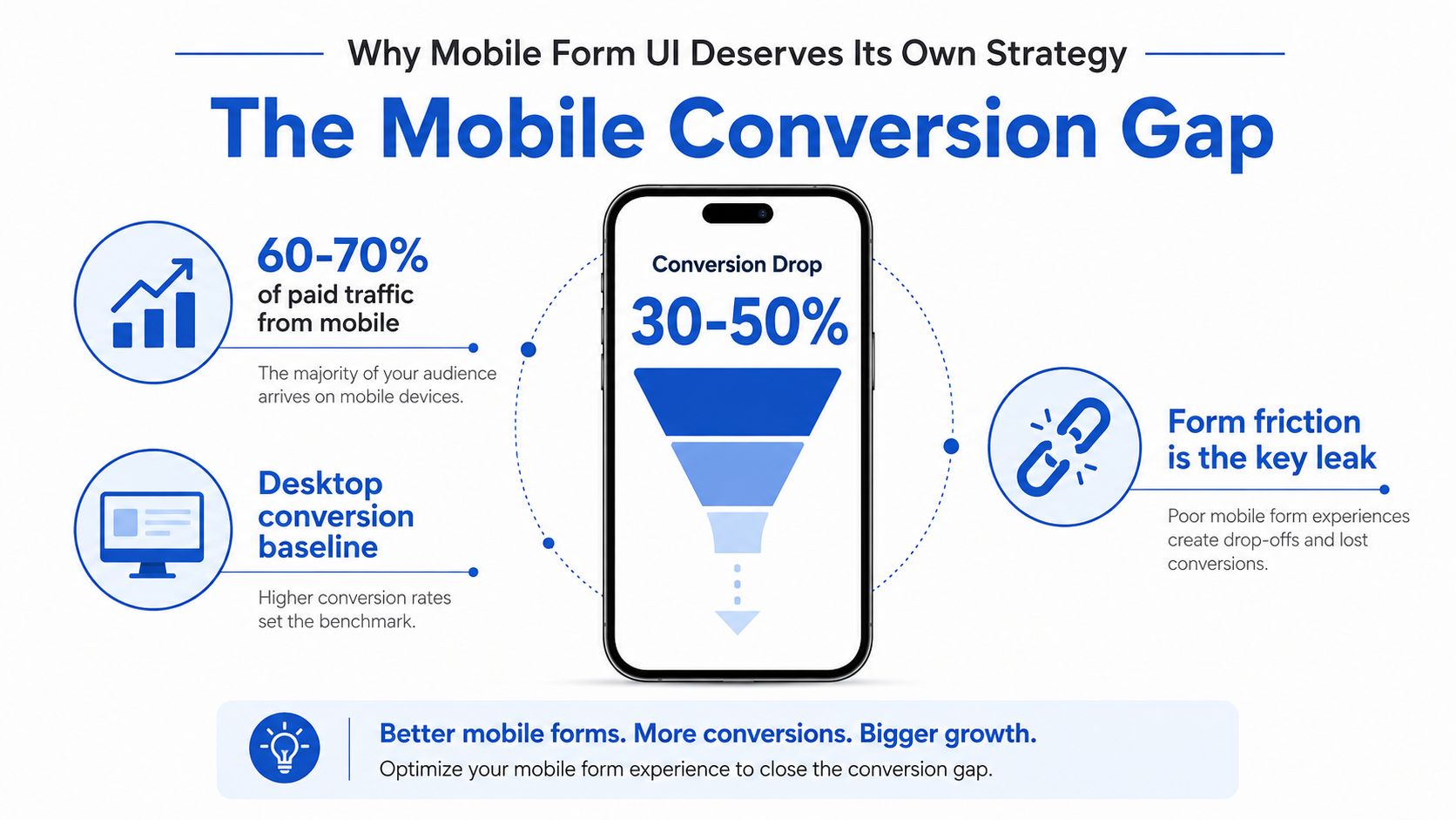
The leak usually sits between intent and input
A marketer can spend days testing a new promise above the fold while the first field remains below a large image, the phone field opens a standard text keyboard, or a submission error sends the user back to the top. Those are interface failures, not copy failures. Field-level friction often affects CPL before a new headline or audience receives a fair test.
Review the journey in four stages:
- Landing-page engagement: Do visitors reach and interact with the form?
- Field progression: Which individual field loses users?
- Validation recovery: Do users correct errors or leave?
- Submission quality: Do captured leads meet sales or buyer requirements?
This breakdown also exposes trade-offs that field count alone hides. A form with fewer fields can still lose when the remaining inputs have poor keyboard types, weak autofill support, unclear labels, or inaccessible focus states. A longer qualification journey can perform when questions are grouped, choices are easy to tap, and progress remains visible.
Industry summaries report that forms with more than five fields can see abandonment rise to 68%, while 47% of users abandon forms that take longer than three minutes. The practical conclusion is not to shorten every form. Remove effort where a phone makes effort expensive, then verify that the leads still satisfy sales requirements. Accessible input patterns, reliable autofill, and clear recovery states belong in that conversion review, not as a late compliance check.
The Core Building Blocks of a Mobile Form
A mobile form should be designed around four jobs: inputs, choices, actions, and progression. The framework is useful because each job creates a different conversion risk. Inputs create typing effort, choices create selection effort, actions create commitment, and progression determines whether the visitor understands what remains.
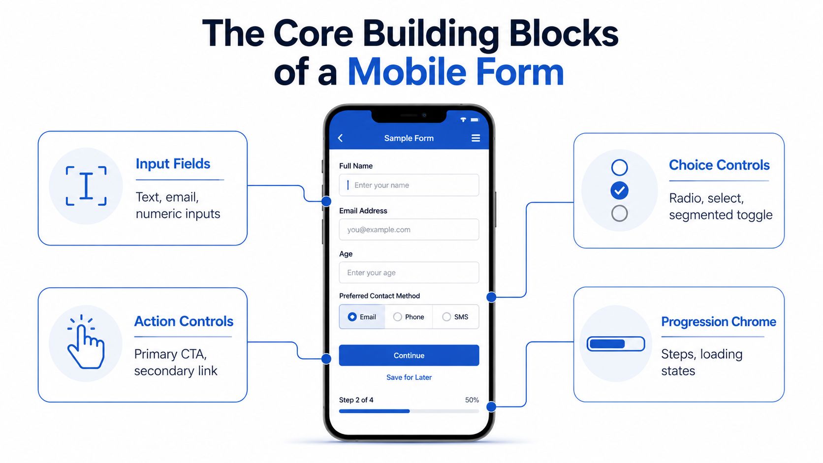
Inputs should reduce work at field level
Text, email, phone, ZIP, and address fields trigger different keyboards, autofill behaviour, cursor placement, and validation states. Configure each field for its actual data type. A phone field that opens a general text keyboard adds avoidable taps before the visitor can finish the answer.
Use a single-column vertical layout for most lead forms. It preserves reading order and gives the browser a predictable focus path. Keep labels above fields rather than using placeholder text as the only instruction, since placeholder text disappears during entry. Set generous hit areas for controls, with the platform guidance covered in the touch-target section below.
Field structure can change perceived length more than the raw field count. A mortgage lead form may ask for a full address, yet an address lookup can let the visitor select one result instead of typing street, city, region, and ZIP separately. The form still collects the same qualification data, but the interaction feels shorter because the phone handles the repetitive work. Test lookup accuracy and fallback entry, because a poor match can create more correction effort than manual typing.
Choices should match the answer
Use radio buttons, chips, segmented controls, or a native select when the user is choosing from a known set. Radio buttons can be effective for mobile qualification because the available answers remain visible and the selection requires little typing. Keep the options mutually clear, and avoid forcing a visitor to open a control merely to discover the choices.
The CTA should state the next value, not just the mechanics. “See my options” or “Get my estimate” gives paid traffic more context than “Submit.” A sticky CTA can help on a long form, provided it does not cover the active field or keyboard.
Progression should explain the task
Use step counters, back controls, loading states, or progress bars only when they clarify a meaningful journey. A two-field capture does not need decorative progress chrome. For longer qualification flows, show where the visitor is, preserve entered answers when moving back, and keep loading feedback visible after submission. Each element should reduce uncertainty or support recovery, not merely fill space.
Single-Step vs Multi-Step on Paid Traffic
The right layout depends on field complexity, audience intent, and when you need qualification. A short lead form doesn't become easier because it has two screens. Splitting a name, email, and phone number across steps forces an extra decision and an extra load without removing meaningful work.
The opposite problem appears when a qualification form asks for everything at once. A dense screen makes the visitor estimate the total effort before entering the first answer. Recent benchmark summaries report that forms with more than five fields can reach 68% abandonment, which is why step-based patterns are useful when the business needs more information.
A practical decision rule
Use single-step for a small capture where the fields are familiar and the value exchange is immediate. Use multi-step when you need to collect several categories of information, when later questions depend on earlier answers, or when sensitive qualification deserves its own context.
| Field Count | Recommended Layout | Expected Mobile Lift | When to Break the Rule |
|---|---|---|---|
| 1–4 | Single step | Don't promise a lift from splitting a short form | Split only when the first answer determines a radically different path |
| 5–8 | Two or three steps | Measure completion and lead quality rather than assuming a percentage lift | Keep single-step if the fields are exceptionally simple and high intent |
| 9+ | Three or more steps with visible progress | Compare completed leads, qualified leads, and CPL | Reduce or defer questions if qualification isn't essential at capture |
The “expected mobile lift” column should be treated as a testing instruction, not a guaranteed outcome. The benchmarks support a complexity relationship, not a universal percentage improvement for multi-step layouts. A shorter or chunked interface can help, but an unnecessary step, weak progress labelling, or a surprise qualification question can erase the benefit.
Qualify after trust has been earned
For paid lead generation, ask for the minimum information needed to identify and route the lead first. Name, contact method, and a location or service category may be enough to create the lead record. Qualification can follow in a second stage if sales needs more context.
That approach also gives you better diagnosis. If users abandon on the first field, investigate trust, offer clarity, and page-to-form continuity. If they start but leave on a later qualification question, investigate perceived effort, wording, and whether the answer format should be a tap choice instead of text.
Touch Targets, Keyboards, and Autofill
Mobile form performance often depends on implementation details hidden from the design file. A visitor sees a phone field, while the operating system determines whether the keyboard shows numbers, letters, or an awkward combination. The browser can also autofill accurately only when the field's purpose is defined correctly.
Apple's Human Interface Guidelines ask for tap targets of at least 44 by 44 points, and Material Design asks for 48 by 48 dp on Android. Start there, then check spacing between adjacent controls. A small visual button can work when its full hit area is easy to select. A small invisible hit area cannot. Test with a thumb, not only with a cursor.
Match the input to the answer
| Field | Input type | Autocomplete token | Abandonment impact |
|---|---|---|---|
| Full name | Text | name | Wrong input behaviour adds typing friction |
email | Missing email affordances slow entry | ||
| Phone | Telephone | tel | A text keyboard creates needless correction |
| ZIP or postcode | Numeric where appropriate | postal-code | Manual switching interrupts flow |
| Address | Text with structured autocomplete | street-address | Repeated address entry increases effort |
Use an email keyboard that surfaces @ and common domain punctuation. Use a numeric keyboard for numeric location fields where the market's format supports it, and use telephone input for phone numbers. Choosing text by default accepts every value, but it also makes the visitor do more work.
Autofill needs the same implementation attention as visual design. Name, email, phone, and address fields should expose the correct autocomplete purpose so iOS and Google Autofill can recognise them. For address-heavy campaigns, connect the experience to a properly configured Google address autocomplete implementation instead of asking users to type a full address into a blank box.
Diagnose field-level leaks
Measure completion and abandonment at field level, not only at the page or campaign level. The field with concentrated loss is usually the design bottleneck. If one input loses far more users than the rest, changing the CTA colour or removing unrelated fields is unlikely to solve the problem.
A practical diagnostic is simple: if a field doesn't trigger the right keyboard or autofill behaviour, it's leaking CPL. Review the field's HTML type, autocomplete token, error state, and focus behaviour. Check whether users can correct an autofilled value without deleting the entire entry.
Run these checks on real iPhones and Android devices, with saved autofill data and the keyboard open. Desktop browser emulation will not expose every failure, especially issues involving keyboard layouts, viewport movement, and selecting small controls. A field that looks correct in a mock-up can still create measurable paid-traffic waste when it forces extra taps or corrections.
Inline Validation and Reducing Perceived Friction
A mobile visitor experiences friction as uncertainty. They tap a field, guess the required format, enter a value, and wait for confirmation. If the next screen rejects that answer, the form feels unreliable, even when the underlying rule is valid.
Separate format validation from business validation. Format validation checks whether an email, phone number, or postcode is structurally usable. Business validation checks routing or qualification rules. The first should help people complete the field. The second should not make a paid-traffic lead feel punished for answering truthfully or reveal qualification criteria before the lead record is captured.
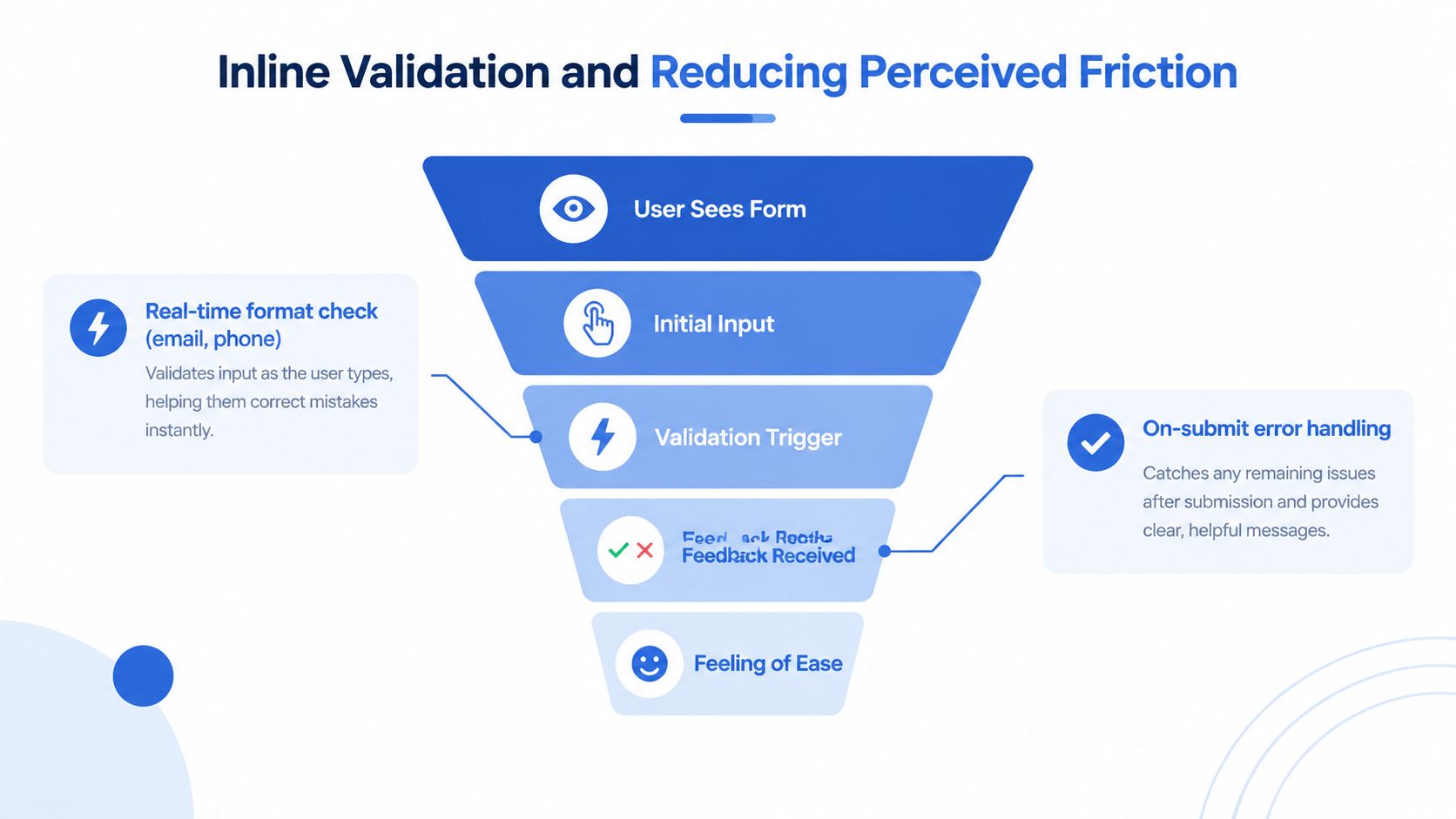
Validate at the right moment
Submit-only validation forces several corrections at once, often after the keyboard closes and the page jumps. Blur validation works for many completed fields, but it needs a completion check first. A phone field that marks 0412 as invalid the moment focus leaves the input may be technically correct, yet it tells the visitor nothing useful if the number is still being entered through a segmented or masked control.
Use the field's expected input pattern to distinguish an incomplete value from an invalid completed value. Delay the error until the value can be assessed fairly, then place the message beside the field, explain the correction in plain language, and preserve the entered characters. On paid traffic, this matters because a lead who has already invested several taps is more likely to abandon after a vague or premature error.
Instrument each field separately. Track focus, first input, correction, validation error, and abandonment, then compare those events by campaign, device, and field order. A drop at the first field can indicate trust or message mismatch. A mid-form loss can point to perceived effort, a confusing question, or a choice that should use taps instead of typing. Field-level drop-off analysis is useful here, but the decision should come from your own campaign data.
Make progress feel concrete
Accurate progress indicators reduce uncertainty. “Step 2 of 4” shows the current position and the remaining work. A brief confirmation animation can acknowledge a valid answer, provided it does not delay focus or the next interaction.
Use address lookup when the campaign needs a full address, and replace open text with chips, radio controls, or segmented choices when the answer is bounded. The performance test is practical: can the visitor answer correctly with fewer decisions, fewer corrections, and less keyboard time? If not, a modern-looking component is decoration, not conversion work.
Three Mobile Form UI Patterns That Convert
The strongest patterns for paid traffic start with the same discipline: capture identity before demanding qualification. The assembly changes by vertical and intent, but each pattern gives the visitor a clear first action and reserves complexity for the point where it can be understood.

High-intent insurance capture
Open with name, email, and phone in a single visible capture. Use labels that match the ad promise, validate email and phone on blur, and make the CTA describe the next step, such as “See my quote options.” Ask coverage type, vehicle details, or household questions after the initial lead record exists, using conditional paths where answers change the route.
Watch scroll-to-form rate and the completion of the first capture. If visitors reach the form but stall before the phone field, test trust signals, consent wording, and the phone input itself before rewriting the headline. For teams comparing layouts, multi-step form UI patterns for reducing mobile drop-off provide a useful reference point, but the campaign still needs field-level evidence.
Local service request
Put ZIP or postcode, service needed, and phone near the top. Represent “service needed” with radio buttons or chips, then offer callback timing after the initial capture. Address lookup can remain optional or later if it isn't required to route the request.
The key metric is field-level drop-off. A local-services form may attract visitors who know exactly what they want but aren't ready to type a full address. Don't force address completion before you've established that the service is available in their area.
Quiz-style qualification
Use one question per screen for offers such as solar, fitness, or mortgage. Give each screen large tap-friendly answers, use a visible progress indicator, and reserve free text for information that can't be represented another way.
The metric to protect is post-submit completion, not just the first tap. A quiz can generate high engagement while losing users at contact capture if the final screen feels like a bait-and-switch. Make the data exchange clear before the visitor invests in the later questions.
Across all three patterns, the rule is consistent: identify the lead with the minimum viable capture, then qualify behind a progress model. Test the order, answer format, and validation timing together, because changing one often changes the user's experience of the others.
Accessibility as a Conversion Lever and a Pre-Launch Checklist
Google's mobile accessibility research found that 20 of 24 participants didn't use accessibility settings even when those settings were available, so paid-traffic teams cannot assume that users with accessibility needs will identify themselves through device preferences (Google research on co-occurring accessibility factors). Accessibility therefore belongs in conversion work before launch, not as a compliance pass after results disappoint.
A form can serve older users and people with motor, visual, or cognitive needs without creating a separate experience. Clear labels, predictable focus order, sufficient contrast, and recovery messages reduce the effort required to understand and correct an input. Those changes also help users who are distracted, rushed, or working with a poor connection, which makes them relevant to paid lead generation rather than purely technical accessibility work.
Use an accessible form design checklist alongside real-device testing. Prioritise behaviour that ordinary visual review misses: whether assistive technology announces an error, whether focus lands on the right field after submission, and whether the message explains the correction. A colour change alone does not communicate failure reliably, particularly when the keyboard has shifted the viewport.
Pre-launch audit
- Field labels: Keep labels visible, programmatically associated with the correct inputs, and distinct from placeholder text.
- Focus order: Move through every step with a keyboard or assistive technology. Confirm the sequence follows the visual and task order.
- Error focus: After an invalid submission, move focus to the first invalid field and place the correction beside that field.
- Error announcement: Pair visible messages with appropriate live-region announcements, so screen readers report new errors and status changes.
- Contrast: Check labels, helper text, CTA text, borders, and error states against their backgrounds. Validate the contrast ratios, not just the colour palette.
- Progress labelling: Expose the current step and remaining work to assistive technology, not only through a visual progress bar.
- Submission recovery: Preserve entered values after validation or network failure, and give a clear status message when submission succeeds or needs another attempt.
Accessibility will not fix an irrelevant offer or broken attribution. It can remove friction that a standard conversion review misses, especially in campaigns reaching older or less confident mobile users. Test these states with assistive technology and real devices before treating the form as ready.
Growform provides a no-code capture layer for responsive single-step, multi-step, and quiz-style forms, with conditional logic, progress bars, inline validation, address lookup, and real-time delivery to HubSpot and GoHighLevel, or to Salesforce through Zapier. Paid teams can build and test mobile form UI without waiting for a developer. Start free trial.
Related articles
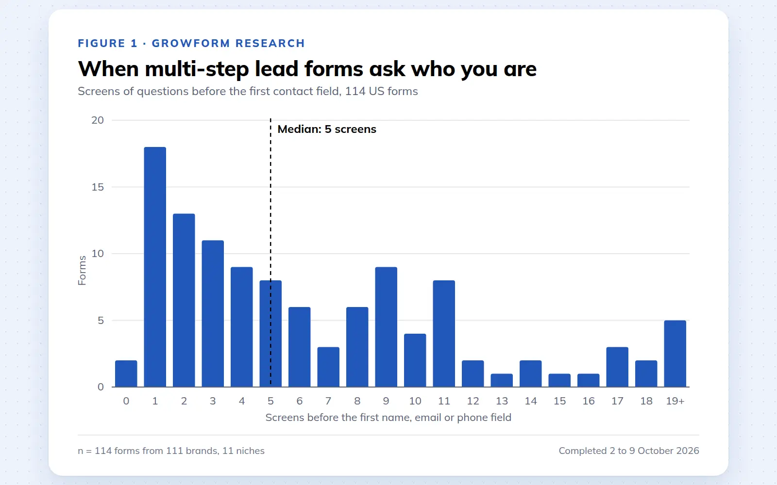
Multi-step lead forms: a 2026 study of 114 forms
We completed 114 US multi-step lead forms screen by screen in October 2026 and counted how long they are, what they ask first, how they show progress, when they ask for contact details and how they ask for consent.
October 9, 2026
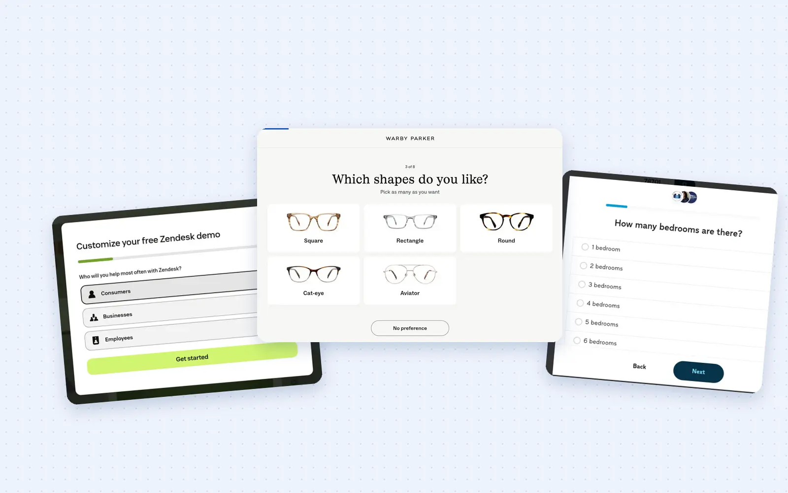
25 lead generation form examples to steal in 2026
From one-field newsletters to mortgage forms, we filled out 25 lead generation forms of every type. Here's what works in 2026, and what to learn from them.
October 9, 2026
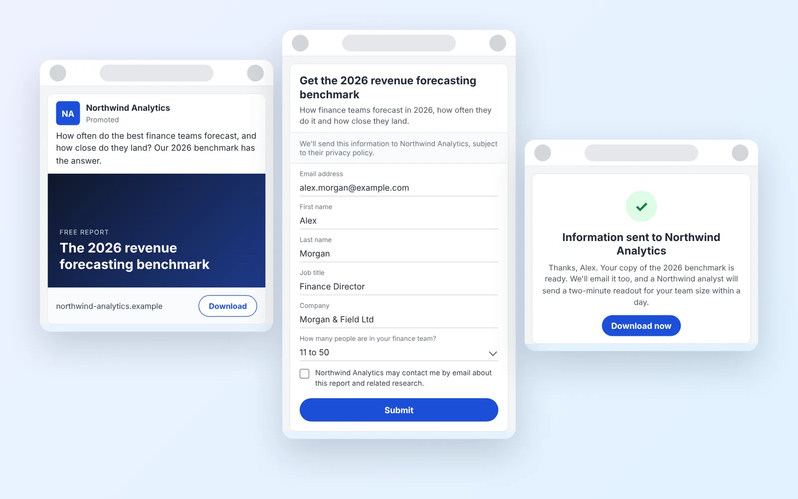
14 LinkedIn lead gen form examples worth stealing in 2026
We painstakingly searched across hundreds of LinkedIn lead gen forms, collated reams of data and worked out what's worth drawing inspiration from in 2026.
October 9, 2026